165
The lost gloss of European repairs from the nineties, which indicates a obscene attitude to coziness
Home is a place where we should be as comfortable and comfortable as possible. Each of us tries to somehow decorate his home, fill it with unique interior items. Unfortunately, some things can ruin even the most expensive and modern repairs. Editorial "Site" collected 14 elements of the apartment, which are the standard of tastelessness.
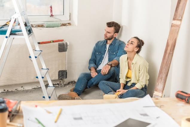
Modern renovation in the apartment Everyone wants to do modern renovation. If you decide to do a renovation or a little refresh the apartment, try to avoid the anti-trends that we collected in this article.
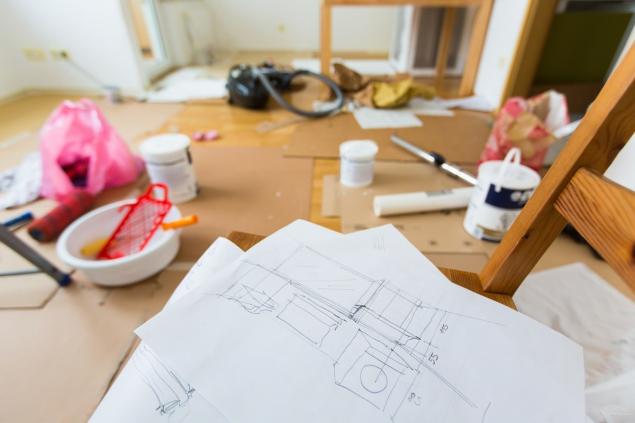
When we just go to someone’s apartment, the first thing that catches the eye is the hallway. Do not spoil the first impression of guests with huge prefabricated hallways that look rude and old-fashioned. It is better to replace them with graceful hooks attached to the wall, or a hanger on legs. Such details fit much better into any interior.
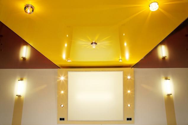
Glossy stretch ceilings Glossy stretch ceilings are a relic of the past. It is better to abandon bright colors and complex designs. Smooth matte ceiling white will be the best solution for any apartment, regardless of the renovation. In addition, you will save a lot on repairs.
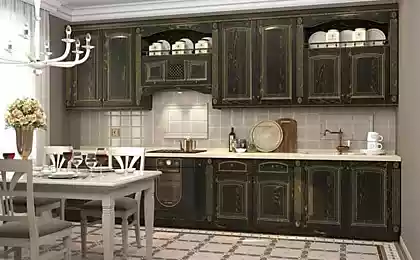
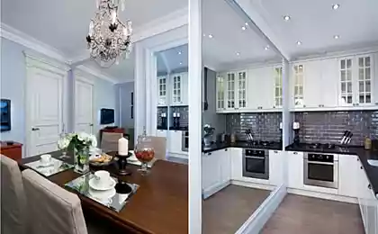
Such elements of luxury as gilding, stucco, crystal are a good example of this tastelessness. Now in fashion minimalism and simplicity. Designers advise to choose brass pens and forget about pseudo-luxury in the form of gilding. If you really want to bring creativity to the interior of your home, give preference to the original antique elements.
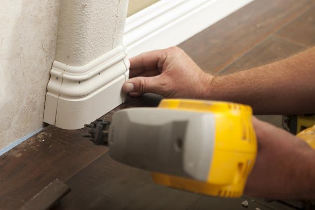
Plastic corners on walls It was previously believed that plastic corners on walls are a practical solution. They were installed to protect the corners of the walls. Such elements very spoil the appearance of the apartment - they are able to make any repair old-fashioned and tasteless.
Closets-coupe with inserts Closets-coupe with patterns and photo printing cause real aesthetic discomfort. By the way, some designers believe that any wardrobe coupes are old-fashioned. If you have enough space in the apartment, then it is better to get a swinging cabinet that will look great in the interior. If there is little space and you need a wardrobe, make a choice in favor of models without accessories, handles and even more ridiculous inserts.
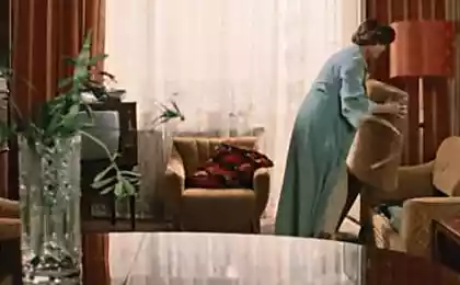
Formerly voluminous sofas and chairs were considered symbols of material prosperity. Today, such “luxury” seems ridiculous. Large upholstered furniture takes up a lot of space and looks just terrible. Modern furniture relies on ergonomics and simplicity. Modest sizes and simple shapes are convenient, beautiful and fashionable.
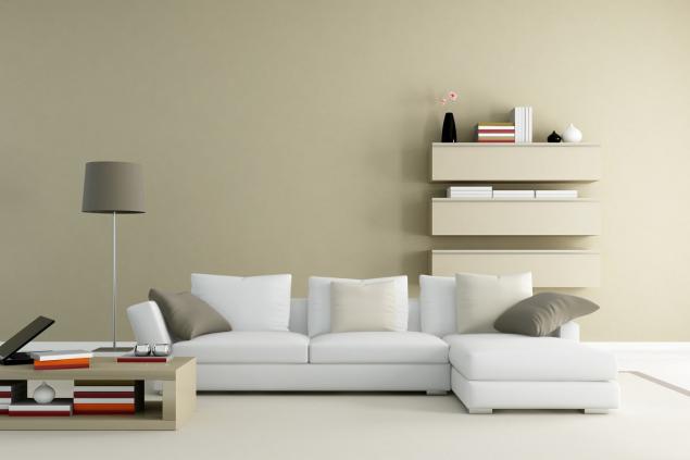
Headset-wall in the living room Such headsets-walls used to be everyone and were considered luxurious. Well, it's time to get rid of that dead weight. Not only do they look out of date, but they are also completely immobile and often quite impractical. Today it is not necessary to buy furniture in a whole block, which can not be moved. It is better to equip the living room so that you can make a change.
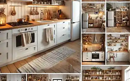
Photo printing on the kitchen apron is another solution that should be left in the past. Huge fruits, flowers, lights of New York and other silly drawings look cheap and tasteless. With their help, you can spoil the appearance of any kitchen. Again, when decorating the kitchen, it is better to strive for simplicity and restraint.
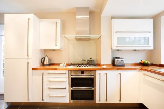
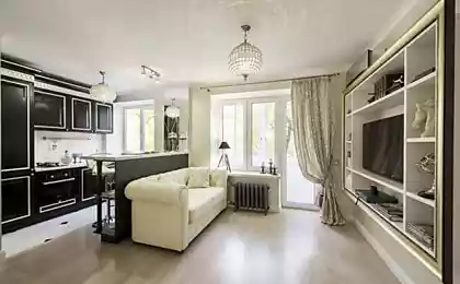
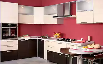
Once upon a time, such a solution was considered very fashionable. These clumsy designs from the 90s do not decorate the kitchen at all and are not practical. Today there are many options for minimalist bar counters that will decorate the interior and will not look stupid.
Shower cabin with a high pallet Another anti-trend is bulky shower cabins with a high pallet. Not only is it uncomfortable and impractical, it also looks terrible. It is better to install a shower cabin with a neat pallet and glass partitions.
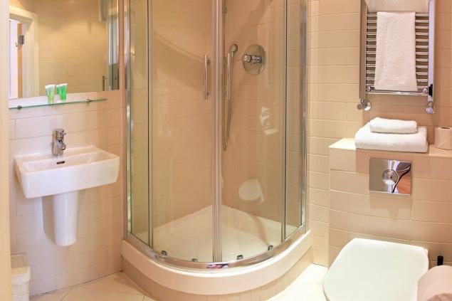
Old-fashioned tiles in the toilet and bathroom Before bathrooms it was fashionable to finish with tiles of bright colors, with catchy patterns, flowers, residents of the underwater world. And also this option was especially popular: the lower part of the room is lined with dark tiles, and the upper part is light, while they are separated by a curb. Well, that option is long out of date. Today, it is better to choose natural colors without sharp contrasts and flashy elements.
Unhidden pipes of the towel dryer Punching pipes very spoil the appearance of the bathroom. Standers and valves are usually hidden, but the pipes that lead to the towel warmer are often forgotten. This is a common mistake that should be left in the past.
731410
Jacuzzi Until recently, the jacuzzi was a subject of luxury and prosperity. Nowadays, these bulky designs are rather indicative of poor taste. Firstly, jacuzzi take up a lot of space, and secondly, require careful care. Now in fashion simple baths of modest dimensions - oval, round, rectangular.
Backlights and spot lamps Once it was very fashionable to hide the illumination in a multi-tiered plasterboard ceiling. Now it's a bad taste symbol. Spot lights and built-in lighting do not add comfort, but rather resemble an office. It is better to look at tape and overhead lamps, which fit much better into the interior.
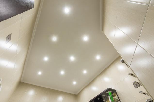
Such solutions were fashionable before, but now symbolize tastelessness and recall the 90s, when everyone wanted to do “the same as the neighbor.” Fortunately, modern renovation It offers many creative solutions for the interior, which at the same time look simple and concise.

Modern renovation in the apartment Everyone wants to do modern renovation. If you decide to do a renovation or a little refresh the apartment, try to avoid the anti-trends that we collected in this article.

When we just go to someone’s apartment, the first thing that catches the eye is the hallway. Do not spoil the first impression of guests with huge prefabricated hallways that look rude and old-fashioned. It is better to replace them with graceful hooks attached to the wall, or a hanger on legs. Such details fit much better into any interior.
Glossy stretch ceilings Glossy stretch ceilings are a relic of the past. It is better to abandon bright colors and complex designs. Smooth matte ceiling white will be the best solution for any apartment, regardless of the renovation. In addition, you will save a lot on repairs.

Such elements of luxury as gilding, stucco, crystal are a good example of this tastelessness. Now in fashion minimalism and simplicity. Designers advise to choose brass pens and forget about pseudo-luxury in the form of gilding. If you really want to bring creativity to the interior of your home, give preference to the original antique elements.
Plastic corners on walls It was previously believed that plastic corners on walls are a practical solution. They were installed to protect the corners of the walls. Such elements very spoil the appearance of the apartment - they are able to make any repair old-fashioned and tasteless.

Closets-coupe with inserts Closets-coupe with patterns and photo printing cause real aesthetic discomfort. By the way, some designers believe that any wardrobe coupes are old-fashioned. If you have enough space in the apartment, then it is better to get a swinging cabinet that will look great in the interior. If there is little space and you need a wardrobe, make a choice in favor of models without accessories, handles and even more ridiculous inserts.
Formerly voluminous sofas and chairs were considered symbols of material prosperity. Today, such “luxury” seems ridiculous. Large upholstered furniture takes up a lot of space and looks just terrible. Modern furniture relies on ergonomics and simplicity. Modest sizes and simple shapes are convenient, beautiful and fashionable.

Headset-wall in the living room Such headsets-walls used to be everyone and were considered luxurious. Well, it's time to get rid of that dead weight. Not only do they look out of date, but they are also completely immobile and often quite impractical. Today it is not necessary to buy furniture in a whole block, which can not be moved. It is better to equip the living room so that you can make a change.
Photo printing on the kitchen apron is another solution that should be left in the past. Huge fruits, flowers, lights of New York and other silly drawings look cheap and tasteless. With their help, you can spoil the appearance of any kitchen. Again, when decorating the kitchen, it is better to strive for simplicity and restraint.

Once upon a time, such a solution was considered very fashionable. These clumsy designs from the 90s do not decorate the kitchen at all and are not practical. Today there are many options for minimalist bar counters that will decorate the interior and will not look stupid.
Shower cabin with a high pallet Another anti-trend is bulky shower cabins with a high pallet. Not only is it uncomfortable and impractical, it also looks terrible. It is better to install a shower cabin with a neat pallet and glass partitions.

Old-fashioned tiles in the toilet and bathroom Before bathrooms it was fashionable to finish with tiles of bright colors, with catchy patterns, flowers, residents of the underwater world. And also this option was especially popular: the lower part of the room is lined with dark tiles, and the upper part is light, while they are separated by a curb. Well, that option is long out of date. Today, it is better to choose natural colors without sharp contrasts and flashy elements.
Unhidden pipes of the towel dryer Punching pipes very spoil the appearance of the bathroom. Standers and valves are usually hidden, but the pipes that lead to the towel warmer are often forgotten. This is a common mistake that should be left in the past.
731410
Jacuzzi Until recently, the jacuzzi was a subject of luxury and prosperity. Nowadays, these bulky designs are rather indicative of poor taste. Firstly, jacuzzi take up a lot of space, and secondly, require careful care. Now in fashion simple baths of modest dimensions - oval, round, rectangular.
Backlights and spot lamps Once it was very fashionable to hide the illumination in a multi-tiered plasterboard ceiling. Now it's a bad taste symbol. Spot lights and built-in lighting do not add comfort, but rather resemble an office. It is better to look at tape and overhead lamps, which fit much better into the interior.

Such solutions were fashionable before, but now symbolize tastelessness and recall the 90s, when everyone wanted to do “the same as the neighbor.” Fortunately, modern renovation It offers many creative solutions for the interior, which at the same time look simple and concise.
Monica Bellucci quotes that women should learn by heart
It will be possible to fly a taxi in three years.
