522
I'm not myself
Yandex change the logo. The main difference from previous ones is that it is entirely written in kirillitse.Studiya Lebedev make Russification logo search engine Yandex.

How to explain the reason for the change in the company's logo, the word "Yandex" has become part of the Russian language. It leans, and no one is straightforward. A composite "Yandex" in any Russian text looks weird, and typing on the keyboard of his uncomfortable. Moreover, the company has eight years called the company "Yandex" - also in Russian.
The word "Yandex" was once coined the name for the technology, and as the name of the file - of course, in Latin - yandex. Then it turned into Yandex, where "I" emphasizes the knowledge of Russian language (detailed history of the invention of speech can be read here).
In 1996, Yandex search technologies were first announced publicly, and then there was the first self-made logo:

Since all six people who were doing then (and still doing), worked in the company CompTek, it is not surprising that the picture was made in the image of the logo of the parent company.
To launch the search engine www.yandex.ru, which occurred 23.09.1997, Subject Lebedev did Yandex first professional logo:

All of the following logos, including a new, as were created in the studio Lebedev. In autumn 1999:

And five years later, in autumn 2004, its upgrade:

- On the decision to change the logo is very influenced by the spread of the Internet. Once we are in any off-line publications next to the logo written yandex.ru, that people generally understand what they mean. Later, when the Russian-language Internet has risen slightly, three letters www have become quite well known, and we started writing www.yandex.ru. Today in RuNet - millions of users, and we believe that the word "Yandex" is known to all and is associated with search and other services on the Internet. This belief has recently received an official study - six months ago, Yandex has issued a certificate to the well-known trademark. At the beginning of March 2008 these signs in Russia was only 71.

The popular blogger Drugoi expressed his opinion that the logo kerning is lame.
- "I" in the new version "stuck" and is very irritating to eyes. Moreover, it is not even in combination "color - black", which should always be taken into account.
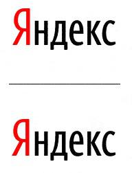
Top - the original version, the bottom - "I" pushed back to where it needed to be.
via # image645405


When the Russian videos filmed based on other people's big ideas
Jumping Parkour and jeans in the action clip clothes Sela