598
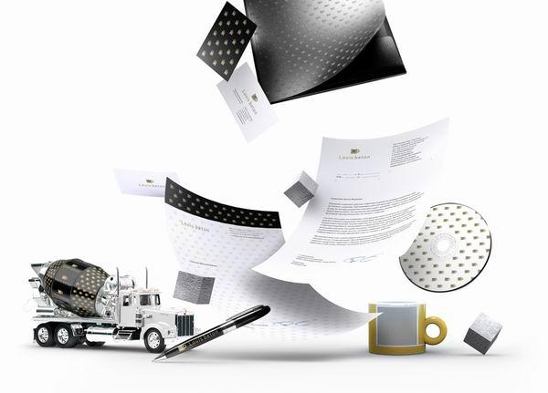
"Louis Beton" - branding boutique for the production of concrete with a light hand of the RA "Sunrise"
Naming, logo and corporate identity for the concrete plant is designed as part of a new joint project of the Republic of Armenia "Sunrise" and building company "meteorite" In step passing naming the development team got a big surprise - was chosen the most brazen and unorthodox option. The factory specializing in the production of high-tech elite brands of concrete called
"Louis Concrete» (Louis Beton) (really something resembling a high-income audience).
The main objective was to highlight the elitism of naming, quality, exclusivity and clearly position the brand in the competitive market of the concrete.
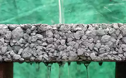
Customers concrete - developers, who tend to be and the owners of buildings under construction. This audience is well-off, a good judge of luxury brands - they are a concrete Boutique want to look, if only out of curiosity.
Click to enlarge. i>
At the heart of the logo - a symbolic image of the formwork (the form in which the concrete is poured). Concrete is mixed in a blender, which has become a metaphor for the circle. At the same time the outlines of formwork up letters «L» and «B» - the first
letters in the name. Cube inside - like array of cured concrete. Grey present in the logo emphasizes the solidity and solidity. Gold - speaks of quality, elitism.
The main carrier, of course, will mixers for concrete transportation, so the first thing was to develop options for their registration. It is also designed corporate identity and souvenirs.
Creative Group:
Creative Director - Andrew Gubaidullin
Design - Dmitry Maslakov
via # image2238355
"Louis Concrete» (Louis Beton) (really something resembling a high-income audience).
The main objective was to highlight the elitism of naming, quality, exclusivity and clearly position the brand in the competitive market of the concrete.
Customers concrete - developers, who tend to be and the owners of buildings under construction. This audience is well-off, a good judge of luxury brands - they are a concrete Boutique want to look, if only out of curiosity.

Click to enlarge. i>
At the heart of the logo - a symbolic image of the formwork (the form in which the concrete is poured). Concrete is mixed in a blender, which has become a metaphor for the circle. At the same time the outlines of formwork up letters «L» and «B» - the first
letters in the name. Cube inside - like array of cured concrete. Grey present in the logo emphasizes the solidity and solidity. Gold - speaks of quality, elitism.
The main carrier, of course, will mixers for concrete transportation, so the first thing was to develop options for their registration. It is also designed corporate identity and souvenirs.
Creative Group:
Creative Director - Andrew Gubaidullin
Design - Dmitry Maslakov
via # image2238355


Orange built in Bucharest jungle of old tires
Beeline: In any country in the world should be more Russian