993
Evernote for Android has adopted Material Design by Google
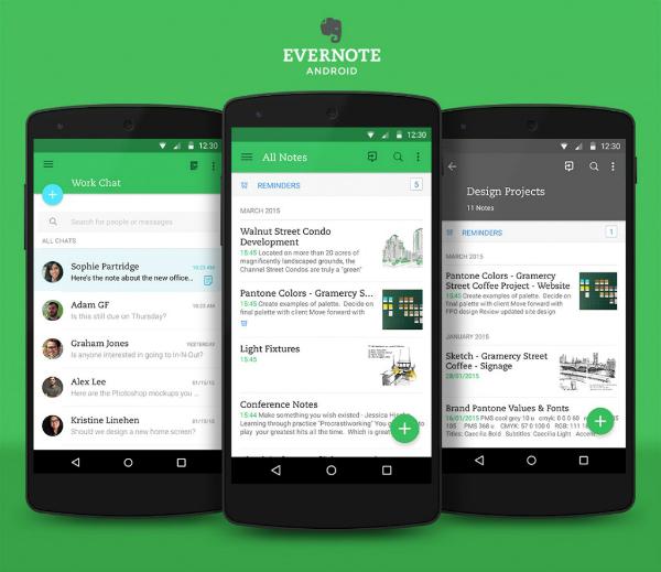
In the past year, Google announced a fresh approach to design applications for the new version of Android - Lollipop. Immediately after this, the team Evernote for Android set to work on the security update for released in the past year 6 Evernote for Android.
We discussed the features of the new design with the product manager Pittapili Teresa (Theresa Pittappilly) and designer Adam Glynn-Finnegan (Adam Glynn-Finnegan), to better understand what is behind these changes. Em>
< What improvements has received a new version?
< Teresa
< Adam Evernote for Android 6 is already close to him visually, so changes may seem insignificant. However, they are very important for comfortable work c application as a whole.
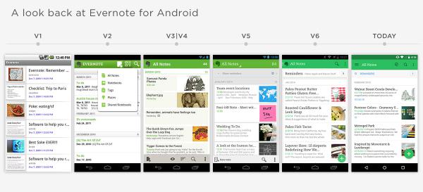
< What is an approach Material Design, and how it influenced the design of the current update Evernote for Android?
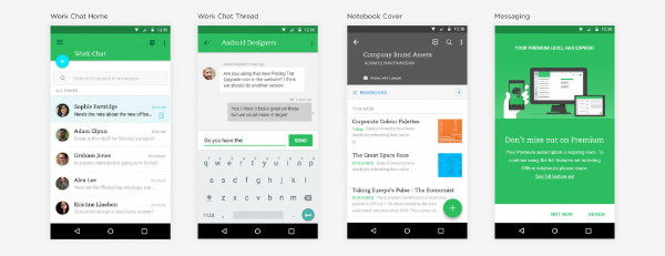
< Adam Material Design - this is the most recent addition vision Google how it should look and work the application for Android. It shows how well can be combined with high-quality visual design capabilities of modern devices based on Android. In a nutshell we can say that the Material Design created to provide an intuitive and uncluttered interface.
Rules are flexible enough so we had space for creativity. We would like the application to reflect the new approach from Google, but to preserve the unique features of Evernote.
< Can you describe the visual appearance of the new Evernote for Android?
< Adam
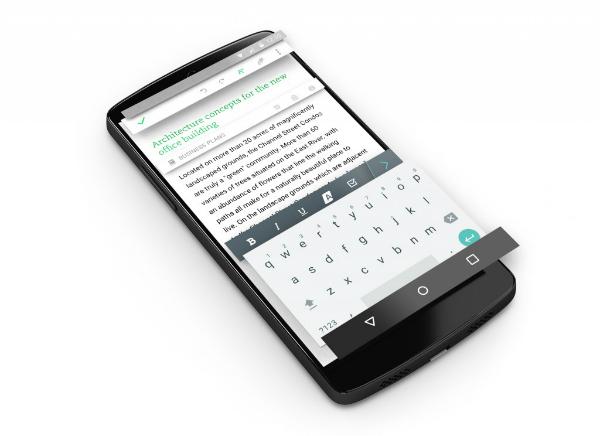
On top of this we add a touch of animation, designed to make it more comfortable to the eye navigation and transitions between screens. The combination of depth, layers, and motion ensures a sense of hierarchy and the feasibility of each component of the application.
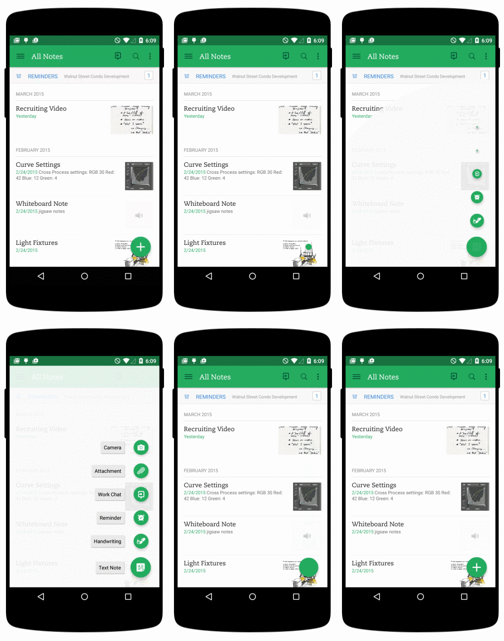
Visually, you can evaluate only a part of these changes. For example, we have significantly facilitated the design editor notes. Evernote - this is your workspace, and we wanted to remove all unnecessary and make it as concise, so that nothing distracts you from the ongoing work.
< Teresa
< How will the new design user feedback?
< Adam
< Teresa
< Some people are surprised design differences Evernote Evernote for Android and for iOS. Why are they so different?
< Teresa
< Adam
Try Evernote for Android & gt; & gt;
Source: geektimes.ru/company/evernote/blog/247124/
The state will pay for the citizens of familiarity with the stock market
NASA astronauts will use augmented reality glasses in space


