2443
Educational program on the map projection with pictures
Data visualization of all kinds, having a certain geographical distribution, has recently become more and more widespread. Here, Habré, articles with maps found almost every week. Maps in the articles are very different, but one thing unites them: as a rule, they use only two map projections, though - not the most successful of the existing ones. I would like to give a few illustrative examples of the projections, which look more aesthetically pleasing and better suited for different kinds of visualization. This article will address global projection and the projection of most of the land, as the visualization of something on a map of the world, perhaps, is the most common of these problems.
Easy Introduction h4> As the article focuses on issues of data visualization, I will not touch a deep theory of projection (datum, conformal, conformal and the like), except for the general principles of their construction. Also, I will talk here about "projection", formally implying "coordinate system», coordinate reference system, because the card of this magnitude does not make sense to separately consider the projection and datum. Mathematics is also virtually no other than the simple geometry. Those who want to get acquainted with mathematical principles, can do it on articles on Wolfram MathWorld . So learn programming in the field of geographic information systems, or advanced users, this article will probably not be very useful.
The problem h4> To begin with, what are the most common projections, and what is wrong with them.
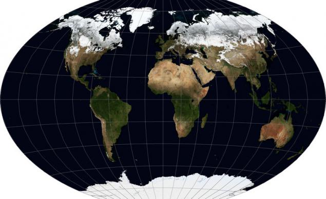
Options solutions h4> What to do with the global data, if we for some reason needed a projection, it is better to retain such properties of objects, as a form, area, distances and angles? The laws of geometry do not allow us to keep all of these properties at once, expanding the circular surface of the Earth on a plane. However, data visualization is most important aesthetics and perception, rather than the preservation of properties, both for navigation and measurement tasks. Because it becomes possible to select a projection distortions which are evenly distributed properties. And these projections, there are quite a few. There are three most famous having similar properties, "Triple Winkel» Winkel Tripel WKID: 54042 PROJ.4: wintri i>, «Robinson projection» Robinson projection WKID: 54030 PROJ.4: robin < / i>, «projection Kavraiskii» (Kavrayskiy projection). The first and last are visually minimal distortion and non-specialist without seeing a degree grid, generally it is difficult to distinguish them, because I will give an illustration for the Winkel Tripel, like the one that I personally like best.

Easy Introduction h4> As the article focuses on issues of data visualization, I will not touch a deep theory of projection (datum, conformal, conformal and the like), except for the general principles of their construction. Also, I will talk here about "projection", formally implying "coordinate system», coordinate reference system, because the card of this magnitude does not make sense to separately consider the projection and datum. Mathematics is also virtually no other than the simple geometry. Those who want to get acquainted with mathematical principles, can do it on articles on Wolfram MathWorld . So learn programming in the field of geographic information systems, or advanced users, this article will probably not be very useful.
Before beginning, explain a couple of things. All examples will be given using a data set of frontiers with here and this site dataset Blue Marble Next Generation with сайта NASA . Last includes cloudless synthesized images of the Earth's surface for each of the twelve months of 2004, which will bring some variety in the illustrations.
I love to open the software, but use GDAL in this case it seemed inefficient - some not very commonly used, but useful projections in its implementation at the moment or not, or I looked bad sources, but because I was preparing illustrations for revenue GlobalMapper, which enjoy for many years, and which is famous for supporting an impressive list of coordinate systems.
The names of some of the projections and the terms and I will give English language, because if someone wants to look for materials on the subject of Russian-language sources in the network, there is somewhat less (volume of articles in Wikipedia in Russian several times less). For most projections, I will try to give not only the names but also the EPSG codes and / or WKID, as well as the name of the projection in the library PROJ.4 a > commonly used in open software (e.g., in the packet R) for supporting the coordinate systems.
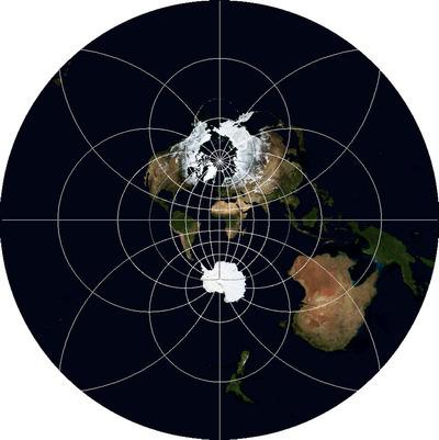
Some projections may prove to someone familiar on picture with xkcd , but all of them will not be considered here.
The problem h4> To begin with, what are the most common projections, and what is wrong with them.
The first projection - the so-called "segmented", it - Geographic projection, Latitude / Longitude, Plate carrée EPSG: 4326 WKID: 54001 PROJ.4: longlat i>. Strictly speaking, it is not even really a projection because it is obtained by interpreting the polar angular coordinates as linear rectangular, without any calculations. This projection is used because it is able to display the entire surface of the earth entirely and because it is the simplest mathematically, and the data are often not distributed projected, that is exactly in the geographical coordinates (latitude and longitude degrees).
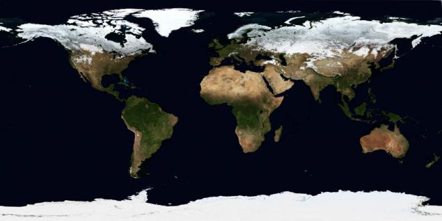
What do we have? Gets the rectangle where the point of the pole face in the line (upper and lower limits). The farther from the equator, the more any object on the map is flattened vertically and horizontally extended. As I said, this is more or less suitable for mapping global data sets, but the polar areas (Canada, Norway, Sweden, the north of Russia, Finland, Greenland, Antarctica, Iceland) are distorted. The projections, which avoid this exist and are discussed below. The only reason to use this projection - its extreme simplicity software implementation - you just need to display the coordinate system from -180º to 180º X and from -90º to 90º on the Y-plane, assuming linear angular units.
Another very popular projection - "Mercator», Mercator projection PROJ.4: merc i>. It is also used to visualize the data covering the whole world, but its popularity is dictated not only by the simplicity - its variants are the de facto standard for global mapping services such as Google Maps, Bing Maps, Here. With her deeply connected mapping library OpenLayers, Leaflet, API aforementioned services. In an embodiment, Google and OpenStreetMap it is called Web Mercator and has the code EPSG / WKID: 3857 em>, it is also sometimes referred to as EPSG: 900913 i>. The principle of its construction is not very difficult geographical - a projection on a cylinder whose axis coincides with the axis of the Earth's geographic, projection occurs lines emanating from the center of the planet, causing the error stretching horizontally polar regions is offset by a proportional vertical stretching. Only problem with this is that the map will be too big vertically, if you try to display the north and Greenland. Because usually discarded 16 ° polar regions (in equal proportions or more - from the south).
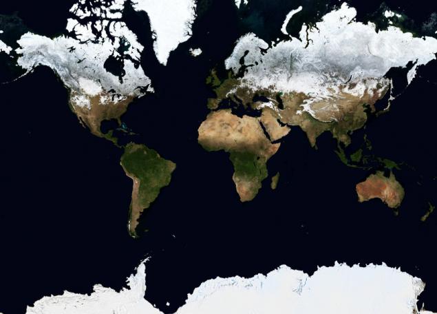
At someone's eyes look a little better than geographically, but one problem we have already mentioned, and the second - the closer to the poles of the object, the more it seems, although its shape is not so distorted. Because, if the subject of visualization - marker density per unit area or distance, this method will display misleading. With proper choice of the method of visualization, of course, this can be compensated for, and for some cases this is not a problem: for example, if the value of a parameter in the whole country is correlated with the color of this country on the map, the effect of stretching the areas not affected. This projection preserves only the shape of objects, because the outlines of continents and countries look quite recognizable. And, as I said, it is - your first and easiest option when creating interactive web maps.


Options solutions h4> What to do with the global data, if we for some reason needed a projection, it is better to retain such properties of objects, as a form, area, distances and angles? The laws of geometry do not allow us to keep all of these properties at once, expanding the circular surface of the Earth on a plane. However, data visualization is most important aesthetics and perception, rather than the preservation of properties, both for navigation and measurement tasks. Because it becomes possible to select a projection distortions which are evenly distributed properties. And these projections, there are quite a few. There are three most famous having similar properties, "Triple Winkel» Winkel Tripel WKID: 54042 PROJ.4: wintri i>, «Robinson projection» Robinson projection WKID: 54030 PROJ.4: robin < / i>, «projection Kavraiskii» (Kavrayskiy projection). The first and last are visually minimal distortion and non-specialist without seeing a degree grid, generally it is difficult to distinguish them, because I will give an illustration for the Winkel Tripel, like the one that I personally like best.
That's the description of this projection looks format ESRI WKT:

PROJCS [& quot; Robinson & quot ;, GEOGCS [& quot; GCS_WGS_1984 & quot ;, DATUM [& quot; D_WGS84 & quot ;, SPHEROID [& quot; WGS84 & quot ;, 6378137, 298.257223563]], PRIMEM [& quot; Greenwich & quot ; 0], UNIT [& quot; Degree & quot ;, 0.017453292519943295]], PROJECTION [& quot; Robinson & quot;], PARAMETER [& quot; central_meridian & quot ;, 0], PARAMETER [& quot; false_easting & quot ;, 0], PARAMETER [& quot; false_northing & quot; , 0], UNIT [& quot; Meter & quot ;, 1]] code> pre>
As is easily seen, although the distortion circuits and some increase in area of the poles are also observed, but it can not be compared with stretching geographic projection and a proportional increase in the Mercator projection.
Here it is necessary to digress and note that the form of this projection, the default is suffering disadvantage, which applies to other global projections. The fact is that if for the central meridian - the line connecting the north and south pole through the center of the map (longitude of origin) - take the prime meridian, the map will be cut by 180 mu. But with a third of Chukotka is on the left edge of the map, and two-thirds - on the right. To make the map more beautiful section must be held somewhere in the area of 169 th meridian east of the western islands Ratmanova, which for central should be taken 11 minutes. Here's an illustration of what happens:
But changes to the description of this case in ESRI WKT:
  PROJCS [& quot; Robinson & quot ;, GEOGCS [& quot; GCS_WGS_1984 & quot ;, DATUM [& quot; D_WGS84 & quot ;, SPHEROID [& quot; WGS84 & quot ;, 6378137, 298.257223563]], PRIMEM [& quot; Greenwich & quot ; 0], UNIT [& quot; Degree & quot ;, 0.017453292519943295]], PROJECTION [& quot; Robinson & quot;], PARAMETER [& quot; central_meridian & quot ;, 11], PARAMETER [& quot; false_easting & quot ;, 0], PARAMETER [& quot; false_northing & quot; , 0], UNIT [& quot; Meter & quot ;, 1]]  code>  pre>


In the format of the definition of the coordinate system for longitude PROJ.4 projection center is specified by  + lon_0 =.  I>


11th meridian - "magic" number: almost all the world of projection, having uniform scale along the equator, can be cut according to the Bering Strait, for if it is to take a central and not a zero.


Note that having to choose the projection, not take into account all the existing real requirements for visualization. For example, if the data relate to the climate, it may make sense to map a line of latitude, or use a projection of where they are horizontal and not bent to the edges of the card (ie, abandon Triple Winkel in favor of, for example, Robinson). In this case, it will easily and accurately estimate the relative proximity of different locations for the poles and equator. Another significant plus Robinson projection - the fact that it is supported by a plurality of software, including the open, while about some of the other can not be said.


Sometimes when you want to preserve some property, for example - the ratio of the object area (countries) - aesthetic side suffers. But since it still can for something needed, I will give one example of such a projection - "projection Mollveyde», Mollweide projection  WKID: 54009 PROJ.4: moll  i>.


As can be seen, it is quite reminiscent of the Robinson projection, but with the difference that the pole is still contracted to a point, from which form the polar regions looks highly distorted. But the proportion of the country's area, as required, saved a lot better.


The youngest competitor of these projections is the projection of the Natural Earth  PROJ.4: natearth  i> - it is a hybrid projection Kavraiskii and Robinson, and its parameters were selected group of American, Swiss and Slovenian experts in 2007, while age of most map projections - at least half a century.


For reprojection data into it there are a number of tools that have been written specifically for this, but its support is far from universal.
A little exotic and special occasions h4> Of course, all the variety of projections does not end there. They invented a lot. Some just look strange (say Bonne projection depicts the Earth as a figure resembling a cut apple or a stylized heart), some - are designed for specific situations. For example, I bet that many have seen in pictures map of the world that looks like a tangerine peel, which is removed and flattened. This, surely, was "Breaking gomolosinusoidalnaya projection Hood» Interrupted Goode Homolosine projection WKID: 54052 i>.
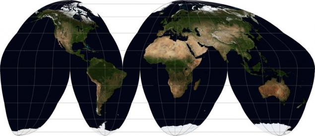
View it quite worthy of the name. Its purpose - to display the size of the objects (and to some extent - form) is close to the natural proportions. Its main problem, apart from the name and a strange-looking, is that by adjusting the central meridian is impossible to ensure that no large piece of land was not cut. Be sure to suffer something from the list: Greenland, Iceland, Chukotka, Alaska. Personally, in my opinion, it is easier to bring a separate image of countries than to use such a card if you do not want to stylize their work under the middle of the XX century.
There are projections that by its nature can not be attributed to global, but I would like to see them here, because they are able to show the globe, that is, how-to view the planet from space. One of them - "The projection of the near-vertical perspectives» Vertical Near-Side Perspective projection WKID: 54049 em>. Its special property - show the Earth's surface in this perspective, as it looks from a certain height. Ellipsoid height (idealized figure, simulating the Earth) is given for this projection explicitly.
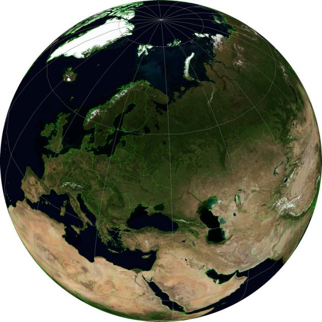
In the illustration, this projection has a latitude and longitude of the center equal to the latitude and longitude of Moscow, and height - 5000000 meters. The greater the distance, the more the image of the earth becomes like her image in the projection, we consider the latter.
Projection, which shows a view of the Earth in a parallel perspective, that is, as it were, with infinite distance, called "orthographic projection» Orthographic projection WKID: 43041 PROJ.4: ortho em>. In a sense, it is familiar to anyone who has ever used Google Earth. I say that in a sense, because "viewing direction" in this projection is always perpendicular to the surface of the Earth, whereas in Google Earth it can be tilted as desired.
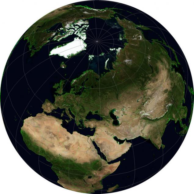
For her, as for the previous projection, you can set the central latitude and longitude to orient the earth in a desired manner. For example, you can show the hemisphere centered at some point in question - for example, illustrating the traffic flows on a continental scale, coming from one company. Make two cards with opposite values of the coordinates, you can get a map of the world (although the distortion at the edges will be very large). Generating a sequence of cards with a smooth change of the central point of the frames for the animation will rotating planet without any three-dimensional graphics.
If the article will be interesting, I'll try to write a continuation of the projection used for the display of individual countries or regions, focused, like this article on the basic properties of these projections for the problem of data visualization, infographics, and the like.
Source: habrahabr.ru/post/235283/
A little exotic and special occasions h4> Of course, all the variety of projections does not end there. They invented a lot. Some just look strange (say Bonne projection depicts the Earth as a figure resembling a cut apple or a stylized heart), some - are designed for specific situations. For example, I bet that many have seen in pictures map of the world that looks like a tangerine peel, which is removed and flattened. This, surely, was "Breaking gomolosinusoidalnaya projection Hood» Interrupted Goode Homolosine projection WKID: 54052 i>.
View it quite worthy of the name. Its purpose - to display the size of the objects (and to some extent - form) is close to the natural proportions. Its main problem, apart from the name and a strange-looking, is that by adjusting the central meridian is impossible to ensure that no large piece of land was not cut. Be sure to suffer something from the list: Greenland, Iceland, Chukotka, Alaska. Personally, in my opinion, it is easier to bring a separate image of countries than to use such a card if you do not want to stylize their work under the middle of the XX century.
There are projections that by its nature can not be attributed to global, but I would like to see them here, because they are able to show the globe, that is, how-to view the planet from space. One of them - "The projection of the near-vertical perspectives» Vertical Near-Side Perspective projection WKID: 54049 em>. Its special property - show the Earth's surface in this perspective, as it looks from a certain height. Ellipsoid height (idealized figure, simulating the Earth) is given for this projection explicitly.
In the illustration, this projection has a latitude and longitude of the center equal to the latitude and longitude of Moscow, and height - 5000000 meters. The greater the distance, the more the image of the earth becomes like her image in the projection, we consider the latter.
Projection, which shows a view of the Earth in a parallel perspective, that is, as it were, with infinite distance, called "orthographic projection» Orthographic projection WKID: 43041 PROJ.4: ortho em>. In a sense, it is familiar to anyone who has ever used Google Earth. I say that in a sense, because "viewing direction" in this projection is always perpendicular to the surface of the Earth, whereas in Google Earth it can be tilted as desired.
For her, as for the previous projection, you can set the central latitude and longitude to orient the earth in a desired manner. For example, you can show the hemisphere centered at some point in question - for example, illustrating the traffic flows on a continental scale, coming from one company. Make two cards with opposite values of the coordinates, you can get a map of the world (although the distortion at the edges will be very large). Generating a sequence of cards with a smooth change of the central point of the frames for the animation will rotating planet without any three-dimensional graphics.
If the article will be interesting, I'll try to write a continuation of the projection used for the display of individual countries or regions, focused, like this article on the basic properties of these projections for the problem of data visualization, infographics, and the like.
Source: habrahabr.ru/post/235283/