1138
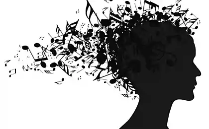
Music visualization: from traditional approaches to modern interfaces

Foreword: I suggest to get acquainted with my master's thesis on radial drum machine. Pay particular attention to the section on rhythm visualization. Also check out a somewhat more scientific review of the literature on visualization and music education. In this article, I discuss the value of video games in music education.
The process of electronic writing and composing music includes the work of not only auditory, but also visual organs. The display of data in audio editors such as Pro Tools and Ableton Live is purely informational in nature – these are waves, grids and linear graphs. Some visualization systems are exceptionally decorative, such as iTunes, which creates psychedelic half-random graphics. There are also systems that are something in between. I see great potential in such graphic systems, I think they can help to better understand the principle of music and find new original compositional techniques. In this article, I offer you a selection of the most interesting music visualization systems I have ever encountered.
Western music recording is a traditional centuries-old way of visualizing music. This is a very slender and compressed system, clear and symbolic, besides, it is easy to master. Programs like Sibelius can easily translate music notation into MIDI data and back again.
But Western music has a number of limitations, especially with regard to contemporary music. It is inconvenient to use in working with microtones. She has a limited ability to express performing nuances - in the hundred years of jazz, nothing better has been invented to denote swing than simply writing the word "swing" at the top of the score. The key system works well for major keys, but not so well for minor keys and when working with musical modes, and when it comes to blues, it is completely useless to use it.
I want to share with you an idea of how music can be improved in the future. This is a visualization of John Coltrane's solo by Jon Snydal on Miles Davis' All Blues (I've edited it a bit to make it easier to see).
Snydal's visualization is more analog than digital - it reflects the exact nuances of Coltrane's performance, with barely discernible shades of pitch, timing and dynamics.
MIDI sequencers offer further improvements beyond standard notation. Note a simplified electronic music sequencer called iNudge. Try it, it's funny.
Here's what Thelonius Monk's "Four In One" melody looks like in standard MIDI-sequencing mode. Rectangles show not only which notes were played and when, but also their exact duration. Red rectangles darker mean that the volume was higher, and pink rectangles lighter – quieter. You can also read the volume on the panel at the bottom.

The MIDI system is very functional and easy to use. It can capture your movements on the keyboard, you can import scores, you even have the ability to draw notes directly on the screen (my favorite method).
MIDI player Music Animation Machine has a number of wonderful videos that combine visual representation of the MIDI track with audio recordings of classical works. Here, for example, the notorious Toccata and Fuga Re-minor Bach.
As the software’s ability to extract data from today’s audio recordings is continually improving, you can start managing them with the same ease as MIDI. This is a screenshot of the Melodyne tone correction program, which is very similar to Auto-tune.
Lines display already sung notes, and orange drops show notes that the singer should take, according to the program. The thickness of the drop displays the volume level. You can drag the drops and redraw the lines as you like to remake the song to suit your mood. The Melodyne program can even decipher and re-record the melody played in the format of a music stand and MIDI.
High and low frequencies It is accepted that higher frequencies should be spatially displayed "above", and lower frequencies - "below". This seems very reasonable, but in fact they can be displayed completely arbitrarily and not even correlate with the physical performance. On the piano, high notes are on the right and low on the left. On the guitar, the “low” E string is physically above the “top.” For wind instruments, playing the lower and upper notes is also not related to their physical coordinates.
The absolute height of the tone is displayed gradually on the ascending, but the high-altitude class is displayed in a circle. The most plausible representation of the spatial organization of tone is the spiral.
High and low are not the only figurative definitions we use to refer to fast and slow vibrations. As I said, a high-altitude class is expressed by a circle.
But in fact, the circle only replaces the definition of “up/down” with “clockwise/counterclockwise”. There are other ways to paint the tone. Intuitively, we try to change the way we approach them and imagine them as moving closer and further or inward and outward. We are also thinking about making higher tones brighter and lower tones darker. Some of those who play stringed musical instruments sometimes specially tune the top string a little higher than it needs to create an effect known as "glitter."
The general agreement is to denote the time from left to right in the notation. But this is not the only possible direction. I'm referring to the paradigm that is offered in rhythmic games like Dance Dance Revolution and Guitar Hero. The perfect implementation of this concept belongs to a game called FreQuency.
The game even allows you to create your own remixes.
I like this “tunnel” metaphor, and I would like to see it spread in an advanced manufacturing environment.
Waves of tone are sinusoidal (harmonic) vibrations and you can visualize them in this way:
Sinusoidal oscillations are not particularly useful for notation. But they do help you scientifically understand what happens when you hear something physically. It’s even better to see it in animation:
Take a look at all the animated drum membranes on Wikipedia.
Audio editors display music as the amplitude of wave vibrations, using droplets that become wider as the sound gets louder. Here is a drum knock (Funky Drummer break), created using the editor ReCycle. Blue drops show drum beats. The intensity of the drops does not contain extensive information about the musical parameters, it only shows the duration and volume. But ReCycle was created to simulate drum samples, for which time and volume are the only really important information.
This is a graph that I drew to show you how you perceive this composition cyclically.
In his article on the Design Observer, Rob Walker talks about wave fluctuations as a musical benchmark that is gradually replacing the traditional “eights” or other recording formats that have already served their purpose. The player on the SoundCloud website uses eye-catching wave charts that help the listener keep track of the location of the song's listening, observing volume peaks. SoundCloud has a band called Pretty Waveforms.
The wave form of tone fluctuation tends to move from pure functionality to design. Joshua Distler created the Bjork album cover concept, where each song is represented as a sound wave.
I have always thought it would be great to use networks to visualize music theory and have even made several attempts to do so. Here is a comparison of a circle of semitones and a circle of quintes, which for each other are a sweep.
This is a chord sequence scheme in John Coltrane's Giant Steps song.
Below is a structural diagram that shows which algorithm you can use to figure out what kind of mood and tonality you hear.
It would be much cooler to have more abstract three-dimensional interactive visualizations that show how chords, tones and melodies function. Leonard Euler demonstrated a way of mapping tonal harmony as a spatial lattice in the form of a torus, as shown in this animation. Red lines denote large tertias, green lines denote small tertias, and blue lines denote quintas.
I have ambitions in this area, but I lack the programming skills to implement them. Others are making serious progress in this direction. Dmitri Tymoczko made a splash when he published his first music-related paper on his topological methods of visualizing tonal harmony in Science. I can't fully understand his ideas, but they seem intriguing to me.
//player.vimeo.com/video/20301089
These are illustrations by Aniruddh Patel from his article “Language, Music, Syntax and Brain”. Again, I'm not quite sure what this means, but I'm planning to figure it out later.
Other theorists have attempted to use color to represent a harmonic function. Scriabin, for example, invented the “light keyboard” for this purpose, although it never became popular.
In writing a song, I like to use simple color coding to distinguish its segments. I use yellow for the introduction and ending, blue for the main theme, green for the chorus and orange for the instruments and breakdown.
Edward Tufte demonstrates some more sophisticated methods of visualizing song structure on his forum:
Martin Wattenburg's Shape of Song project features a replay within a single musical composition. Here's his visualization of Madonna's song Like a Prayer.
And this is a visualization of Wattenberg for Beethoven's To Elise.
Next, I will cite a fascinating video by Niklas Roy, which shows how you can create a fashionable audio sequence on a drum machine using a binary account.
//player.vimeo.com/video/1639345
Isn’t this graphical color system a cool notation or interface?
Visual Complexity has a lot of ideas like this.
In addition, John Clover told me about this post, which strongly echoes mine: “Awesome visualization of music and learning music.”
I had the opportunity to play some Bjork songs from the Biophilia album/project. The visualization of some of them is very original and interactive, some of the songs are visualized just interesting, but traditional, and the visualization of some is incomprehensible, but deserves attention for creativity. Anyway, it's a remarkable experiment that I think will have an impact on the principles of music visualization.
Source: habrahabr.ru/company/audiomania/blog/235339/


RC paper airplane PowerUP 3.0: reviews first pilots
Leap Motion released a gesture recognition system for Oculus Rift