Part 1
Part 2
Part 3
We all know that page load time significantly affects the conversion rate, but what about the time required to perform a certain action?
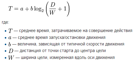
Fitt's Law requires that the time required for the mouse cursor to the desired object can be represented as a function that depends on the distance to the target and target size.
Theoretically, this means that in order to induce growth
CTR (click-through rate) is sufficient to increase the target (within reason) and place it near the expected position of the mouse.
Conversely, you can reduce the number of unwanted user actions, by reducing the corresponding interface elements in combination with their placement in a remote part of the page (though in this case we should not forget that the size and placement of the buttons "close tab", you are not subject) .
Some information h5> For lovers of formalization, the mathematical form of the law from Wikipedia:
In fact, the law of Fitts intersects with the principle of cost-benefit analysis. The meaning can be reduced to that equal to that in other circumstances than simply the action, the higher the probability. At the same time, it is not always obvious, it is not only the parameters of the target object, but also about its environment. A distance of 10 pixels can be huge, if at the time of its overcoming Users will see the last ten pop and pop-up windows.
Some tests have shown us quite apparent. It can be argued that rewarding experience that can be drawn from the presented design options - it's the knowledge of how not to do the example of the early drafts of pages. The main conclusion is obvious: the "magic button" should be visible and easily accessible.
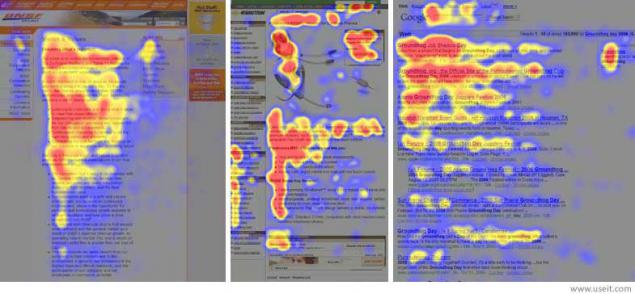
A few words on the topic "place near the expected position of the mouse cursor»: h5> We have already mentioned that the average movement of the mouse while viewing the site, I have F-shaped pattern. This means that the user primarily scans the upper part of the site. After that, it scrolls down, paying attention to the central part of probation.
It should be remembered that the model view for each site depends largely on the design features and content. For example, for long pages model is more likely to resemble E.
Image Source
By the way, the idea of F-model, perfectly resonates with another principle (of course taking into account the features of the site as a visual way of presenting information), which has a long history not only in design but also in photography and other forms of art. We are talking about the "rule of thirds."
The essence of the rule is that the viewer's visual emphasis often placed on the lines that are conventionally divided into three parts facility, both horizontally and vertically.
A clear demonstration of the rules in action (source - Wikipedia)

Example number 1: Hyundai (62% increase in the benchmark)
Hyundai created a website, the main objective of which was to spread the various brochures and information about the test-drive. The main problem that arose after the start of the project, it was a small number of subscribers.
To remedy this, the marketing group Hyundai has developed a comprehensive solution to the problem:
1. Changing SEO text;
2. Increase images (more clearly attracts attention);
3. Two large buttons CTA .
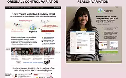
In the original, the user can sign up for a test drive or order a brochure by clicking on the text link in the panel on the left side of the screen.
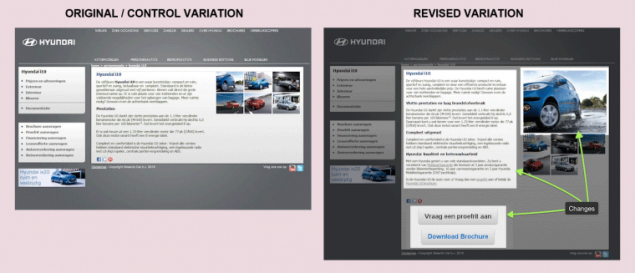
As a result of all these changes have led to an increase in the number of booked a test drive Request a brochure and 62%.
While large buttons "including" Fitts's Law, a small distance between them, strengthened its effect. Probably in the next test, they should try to move the CTA to the top.
Our Comment:
Absolutely expected for us, record of this test was ambiguous perceived audience:
Example number 2: The campaign of Barack Obama in 2012 (number of people who unsubscribe, decreased by 22%)
According to the data of about 500 million. Dollars to the Obama campaign were collected by sending requests via e-mail.
In order to achieve this success, it was necessary to carefully consider each element of the list. In particular, pay attention to the point that allowed unsubscribe.
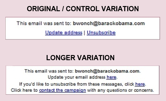
Design change will reduce the number of unsubscribe at 22%.
In addition to Fitts's Law, the success of this option can also be attributed to the influence of the law of mental models. If the user decides to unsubscribe, then look for something like "unsubscribe", but certainly not "click here».
Example number three: SAP (32, 5% growth)
Enterprise software company SAP wanted to increase the number of downloads of its software Crystal Reports.
The original page looked like a normal company's website rather formal design with a small amount of text. Download link was also presented in text form.
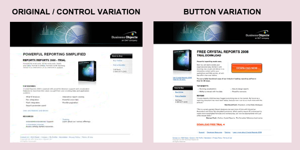
The winning contained two important changes. Firstly, was clearly highlighted download button, and secondly, distractions have been removed at the bottom of the page. As a result, the number of downloads a trial version increased by 32, 5%.
Sample number 4: The Vineyard (32% increase in )
The original page contained a large image of one of the rooms and a brief history of the hotel. The link to make your reservation has been located at the bottom and slightly stand out.
In the test page has been added, only the button "Book»
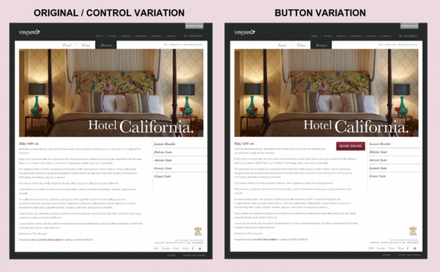
In this case, CTA has been moved to the top of the page (reducing the distance to the target) and use the large button that attracts attention (increased size of the target).
P.S. An infinite increase in the size button will not lead to an infinite increase in the number of clicks on it.
Source: habrahabr.ru/company/paysto/blog/230703/