1058
How easily and naturally spoil logo
Memo to customers and designers. Well, because there is no limit to perfection.
The logo should communicate clearly about what you are doing, and no solid company will not work with the logo of a pair of lines. And if you offer the font logo - this is the first sign that the designer is trying to fake. In general, here are five simple ways on how you can mess up the logo.
5 photos from here
1. The logo should communicate clearly about what you are doing:

2. No solid company will not work with the logo of a pair of lines:
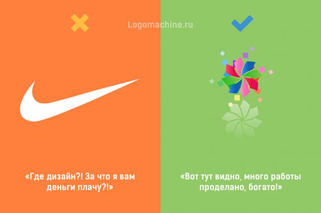
3. The font logo - the first sign that the designer is trying to fake:

4. No one understands better the fonts you, your colleagues and relatives. Simply twist all fonts in a row, until something does not catch the fancy. If you can highlight a word within another word, be sure to do it, be original:

5. When the logo is ready, be sure to add it to your favorite color as Apple, Google and McDonalds:

Source: http: //
The logo should communicate clearly about what you are doing, and no solid company will not work with the logo of a pair of lines. And if you offer the font logo - this is the first sign that the designer is trying to fake. In general, here are five simple ways on how you can mess up the logo.
5 photos from here
1. The logo should communicate clearly about what you are doing:

2. No solid company will not work with the logo of a pair of lines:

3. The font logo - the first sign that the designer is trying to fake:

4. No one understands better the fonts you, your colleagues and relatives. Simply twist all fonts in a row, until something does not catch the fancy. If you can highlight a word within another word, be sure to do it, be original:

5. When the logo is ready, be sure to add it to your favorite color as Apple, Google and McDonalds:

Source: http: //
