493
12 things you didn't know about famous logos
One million nine hundred twenty eight thousand two hundred ninety one
All every day we see the logos of famous companies, but rarely think about who created them and what they actually mean.
Site found for you 12 stories that will reveal little secrets hidden in the most famous logos.
Apple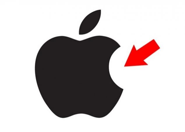
According to legend, the Apple logo, dedicated to mathematics Alan Turing, who committed suicide, bite the poisoned Apple. Actually everything is much simpler: according to the designer Rob Janoff, he drew an Apple bitten in order to show its size because the whole Apple with the same success can be taken for any other fruit rounded shape.
Ferrari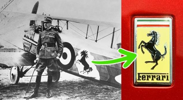
Many people think the horse on the Ferrari logo symbolizes horsepower, but it's not. Enzo Ferrari in his biography mentioned that initially, the silhouette of the horse was applied to the fuselage of the aircraft Italian ACE pilot Francesco Baracchi. This symbol was donated by Enzo Francesco's mother after his victory in the race and subsequently became well-known logo.
Wikipedia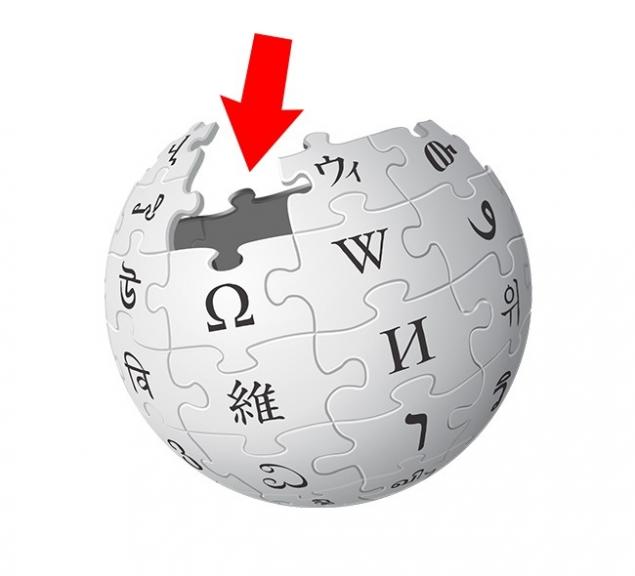
The symbol of the world encyclopedia was the globe that, in General, is not surprising. The pieces of which it consists, constitute multilingualism, therefore, each of them marked with letters from different alphabets. Together they form the word "wikipedia", and missed the puzzles indicate that the encyclopedia is not completed and it's always new information arises.
Android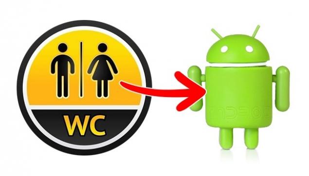
Graphic designer Irina Blok and her team set a task to come up with a logo that would include the robot and was easily recognizable. It's funny, but the inspiration to create this cute green robot was the icons that we often see on the doors of public toilets.
McDonald's
In 1962, McDonald's hired psychologist Louis Cheskin, who offered to replace the logo with the chef Speedee on the Golden arches in the form of the letter "M". In his opinion, the shape of the arches is reminiscent of women's Breasts that on a subconscious level is appetite and reminds people of the carefree childhood. However, the Golden arches were not invented by Checkin — they were present in the interior of the restaurants in the 1950s.
Lacoste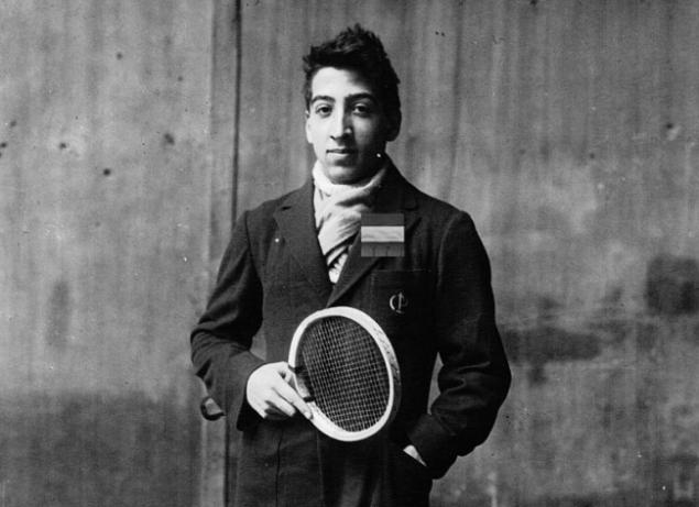
Four million seven hundred thirty nine thousand five hundred thirty nine
In 1923, Rene Lacoste was walking down the street with the captain of his team Alan Moore and noticed in the window a suitcase made from crocodile skin. Lacoste and Moore argued that if Rene wins the next game, then Alan will give him the suitcase. Lacoste lost, but the story I heard journalist and wrote an article about the tennis player who didn't win, but "fought like a crocodile». So Lacoste was nicknamed "crocodile" and a picture of this reptile became the logo of his company.
BMW
It is believed that the BMW logo represents the propeller on blue sky background — this version is shared by even some of the staff of the company. But in this case everything is explained much easier: the blue and white colors were chosen by the creators in honor of Bavarian flag.
Uber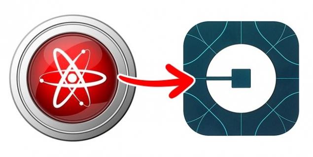
Uber recently changed their logo with the letter U on something remotely resembling bits of information and the atoms that make up everything around it. According to the company, the logo symbolizes that now Uber can be found everywhere — in the same way as bits and atoms.
Pinterest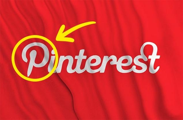
At first glance, the logo looks quite simple. But if you look at the capital letter P, you will notice that it resembles pushpin like those that we use in order to pin magazine clippings, notes and photos to a cork Board. Does the same thing Pinterest boards in this service virtual.
Nike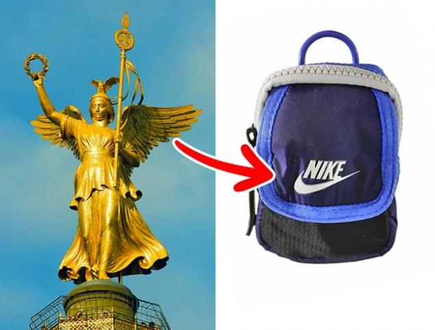
One of the most recognizable logos on the planet was one of the most expensive — just $Thirty five. That's exactly what the owner of the company Phil knight paid a student Carolyn Davidson for her work in 1971, with the result at first was not impressed. Well, Phil was wrong — the emblem of "swoosh" (swoosh) was more than successful, it is not surprising that it is often associated with the wing goddess of victory, Nike.
Starbucks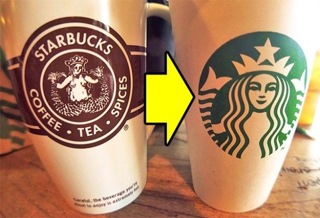
Not everyone knows this, but the woman on the Starbucks logo is a mermaid, which holds two of its tail. This image was inspired by the legend about fairy Melusine — female fish with two tails married to a mere mortal. In 1971, the image of a mermaid on the coffee Cup could be seen as a whole, but it was "censored".
Pepsi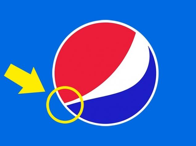
Uncomplicated on the logo of Pepsi is worth more than you might think, he cost the company $1 million When developing the character designers were guided by the proportions of the Golden section, which are considered the most harmonious and most pleasing to the human eye.
Photos on the preview severoes29/depositphotos.com
via depositphotos.com/117968646/stock-illustration-pepsi-summer-new-2016.html?utm_source=Adme&utm_medium=freesub&utm_campaign=RU-brand
All every day we see the logos of famous companies, but rarely think about who created them and what they actually mean.
Site found for you 12 stories that will reveal little secrets hidden in the most famous logos.
Apple

According to legend, the Apple logo, dedicated to mathematics Alan Turing, who committed suicide, bite the poisoned Apple. Actually everything is much simpler: according to the designer Rob Janoff, he drew an Apple bitten in order to show its size because the whole Apple with the same success can be taken for any other fruit rounded shape.
Ferrari

Many people think the horse on the Ferrari logo symbolizes horsepower, but it's not. Enzo Ferrari in his biography mentioned that initially, the silhouette of the horse was applied to the fuselage of the aircraft Italian ACE pilot Francesco Baracchi. This symbol was donated by Enzo Francesco's mother after his victory in the race and subsequently became well-known logo.
Wikipedia

The symbol of the world encyclopedia was the globe that, in General, is not surprising. The pieces of which it consists, constitute multilingualism, therefore, each of them marked with letters from different alphabets. Together they form the word "wikipedia", and missed the puzzles indicate that the encyclopedia is not completed and it's always new information arises.
Android

Graphic designer Irina Blok and her team set a task to come up with a logo that would include the robot and was easily recognizable. It's funny, but the inspiration to create this cute green robot was the icons that we often see on the doors of public toilets.
McDonald's

In 1962, McDonald's hired psychologist Louis Cheskin, who offered to replace the logo with the chef Speedee on the Golden arches in the form of the letter "M". In his opinion, the shape of the arches is reminiscent of women's Breasts that on a subconscious level is appetite and reminds people of the carefree childhood. However, the Golden arches were not invented by Checkin — they were present in the interior of the restaurants in the 1950s.
Lacoste

Four million seven hundred thirty nine thousand five hundred thirty nine
In 1923, Rene Lacoste was walking down the street with the captain of his team Alan Moore and noticed in the window a suitcase made from crocodile skin. Lacoste and Moore argued that if Rene wins the next game, then Alan will give him the suitcase. Lacoste lost, but the story I heard journalist and wrote an article about the tennis player who didn't win, but "fought like a crocodile». So Lacoste was nicknamed "crocodile" and a picture of this reptile became the logo of his company.
BMW

It is believed that the BMW logo represents the propeller on blue sky background — this version is shared by even some of the staff of the company. But in this case everything is explained much easier: the blue and white colors were chosen by the creators in honor of Bavarian flag.
Uber

Uber recently changed their logo with the letter U on something remotely resembling bits of information and the atoms that make up everything around it. According to the company, the logo symbolizes that now Uber can be found everywhere — in the same way as bits and atoms.

At first glance, the logo looks quite simple. But if you look at the capital letter P, you will notice that it resembles pushpin like those that we use in order to pin magazine clippings, notes and photos to a cork Board. Does the same thing Pinterest boards in this service virtual.
Nike

One of the most recognizable logos on the planet was one of the most expensive — just $Thirty five. That's exactly what the owner of the company Phil knight paid a student Carolyn Davidson for her work in 1971, with the result at first was not impressed. Well, Phil was wrong — the emblem of "swoosh" (swoosh) was more than successful, it is not surprising that it is often associated with the wing goddess of victory, Nike.
Starbucks

Not everyone knows this, but the woman on the Starbucks logo is a mermaid, which holds two of its tail. This image was inspired by the legend about fairy Melusine — female fish with two tails married to a mere mortal. In 1971, the image of a mermaid on the coffee Cup could be seen as a whole, but it was "censored".
Pepsi

Uncomplicated on the logo of Pepsi is worth more than you might think, he cost the company $1 million When developing the character designers were guided by the proportions of the Golden section, which are considered the most harmonious and most pleasing to the human eye.
Photos on the preview severoes29/depositphotos.com
via depositphotos.com/117968646/stock-illustration-pepsi-summer-new-2016.html?utm_source=Adme&utm_medium=freesub&utm_campaign=RU-brand


