380
Stylish inexpensive repair: top 13 tips
1. A good mine at bad game. 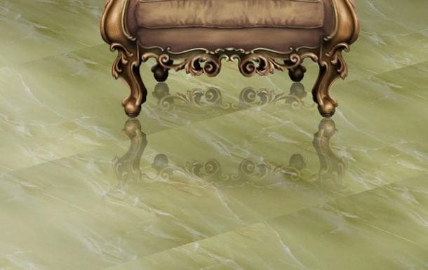
Silk and 100% polyester. Tile "under a stone" linoleum "under the flooring," laminate "onyx", "Trekhgorka" under Ralph Lauren. Granite tiles "under Python". "Distressed" there is something... to even think About it uncomfortable. Alas, will not. Browse good interior design magazines. Everywhere stone is a stone, tile – not that other as tiles, and the tree – that tree. If there is no money for flooring, and laminate easy – below your dignity, look good engineering Board. As a result, you will get a floor that looks much more expensive than the money spent on it. A good alternative to granite for kitchens, bathrooms and hallways – cement tiles. The result will look a hundred times more expensive.
2. Leave the ceiling alone.
All become obsessed with ceilings! If to think clearly, drawing attention to the ceiling, you only remind everyone of its existence. And therefore its height. Ceilings with a height of sixty-two did not turn, though burst, to melt somewhere in the unimaginable heights of the majestic vaults. This may not be whatever you promised "decorating tricks". Just accept it. High doorways can make for your home is much more than a ridiculous five-layer ceiling with neon lights. Let interior doors are the height of two, say, twenty. And door handles a little lower, five centimeters to seven. Showing an unusual approach, you'll be pleasantly surprised with the result.
3. Choosing paint for the walls, consider the movement of colors around the house.
Adjacent premises should be in contrast. If you have a bright living room, even hallway is painted a deep, relatively dark color. The cost of the paint in any case will be the same, and the result can look really expensive.
4. Buy modular cabinets made of laminate in the shop, and the doors to them in good order a joiner's workshop.
This will give you significant savings, which, however, no one will ever notice. The same is true concerning the equipment of the kitchen.
5. If you buy ready-made furniture, let the veneer of the facades will be dark, and the panels of the doors are simple (rectangular).
Remember: light wood always looks cheaper. Avoid yellowish and reddish shades of veneer. And, save for the furniture, invest in good pens!
6. If a good carpet no money, look for carpet viscose or blended fibers that mimic silk or wool pile carpet.
Select the perfect color and texture and make the piece the desired size. For a small extra money neaten the edges with braid.
7. Put curtains blackout lining.
Even cheap curtain fabric from this seriously will win. Look for fabrics three-meter width. This gives significant savings. If you are willing to spend a lot, refrain from printed textiles (fabrics with patterns). When cutting fabrics with a pattern, because of the need to correctly connect the leaf remains a lot of trimmings. The more rapport, the more waste. Do not use for Drapes curtain tape. Let the seamstress will provide a "manual" folds. It's not so expensive, and pleats gathered on the braid look very cheap.
8. Set-set-kit. Same thing in the interior is allowed only in one case: if it is a twin things that form a symmetrical composition. Chandeliers, table lamps and sconces from one set and leave those whom God has not given imagination. They are the same sets of upholstered furniture "sofa two chairs" and the like tender sadness. Read more – see next paragraph.
9. Ready-made solutions.
Bad news: they are not. At least for us. Shower room is being built by the building method because it room. If you don't keep a student hostel or underground massage parlor with a Striptease, shower (it's a sad structure made of yellow acrylic and twisted doors) you will not do. Don't waste money on "designer" plumbing. Let the appearance of the plumbing of a bathroom (kitchen, bathroom) will be dictated by the function. Buy sinks and faucets simple forms, without undue decoration. The toilet should be discreet and to cope with their responsibilities. Admire them no one will, right?
10. Paintings, prints, etchings, photographs and posters bramlette in a simple but deep frames with glass and be sure Mat.
Even a picture printed on a home inkjet printer (or naive child's drawing), in this frame looks very much. Play with the size of the Mat. Little work in a very wide Mat looks very "designer". And, by the way, the cardboard for passe-partout can be almost any color.
11. Comfort. Another collective fetish.
According to my observations, that in our Palestine is called "comfort" in 99 percent of cases – is a metaphoric distress. This is largely a bodily memory of a bygone childhood, a warm and gentle scarce Soviet life with the carpets, swarming with saprophytes, good grandmother, Czechoslovakian crystal, and no one read the Dreiser polished to Polish the wall of the "Ganka". Comfort even more will not add costly devilry style round bed with music and Minibar, bar with built-in aquarium, etc. The same is true in respect of such rich things as a valance, garland and swags. Don't worry: in a good, thought-out interior comfort inevitably comes naturally. So...
12. ...Goodbye, Gypsy Sir!
Duvet covers calico in small Nefertiti, towels in scarlet rosanah, "spread" shades pillowcase nylon blankets with the Shanghai leopards. All these attributes of the collective-farm chic, forgive for frankness. Comfort they will not add. Mottled coloring is often necessary these things solely in order to hide their extremely lousy quality. Let the bed linen and bath towels will be just white (options: ivory, ecru). But from excellent Egyptian cotton.
13. However, with ivory is also important not to overdo it.
Peach, beige, sand and detailed... the Average gamma is good for chain hotels. Because they screen the interiors have to like everything. Your interior must like you. After all, he is a manifestation of your essence, right? Take a hand fan, a range of any manufacturer of paints. Feel a pleasant heaviness? This is your opportunity. Don't miss them!
Source: domashniy.ru/
