611
Interior "impossible" for a small apartment
In the house, as in man, everything should be fine. Sophisticated design and atmosphere is a pledge of good mood and well-being. Let's learn about the basic flaws that threaten to become a real disaster when you are creating your own project.
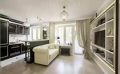
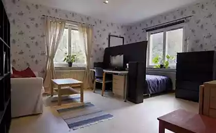
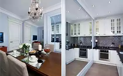
1. How not to spoil a small prostranstvennogo success in the efficient use of space. First, limit the amount of furniture. And better to place it near walls, and not randomly around the room. Big and spacious wardrobe (preferably with doors mirrored or non-transparent, frosted glass is an alternative to the multitude of tables, shelves, chests. The same goes for accessories, if there are too many, the room takes on the effect of clutter. Do with them only 2-3 bright accent.
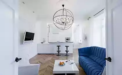
Second, the wrong color scheme. Avoid the abundance of white, think about pastel shades, they are very diverse and not boring. The same applies to the flooring. Let it be light, so you will visually increase the area. If it is dark, to "throw" a beige or milky color to the carpet.
Thirdly, use vertical space. Charming wall shelves in the style of hi-tech or with a rustic touch will make the interior of the uniqueness and charm. It should also be mentioned about the curtains, do not hang them too low, the best option – the ceiling of the bus.
Fourth, more light and a smaller room will become cozier and more spacious. Best suited point or embedded hidden lamps, floor lamps, lightweight construction.
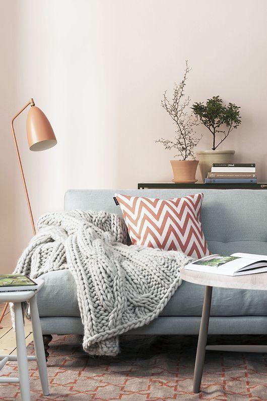
2. The layout and design malogabaritok to discuss the question of storage, the limited space requires a balanced solution. Use a horizontal region, a niche that is easy to conceal in the wall. Don't be afraid of big furniture, the main thing that it was proportional to the volume of the room. But all sorts of stuff should be in limited quantity, get rid of the old and unnecessary.
Before beginning repairs, you should be careful to plan everything, down to the last detail. Don't get carried away with the zoning and use of different materials as separators. The unity of style is what makes malogabaritki better.
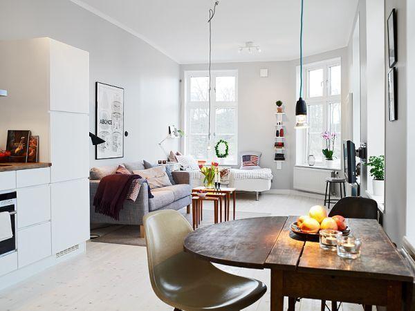
3. Living without ochibana of the most common problems – lots of furniture and a wrong selection of assorted accessories. Get away from the usual arrangement of sofas and tables near the walls, around the perimeter. According to experts in the field of design looks much more interesting the arrangement of small areas grouped items.
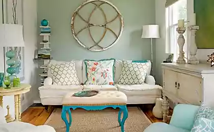
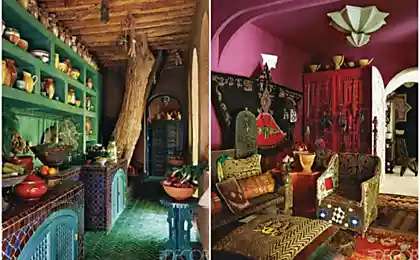
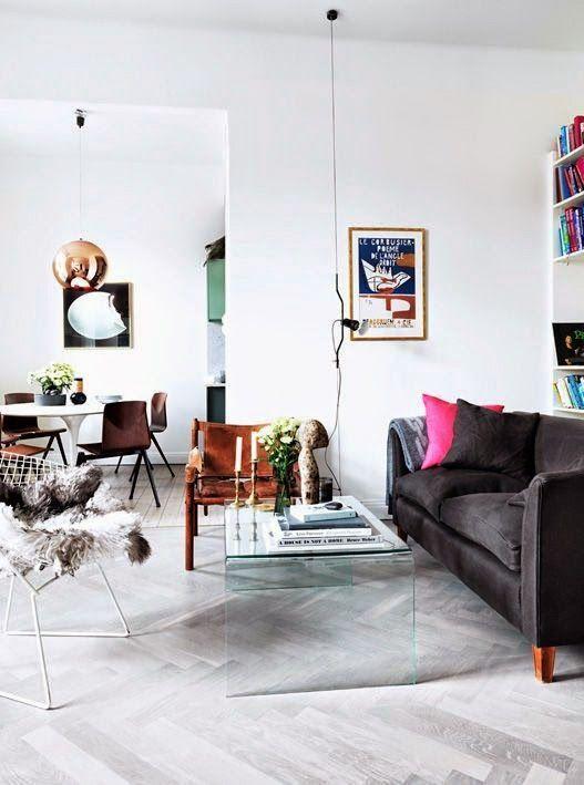
Another weak point of most living rooms, the monotony and the fear of bright colour. All the space in one single colour (albeit different shades) is extremely boring and long not true. Not to be confused with rich colors and elements, apply a dot with the desire to absorb flat in all colors of the rainbow. The main ally in this matter – a sense of proportion. A couple of orange pillows or green curtains will make the interior of freshness and individuality.
It should also be said about the paintings, the photographs, or rather about their location. Often we intuitively understand that something is wrong, but the habit keeps us from seeing the error. It's all about the height. Paintings are hanging very often near the ceiling, meanwhile, as the perfect place – at eye level (think art galleries, museums) and on the same line, unless there's a collage of different size frames.
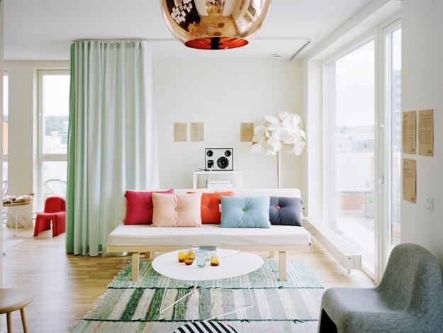
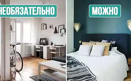
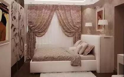
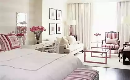
4. "Mistakes" in the bedroom countegany principle when you create the zone for sleep and rest is the feeling of comfort and privacy. Do not make the lighting too bright and "beating" in the eyes, it is best muted and soft. The same applies to colors. It is better to be less heavy use of pastel and natural colors.
The role of the location of the bed in the space. Consider its size and dimensions, it's best when there is access from two sides. Contrary to popular belief, the furniture pushed into a corner, by contrast, will reduce the volume of the space.
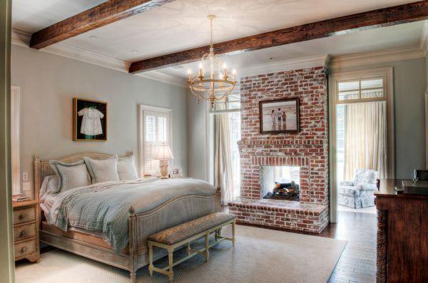
5. Shortcomings in pediatric comnature attempt to embody in the design of the room for your kids your old fantasies and dreams and it is best to consult with them, find out wishes and preferences, as space is intended for them. As a rule, scene clearance (or space marine craft, house, Princess, etc.) all get bored. Therefore, planning a repair in the long term, prefer neutral design options, and to give them a particular theme will help accessories or furniture that change much easier.
Children to save is not accepted. But the funds must be invested wisely. It is best to spend them on high-quality environmentally friendly materials, but expensive accessories and trinkets later. Let the situation be functional, designed for children's games, where the irrepressible character will be able to correct them with pencil and markers.
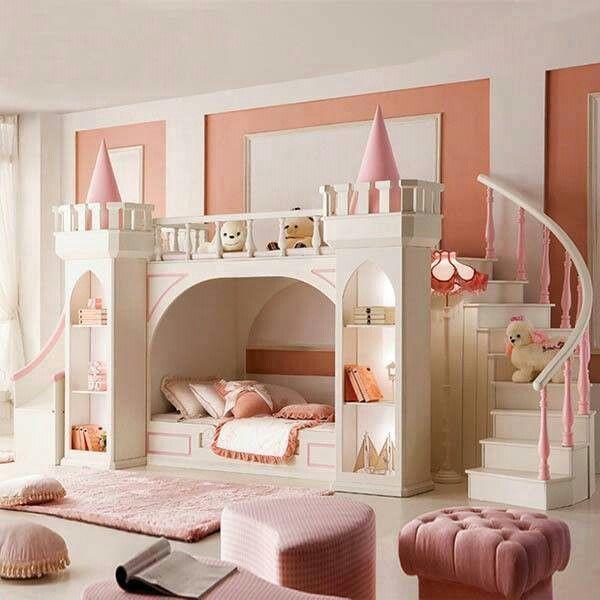
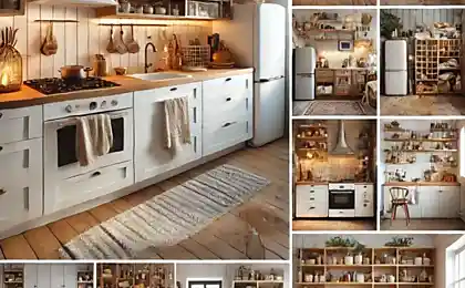
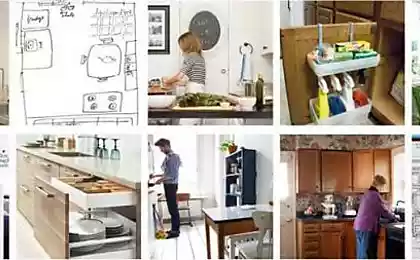
6. Failure to koneripalli with a sink, stove and refrigerator should be designed rationally: not too big, but not tiny, which barely fit two people. As for materials, you should think about quality. Initially, saving on buying the tiles or a special coating for walls, in the near future, you risk to spoil the surface with steam from cooking and grease stains that don't wash off. The same can be said about the hood, is not a luxury but a necessity.
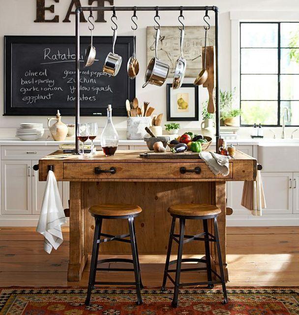
7. Bathroom without problemata place in the apartment or house, the arrangement of which to save is simply unreasonable. Any flaws or cheap materials in the future can easily lead to breakdowns of the plumbing, and it threatens to flood and repair nothing in General. So if you have difficulty with the installation of communications, lighting, it is better to invite specialists.
Choose the correct source code corresponding to specific premises. Namely: resistant to high humidity, temperature changes, appearance of fungus and mold.
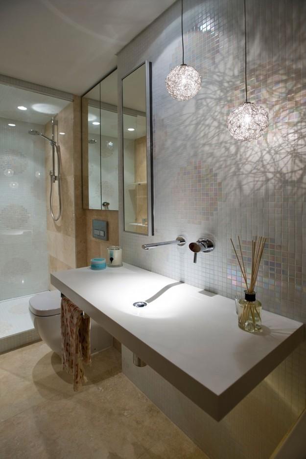
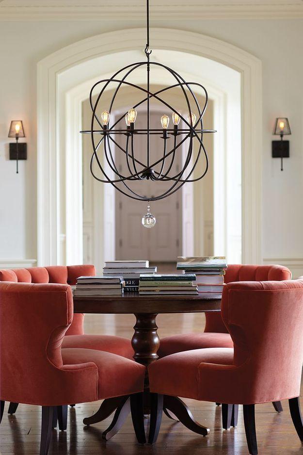
8. The Queen of mistakes – bad ouestionnaire you can often find a technique that used only a single light source that is fundamentally wrong. Create multi-level design with spotlights, wall lamps, floor lamps, etc.
Use dimmers – power regulators, they will allow you to create an atmosphere in the room that is called on demand. If the room has large closets, do not neglect the additional lighting built into them.
9. Wrong selection of colors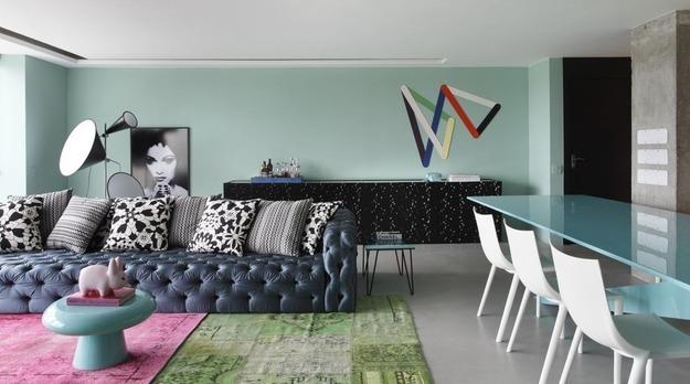
10. Things in order pravilnosti repair all the rules and by using the tips you received an ergonomic housing. But now it is important to maintain it in good order, and this will need cleaning and restoring order. Use, for example, modern special containers and cartons, bearing not only functional load, but also decorative. Don't fill space with unnecessary things.
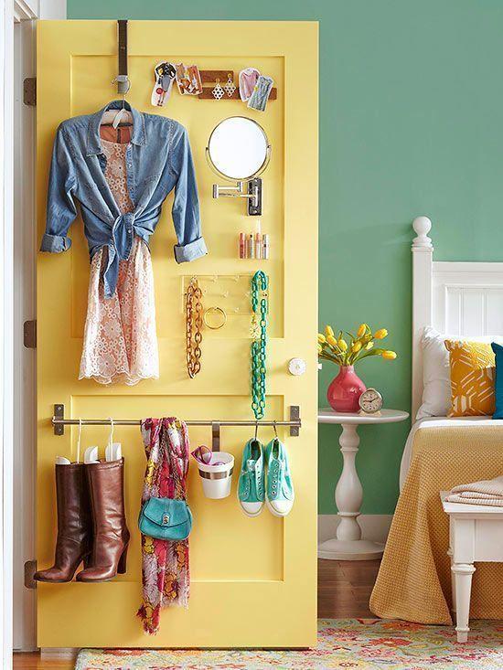
11. Errors that need to be delatnosti some rules not only pleasant but sometimes useful for own room design. What is unacceptable in one setting, others sparkle with new colors and will be a highlight. So all is strictly individual and depends on how you submit custom solution. Floors with no carpet, no curtains or pillows on the couch and so on – all of this is to try and see what happens in the end.published
P. S. And remember, only by changing their consumption — together we change the world! © Join us at Facebook , Vkontakte, Odnoklassniki
Source: interiorsmall.ru/pravilnaya-organizaciya-prostranstva/
1. How not to spoil a small prostranstvennogo success in the efficient use of space. First, limit the amount of furniture. And better to place it near walls, and not randomly around the room. Big and spacious wardrobe (preferably with doors mirrored or non-transparent, frosted glass is an alternative to the multitude of tables, shelves, chests. The same goes for accessories, if there are too many, the room takes on the effect of clutter. Do with them only 2-3 bright accent.
Second, the wrong color scheme. Avoid the abundance of white, think about pastel shades, they are very diverse and not boring. The same applies to the flooring. Let it be light, so you will visually increase the area. If it is dark, to "throw" a beige or milky color to the carpet.
Thirdly, use vertical space. Charming wall shelves in the style of hi-tech or with a rustic touch will make the interior of the uniqueness and charm. It should also be mentioned about the curtains, do not hang them too low, the best option – the ceiling of the bus.
Fourth, more light and a smaller room will become cozier and more spacious. Best suited point or embedded hidden lamps, floor lamps, lightweight construction.

2. The layout and design malogabaritok to discuss the question of storage, the limited space requires a balanced solution. Use a horizontal region, a niche that is easy to conceal in the wall. Don't be afraid of big furniture, the main thing that it was proportional to the volume of the room. But all sorts of stuff should be in limited quantity, get rid of the old and unnecessary.
Before beginning repairs, you should be careful to plan everything, down to the last detail. Don't get carried away with the zoning and use of different materials as separators. The unity of style is what makes malogabaritki better.

3. Living without ochibana of the most common problems – lots of furniture and a wrong selection of assorted accessories. Get away from the usual arrangement of sofas and tables near the walls, around the perimeter. According to experts in the field of design looks much more interesting the arrangement of small areas grouped items.
Another weak point of most living rooms, the monotony and the fear of bright colour. All the space in one single colour (albeit different shades) is extremely boring and long not true. Not to be confused with rich colors and elements, apply a dot with the desire to absorb flat in all colors of the rainbow. The main ally in this matter – a sense of proportion. A couple of orange pillows or green curtains will make the interior of freshness and individuality.
It should also be said about the paintings, the photographs, or rather about their location. Often we intuitively understand that something is wrong, but the habit keeps us from seeing the error. It's all about the height. Paintings are hanging very often near the ceiling, meanwhile, as the perfect place – at eye level (think art galleries, museums) and on the same line, unless there's a collage of different size frames.

4. "Mistakes" in the bedroom countegany principle when you create the zone for sleep and rest is the feeling of comfort and privacy. Do not make the lighting too bright and "beating" in the eyes, it is best muted and soft. The same applies to colors. It is better to be less heavy use of pastel and natural colors.
The role of the location of the bed in the space. Consider its size and dimensions, it's best when there is access from two sides. Contrary to popular belief, the furniture pushed into a corner, by contrast, will reduce the volume of the space.

5. Shortcomings in pediatric comnature attempt to embody in the design of the room for your kids your old fantasies and dreams and it is best to consult with them, find out wishes and preferences, as space is intended for them. As a rule, scene clearance (or space marine craft, house, Princess, etc.) all get bored. Therefore, planning a repair in the long term, prefer neutral design options, and to give them a particular theme will help accessories or furniture that change much easier.
Children to save is not accepted. But the funds must be invested wisely. It is best to spend them on high-quality environmentally friendly materials, but expensive accessories and trinkets later. Let the situation be functional, designed for children's games, where the irrepressible character will be able to correct them with pencil and markers.

6. Failure to koneripalli with a sink, stove and refrigerator should be designed rationally: not too big, but not tiny, which barely fit two people. As for materials, you should think about quality. Initially, saving on buying the tiles or a special coating for walls, in the near future, you risk to spoil the surface with steam from cooking and grease stains that don't wash off. The same can be said about the hood, is not a luxury but a necessity.

7. Bathroom without problemata place in the apartment or house, the arrangement of which to save is simply unreasonable. Any flaws or cheap materials in the future can easily lead to breakdowns of the plumbing, and it threatens to flood and repair nothing in General. So if you have difficulty with the installation of communications, lighting, it is better to invite specialists.
Choose the correct source code corresponding to specific premises. Namely: resistant to high humidity, temperature changes, appearance of fungus and mold.

8. The Queen of mistakes – bad ouestionnaire you can often find a technique that used only a single light source that is fundamentally wrong. Create multi-level design with spotlights, wall lamps, floor lamps, etc.
Use dimmers – power regulators, they will allow you to create an atmosphere in the room that is called on demand. If the room has large closets, do not neglect the additional lighting built into them.

9. Wrong selection of colors
- Choose a palette of colors given the lighting. The same shades in natural and artificial light look completely different.
- You have no limits to the number of colors, however, preferable 2-3 major or the same amount plus, for emphasis.
- The unity of the interior, all the rooms should overlap with each other, and not to be a separate universe.
- Learn from mistakes and that's a fact, take a risk, try it, only way to find the perfect solution.

10. Things in order pravilnosti repair all the rules and by using the tips you received an ergonomic housing. But now it is important to maintain it in good order, and this will need cleaning and restoring order. Use, for example, modern special containers and cartons, bearing not only functional load, but also decorative. Don't fill space with unnecessary things.

11. Errors that need to be delatnosti some rules not only pleasant but sometimes useful for own room design. What is unacceptable in one setting, others sparkle with new colors and will be a highlight. So all is strictly individual and depends on how you submit custom solution. Floors with no carpet, no curtains or pillows on the couch and so on – all of this is to try and see what happens in the end.published

P. S. And remember, only by changing their consumption — together we change the world! © Join us at Facebook , Vkontakte, Odnoklassniki
Source: interiorsmall.ru/pravilnaya-organizaciya-prostranstva/
The use of internal medicinal properties of plants for su-Jok of CEMENTERIO
12 signs of a spoiled child

