527
That is why some movies grab us from the first seconds


What, do not hesitate, what color you feel beautiful! Red or blue? Yellow or green? Fuchsia and aqua? We do not know why, but some of the colors we like more than others. And this choice is going on deep, subconscious level.
The creators of Twitter @CINEMAPALETTES even sure that our color preferences influence our tastes in cinema. Every day they publish the famous picture of any film, and a color palette that is used in it. It turns out that the combination of certain colors is enough to make us watch a movie without stopping!
< Website is divided into a selection of frames. Select a movie that wants to revise again and again, and compare the frame palette to your color preferences. You will be surprised
Irvin Kershner! "Star Wars: The Empire Strikes Back" (1980)

Steven Spielberg's "Jurassic Park" (1993)

James Cameron's "Titanic" (1997)
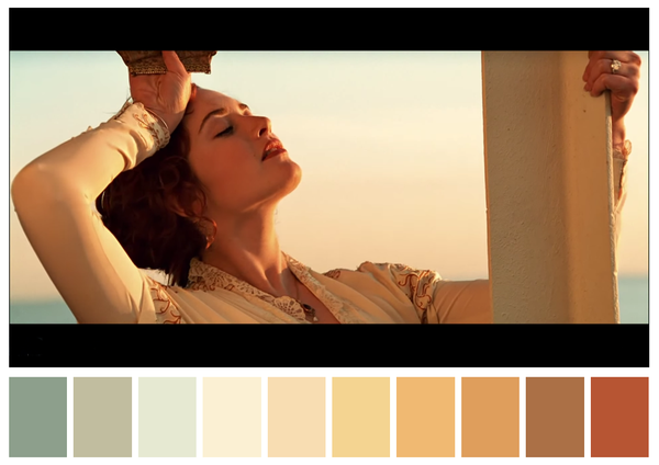
Chris Buck "Cold heart" (2013)

Martin Scorsese's "The Wolf of Wall Street" (2013)
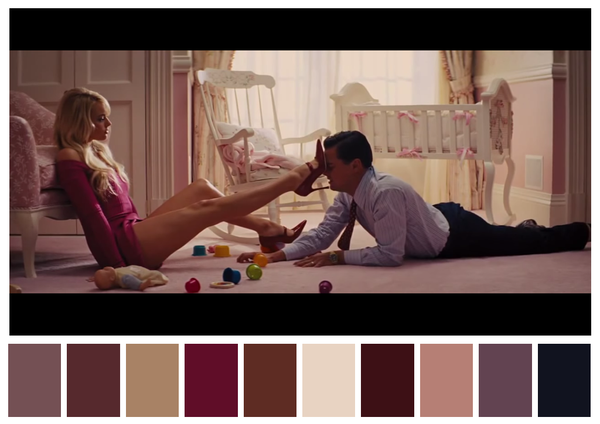
Ang Lee "Life of Pi" (2012)

Tim Burton's "Big fish" (2003)

< br>
Jean-Pierre Jeunet "Amelie" (2003)

< br> Michel Gondry's "Eternal Sunshine of the Spotless mind" (2004)

Quentin Tarantino's "Pulp Fiction" (1994)

Robert Rodriguez "sin City" (2005)

Luc Besson "Leon" (1994)

Still a preview: "Alice in Wonderland» Walt Disney Studios
via twitter.com/CINEMAPALETTES
10 films that will surprise even experienced spectator
This photographer knows exactly what the perfect shot

