560
Phallic logo! And where people looked ...
The most awkward work Mount designers who create logos, and sometimes do not bother to look at them more closely.
At the same time, customers of these designers is not better because of the kind of work they do and get paid
a kind of Top-10, where the seats were distributed as follows
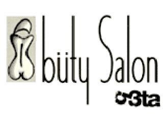
10. On the tenth place is the logo of the London beauty Buty Salon, one of the visitors who saw the advertising flyer with an offer discounts for facial massage. (78%)
9. Ninth place went to companies bdu.com, supplying uniforms. In the form of the company, according to the authors b3ta.com, the soldiers look like gays. (79%)
8. Eighth place went to the logo of the German Volleyball Union (DVV), where a phallic symbol resembles a jellyfish. (80%)

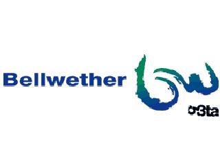
7. On the seventh line - consulting company co Bellwether their little "sluggish" logo. (85%)
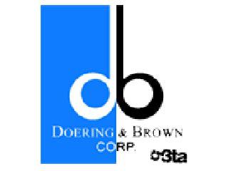
6. Sixth place was taken by the gentlemen of the company Doring & Brown, who call themselves experts in the field of printing. However, this did not prevent them printed themselves so obvious logo. (86%)
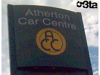
5. Further, in the 5 position, you can see the car downtown Azerton c tiny "penis" and two big "balls". (90%)
4. Fourth place belongs to the logo of the American steakhouses Orchard Street Top Shop, after watching that, according to the authors website, any appetite disappears. (94%)

3. The three leaders opens firm for the production and installation of windows PCW, the logo is a phallic symbol applied horrific injuries. (94%)

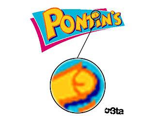
2. The second place gave b3ta.com site logo holiday camps Pontis, which secretes an unusual letter «T». (97%)
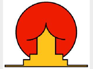
1. And finally, in first place, with 100 per cent "fallosnosti" was the emblem of the Brazilian Institute of Oriental Studies, which is really worthy of the highest mark.
Source:
At the same time, customers of these designers is not better because of the kind of work they do and get paid
a kind of Top-10, where the seats were distributed as follows
10. On the tenth place is the logo of the London beauty Buty Salon, one of the visitors who saw the advertising flyer with an offer discounts for facial massage. (78%)

9. Ninth place went to companies bdu.com, supplying uniforms. In the form of the company, according to the authors b3ta.com, the soldiers look like gays. (79%)

8. Eighth place went to the logo of the German Volleyball Union (DVV), where a phallic symbol resembles a jellyfish. (80%)

7. On the seventh line - consulting company co Bellwether their little "sluggish" logo. (85%)

6. Sixth place was taken by the gentlemen of the company Doring & Brown, who call themselves experts in the field of printing. However, this did not prevent them printed themselves so obvious logo. (86%)

5. Further, in the 5 position, you can see the car downtown Azerton c tiny "penis" and two big "balls". (90%)

4. Fourth place belongs to the logo of the American steakhouses Orchard Street Top Shop, after watching that, according to the authors website, any appetite disappears. (94%)

3. The three leaders opens firm for the production and installation of windows PCW, the logo is a phallic symbol applied horrific injuries. (94%)

2. The second place gave b3ta.com site logo holiday camps Pontis, which secretes an unusual letter «T». (97%)

1. And finally, in first place, with 100 per cent "fallosnosti" was the emblem of the Brazilian Institute of Oriental Studies, which is really worthy of the highest mark.

Source: