1365
10 offices, which are less likely resemble offices
Red Bull
Amsterdam, Netherlands
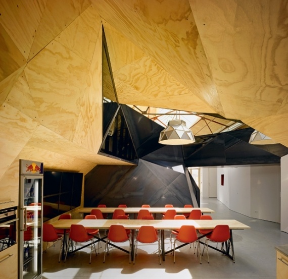
The concept of the project was to create an interior that corresponds to the philosophy of the company Red Bull. Chief Architect Bureau Sid Lee Architecture Jeanne Pelly suggested using the principle of two opposite and complementary hemispheres of the human brain: reason versus intuition, art versus industry, darkness against light, angels against demons.
Rooms from cave-faceted metal parts and winding corridors inside the reconstructed shipbuilding dock embody the idea of the dichotomy of space, common areas flow into private rooms, black becomes white and vice versa. One of the aims of the authors of the project was to combine simplicity and brutality of industrial buildings with an active, even athletic lifestyle, which is associated with Red Bull. "Energy is not wasted energy - redistributed" - this is the one of the slogans of the company, and the interior is strongly illustrates - cliffs on one side and a skate park on the other. Adds surreal picture view from the window in the old shipyard battened up with the ever-necked cranes and the Russian submarine, which has already become an anachronism.
Adobe, the new headquarters
Utah
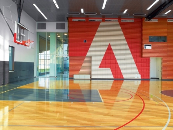
The first headquarters of Adobe in San Jose (CA) said according to witnesses, the space station. The new office in Lehi (Utah) designed by experts from the architectural studio in cooperation with Rapt Studio WRNS Studio. The space designed for 1,000 employees. During the construction of the building it was used a lot of glass, thereby prevails in natural light and a huge outdoor space. The walls of the headquarters of painted street artist El Mac and tattoo artist Mike Giant. Painted on the wall of the main atrium of the girl symbolizes the childlike, which are suitable for the work of employees of the company and the people who use the products of Adobe. The design of a lot of computer graphics and digital printing. Ergonomic space allowed to equip the campus of a full-size basketball court, climbing wall, swimming pool, ping-pong, gym and cafe. "Playful interior is a reflection of the creative business of the company Adobe», - say the authors of the project. It remains only envy them all.
Pride & Glory Interactive, an advertising agency
Krakow, Poland
The new office of the advertising agency Pride & Glory Interactive on the site of the former factory premises in Krakow, Poland, designed by Polish architects Morpho Studio. District Zablocie, where the office was formed back in the mid XIX century, when there were built the first industrial enterprises. Now this area, as well as many industrial areas of Europe, is experiencing a renaissance, becoming the main city in the Museum of Modern Art.
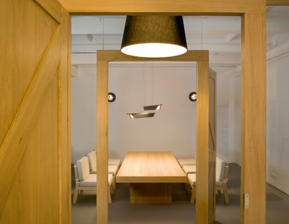
The head office of the agency Pride & Glory Interactive is located in a former factory for the production of cables. The main idea of the project areas is quite paradoxical: to preserve the atmosphere of an industrial plant and harmoniously fit into it elements that create the comfort of home. The design used in the back found old stuff: shelves, reception desk and some tables made of planks remaining after removal of 100-year-old house of one of the owners of the agency. An important element of the organization of space has become an open kitchen with dining area, which according to the authors intended to unite people working together - like at home. Also, the designers found an excellent lighting solution - light bulb hanging from the ceiling on cables like a spider web.
Google, the new headquarters
London, UK
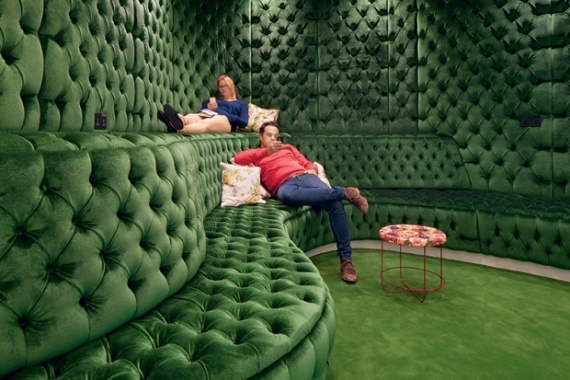
British Google moved into a new residence, which worked on the design of talented architects and designers studio PENSON. The space turned out incredibly eclectic, comfortable, fun, without losing functionality. The situation largely framed in retrostile and is called "Grandma's apartment" because recalls classic English living room of the old woman - wool ottomans, pillows, rocking chairs. For the flooring were chosen natural wood planks and carpets. It is also widely used in the decoration of recycled materials. The whole office is perceived as one large open space, highlighting thematic areas: a conference hall called Town Hall, accommodating up to 200 people; Lala library with a huge semi-circular white sofa with colorful pillows, and; Secret Garden - for those who are tired of sitting in the office; a rooftop terrace with soft benches, surrounded by a green fence, with its panoramic views of London, "Velvet Room," in which the walls and sofas are covered with green cloth in the style of a British pub. In addition, on the ninth floor smashed a real garden, which can be anything personally plant, pre-recorded.
Lee Penson, founder of design bureau, says about the project: "The whole place is made for people. Nooks, comfort, soft slippers, rugs, pillows, couches, good food and fresh air - all that relaxes, soothes, while forcing the imagination to work there at the headquarters of Google ».
Yandex II
St. Petersburg, Russia
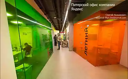
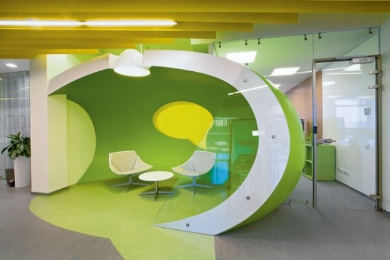
Office for the Internet company "Yandex" in St. Petersburg was created by Russian studio Za Bor Architects. Za Bor Architects and "Yandex" has been cooperating for the second time - the office, opened in 2008, it has become a powerful breakthrough in the history of contemporary design in Russia and has received several architectural awards. The second project - is located in the same building office, twice the previous total area of 3310 square meters. m, of which 200 meters - a long corridor. When designing its architects had to solve two challenges - first, extremely difficult to rationally organize the space extending along the axis of the central corridor; secondly, visually reflect the direction of the company. Architects Peter Zaytsev Arseniy Borisenko and decided to use a corridor-armchair system located along the corridor peregovornye- "cell", work areas and unusual objects, thus providing for them a particular functionality. Guests are literally within the service "Yandex": Following the corridors, they see familiar fields for entering username and password for the mail and at every step encounter symbols and familiar icons, though they are not always easy to find - tiny pixel icons turned into a multimeter 3D-objects . The office has a gym, a dining room, showers and a few cafes. Meeting rooms, two lecture halls, as well as equipped with fantasy jobs.
Lego PMD, headquartered
Billund, Denmark
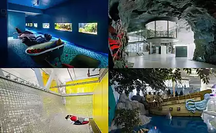
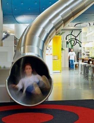
That office and must be "toy" of the company, and even the Scandinavian - nothing rigorous and serious, lots of light, open space, bright cheerful colors and original functional solutions. All of this came up and embodied designers Rosan Bosch and Rune Fjord. The design of the room is focused on the game, awakening imagination. The main idea was to create an interior designer to help workers to return to their own childhood: hanging bridges, wrapped in thick blue cloth, and creates a feeling of walking on a cloud. Rays from the "cloud" at a special tube, you can quickly get down to the first floor. Another extraordinary idea - non-standard scales: on one wall depicts a giant LEGO-man, walking among the "blades" in height of several meters, and in the area for coffee breaks are tables with built-in miniature bonsai trees. This unusual juxtaposition liberates the imagination and helps to get away from the stereotypes of scale. Thus, the designers managed to actually erase the line between work and play.
Microsoft, headquartered
Vienna, Austria
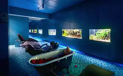
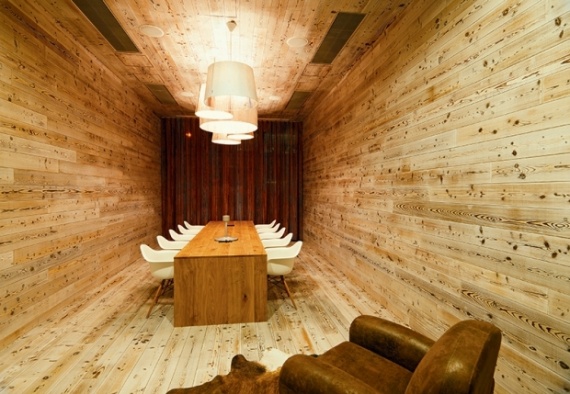
Design of the main office of Microsoft in Vienna engaged experts architectural bureau INNOCAD Architektur. The purpose of the project was the harmonious integration of social life in the working environment. The result is a fun, laid-back office with an environmental flavor. There are themed rooms for negotiations, "hunting lodge", a fully decorated tree and the "Ocean" - with built-in aquarium. The corridors are decorated with natural prints painted on a green floor-line, light, transparent glass walls make the space dimensionless. There are many original details: X-rays of the computer on the rear wall of the reception, furry walls of artificial grass and, of course, games room. Particular attention was paid to the recreation area, where randomly placed soft mini-sofas and ottomans, a form reminiscent of computer parts. To get to the recreation area, you need to slide down from the second floor of a true children's slides.
Vitus Bering Innovation Park
Horsens, Denmark
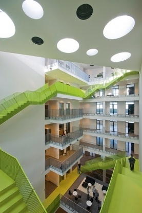
Innovation Center for Entrepreneurs named Vitus Bering - the project of the Danish architectural office CF Moller. The basic concept here was the visual embodiment of the idea of continuous professional development. Reflection she found in the appearance of a spiral staircase made of fiber cement, which embodies the "pursuit up." Bright green staircase made in the form of tapes, ovivayuschey wall of the atrium, it passes through all six levels of the building and ends with access to the roof. Custom design staircases designed to really simplify moving between multiple classrooms, offices and conference rooms and visually unite them. Part of the roof assigned recreation area: a beautiful view of the city and a relaxing comfortable environment. Another interesting detail - a clever system of air conditioning (in the innovation center of the other, and should not be), which is adapted according to the number of people present in each room.
Cable Industry, headquartered
Empoli, Italy
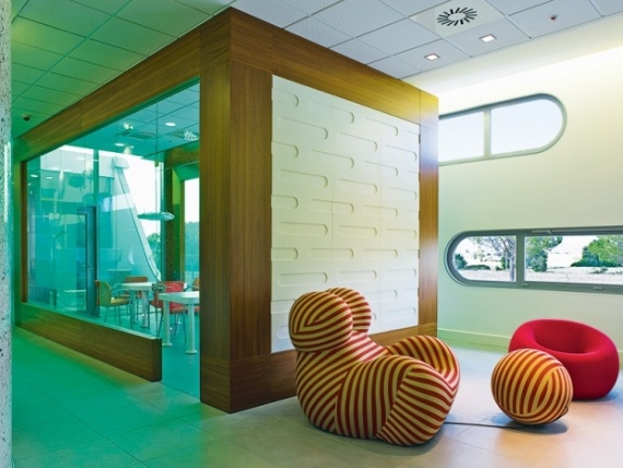
The building of the central office of Cable Industry, develops banking software, in the town of Empoli - the creation of Italian designer Massimo Mariani. The total area of the building, which resembles a ship from the movie "Space Odyssey" and occupies three floors, - 4500 square meters. m. The first floor is completely given over to the exhibition space, in fact, it is under the ground - before the construction around the building was excavated a ditch, then seeded lawn. At night, due to the correct location of lighting a space filled with light and give the impression of space ship taking off. The interior used a lot of colored glass, which in combination with daylight creates a black-and-white inside offices impressive lighting effect. Fairly low-key colors of the walls is diluted with bright accessories - colorful tables, striking design chairs with ottomans unusual shape. On the upper floors are offices and offices, access to the patio and terrace. All couched in the same style - architectural form, ligaments, entrances, furniture, decoration. Under the roof is hidden autonomous photovoltaic system that makes the building completely self-sufficient.
Facebook, the new building (project)
California
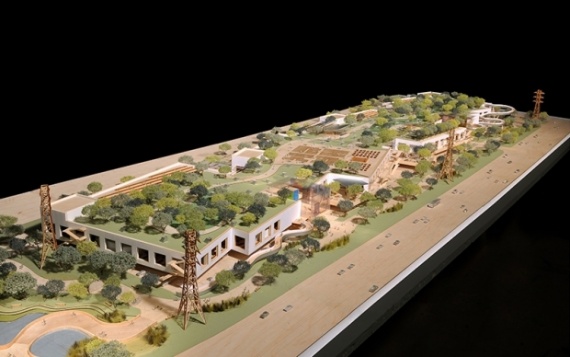
The new campus should be replaced with a social network designed by Frank Gehry, the patriarch (he '84), who will give a head start to many young. And he of the few architects who manages to meet the requirements of customers and thus keep within the budget. The new building will be a huge Facebook in size, but very simple in architecture - just as the hangar or warehouse. But for such a progressive company the main thing - the functionality and convenience, not an extravagant look. Downstairs - parking on the ground floor and on the roof there will be gardens - so much greenery is assumed that the building will be published, according to Mark Zuckerberg, resemble a green hill. And this, incidentally, is also a design course, which will remain unappreciated. Facebook as a phenomenon symbolizes openness, and a new office will be the largest open-work space on the planet - it is designed for 2,800 people (this will be software developers). The old building will be connected to the new tunnel, which will pass under the highway.

Amsterdam, Netherlands
The concept of the project was to create an interior that corresponds to the philosophy of the company Red Bull. Chief Architect Bureau Sid Lee Architecture Jeanne Pelly suggested using the principle of two opposite and complementary hemispheres of the human brain: reason versus intuition, art versus industry, darkness against light, angels against demons.
Rooms from cave-faceted metal parts and winding corridors inside the reconstructed shipbuilding dock embody the idea of the dichotomy of space, common areas flow into private rooms, black becomes white and vice versa. One of the aims of the authors of the project was to combine simplicity and brutality of industrial buildings with an active, even athletic lifestyle, which is associated with Red Bull. "Energy is not wasted energy - redistributed" - this is the one of the slogans of the company, and the interior is strongly illustrates - cliffs on one side and a skate park on the other. Adds surreal picture view from the window in the old shipyard battened up with the ever-necked cranes and the Russian submarine, which has already become an anachronism.
Adobe, the new headquarters

Utah
The first headquarters of Adobe in San Jose (CA) said according to witnesses, the space station. The new office in Lehi (Utah) designed by experts from the architectural studio in cooperation with Rapt Studio WRNS Studio. The space designed for 1,000 employees. During the construction of the building it was used a lot of glass, thereby prevails in natural light and a huge outdoor space. The walls of the headquarters of painted street artist El Mac and tattoo artist Mike Giant. Painted on the wall of the main atrium of the girl symbolizes the childlike, which are suitable for the work of employees of the company and the people who use the products of Adobe. The design of a lot of computer graphics and digital printing. Ergonomic space allowed to equip the campus of a full-size basketball court, climbing wall, swimming pool, ping-pong, gym and cafe. "Playful interior is a reflection of the creative business of the company Adobe», - say the authors of the project. It remains only envy them all.
Pride & Glory Interactive, an advertising agency

Krakow, Poland
The new office of the advertising agency Pride & Glory Interactive on the site of the former factory premises in Krakow, Poland, designed by Polish architects Morpho Studio. District Zablocie, where the office was formed back in the mid XIX century, when there were built the first industrial enterprises. Now this area, as well as many industrial areas of Europe, is experiencing a renaissance, becoming the main city in the Museum of Modern Art.
The head office of the agency Pride & Glory Interactive is located in a former factory for the production of cables. The main idea of the project areas is quite paradoxical: to preserve the atmosphere of an industrial plant and harmoniously fit into it elements that create the comfort of home. The design used in the back found old stuff: shelves, reception desk and some tables made of planks remaining after removal of 100-year-old house of one of the owners of the agency. An important element of the organization of space has become an open kitchen with dining area, which according to the authors intended to unite people working together - like at home. Also, the designers found an excellent lighting solution - light bulb hanging from the ceiling on cables like a spider web.
Google, the new headquarters

London, UK
British Google moved into a new residence, which worked on the design of talented architects and designers studio PENSON. The space turned out incredibly eclectic, comfortable, fun, without losing functionality. The situation largely framed in retrostile and is called "Grandma's apartment" because recalls classic English living room of the old woman - wool ottomans, pillows, rocking chairs. For the flooring were chosen natural wood planks and carpets. It is also widely used in the decoration of recycled materials. The whole office is perceived as one large open space, highlighting thematic areas: a conference hall called Town Hall, accommodating up to 200 people; Lala library with a huge semi-circular white sofa with colorful pillows, and; Secret Garden - for those who are tired of sitting in the office; a rooftop terrace with soft benches, surrounded by a green fence, with its panoramic views of London, "Velvet Room," in which the walls and sofas are covered with green cloth in the style of a British pub. In addition, on the ninth floor smashed a real garden, which can be anything personally plant, pre-recorded.
Lee Penson, founder of design bureau, says about the project: "The whole place is made for people. Nooks, comfort, soft slippers, rugs, pillows, couches, good food and fresh air - all that relaxes, soothes, while forcing the imagination to work there at the headquarters of Google ».
Yandex II

St. Petersburg, Russia
Office for the Internet company "Yandex" in St. Petersburg was created by Russian studio Za Bor Architects. Za Bor Architects and "Yandex" has been cooperating for the second time - the office, opened in 2008, it has become a powerful breakthrough in the history of contemporary design in Russia and has received several architectural awards. The second project - is located in the same building office, twice the previous total area of 3310 square meters. m, of which 200 meters - a long corridor. When designing its architects had to solve two challenges - first, extremely difficult to rationally organize the space extending along the axis of the central corridor; secondly, visually reflect the direction of the company. Architects Peter Zaytsev Arseniy Borisenko and decided to use a corridor-armchair system located along the corridor peregovornye- "cell", work areas and unusual objects, thus providing for them a particular functionality. Guests are literally within the service "Yandex": Following the corridors, they see familiar fields for entering username and password for the mail and at every step encounter symbols and familiar icons, though they are not always easy to find - tiny pixel icons turned into a multimeter 3D-objects . The office has a gym, a dining room, showers and a few cafes. Meeting rooms, two lecture halls, as well as equipped with fantasy jobs.
Lego PMD, headquartered

Billund, Denmark
That office and must be "toy" of the company, and even the Scandinavian - nothing rigorous and serious, lots of light, open space, bright cheerful colors and original functional solutions. All of this came up and embodied designers Rosan Bosch and Rune Fjord. The design of the room is focused on the game, awakening imagination. The main idea was to create an interior designer to help workers to return to their own childhood: hanging bridges, wrapped in thick blue cloth, and creates a feeling of walking on a cloud. Rays from the "cloud" at a special tube, you can quickly get down to the first floor. Another extraordinary idea - non-standard scales: on one wall depicts a giant LEGO-man, walking among the "blades" in height of several meters, and in the area for coffee breaks are tables with built-in miniature bonsai trees. This unusual juxtaposition liberates the imagination and helps to get away from the stereotypes of scale. Thus, the designers managed to actually erase the line between work and play.
Microsoft, headquartered

Vienna, Austria
Design of the main office of Microsoft in Vienna engaged experts architectural bureau INNOCAD Architektur. The purpose of the project was the harmonious integration of social life in the working environment. The result is a fun, laid-back office with an environmental flavor. There are themed rooms for negotiations, "hunting lodge", a fully decorated tree and the "Ocean" - with built-in aquarium. The corridors are decorated with natural prints painted on a green floor-line, light, transparent glass walls make the space dimensionless. There are many original details: X-rays of the computer on the rear wall of the reception, furry walls of artificial grass and, of course, games room. Particular attention was paid to the recreation area, where randomly placed soft mini-sofas and ottomans, a form reminiscent of computer parts. To get to the recreation area, you need to slide down from the second floor of a true children's slides.
Vitus Bering Innovation Park

Horsens, Denmark
Innovation Center for Entrepreneurs named Vitus Bering - the project of the Danish architectural office CF Moller. The basic concept here was the visual embodiment of the idea of continuous professional development. Reflection she found in the appearance of a spiral staircase made of fiber cement, which embodies the "pursuit up." Bright green staircase made in the form of tapes, ovivayuschey wall of the atrium, it passes through all six levels of the building and ends with access to the roof. Custom design staircases designed to really simplify moving between multiple classrooms, offices and conference rooms and visually unite them. Part of the roof assigned recreation area: a beautiful view of the city and a relaxing comfortable environment. Another interesting detail - a clever system of air conditioning (in the innovation center of the other, and should not be), which is adapted according to the number of people present in each room.
Cable Industry, headquartered

Empoli, Italy
The building of the central office of Cable Industry, develops banking software, in the town of Empoli - the creation of Italian designer Massimo Mariani. The total area of the building, which resembles a ship from the movie "Space Odyssey" and occupies three floors, - 4500 square meters. m. The first floor is completely given over to the exhibition space, in fact, it is under the ground - before the construction around the building was excavated a ditch, then seeded lawn. At night, due to the correct location of lighting a space filled with light and give the impression of space ship taking off. The interior used a lot of colored glass, which in combination with daylight creates a black-and-white inside offices impressive lighting effect. Fairly low-key colors of the walls is diluted with bright accessories - colorful tables, striking design chairs with ottomans unusual shape. On the upper floors are offices and offices, access to the patio and terrace. All couched in the same style - architectural form, ligaments, entrances, furniture, decoration. Under the roof is hidden autonomous photovoltaic system that makes the building completely self-sufficient.
Facebook, the new building (project)

California
The new campus should be replaced with a social network designed by Frank Gehry, the patriarch (he '84), who will give a head start to many young. And he of the few architects who manages to meet the requirements of customers and thus keep within the budget. The new building will be a huge Facebook in size, but very simple in architecture - just as the hangar or warehouse. But for such a progressive company the main thing - the functionality and convenience, not an extravagant look. Downstairs - parking on the ground floor and on the roof there will be gardens - so much greenery is assumed that the building will be published, according to Mark Zuckerberg, resemble a green hill. And this, incidentally, is also a design course, which will remain unappreciated. Facebook as a phenomenon symbolizes openness, and a new office will be the largest open-work space on the planet - it is designed for 2,800 people (this will be software developers). The old building will be connected to the new tunnel, which will pass under the highway.


