510
How to arrange a narrow room — a real example
High-rise apartment buildings often include not only spacious apartments, but more economical alternatives with the so-called linear layout.
For example, the area of one of such premises in Rio de Janeiro is only 27 square meters, of which the result is a cosy and unusual accommodation.
Maximum openness
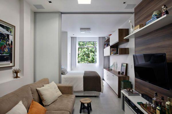
In the Studio, of course, there is only one window, located directly opposite the entrance from the opposite side. Therefore, the ideas all transverse bulkheads, in this case totally inappropriate, as they block the flow of natural light inside from the street.
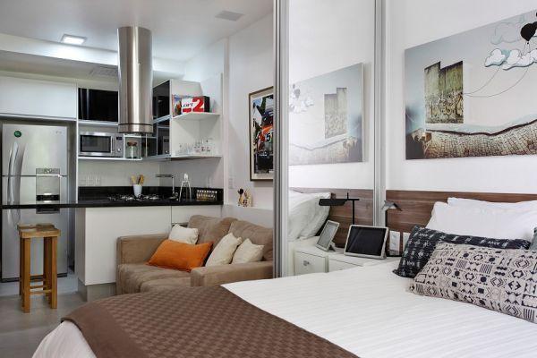
The easiest way to divide the room into several functional areas that will follow each other. For example, closer to the window to locate the sleeping area, then a compact living room with plasma screen on the wall, and behind it the kitchen, smoothly passing in the hallway with access to the bathroom.
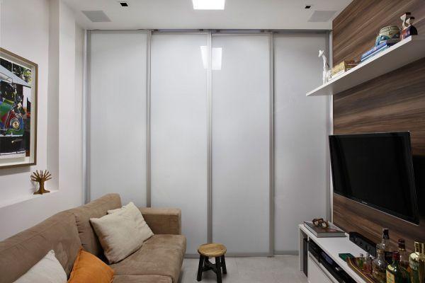
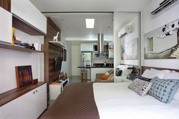
In this project used the original course with a thin sliding partition that closes the bed from prying eyes. And from the inside it has a mirror surface that visually expands the living space.
Sliding wall
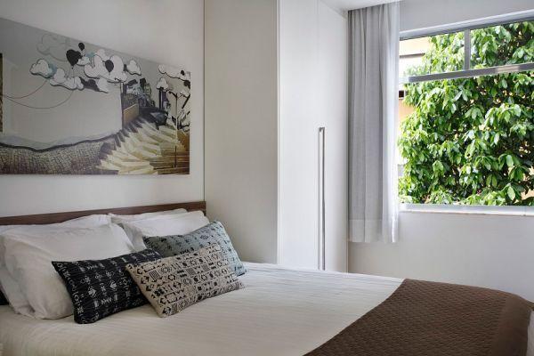
It should be noted that the landlord did everything to make it look wider. For this he used a borrowed southern areas of the Scandinavian style, the main characteristics of which are light colors like white and soft cream, and the outdoor window opening.
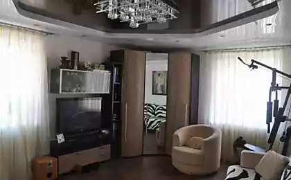
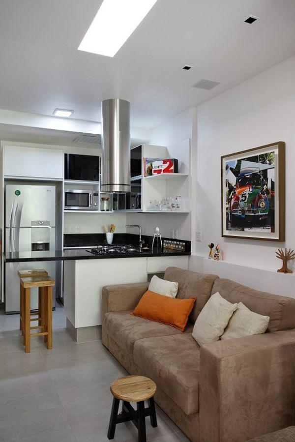
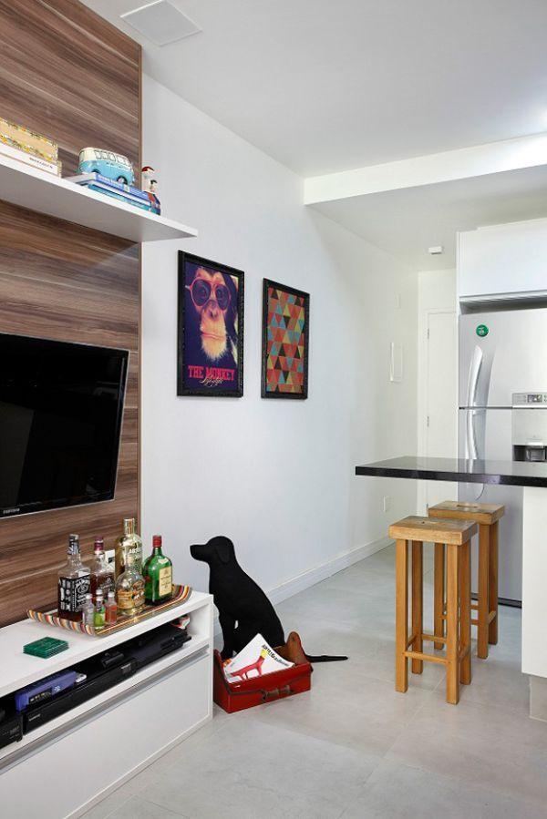
With the same purpose of the wall is decorated with a large number of paintings and wooden panels for the TV mount. In addition to horizontal decor it is equipped with a powerful living room area flat lamp, which becomes a Central focus, creating a greater volume.
Selection sets
In this case we can speak about the perfect choice of the furniture items that do not clutter the space, but rather facilitate it. A primary example is a Breakfast bar in the kitchen, which is only one person living here as a work and dining surface.
System storage is left to chance – you can verify this by considering the long cupboard for storing clothes and original mini-bar.
A minimum number of parts
The excess small items of decor usually creates a heavy atmosphere, as it almost always leads to a feeling of slight confusion.
As a result, the owner of the Studio considered sufficient for a number of works of art and posters, and also diluted with too light Foundation interior brown tones of the textiles, thus bringing it closer to minimalist.
published
P. S. And remember, only by changing their consumption — together we change the world! © Join us at Facebook , Vkontakte, Odnoklassniki
Source: interiorsmall.ru/otdelka-uzkoy-komnaty/
For example, the area of one of such premises in Rio de Janeiro is only 27 square meters, of which the result is a cosy and unusual accommodation.


Maximum openness
In the Studio, of course, there is only one window, located directly opposite the entrance from the opposite side. Therefore, the ideas all transverse bulkheads, in this case totally inappropriate, as they block the flow of natural light inside from the street.
The easiest way to divide the room into several functional areas that will follow each other. For example, closer to the window to locate the sleeping area, then a compact living room with plasma screen on the wall, and behind it the kitchen, smoothly passing in the hallway with access to the bathroom.
In this project used the original course with a thin sliding partition that closes the bed from prying eyes. And from the inside it has a mirror surface that visually expands the living space.

Sliding wall
It should be noted that the landlord did everything to make it look wider. For this he used a borrowed southern areas of the Scandinavian style, the main characteristics of which are light colors like white and soft cream, and the outdoor window opening.
With the same purpose of the wall is decorated with a large number of paintings and wooden panels for the TV mount. In addition to horizontal decor it is equipped with a powerful living room area flat lamp, which becomes a Central focus, creating a greater volume.


Selection sets
In this case we can speak about the perfect choice of the furniture items that do not clutter the space, but rather facilitate it. A primary example is a Breakfast bar in the kitchen, which is only one person living here as a work and dining surface.
System storage is left to chance – you can verify this by considering the long cupboard for storing clothes and original mini-bar.

A minimum number of parts
The excess small items of decor usually creates a heavy atmosphere, as it almost always leads to a feeling of slight confusion.
As a result, the owner of the Studio considered sufficient for a number of works of art and posters, and also diluted with too light Foundation interior brown tones of the textiles, thus bringing it closer to minimalist.


published
P. S. And remember, only by changing their consumption — together we change the world! © Join us at Facebook , Vkontakte, Odnoklassniki
Source: interiorsmall.ru/otdelka-uzkoy-komnaty/

