1175
34 Thumbelina from Samsung. Voooot takoooy width
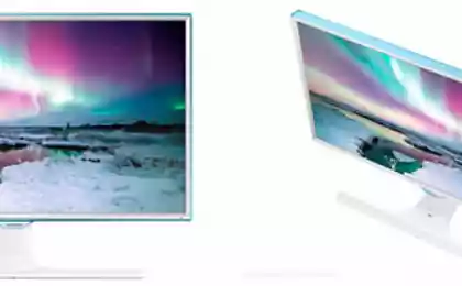
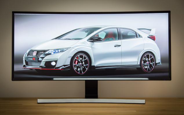
In December 2014, Samsung announced an interesting novelty: a curved 34-inch monitor S34E790C , which earlier this year, has already appeared on store shelves. The model is interesting for several reasons: the resolution of new items - Ultra WQHD (3440x1440, aspect ratio 21: 9), which makes this monitor is particularly suitable for multimedia applications and any operating problems (Photoshop, Illustrator, any video editor becomes a hundred times more convenient: the panels and tools do not eat off the workspace, and if rendered "the edge" of our usual 16: 9).
Second, it uses a new * VA-matrix on a plastic substrate: it is curved, has a W-LED backlight and honest ... 8-bit mode without dithering! Well, since it's Samsung, a company that can produce any product from A to Z in the home, the price of this wonder of the world get almost twice lower than the competition. Whether it strongly affected the quality? Let's see!
Specifications Screen: 34 & quot;
Aspect ratio: 21: 9
Panel Type: VA (Curved)
Backlight Type: LED (light-emitting diode)
Static Contrast: 3000: 1
Dynamic Contrast: Mega ∞ DCR
Resolution: 3440x1440
Response time: 4 ms
Viewing Angles (H / V): 178 ° / 178 °
Supported colors: 16 7 M
Built: Game Mode, Flicker Free, Eco Saving, Off Timer, Image Size, Samsung MagicBright, Sound Mode
Additional software for PC: Easy Setting Box
OS Compatibility: Windows, Mac
Windows Certification: Windows 8.1
Options
Monitor Samsung S34E790C came to our office in a large cardboard box, wrapped in foam thickness: in some other way would be difficult to ensure immobility during transport. In the thickness of the packaging material were:
- The monitor itself;
- Power cord and AC adapter;
- Two-wire video: DisplayPort and HDMI;
- Power USB (3.0);
- Guarantee.
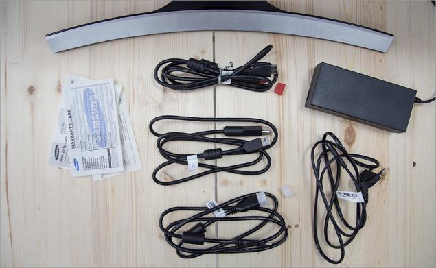
I'm slowly getting used to the fact that manufacturers do not put in all sorts of penny kit (for manufacturers) wiring, they say, "and so they have a user." Samsung in this respect is not stingy, and besides quite good meter HDMI-wire put even DisplayPort.
Nothing more, but for the monitor like nothing more is necessary.
Appearance
About appearance is nothing special to tell - just one look at the device on both sides and all will become clear. However, without a review of this section would not be complete.
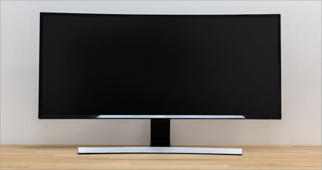
In short, look just gorgeous. Love at first sight. And he not only liked me as a monitor like fellow pros and the usual (less demanding technology) people. Pretty minimalistic design, strict - fit into any interior (the main thing that the place was enough).
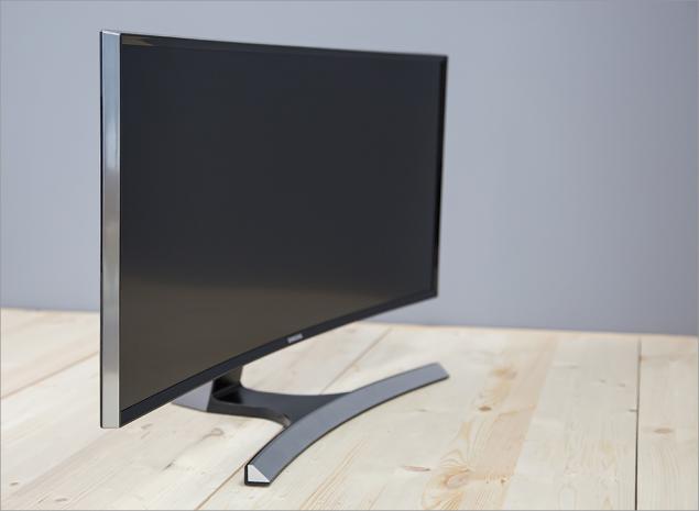
Black semi-matte screen is framed by black plastic frame - this combination is not very convenient when wiping dust, but I bet: having such a monitor, you will care for him with all my heart, no frame will not embarrass you.
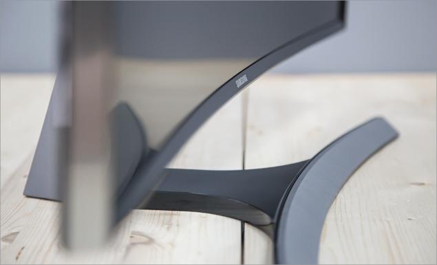
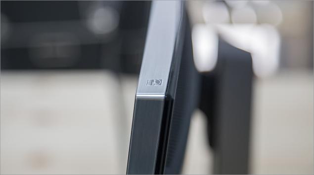
All side surfaces of plastic is also used, but with the texture and gray melkoshlifovannogo metal.
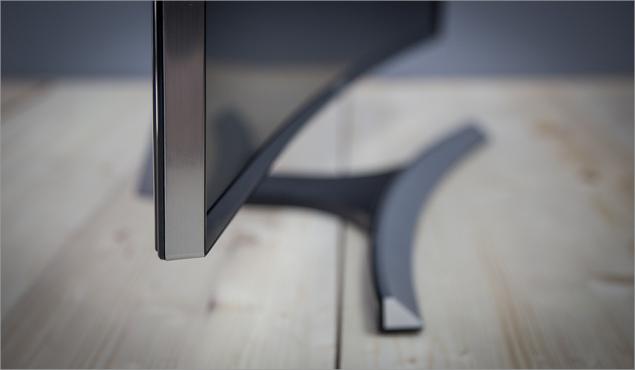
More can be seen from the front of the arcuate leg-stand, which keeps the display itself. Unfortunately, all plastic is also used, although, looking ahead, for the price of the monitor could be completely done and metal stand :)
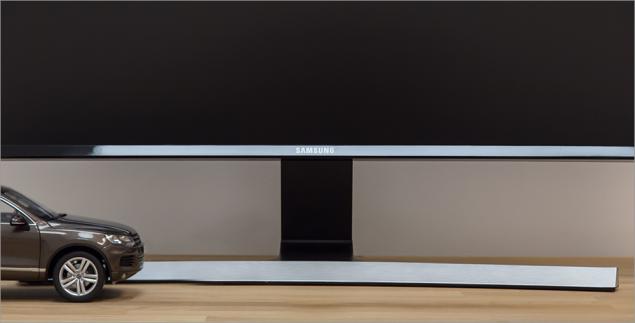
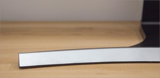
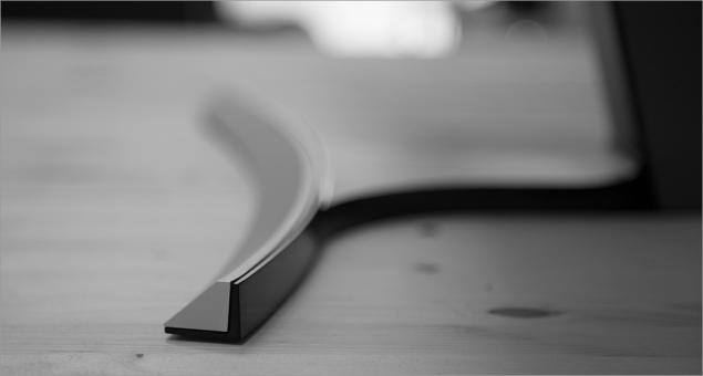
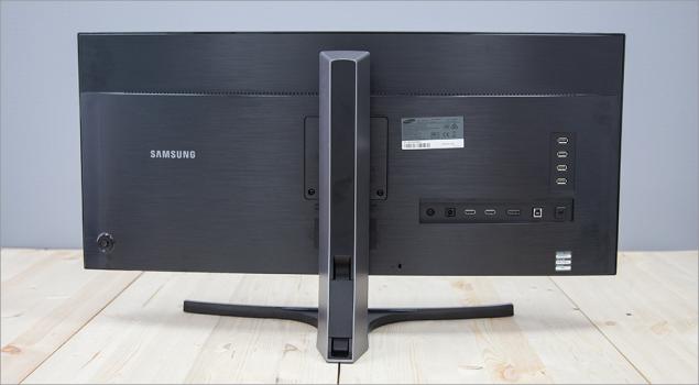
Almost all of the reverse side is represented by a plastic cover with all of the same polished texture, but the functional elements on it a few more.
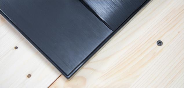
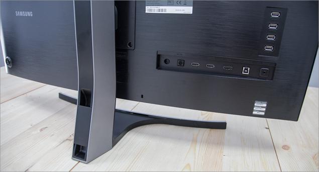
On the right side are device interfaces: power connector (DC, 22V), two HDMI (version 1.4), one DisplayPort (version 1.2), USB 3.0 (type B, cable included), headphone minijack (or audio) and as much as 4 Connector USB 3.0 (Type A). More below is anti-theft (Kensington) Castle.
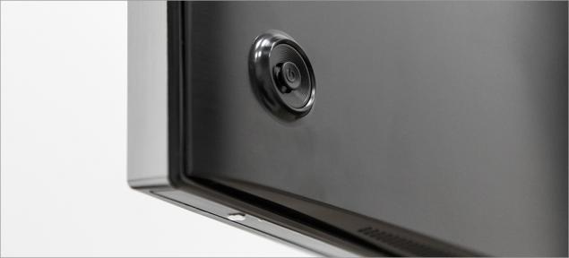
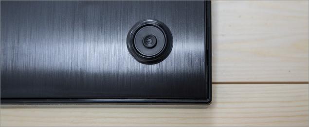
In the lower left corner is an analog multi-position joystick to navigate through the menu screen.
The screen is attached to the base by 2 screws - if they loosen, you can use any other VESA-compatible mount (100x100 mm). In the Stand Body present cable channel, closed cap: it is quite fit all the wires that can be connected to the monitor. But that wire is not sticking out from behind the screen, most likely, will have to use an additional tie-clip.
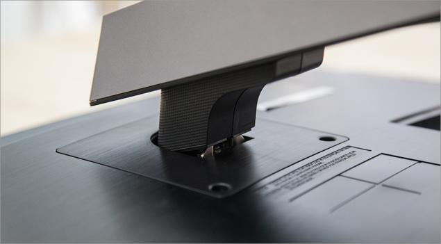
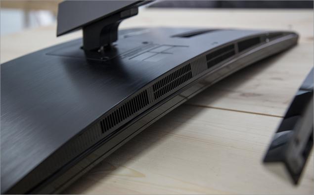
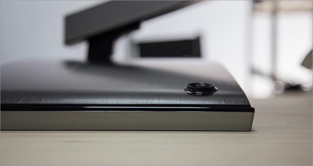
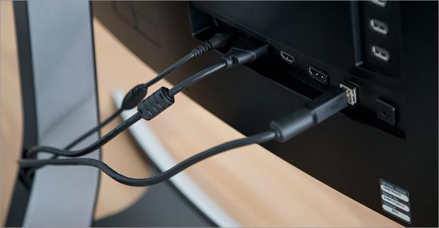
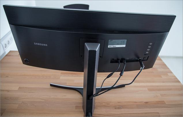
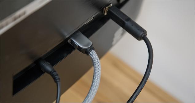
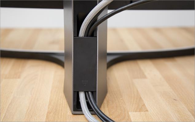
Location screen is height adjustable (~ 100 mm), you can also tilt the screen to or away from you (about 20 degrees); the possibility of rotation is absent.
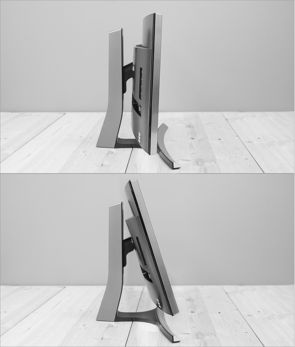
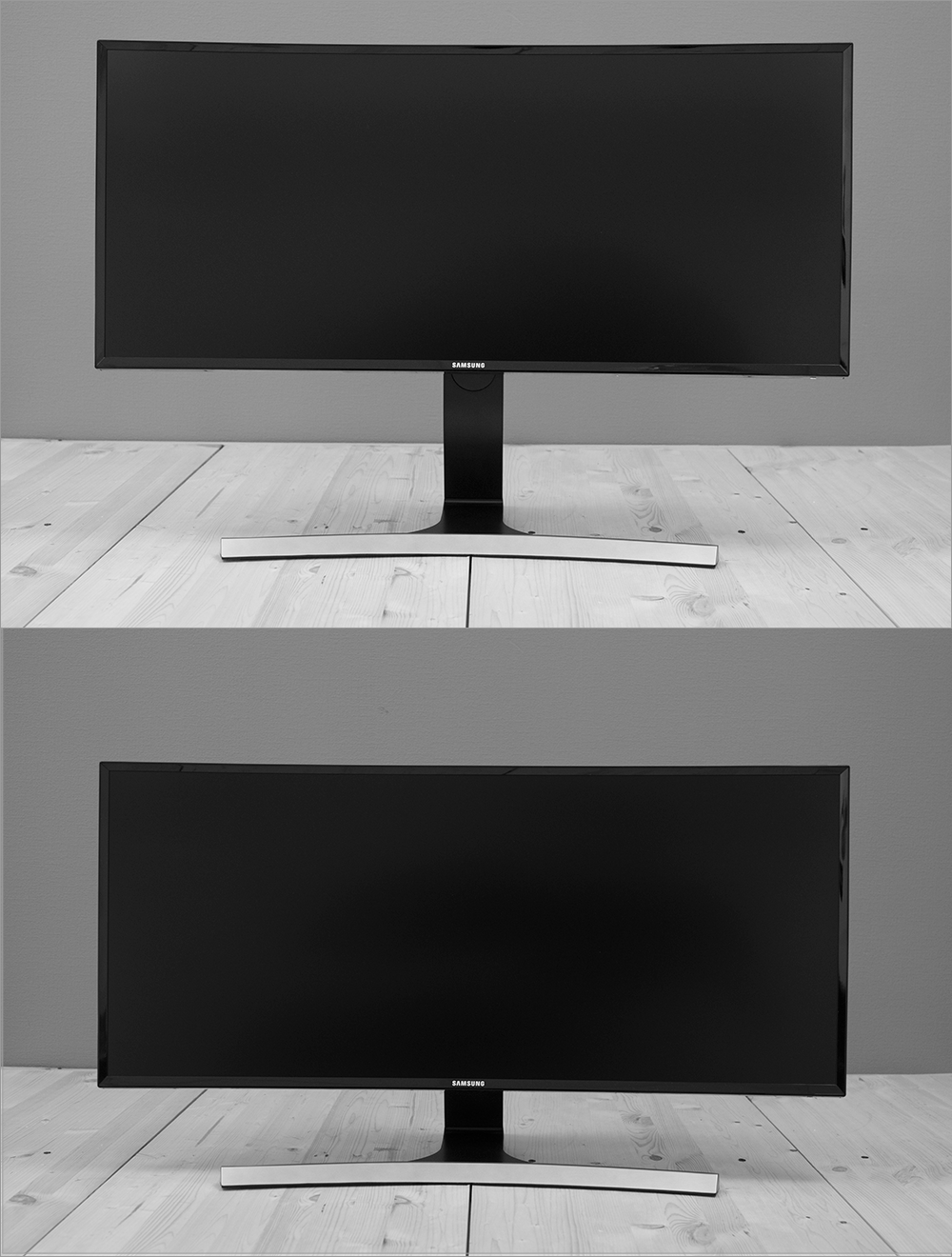
Speaking of the rotation, I mean not so much the vertical position of "sheets screen" (to see the source sites from the first to the last line) - just sometimes need to rotate the screen, such as non-standard location of the monitor on a work surface. And staff this is not possible, although it can be obtained by using the advanced attachment.
If you look at the monitor completely from the bottom, you can see the bars of speakers (the device has two speakers stereo, each with a capacity of 7 W), and the stand - 6 small rubber pads for fixing the monitor on a work surface.
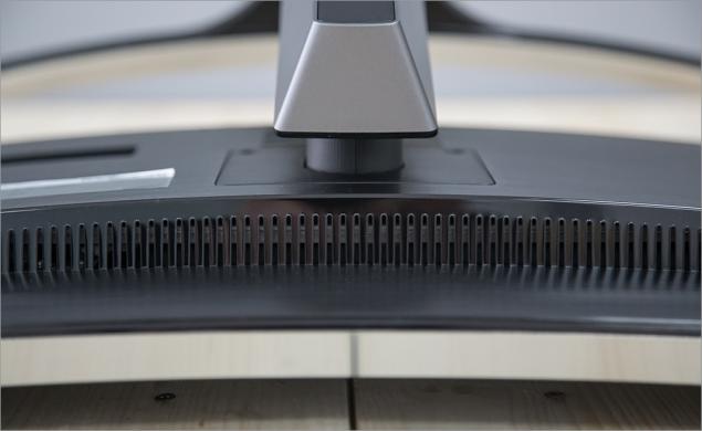
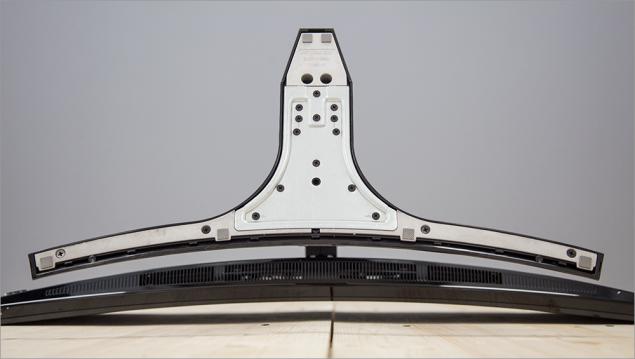
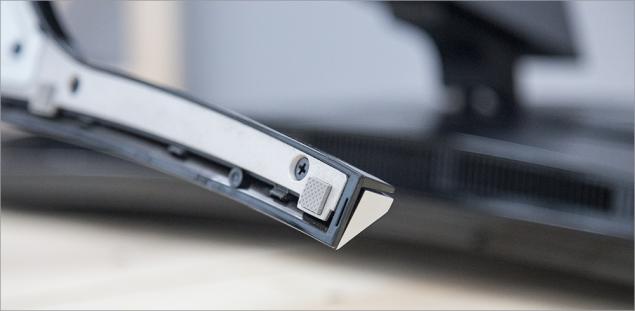
The build quality is generally good, but here's some monolithic device is clearly not enough: when inserting USB-cable (or USB flash drive), monitor sways, tries to turn around, and if any transformation heard muffled crackling plastic. However, such a large monitor would be difficult to do without the use of a monolithic metal in the body.
Weight complete unit is 10 pounds, he same screen (without stand) weighs 7.5 kg - maybe this information will be helpful in the selection of an alternative attachment (I use brackets Ergotron).
Enabling and work
If the monitor is connected to the network and to any of the sources, it turns on and automatically finds the source of the signal (the good choices he did not so much). All monitor ready to go :)
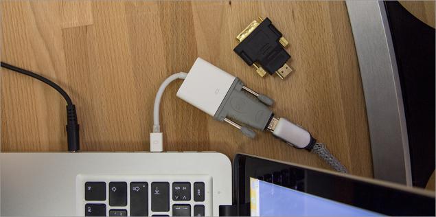
The first surprise was waiting for me when I tried to connect to my old monitor (by modern standards) MacBook Pro 2012 - in fact, is not available HDMI-connector, only Thunderbolt. Without thinking, I got an adapter with Thunderbolt to HDMI and connect your laptop through it. For a moment in front of me appeared a giant landfill desktop, but after a couple of seconds on it crawled band and began to include the monitor-off.
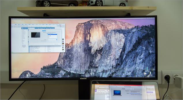
« It's all in Chinese Adapter i>» - thought Stirlitz :) A minute later I got a known working adapter with HDMI to DVI, which is connected to a DVI to Thunderbolt (also known working - connect your monitor working through it). The same result. Nothing left but to take a new model MacBook, which has a HDMI-connector by default - with it all at once earned. But there is and the environment had to adjust from scratch, and so wanted to change immediately, on the spot ... Everyone else is to become Board: Aby what source will not work here, because the resolution here laughing.
What can I say about the picture quality? If subjectively, it is a pretty good "out of the box." At least for those applications that I work with on a daily basis: the browser, mail, text and graphics editors. I mean, I sat in front of the new monitor and immediately began to work - no color rendition, no sharpness or something else does not bother me that I previously worked for him.
But the dimensions of this ... yeah ...) For several years I worked at a laptop with an external 24-inch monitor: once to me this seemed gigantic diagonal, but then I got used to. And some applications (such as the same template) sometimes was a bit crowded. Now here is 34 inches: the feeling that you find yourself on a boat somewhere in the middle of the ocean - vast expanses around you, you can go in any direction.
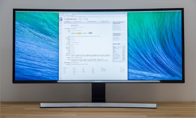
Certainly such a diagonal addictive need, as well as to form a curved display. If you are used to form rectangular windows applications, but now they will be bent into a tube, that the first time it will be very strange. Under the new diagonal you also rebuilt at once: patterns will have to change some computer work. Well, for example, early in my laptop was open Skype or e-mail client, and on the external screen - the browser window with a bunch of tabs. Now the browser window can be placed in the middle, mail and Skype are on the sides, in the periphery (and more space left!). That is, the laptop screen has remained empty, while I got used to the fact that there is something neglect. And if not empty, the Twitter client and a task manager, for example.
Workspace can be divided into 3 parts: the central and lateral. If you sit in the middle, then, this situation will seem best: the main task will be performed at the center, and all the accessories - at the periphery. Applications are many:
For the programmer: in the left side of the browser is open with an interesting article on Habré, in the center - a text editor to code, right - some documentation and task-manager.
To copywriter: in the center of the main document open, right or left - support (for example, if you have something to translate), the remainder of the - any type of tool spelling or printer.
For the photographer or designer: in the middle of open editing (for example, Photoshop), the left - a file manager with a photo on the right - does open Habrastorage / Flickr / 500px etc.
To the amateur XXX content: which, however, the difference))
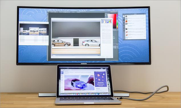
To slacker like me: left open twitter client and Skype, in the center - the browser with your favorite site, right - mail client and dusty task-manager. Or one browser to full screen, but with a bunch of tabs, each of which is displayed on the panel in full size, and not just a favicon. In general, would monitor and place on it's always something you can.
With this screen you have to change those scenarios using a second screen that you were before. Get used to the new location of the old applications. And this is probably the only discomfort, which you will encounter. But on the other hand, once you have first appeared a second monitor, and you also do not know what to do with it.
By the way, there are many software solutions that greatly facilitate your process of adaptation to the new diagonal - various tools for the management of windows. I will list a couple of utilities for example, OS X (most of them, unfortunately, paid).
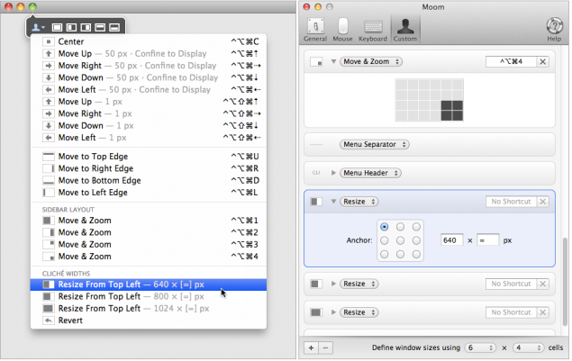
So, the list:
Cinch / Moom / BetterTouchTool / Spectacle / ShiftIt / Divvy / SizeUp / BetterSnapTool / Amethyst / Optimal Layout
(And ещё dozen utilities)
Use of health.
As can be seen in the photographs, the monitor has a curved shape - the radius of curvature of 3 meters. If you sit at a "flat" monitor similar to the diagonal, then the edge of the screen would be located further away from the user's eye, than the central part.
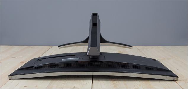
That is, the user would have to constantly refocus, which a priori is not conducive to long-term pastime behind the monitor. Curved screen solves this problem, as in this case, the distance to the user's eyes almost the same anywhere - it is beneficial to eye strain and neck, and also allows you to "see more." And not just "see more", namely "dive" in the process, as it were, of marketing as it sounds: it is easier to focus on the home, which is especially useful in all sorts of openspeysah. Feeling that monitor literally surrounds you while working :) The monitor is equipped with technology Flicker Free, which prevents flicker - this provides an additional eye protection from the constant stress caused by flickering monitor. Maybe it sounds a little advertising again, but fact is fact - the monitor can spend a long time without any discomfort, what I have seen for myself during the test.
Settings
The OSD menu appears when you press the joystick on the rear panel. The structure is quite simple, as it consists of only 5 points:
- A menu option
- Changing the source
- PiP / PbP
- Refund (removes the menu)
- Turn off (device)
Easily the joystick left or right adjusts the volume, and up and down - the picture settings (brightness, contrast, sharpness). Changing the source is organized is not very convenient: By selecting this option, you have to consistently switch between each of the source (the benefit of their little here), while the opportunity to select the desired source would be more convenient.
In the main menu of the monitor is 5 sections briefly about each of them:
- Image. B> Adjust the brightness, contrast and sharpness, as well as setting RGB-channels, hue and gamma.
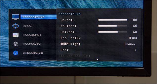
- screen. B> In this section, customizable image scaling (wide or normal), and the mode options PiP (Picture-in-Picture) and PbP (Picture-by-Picture). In PiP-mode, you can specify the position and size of the embedded image and source channel, the same mode PbP, but it is still possible to select the source.
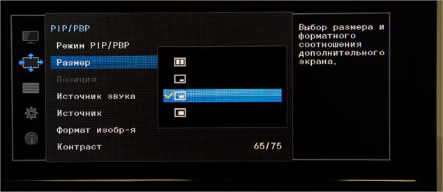
- Options. B> Language, OSD-menu transparency and time display on the screen.
- Options. B> Here are configured sound (volume, profile - standard, music, movie or voice, audio mode: stereo or only the left / right channel), Energy Saver, super-charging via USB, the PC mode / AV, version of DisplayPort (1.1 or 1.2), the detection signal sources (manual or automatic). Here you can turn off the timer, select the operation mode LED (so that it burned while working or only in standby mode), and reset all settings to the factory.
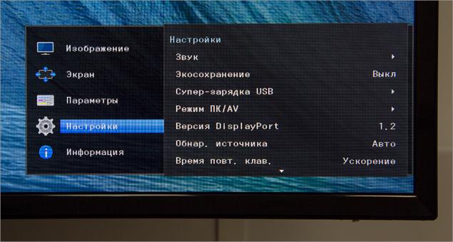
- information. B> section with the characteristics of the device.
A few words about the super-charging via USB. 4 on the rear panel USB-connector - if you just stick to them, such as iPhone, it will not charge. If you connect the monitor to your laptop via USB-cable (that comes in the kit), then the charge will go, but the laptop will be busy connector cord from the monitor. The function of the super-charging can be activated (disabled by default) on the first two USB-connectors charging function (5V and 1.5A to the place of the standard 5V 900mA and up), so they can charge gadgets even without connecting to a laptop. Remains one question: what do prevent this option enabled by default for all connectors?
Image quality
Tools menu you can adjust the monitor several parameters:
- Brightness. B> a scale from 0 to 100 in increments of 1 division. Pleasantly pleased with the minimum brightness and maximum. The minimum value is useful when working in the dark: so as not to blind himself or others. The maximum value is ideal for use in good lighting conditions. The optimal value of the brightness when working in an office room with the included external light - 65 units.
- Contrast. B> The scale also from 0 to 100 units in increments of 1 division. At the maximum brightness color reproduction becomes terrible: Habré left menu tabs and section merge with the white background of the article. While at the minimum value the opposite effect: all too contrasting. Optimal contrast value at which the Habr looks as he looked at the monitor of our designer - the same 65 units.
- Sharpen. B> a scale of 0 to 100, but the move is already 4 units. The maximum value - unpleasantly sharp "peresharp", while the minimum value - do not read soap. The optimum value is 64 points - at this level of clarity even small text looks nice and readable without problems.
- Color. B> Manual Setup RGB-channel display and color temperature modes (6 presets) and gamma (3 presets). These options I did not change, good color rendition, I liked "out of the box." However, you can play around with these settings.
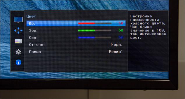
There are a number of parameters, which I also did not touch:
- Game Mode: on / off, always enabled
- Samsung MagicBright: Custom, Standard, Cinema, Dynamic
- Response time: standard, fast, fastest
Note issue. Diagonal of the device is 34 inches, then there are places (in width) nearly a meter. What prevented the manufacturer to make a larger menu, where instead of "Games. mode "and all the" User. "would be the normal menu names and options? Answer: 42.
In fact, this is not the only flaw localization, there are also such:
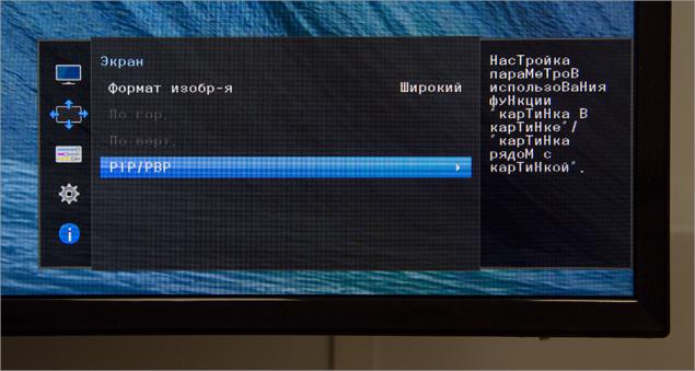
However, the menu as much as 14 languages to choose from, that can not but rejoice.
Several photos fragment monitor, made with a short interval under constant external conditions and camera settings.
Let's go back to the quality of the image.
Price.
Second, it uses a new * VA-matrix on a plastic substrate: it is curved, has a W-LED backlight and honest ... 8-bit mode without dithering! Well, since it's Samsung, a company that can produce any product from A to Z in the home, the price of this wonder of the world get almost twice lower than the competition. Whether it strongly affected the quality? Let's see!

Specifications Screen: 34 & quot;
Aspect ratio: 21: 9
Panel Type: VA (Curved)
Backlight Type: LED (light-emitting diode)
Static Contrast: 3000: 1
Dynamic Contrast: Mega ∞ DCR
Resolution: 3440x1440
Response time: 4 ms
Viewing Angles (H / V): 178 ° / 178 °
Supported colors: 16 7 M
Built: Game Mode, Flicker Free, Eco Saving, Off Timer, Image Size, Samsung MagicBright, Sound Mode
Additional software for PC: Easy Setting Box
OS Compatibility: Windows, Mac
Windows Certification: Windows 8.1
Options
Monitor Samsung S34E790C came to our office in a large cardboard box, wrapped in foam thickness: in some other way would be difficult to ensure immobility during transport. In the thickness of the packaging material were:
- The monitor itself;
- Power cord and AC adapter;
- Two-wire video: DisplayPort and HDMI;
- Power USB (3.0);
- Guarantee.

I'm slowly getting used to the fact that manufacturers do not put in all sorts of penny kit (for manufacturers) wiring, they say, "and so they have a user." Samsung in this respect is not stingy, and besides quite good meter HDMI-wire put even DisplayPort.
Nothing more, but for the monitor like nothing more is necessary.
Appearance
About appearance is nothing special to tell - just one look at the device on both sides and all will become clear. However, without a review of this section would not be complete.

In short, look just gorgeous. Love at first sight. And he not only liked me as a monitor like fellow pros and the usual (less demanding technology) people. Pretty minimalistic design, strict - fit into any interior (the main thing that the place was enough).

Black semi-matte screen is framed by black plastic frame - this combination is not very convenient when wiping dust, but I bet: having such a monitor, you will care for him with all my heart, no frame will not embarrass you.

All side surfaces of plastic is also used, but with the texture and gray melkoshlifovannogo metal.


More can be seen from the front of the arcuate leg-stand, which keeps the display itself. Unfortunately, all plastic is also used, although, looking ahead, for the price of the monitor could be completely done and metal stand :)


Almost all of the reverse side is represented by a plastic cover with all of the same polished texture, but the functional elements on it a few more.

On the right side are device interfaces: power connector (DC, 22V), two HDMI (version 1.4), one DisplayPort (version 1.2), USB 3.0 (type B, cable included), headphone minijack (or audio) and as much as 4 Connector USB 3.0 (Type A). More below is anti-theft (Kensington) Castle.


In the lower left corner is an analog multi-position joystick to navigate through the menu screen.


The screen is attached to the base by 2 screws - if they loosen, you can use any other VESA-compatible mount (100x100 mm). In the Stand Body present cable channel, closed cap: it is quite fit all the wires that can be connected to the monitor. But that wire is not sticking out from behind the screen, most likely, will have to use an additional tie-clip.


Location screen is height adjustable (~ 100 mm), you can also tilt the screen to or away from you (about 20 degrees); the possibility of rotation is absent.


Speaking of the rotation, I mean not so much the vertical position of "sheets screen" (to see the source sites from the first to the last line) - just sometimes need to rotate the screen, such as non-standard location of the monitor on a work surface. And staff this is not possible, although it can be obtained by using the advanced attachment.
If you look at the monitor completely from the bottom, you can see the bars of speakers (the device has two speakers stereo, each with a capacity of 7 W), and the stand - 6 small rubber pads for fixing the monitor on a work surface.


The build quality is generally good, but here's some monolithic device is clearly not enough: when inserting USB-cable (or USB flash drive), monitor sways, tries to turn around, and if any transformation heard muffled crackling plastic. However, such a large monitor would be difficult to do without the use of a monolithic metal in the body.
Weight complete unit is 10 pounds, he same screen (without stand) weighs 7.5 kg - maybe this information will be helpful in the selection of an alternative attachment (I use brackets Ergotron).
Enabling and work
If the monitor is connected to the network and to any of the sources, it turns on and automatically finds the source of the signal (the good choices he did not so much). All monitor ready to go :)
The first surprise was waiting for me when I tried to connect to my old monitor (by modern standards) MacBook Pro 2012 - in fact, is not available HDMI-connector, only Thunderbolt. Without thinking, I got an adapter with Thunderbolt to HDMI and connect your laptop through it. For a moment in front of me appeared a giant landfill desktop, but after a couple of seconds on it crawled band and began to include the monitor-off.

« It's all in Chinese Adapter i>» - thought Stirlitz :) A minute later I got a known working adapter with HDMI to DVI, which is connected to a DVI to Thunderbolt (also known working - connect your monitor working through it). The same result. Nothing left but to take a new model MacBook, which has a HDMI-connector by default - with it all at once earned. But there is and the environment had to adjust from scratch, and so wanted to change immediately, on the spot ... Everyone else is to become Board: Aby what source will not work here, because the resolution here laughing.

What can I say about the picture quality? If subjectively, it is a pretty good "out of the box." At least for those applications that I work with on a daily basis: the browser, mail, text and graphics editors. I mean, I sat in front of the new monitor and immediately began to work - no color rendition, no sharpness or something else does not bother me that I previously worked for him.
But the dimensions of this ... yeah ...) For several years I worked at a laptop with an external 24-inch monitor: once to me this seemed gigantic diagonal, but then I got used to. And some applications (such as the same template) sometimes was a bit crowded. Now here is 34 inches: the feeling that you find yourself on a boat somewhere in the middle of the ocean - vast expanses around you, you can go in any direction.

Certainly such a diagonal addictive need, as well as to form a curved display. If you are used to form rectangular windows applications, but now they will be bent into a tube, that the first time it will be very strange. Under the new diagonal you also rebuilt at once: patterns will have to change some computer work. Well, for example, early in my laptop was open Skype or e-mail client, and on the external screen - the browser window with a bunch of tabs. Now the browser window can be placed in the middle, mail and Skype are on the sides, in the periphery (and more space left!). That is, the laptop screen has remained empty, while I got used to the fact that there is something neglect. And if not empty, the Twitter client and a task manager, for example.
Workspace can be divided into 3 parts: the central and lateral. If you sit in the middle, then, this situation will seem best: the main task will be performed at the center, and all the accessories - at the periphery. Applications are many:
For the programmer: in the left side of the browser is open with an interesting article on Habré, in the center - a text editor to code, right - some documentation and task-manager.
To copywriter: in the center of the main document open, right or left - support (for example, if you have something to translate), the remainder of the - any type of tool spelling or printer.
For the photographer or designer: in the middle of open editing (for example, Photoshop), the left - a file manager with a photo on the right - does open Habrastorage / Flickr / 500px etc.
To the amateur XXX content: which, however, the difference))

To slacker like me: left open twitter client and Skype, in the center - the browser with your favorite site, right - mail client and dusty task-manager. Or one browser to full screen, but with a bunch of tabs, each of which is displayed on the panel in full size, and not just a favicon. In general, would monitor and place on it's always something you can.
With this screen you have to change those scenarios using a second screen that you were before. Get used to the new location of the old applications. And this is probably the only discomfort, which you will encounter. But on the other hand, once you have first appeared a second monitor, and you also do not know what to do with it.
By the way, there are many software solutions that greatly facilitate your process of adaptation to the new diagonal - various tools for the management of windows. I will list a couple of utilities for example, OS X (most of them, unfortunately, paid).

So, the list:
Cinch / Moom / BetterTouchTool / Spectacle / ShiftIt / Divvy / SizeUp / BetterSnapTool / Amethyst / Optimal Layout
(And ещё dozen utilities)
Use of health.
As can be seen in the photographs, the monitor has a curved shape - the radius of curvature of 3 meters. If you sit at a "flat" monitor similar to the diagonal, then the edge of the screen would be located further away from the user's eye, than the central part.

That is, the user would have to constantly refocus, which a priori is not conducive to long-term pastime behind the monitor. Curved screen solves this problem, as in this case, the distance to the user's eyes almost the same anywhere - it is beneficial to eye strain and neck, and also allows you to "see more." And not just "see more", namely "dive" in the process, as it were, of marketing as it sounds: it is easier to focus on the home, which is especially useful in all sorts of openspeysah. Feeling that monitor literally surrounds you while working :) The monitor is equipped with technology Flicker Free, which prevents flicker - this provides an additional eye protection from the constant stress caused by flickering monitor. Maybe it sounds a little advertising again, but fact is fact - the monitor can spend a long time without any discomfort, what I have seen for myself during the test.
Settings
The OSD menu appears when you press the joystick on the rear panel. The structure is quite simple, as it consists of only 5 points:
- A menu option
- Changing the source
- PiP / PbP
- Refund (removes the menu)
- Turn off (device)
Easily the joystick left or right adjusts the volume, and up and down - the picture settings (brightness, contrast, sharpness). Changing the source is organized is not very convenient: By selecting this option, you have to consistently switch between each of the source (the benefit of their little here), while the opportunity to select the desired source would be more convenient.
In the main menu of the monitor is 5 sections briefly about each of them:
- Image. B> Adjust the brightness, contrast and sharpness, as well as setting RGB-channels, hue and gamma.

- screen. B> In this section, customizable image scaling (wide or normal), and the mode options PiP (Picture-in-Picture) and PbP (Picture-by-Picture). In PiP-mode, you can specify the position and size of the embedded image and source channel, the same mode PbP, but it is still possible to select the source.

- Options. B> Language, OSD-menu transparency and time display on the screen.
- Options. B> Here are configured sound (volume, profile - standard, music, movie or voice, audio mode: stereo or only the left / right channel), Energy Saver, super-charging via USB, the PC mode / AV, version of DisplayPort (1.1 or 1.2), the detection signal sources (manual or automatic). Here you can turn off the timer, select the operation mode LED (so that it burned while working or only in standby mode), and reset all settings to the factory.

- information. B> section with the characteristics of the device.
A few words about the super-charging via USB. 4 on the rear panel USB-connector - if you just stick to them, such as iPhone, it will not charge. If you connect the monitor to your laptop via USB-cable (that comes in the kit), then the charge will go, but the laptop will be busy connector cord from the monitor. The function of the super-charging can be activated (disabled by default) on the first two USB-connectors charging function (5V and 1.5A to the place of the standard 5V 900mA and up), so they can charge gadgets even without connecting to a laptop. Remains one question: what do prevent this option enabled by default for all connectors?
Image quality
Tools menu you can adjust the monitor several parameters:
- Brightness. B> a scale from 0 to 100 in increments of 1 division. Pleasantly pleased with the minimum brightness and maximum. The minimum value is useful when working in the dark: so as not to blind himself or others. The maximum value is ideal for use in good lighting conditions. The optimal value of the brightness when working in an office room with the included external light - 65 units.
- Contrast. B> The scale also from 0 to 100 units in increments of 1 division. At the maximum brightness color reproduction becomes terrible: Habré left menu tabs and section merge with the white background of the article. While at the minimum value the opposite effect: all too contrasting. Optimal contrast value at which the Habr looks as he looked at the monitor of our designer - the same 65 units.
- Sharpen. B> a scale of 0 to 100, but the move is already 4 units. The maximum value - unpleasantly sharp "peresharp", while the minimum value - do not read soap. The optimum value is 64 points - at this level of clarity even small text looks nice and readable without problems.
- Color. B> Manual Setup RGB-channel display and color temperature modes (6 presets) and gamma (3 presets). These options I did not change, good color rendition, I liked "out of the box." However, you can play around with these settings.

There are a number of parameters, which I also did not touch:
- Game Mode: on / off, always enabled
- Samsung MagicBright: Custom, Standard, Cinema, Dynamic
- Response time: standard, fast, fastest
Note issue. Diagonal of the device is 34 inches, then there are places (in width) nearly a meter. What prevented the manufacturer to make a larger menu, where instead of "Games. mode "and all the" User. "would be the normal menu names and options? Answer: 42.
In fact, this is not the only flaw localization, there are also such:

However, the menu as much as 14 languages to choose from, that can not but rejoice.
Several photos fragment monitor, made with a short interval under constant external conditions and camera settings.
Let's go back to the quality of the image.
Price.
Quadcopter "Phantom-2": a master class for beginners
Checker - a simple way to find out if everything is OK with your belongings


