2470
Architectural Illusions
Street art - a wonderful thing. But even more interesting if it is at the service of innovative ideas create optical illusions. Also, this trend was picked up by architects and designers of building facades. Some concepts simply unreal beautiful, really fascinate.
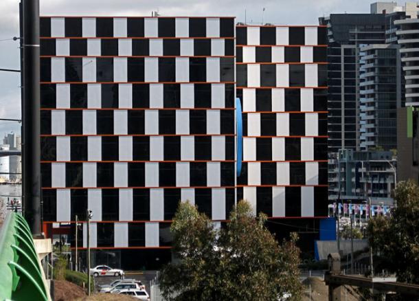
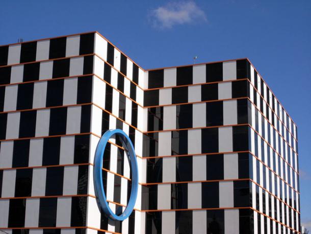
And customs can be original. This service office in Melbourne, Australia. The solid parallel lines. Because inserts contrast seems uneven cells. But in fact they are just perfectly aligned.
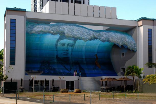
Building Manu Nala, Honolulu, Hawaii. Painted wave style creates the illusion of 3D sculpture or concave wall.
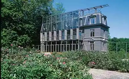
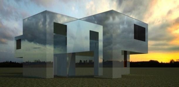
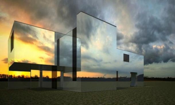
Invisible Rachel Raymond house in Belmont, Massachusetts. Constructed under the project Eleanor Raymond in 1931, then was upgraded by architect Pedro Costa. Mirrored walls and clever arrangement can create the illusion of the disappearance of the house. On a clear day it is not visible in a landscape.
Hartford, Connecticut. This mirrored walls of the facade of the house. Because of the reflection it seems that the facade is decorated with a cross plate decor, and balconies are skewed.
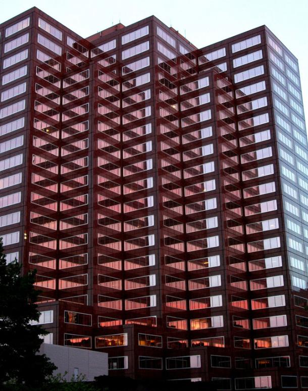
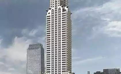
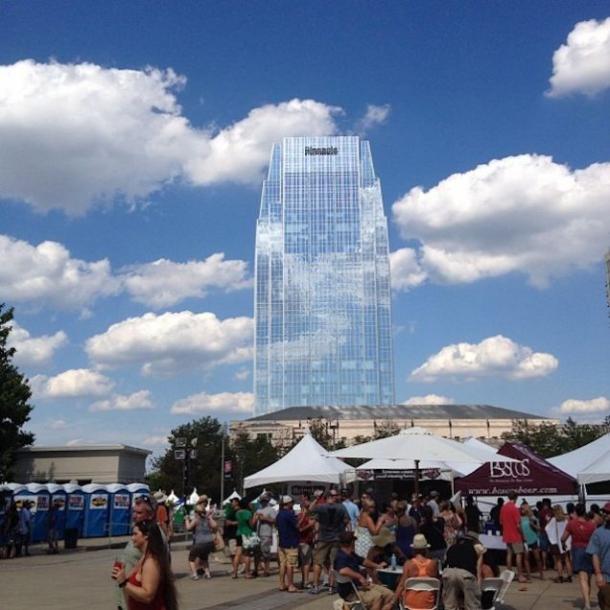
Another building with mirrored walls. Because it is high, it is nothing but clouds, does not reflect. Commercial and business center, designed by Picard Chilton. Located in Nashville, Tennessee.
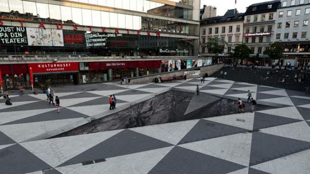
Rather unpleasant from a psychological point of view, the failure of an illusion in the square. The work, entitled "Watch your feet," Erik Johansson, Sweden.
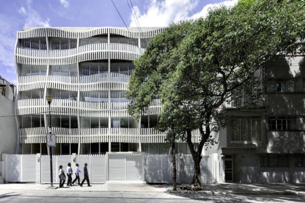
Apartment house in Mexico City, built in 2011. There are no illusions, Balconies really wavy. It's nice to live in such a house is probably beautiful both inside and outside.
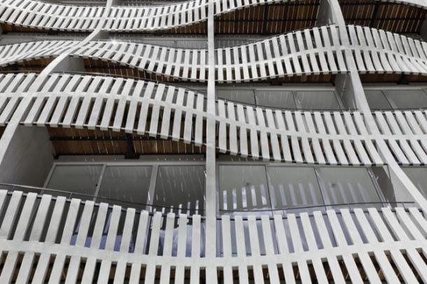
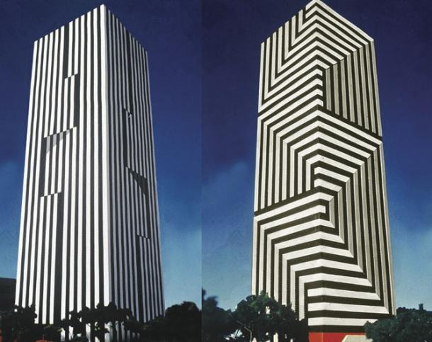
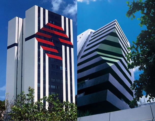
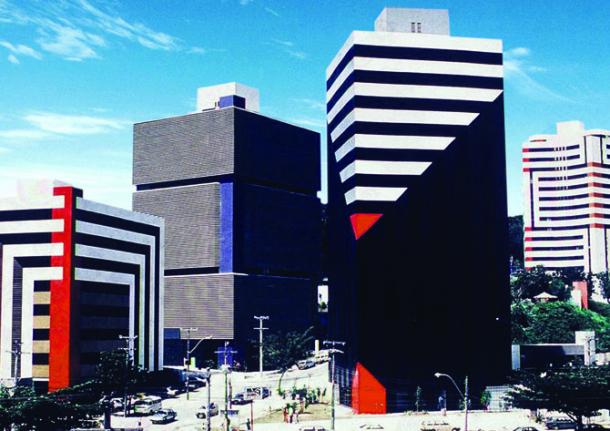
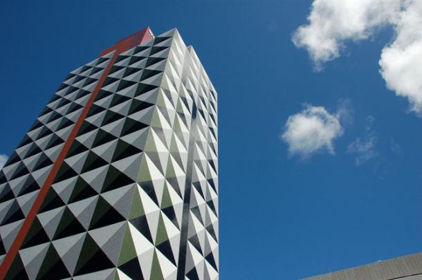
But the architect Fernando Peiksoto from Brazil, it seems, has missed the concept. From his work in the eyes dazzled, it is unlikely that the design can please: after a few seconds of observation is terribly irritating to the eyes. And when you consider that the country is constantly hot sun is shining and the building literally dazzle his motley, you have to believe that people are not very happy.

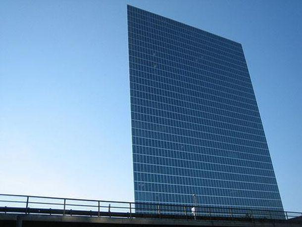
John Hancock Tower in Boston. Due to the fact that the sharp corners of the building, on the one hand it seems that houses in general have, but instead a plate with windows cost.
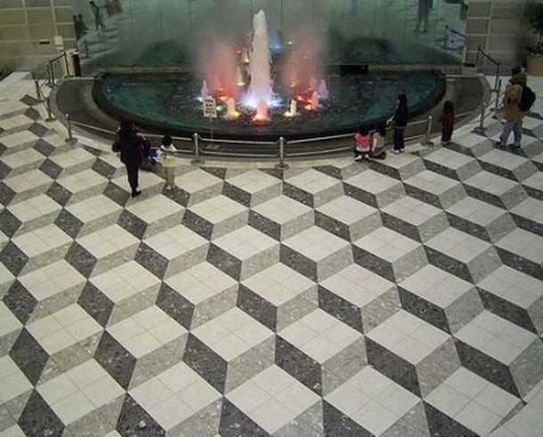
Hotel in Tokyo impresses with its unconventional design floor. Actually walk on this floor is extremely unpleasant, there is a feeling of dizziness and loss of stability. And in terms of feng shui is also dangerous.
It is strange that the hotel still welcomes guests and not ruined. Maybe Feng Shui does not work?

And customs can be original. This service office in Melbourne, Australia. The solid parallel lines. Because inserts contrast seems uneven cells. But in fact they are just perfectly aligned.


Building Manu Nala, Honolulu, Hawaii. Painted wave style creates the illusion of 3D sculpture or concave wall.

Invisible Rachel Raymond house in Belmont, Massachusetts. Constructed under the project Eleanor Raymond in 1931, then was upgraded by architect Pedro Costa. Mirrored walls and clever arrangement can create the illusion of the disappearance of the house. On a clear day it is not visible in a landscape.


Hartford, Connecticut. This mirrored walls of the facade of the house. Because of the reflection it seems that the facade is decorated with a cross plate decor, and balconies are skewed.

Another building with mirrored walls. Because it is high, it is nothing but clouds, does not reflect. Commercial and business center, designed by Picard Chilton. Located in Nashville, Tennessee.

Rather unpleasant from a psychological point of view, the failure of an illusion in the square. The work, entitled "Watch your feet," Erik Johansson, Sweden.

Apartment house in Mexico City, built in 2011. There are no illusions, Balconies really wavy. It's nice to live in such a house is probably beautiful both inside and outside.


But the architect Fernando Peiksoto from Brazil, it seems, has missed the concept. From his work in the eyes dazzled, it is unlikely that the design can please: after a few seconds of observation is terribly irritating to the eyes. And when you consider that the country is constantly hot sun is shining and the building literally dazzle his motley, you have to believe that people are not very happy.


John Hancock Tower in Boston. Due to the fact that the sharp corners of the building, on the one hand it seems that houses in general have, but instead a plate with windows cost.

Hotel in Tokyo impresses with its unconventional design floor. Actually walk on this floor is extremely unpleasant, there is a feeling of dizziness and loss of stability. And in terms of feng shui is also dangerous.
It is strange that the hotel still welcomes guests and not ruined. Maybe Feng Shui does not work?
