1078
Sberbar - Food nearby.
In Moscow, on the street Kuntsevsky enterprising businessmen staged a "co-branding in Russian."
Close to the office of the Savings Bank Ltd. "Santa" opened "Sberbar».
In addition to the end of words, corporate identity new bar is different from the corporate identity of Sberbank color - deep red instead of green,
logo - "Pacman" stretched, flattened corner and bought a leg of the glass, as well as working time.
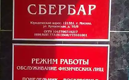
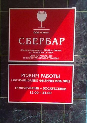
Sberbar serves only individuals from 12 pm to 12 midnight.
The slogan of the Savings Bank has also undergone adjustments: "Always there" has become a "Food next."
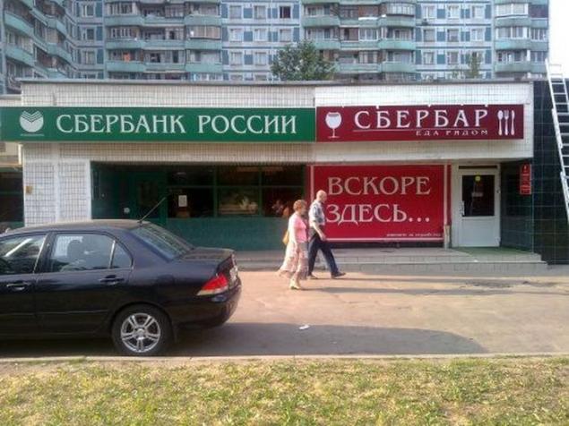
We must give owners a sense of humor "Sberbara" on the sign which says that in the cafe will be served individuals from Monday to Sunday from 12 to 24 hours. The apparent similarity of visual appearance of the two organizations entirely different structure and has been the subject of reflection and creativity on the legality of such borrowing. According to Lenta.ru, «Sberbar" officially opened on July 22. Owners institutions explain that the idea of the name came entrepreneurs "spontaneously, in a conversation with friends." But most importantly, corporate identity, logo and design institutions were their own notion, no advertising agencies in the process of creating a new brand did not participate.
via Source
Close to the office of the Savings Bank Ltd. "Santa" opened "Sberbar».
In addition to the end of words, corporate identity new bar is different from the corporate identity of Sberbank color - deep red instead of green,
logo - "Pacman" stretched, flattened corner and bought a leg of the glass, as well as working time.
Sberbar serves only individuals from 12 pm to 12 midnight.
The slogan of the Savings Bank has also undergone adjustments: "Always there" has become a "Food next."

We must give owners a sense of humor "Sberbara" on the sign which says that in the cafe will be served individuals from Monday to Sunday from 12 to 24 hours. The apparent similarity of visual appearance of the two organizations entirely different structure and has been the subject of reflection and creativity on the legality of such borrowing. According to Lenta.ru, «Sberbar" officially opened on July 22. Owners institutions explain that the idea of the name came entrepreneurs "spontaneously, in a conversation with friends." But most importantly, corporate identity, logo and design institutions were their own notion, no advertising agencies in the process of creating a new brand did not participate.

via Source


