721
As operators reach the desired effect in a movie
Today we tell about a study that was conducted on the basis of a single frame of the movie. In constructing the frames into account factors such as the direction of movement of the camera, lighting and colors.
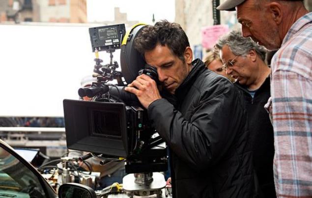
Those who are ever fond of photography, surely aware of the existence of so-called "rule of thirds" (or golden ratio). To explain the rest: the frame is divided into three equal parts horizontally and further three vertically. At the intersection of these lines are formed of four points, which professionals call "node of attention." The human brain is so constituted that we are more comfortable seeing the main object of the photo or film frame is in one of these points - and not in the middle, as a layman might think.
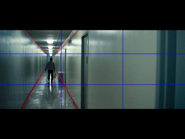
It was following "rule of thirds" was able to give this frame a sense of balance. In addition, the effect of seeking to strengthen and at one point the line of a long corridor (marked with red arrows), who also directed the viewer's attention on the character.
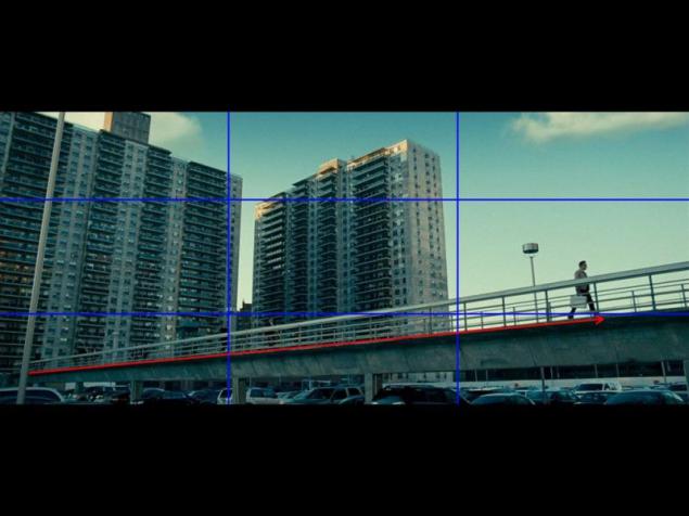
Two large buildings, occupying two thirds of the frame on the left and the open sky in the third on the right give an amazing sense of balance. As a result, all the viewer's attention is focused on the tiny figure of Ben Stiller. This contributes to the diagonal, which forms a bridge (marked with a red arrow)
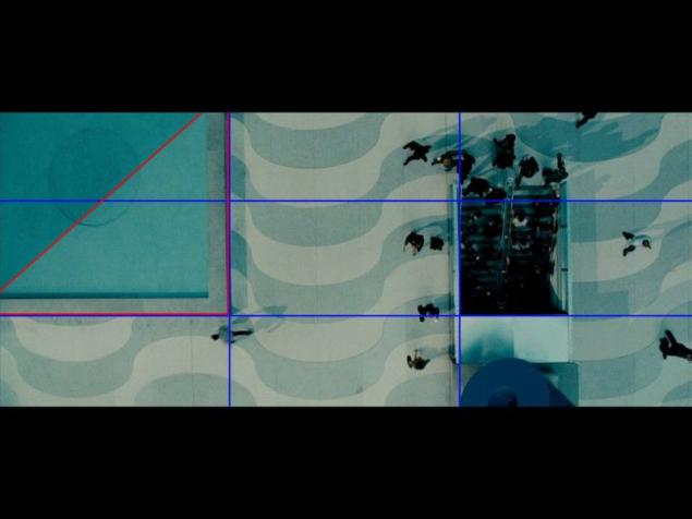
In this picture, the rule of thirds is used repeatedly. The square on the left (marked in red) and shadow on the water divides it exactly in half.
The atmosphere of this frame is created with the help of illumination from behind, making silhouettes of the characters look particularly expressive. An important touch - warm dust clouds illuminated by the setting sun. Please note that the sun itself is located very close to one of the "node of attention».
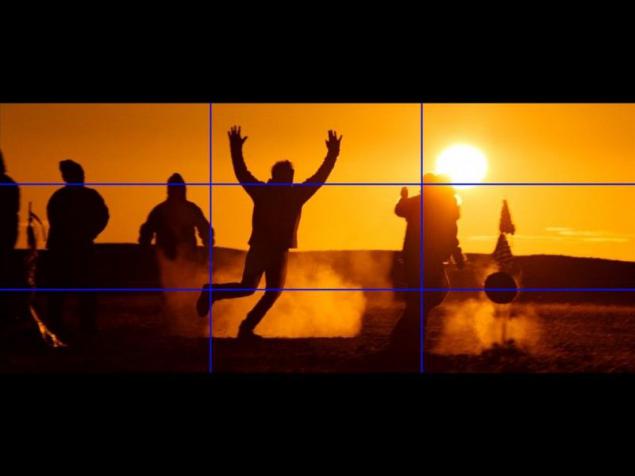
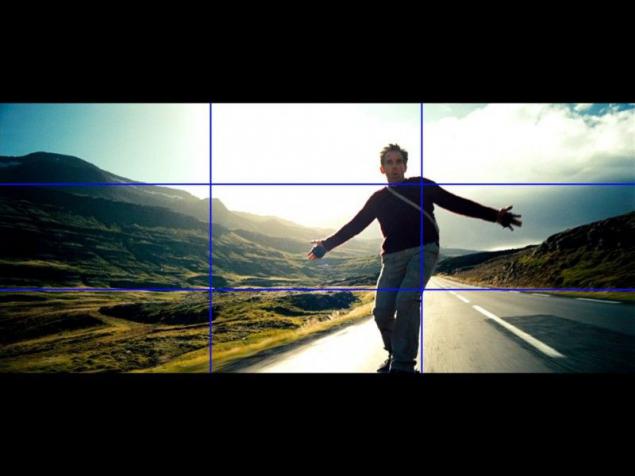
Figure Ben Stiller shifted to the right, behind him - the open sky and the head of an actor falls into one of the "node of attention." If cameras are positioned differently and mountains would be placed behind the actor, it is such an impressive contrast would not have arisen, and the viewer would have taken more time to decide on what's the focus.
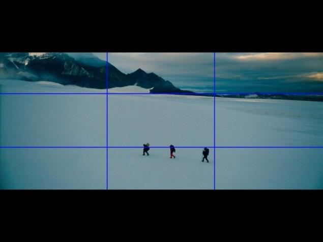
If the frame appears several objects (or groups of objects) worthy of viewers' attention, their number must be odd - because the audience comfortable. Odd number creates a greater sense of balance than, say, if these objects would be only two.
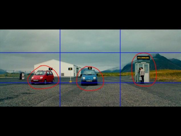
The horizon line is shifted upwards because the lower part is more interesting than the sky, and thus manages to create a sense of isolation of the three heroes.
Source: i.imgur.com

Those who are ever fond of photography, surely aware of the existence of so-called "rule of thirds" (or golden ratio). To explain the rest: the frame is divided into three equal parts horizontally and further three vertically. At the intersection of these lines are formed of four points, which professionals call "node of attention." The human brain is so constituted that we are more comfortable seeing the main object of the photo or film frame is in one of these points - and not in the middle, as a layman might think.

It was following "rule of thirds" was able to give this frame a sense of balance. In addition, the effect of seeking to strengthen and at one point the line of a long corridor (marked with red arrows), who also directed the viewer's attention on the character.
Two large buildings, occupying two thirds of the frame on the left and the open sky in the third on the right give an amazing sense of balance. As a result, all the viewer's attention is focused on the tiny figure of Ben Stiller. This contributes to the diagonal, which forms a bridge (marked with a red arrow)

In this picture, the rule of thirds is used repeatedly. The square on the left (marked in red) and shadow on the water divides it exactly in half.

The atmosphere of this frame is created with the help of illumination from behind, making silhouettes of the characters look particularly expressive. An important touch - warm dust clouds illuminated by the setting sun. Please note that the sun itself is located very close to one of the "node of attention».

Figure Ben Stiller shifted to the right, behind him - the open sky and the head of an actor falls into one of the "node of attention." If cameras are positioned differently and mountains would be placed behind the actor, it is such an impressive contrast would not have arisen, and the viewer would have taken more time to decide on what's the focus.

If the frame appears several objects (or groups of objects) worthy of viewers' attention, their number must be odd - because the audience comfortable. Odd number creates a greater sense of balance than, say, if these objects would be only two.

The horizon line is shifted upwards because the lower part is more interesting than the sky, and thus manages to create a sense of isolation of the three heroes.

Source: i.imgur.com


