534
2007-1957. Nile Studio draws cafe "Festival" in GUM
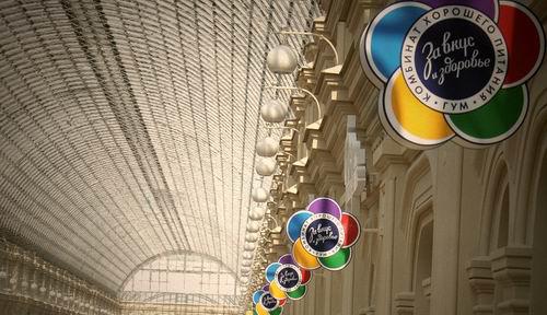
In those times, when Moscow hosted the International Youth Festival, we had such a profession - graphic designer and graphic artist, and the word "design", "corporate identity" and even "logo" No one knew. But fifty years only the names have changed, but the essence remained prezhney.GUM opened a new cafe nostalgic name "Festival" and decided to formalize it in an appropriate manner. To do this have been caused by special people - designers Nile Studio, have an inexhaustible supply of nostalgia, the knowledge of the era and modern professionalism.
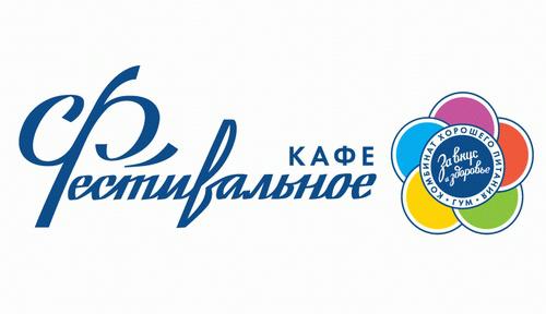
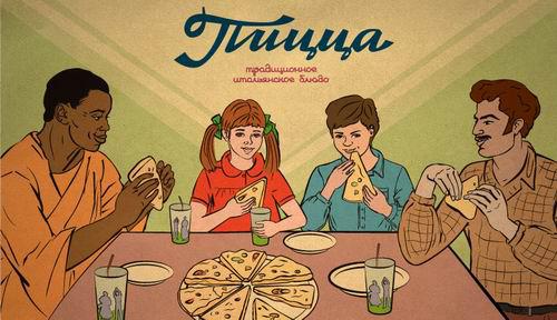
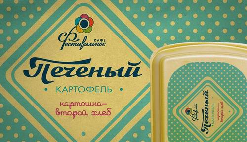
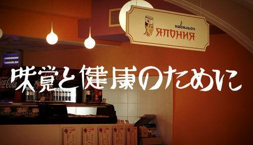
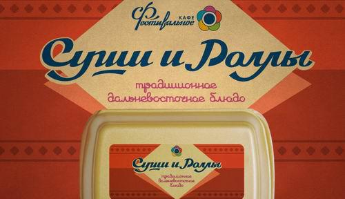
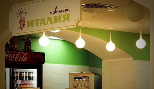
Combine good food cafe "Festival" and all three of his pavilion - "Italy", "Japan" and "Potatoes" are decorated with love and good taste.
Large-scale developments have been made to create a corporate identity. Designed logo and four four brand names - for a cafe "Festival" and three pavilions. Made registration of all products - from price tags, packages and packaging for soups, salads, desserts, sauces and drinks to posters. And the products are available in each pavilion own style. Separately for each zone is further made special packaging for branded products - pizza, sushi and rolls and potatoes.
To recreate the spirit of the age is actively used not only graphic styling, but also a clever play on the word. Almost all products are available friendly parting words - "Soup - the basis of a healthy diet", "Sweet uplifting" and sometimes a brief excursion into the national cuisine - "Tomato sauce - a favorite seasoning in the kitchens of the ranks of countries in Eastern Europe».


To ensure proper use of corporate identity has been prepared complete brand book.
via # image1299355


Gillette launches a global campaign featuring Tiger Woods, Roger Federer and Thierry Henry
Improvisation with a bra - it's not jazz