1198
Upgrading Home Screen or Apple Watch may affect iOS
More recently, we have seen the emergence of a new paradigm in the user interface Apple. Namely - saw on the presentation held in September home screen Apple Watch, which is the first ever walked away from the fundamental representation of the home screen, Apple has shown in 2007, with the first iPhone.
Apple seriously rasschityvat to watch - the company believes that it is her future. However, whether it is for the future of the home screen iOS? Let's understand whether this is so and how we all came to the conclusion that there is now.
A bit of history. B>
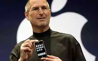
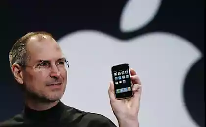
So, to understand why the iPhone home screen now looks just so and not otherwise, remember how it looked in 2007, when Apple introduced the first device c 3, 5 -inch screen. Applications then had a little party applications did not exist, and even such a small display is quite enough.
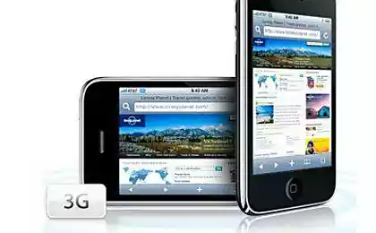
Later the same, increasing the screen size, Apple just added a number underneath. In 2010 appeared iPad, with the same home screen, only an increase in size. iPhone 5 came in 2012, brought a 4-inch display and a number added to the home screen. The same thing happened this year with the arrival of the iPhone 6 and iPhone 6 Plus.
Thus, what we have now, in 2014 - the same that was submitted in 2007, with a slightly evolve design. many arguments cited in support of the idea that this style is a bit old. And change is certainly would not hurt, but only those which have improved, supplementing what is already there. For example, what would happen if the iOS home screen would look like on the Apple Watch?
One navigation system. B>
The existing system of navigating the home screen, it is becoming less comfortable with the growing number of applications, and with the advent of floating grid applications Apple Watch altogether creates a barrier between the devices. But such a "floating" navigation looks more modern with its round icons, and she would have looked equally harmonious and 9, 7-inch iPad Air and miniature clocks.
In the center of the screen Apple Watch - Icon hours, as a kind of anchor in the sea of applications. Thus anchored in the interface iPhone could become Spotlight - Search Center, which gives you instant access to all the music, photos, applications that are on the device and out. This is the starting point, where you come back every time when you close the app or turn on the device screen.
However, there is no need every time you need to open the application, refer to the Spotlight. Honeycomb icons can be arranged in such a way that the most needed was at hand, rather, under the finger. Do not forget that the screen can be scaled, then look at the cloud applications with bird's-eye view, then zoom in as close as required. This approach, moreover, great help to people with low vision.
The organization of folders that will remain the same as before: hold the app icon and put it in the folder. That's just one thing - no more restrictions on the number of applications inside. Each folder will be a portal to a new cloud applications, organizing workspaces efficiently. On the preview folder sort flower of seven icons, but worth it on tapnut - and see everything that is inside.
Access or Reachability. B>
One of the new features associated with the new screen size of iPhone, was represented by a function Reachability, which in the Russian-language version of Apple dubbed Access < / a>. Double-clicking on the button Home, you can move the desktop for a few rows down, thus making access to applications that are at the top of the screen, more feasible. But at first glance, such a solution is somewhat soggy says maladjustment interface to work with screens of this size. The new navigation system is able to significantly improve the situation. If the application is far, it is possible to delay the cloud, or simply scroll through his swipe until the application becomes available.
Current placement applications as well suggests that the most important of them are at the top - at the very inconvenient location of the interface. At that time, as a new navigation system makes the center of attention center of the screen, concentrating there the most important and necessary, really simplifying access.
The iconography. B>
So, now redraw all the icons for the new interface, you ask? Not exactly. If you take the current iOS icons and cut them in circles, turns out just what you need.
This will greatly simplify the developer's life: at this point for the application need to draw two types of icons. Look, by the way, is also not completely wrong.
Conclusion. B>
With Apple Watch created a new UI, is not only more intuitive, but also more adaptive and flexible. Whether or not it is on iOS - show, of course, only time. But the above things will definitely make it a strong contender for the post of a new type of interface in mobile devices Apple.
What you think? B>
P.S. Below there are a free translation of the .
Source:


Superstition, confidence and development
Jump from a height of 41 kilometers, a record Baumgartner beat Google vice president