923
"The effect of empty space" or the luxury of nothing
Recently, among the myriad of material and design concepts we came across two interesting studies that covered the impact of the same effect in the retail and e-commerce.
The first study was conducted in 2005. Its author, Dimitri Mortelmans, studied the relationship between the design of the storefront and its perception of the buyer. In particular, the author points out that the high-end boutique stores and manages to create a feeling of luxury in their exposures through proper use of the empty space in the design of shop windows and showrooms.
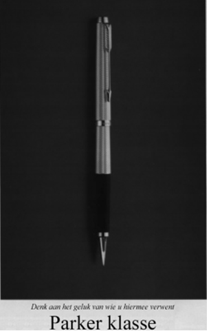
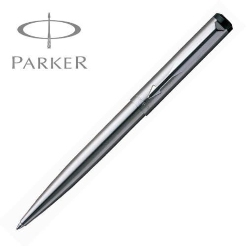
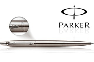
As a vivid example the author gives the concept of advertising on Parker (black and white image is taken from the description of the study, but it can be argued that Parker have kept this concept to the present day, ie for 10 years).
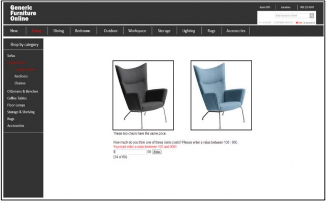
Example 1
Example 2
The second исследование It was conducted in 2013. During the experiment it was collected statistics on how the use of the empty space in the design of an online store affects the valuation of the goods by the visitor.
The experimental part
To conduct the study were invited to a team of volunteers. Some subjectivity in relation to the results cause two things:
- A small control group (108 people);
- The group was assembled from representatives of one of the social environment (students of psychology).
And if the first fact eliminates article , published in 2007, the second problem is not described by the authors.
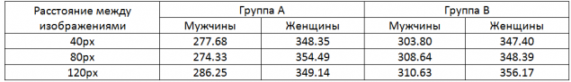
In the experiment, a group of volunteers was divided into two control groups (A and B), each of which demonstrated several models of chairs in the online store. 20 were prepared groups of images, each of which included the same model, made in various colors. The images have a size of 300x300.
Each of the 20 groups of pictures had three embodiments which differ between the images (40, 80 and 120 px). As a result, each participant in the control group was shown 60 groups of pictures.
Group A were shown two images of chairs, the total area of empty space was 754, 875 px2.
The Group has assessed the three chairs, with white background served 664, 875 px2.
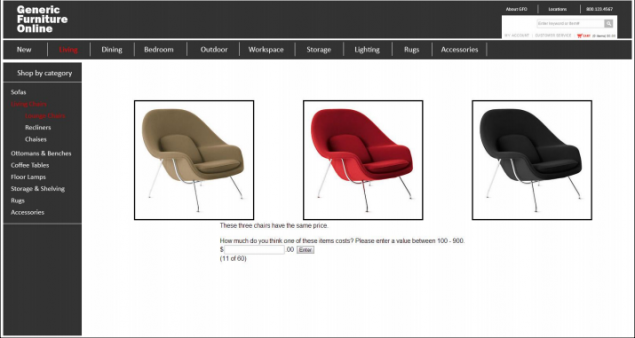
The volunteers were asked to rate the value of each model in the range from 100 to 900 dollars.
Results:
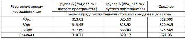
During the experiment, data were obtained on the basis of which it can be argued that there is an optimum combination of total area of white space in a design and the distance between its elements. In this case, images of furniture.
Option B with a smaller area of space exceeds Option A an average of $ 15. This suggests that excessive design creates a feeling of emptiness that the shop is empty and leads to a reduction in the subjective assessment of each individual product.
At the same time, the same models were rated higher because the space between the images. Thus the effect of increasing the 80 pixels to 120, considerably higher than the effect of 40 - 80.
It may seem that it made sense to conduct a study has at least one embodiment of the design, where the total area of the space would be smaller than in option B, but it is not. The data obtained is logical to assume that the decrease in the total area of space will reduce the indentation between objects and reduce the level evaluation of the models. The same logic eliminates the need for an experiment with large distances between objects, which will increase the total free space and decrease the number of objects that can be positioned on the screen.
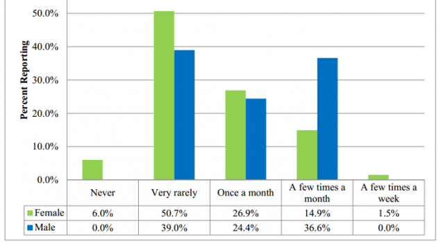
Gender refinement i>
Although some fluctuation in the "female" results, it is evident that in the embodiment the distance 120 between objects pixels is optimal. At the same time, if you do not specialize in specific products for women, it is likely that two of the three buyers will be men (the graph shows the frequency data online purchases made by the representatives of different sexes):
Conclusion:
To create a favorable environment for the product image you need to choose the optimal ratio between the total area of free space and the distance between objects. Simplistically, this ratio can be described as a medium-sized image, surrounded by margins of 100-120 pixels (about one-third the size of the image).
At the same time, unnecessary space is much greater than the area of the total area of the images, creates the effect of voids and excessive density - a sense of a flea market. Both of these factors lead to a decrease in the level of the subjective assessment of the submitted products.
Do not let your horror vacui take your money!
Source: habrahabr.ru/company/paysto/blog/228609/


"Do No Harm", or How to avoid becoming a corporation
Superbolides Nissan in 2020 the 15th anniversary of Gran Turismo