6946
12 logo, the importance of which you did not even know!
As you know, the logo is considered one of the main attributes of each company. It serves to reflect the products and services offered very same firm. For many, it's just unremarkable picture, but if you only knew how long puzzled designers to develop a proper emblem! But it turns out that very often the creation of a brand name lies the whole story.
Offer your attention to find out what secrets hide a graphics famous brands.
1. Nike
Nike - popular company that produces sports clothing and footwear. She was named after the Greek goddess of victory Nike. In 1971 designer Carolyn Davidson created the brand logo. Known arrow "Swoosh" means "sound of cutting air».
2. Adidas
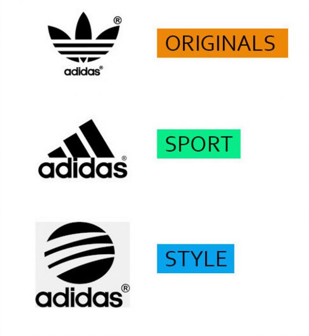
About Adidas know everything, so mention the considerable popularity of the company is not even worth it. Taking into account the fact that the name of the founder Adolf Dassler, it is easy to guess, in honor of whom referred to the German industrial group. As for the logo, the three stripes symbolize movement up the stairs, and shamrock - the three continents on which the company is present.
3. BMW
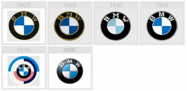
Bavarian Motor Works started its operations with aircraft production, now produces high-quality cars, motorcycles and bicycles. The first emblem adopted in 1917, depicted the rotating propeller. However, the logo was too complex and small, and in 1920 it was divided into four parts. The silver-white sector in the black steel bezel with alternating sky-blue. Take into account the fact that the blue and white - the national colors of Bavaria.
4. Hyundai
At first you might think that the symbol of the South Korean carmaker Hyundai - it's just a letter H. But look: Have you noticed a friendly seller, shaking hands with the buyer?

5. Bentley
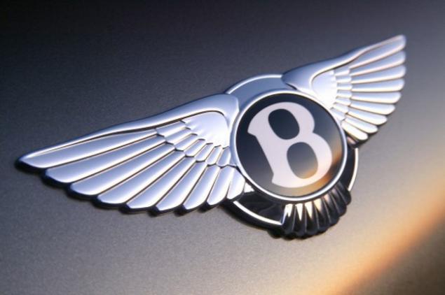
The symbol of the British carmaker has become a winged letter "B" after the surname of the company founder Walter Owen Bentley. Wings denote the strength, speed and independence. Colors also play an important role lot: green background logo assigned to racing cars, red - sophisticated black - powerful.
6. Mercedes
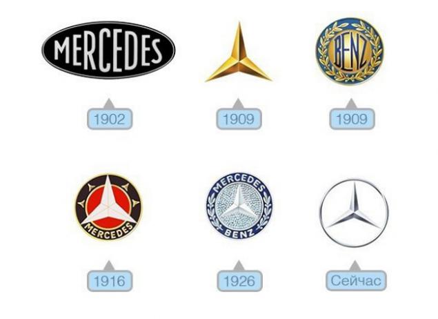
To celebrate excellence in the water, on land and in the air for Mercedes logo made in the form of a three-beam star. After the merger with Benz put the star in a laurel wreath - a symbol of victory. To simplify the laurel logo was removed, and a circle. There is another version of the origin of the logo Mercedes. The company's founders, Wilhelm Maybach, Gottlieb Daimler and called Emile Ellinek could not decide what to choose for the emblem of the brand. Daimler, for example, wanted to see on the hood of the car his portrait, and Maybach - an orange that seemed inexplicably strange. And Emil proposed to place on the hood of an elephant. He said: « Mercedes - an elephant automobile industry i>». But his colleagues did not even notice, saying the company and in honor of his daughter named Mercedes. It almost came to blows. The men took the cane and crossed them. Just at that time, I ran into the room already mentioned above, and the girl fell to her knees, the rumor: « The fate of the company in your hands i>». And they kept? That's right - crossed sticks. Doubts about the brand mark Zrazy have disappeared.
7. Armani
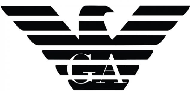
The Italian company Giorgio Armani SpA produces clothing, accessories and footwear, which are popular all over the world for many years. The inscription on the GA logo can be seen in the background of an eagle. Mighty bird symbolizes nothing else, as an homage to the United States -'s largest trading partner.
8. Trussardi
Company Trussardi - a well-known fashion house - is not only engaged in production of clothing and accessories, but also specializes in the design of bicycles, airplanes, china and fragrances. As you can see, the logo depicts greyhound dog breed, known for its vigor and beauty.
9. Vaio
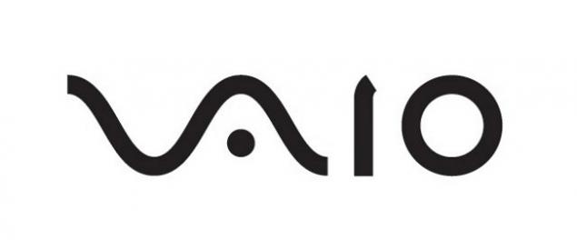
Vaio - a company, under which the World Sony brand until 2014 produced personal computers. Mark of Visual Audio Intelligence Organiser refers to the wave as a symbol of the analog signal, and the last unit to zero - a digital signal.
10. LG
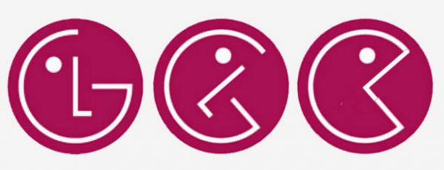
Did you know that the largest manufacturer of home appliances LG, we are constantly reminded that «Life Good» («life is good"). Two-letter symbol reminiscent of a human face, and red background color is associated with love to their customers.
11. Baskin Robbins
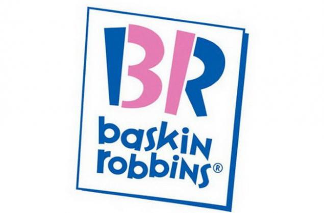
Pink part «BR» make up the number 31: There is so many flavors of ice cream Baskin Robbins.
12. Toblerone
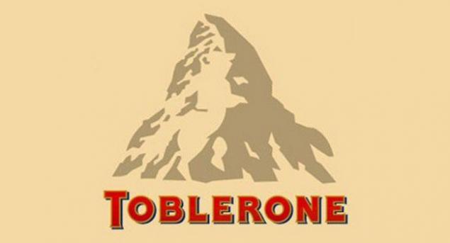
The name of the Swiss company Toblerone - chocolate manufacturer - is a combination of the names of the confectioner Tobler and the Italian word Torrone (a special type of nougat). The emblem you will notice another clumsy. Said Bern, where produce and delicacies, is also called the city bears. That is why Toblerone included in your logo silhouette of this animal.
Interesting logos there are many - they can write and write. If you also have something to tell, said on the comments previously share articles with friends. It will be interesting to find out!
via ofigenno cc
Offer your attention to find out what secrets hide a graphics famous brands.
1. Nike
Nike - popular company that produces sports clothing and footwear. She was named after the Greek goddess of victory Nike. In 1971 designer Carolyn Davidson created the brand logo. Known arrow "Swoosh" means "sound of cutting air».

2. Adidas
About Adidas know everything, so mention the considerable popularity of the company is not even worth it. Taking into account the fact that the name of the founder Adolf Dassler, it is easy to guess, in honor of whom referred to the German industrial group. As for the logo, the three stripes symbolize movement up the stairs, and shamrock - the three continents on which the company is present.

3. BMW
Bavarian Motor Works started its operations with aircraft production, now produces high-quality cars, motorcycles and bicycles. The first emblem adopted in 1917, depicted the rotating propeller. However, the logo was too complex and small, and in 1920 it was divided into four parts. The silver-white sector in the black steel bezel with alternating sky-blue. Take into account the fact that the blue and white - the national colors of Bavaria.

4. Hyundai
At first you might think that the symbol of the South Korean carmaker Hyundai - it's just a letter H. But look: Have you noticed a friendly seller, shaking hands with the buyer?

5. Bentley
The symbol of the British carmaker has become a winged letter "B" after the surname of the company founder Walter Owen Bentley. Wings denote the strength, speed and independence. Colors also play an important role lot: green background logo assigned to racing cars, red - sophisticated black - powerful.

6. Mercedes
To celebrate excellence in the water, on land and in the air for Mercedes logo made in the form of a three-beam star. After the merger with Benz put the star in a laurel wreath - a symbol of victory. To simplify the laurel logo was removed, and a circle. There is another version of the origin of the logo Mercedes. The company's founders, Wilhelm Maybach, Gottlieb Daimler and called Emile Ellinek could not decide what to choose for the emblem of the brand. Daimler, for example, wanted to see on the hood of the car his portrait, and Maybach - an orange that seemed inexplicably strange. And Emil proposed to place on the hood of an elephant. He said: « Mercedes - an elephant automobile industry i>». But his colleagues did not even notice, saying the company and in honor of his daughter named Mercedes. It almost came to blows. The men took the cane and crossed them. Just at that time, I ran into the room already mentioned above, and the girl fell to her knees, the rumor: « The fate of the company in your hands i>». And they kept? That's right - crossed sticks. Doubts about the brand mark Zrazy have disappeared.

7. Armani
The Italian company Giorgio Armani SpA produces clothing, accessories and footwear, which are popular all over the world for many years. The inscription on the GA logo can be seen in the background of an eagle. Mighty bird symbolizes nothing else, as an homage to the United States -'s largest trading partner.

8. Trussardi
Company Trussardi - a well-known fashion house - is not only engaged in production of clothing and accessories, but also specializes in the design of bicycles, airplanes, china and fragrances. As you can see, the logo depicts greyhound dog breed, known for its vigor and beauty.

9. Vaio
Vaio - a company, under which the World Sony brand until 2014 produced personal computers. Mark of Visual Audio Intelligence Organiser refers to the wave as a symbol of the analog signal, and the last unit to zero - a digital signal.

10. LG
Did you know that the largest manufacturer of home appliances LG, we are constantly reminded that «Life Good» («life is good"). Two-letter symbol reminiscent of a human face, and red background color is associated with love to their customers.

11. Baskin Robbins
Pink part «BR» make up the number 31: There is so many flavors of ice cream Baskin Robbins.

12. Toblerone
The name of the Swiss company Toblerone - chocolate manufacturer - is a combination of the names of the confectioner Tobler and the Italian word Torrone (a special type of nougat). The emblem you will notice another clumsy. Said Bern, where produce and delicacies, is also called the city bears. That is why Toblerone included in your logo silhouette of this animal.

Interesting logos there are many - they can write and write. If you also have something to tell, said on the comments previously share articles with friends. It will be interesting to find out!
via ofigenno cc
Rejuvenating Mask from the English cosmetologists. Recipe tested by dozens of generations.
Incredibly easy way to lose weight without exhausting yourself diets. An example of this guy inspiring!

