834
Pebble Time - first impressions

I quite quickly became a fan products Pebble. I bought their first watch - so soon and become, as well, very much comfortable with them. As a result, I have six months to use plastic "Pebble", then a year - Pebble Steel, and the last two weeks wore Pebble Time, which was free a > developers. Under the cut a small overview of the latest.
Frankly, the last two weeks I have not found time to sit down and thoroughly dig deeper in hours. For example, I still do not know why you can use the microphone in hours. Also, with this review, I apologize in advance if it came out a few ragged or surface.
I will not describe the look of hours, a manufacturer from the very beginning did not make any secret of it. Let me just say that even the plastic version clock front side is protected by a metal plate, and the screen - the glass Gorilla Glass. So vulnerability to scratching, as the first plastic "Pebble", apparently, forever gone. More subjectively, looks Pebble Time (especially my copy white) loses much solidity in Pebble Steel.
The strap is made of soft silicone. It is thick enough (about 3 mm) and wide (standard 22mm). Its certainly I decided to replace it, as it is magnetized and it abundantly adhere fine lint from clothing. On a white strap it looks messy.
The screen is likely to cause a lot of discussion. I went there for the benefit of the hours that he was colored? Of course, yes! Monochrome dials look a little less contrast, and with a slight yellowish tinge.
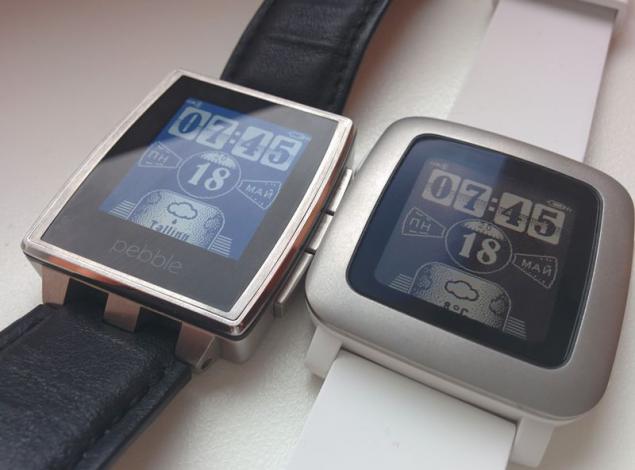
With color more and more difficult, there depends on their design. Some familiar dials me after painting turned into a vinaigrette, to look at that is not very nice. Working version of my dial (see photo in the header) for me was easy to read. In short, then it depends directly on the dials. Menu hours pleasant contrast.
Backlit screen as before can be switched off completely or by shaking or pressing the button. The brightness is low and not adjustable. At first it upset me, but later I realized that the way it should. Day backlight is not needed at all, because the screen is not "going blind" from the bright light, and vice versa (as assured developers) only becomes contrast. Therefore, the backlight is needed only when a bad light, and in these cases it lacks brightness.
It is logical to assume that for the color screen will have to pay more frequent recharging the battery, but it is not. I used to watch in a fairly intensive mode (regular notices, digging into the menu, change dials) and in six days the battery indicator shows 0. More hours worked per day, and then went into power-saving mode, in which only work lights and the screen displays Special dial (white background, in the center of the small numbers time and battery power). In this mode, the clock has not lasted for at least 6 hours. Total more than 7 days.
A full charge takes at least one and a half hours. Plug charging, as in previous models, holds a magnet, but recorded very little. By the way, now it can be put in two positions (left or right cable).
Main software "trick» Pebble Time - this timeline. He demonstrates an example of hours that "now - is the transition of the future into the past." Timeline displays the main events of the day before and the day after tomorrow to. Access to events is done by pressing the top (to the "past") and the bottom (in the 'future') buttons on the right side of hours. By default, the timeline displays the time of sunrise and sunset, weather, missed calls and events from Google Calendar. Because the timeline is available for developers who are extending the functional tape.
Since I raised the issue of the buttons, it makes sense dorasskazat and about them. Appointment of the remaining two buttons has not changed since the previous version of hours: middle button on the right - the entrance to the menu / to confirm, and the only button on the left - exit / turn on the backlight. The buttons are a bit softer than Pebble Time, which I really liked.
The watch can display all notifications that are displayed on your phone, but you can adjust (on the phone) list of allowed programs. Language notification corresponds to what is selected in the system settings of the phone. Here lies the most embarrassing moment associated with Pebble Time - hours firmware does not support Cyrillic. As a result, small squares instead of letters.
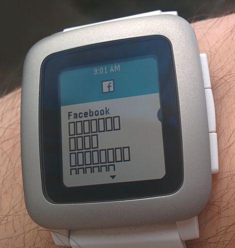
In the previous version, I decided to watch it for yourself with the application YaNC Pro, which is on the side of the phone generates a picture with the text notification and already it sends the clock. How to be turned out in such a situation, users iOS, I do not know, because there are only YaNC Pro for Android. As it turned out, YaNC Pro works perfectly with Pebble Time, as well as all other applications and dials, which I enjoyed.
In general, the clock still need to understand, but in two weeks they left a good impression. Above all pleased that the change in the Pebble Steel Pebble Time has passed for me almost imperceptibly, which means that other users will not experience discomfort.
Source: geektimes.ru/post/251166/
Dawn probe has sent new pictures of Ceres
As the Internet is not working - yellow pages instead of modern tools
