995
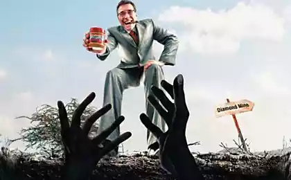
Dialogues between customers and advertisers
We have gathered the most ambiguous dialogue between customers and advertisers, letters and comments of customers.
And we offer you to share their stories.
These are the stories that tell a friend then, already at the end of the project, have fun laughing at the fact that almost destroyed the work.
Dialogues
Finished the painful process of reconciliation:
Client: All great! I do not like it, but you like?
Designer: I too, just do not tell anyone that I did it.
- Make the site to from the left corner to the right is crawling creature is green, sea snails such as, but flexible, bend. And to him he stretched tail trace of him. This trail of brown fat. And from the right corner toward him crept other being brown, but a trace of it was green.
- And that it will symbolize? (barely contained, but continued to ask counter-questions):
- Which means that our customers and our performers meet us. You know they will have to meet in the center of the page!
- And both will be meeting? Are there any preferences, ideas?
- YES! There will be an explosion of brown on the page. The explosion is painted in green and slowly subsides. From crawling under it even now being striped in brown and green stripes. And crawling in different directions.
- May not be necessary - in different directions? It targets all alone, let him move together?
- Mmm ... and perhaps you are right! They become one being red! (He raised his voice and clearly inspired ...) This is to symbolize the union of all AS IF OUR IDEAS AND FORCES! And it is being twisted, twisted like a spiral in the center of the page. It will be shown in perpetual motion - the client - we (our ideas) - performer - - the client - we (our ideas) - performer and so on
- But if it is constantly spinning, no one can read on the page ...
- Do not need! But we remember !!!
Customer (cheerfully) from behind the first designers: - Please Play fonts!
The first designer (loud to hear the second designer) - Arial!
The second designer: - Yeah, I'm on the "L" ... er ... Latter gottik!
The first designer - Kaslon! You're at the "H»!
The second designer: - New Baskerville!
The first designer - Lazurskii!
The second designer - Izhitsa!
The first designer - Again on "A" ... Academy!
The second designer: - Janus!
Customer (quietly): - Thank you, thank you! Let's leave the font as it is ...
The customer wishes to order a banner 6? 3 m. Receive e-mail image. GIF 3 × 3 cm, and a formal application, such ...
"Please make ..." etc. Text "Deputy Director Ivanov II»
I write him:
- I can not print the picture. We need another solution.
An hour later, I receive an angry letter:
"Poster Printing permission! Director General Bubino AA »
- And you designer who drew the logo, except for this pictures just do not leave? we just need to work a vector, jpg is not suitable.
- No, well, there was a file, but it does not open, and I deleted it ...
Designer delivers the job to the customer. Customer satisfaction nods, agrees with everything:
- Well, everything seems to be made!
- Well, with your 1500.
Customer, giving the money, "I hope, if then will need to to transport, you can contact? It's not so much that once made and forgotten? »
- Of course, depending on what and how to be corrected.
- Well, of course! I will not say, "Let's change everything»!
- No problem. Incidentally, another moment. And I can then, if I have suddenly run out of money or any new plans, I will return to you about a little extra? It is a trifle, I need very rarely, I think you do not complicate.
- ???
- Do not you worry! I did not come to you, they say, pay me again!
Letting layout:
- It would be bad.
- How much?
- Very bad.
- As far as "very»?
- Kick as bad. Shit rare. Marriage - 100%. Without tears will not look.
- All right, we print.
- Sign the waiver.
- Good (signs).
Letting circulation:
- (A hysterical tone of voice) Why do not you say it's so bad to be ???!
Me: I need your logo and guideline for me to develop a cap for your site according to your corporate symbolism
Customer: Okay, I will throw off you by fax!
Buyer: Our budget is $ 400, but we do not have anything easy ... you used the program Autluk?
I: Yes, of course!
Buyer: Here we need a website with the same function, plus several improvements
Designer, gathering the remnants of the will:
- Do you give yourself a report that another comment and I kill myself? !!!
The client (completely amorphous aunt):
- Stop being angry! Of course I understand! Comments will be no more! I have only the Edit ...
K: I need a design in 16.00 and second at 18.00!
D: but now 15.45 ...
K: I have sent a letter to 14.30. Once again you let us down !!!
Customer: I do not know what I want, let your designer try different options!
Manager: Work with the designer is 1500 rubles per hour.
Customer: Yes, you ohreneli! Prostitutes are cheaper!
Manager: That prostitutes different options and try!
Comments on one line
- Play around with the shape of a square
- You can make these circles More rounder?
- Really liked your idea of a black man. And you can remove the black man?
- We are very impressed with your option, it was amazing! Simply super. But redo.
- Computer graphics cheer boy
- We want to brick logo, because it solid and lime.
- We have asked for CMYK, and you sent ENP!
- I do not know what I want, I do not know what I need. But if you do - I immediately recognized.
- Listened to mother-in music for video. It is not rushing. Have PEYRELEAU!
- My wife likes blue. The receptionist, by the way, too. Change it to any more.
- Orange in the layout is not enough positive. A green looks harmless enough ...
- The current background color (blue) to change the color of clear summer sky
- Today, it looks good! Let's see how it will look tomorrow.
- I am interested in the development of a small website. It should be able to order products, pay by credit card, register, add photos and chat with friends.
- Here is just a wonderful layout, font and beautiful illustration perfectly blended. And red so bright! But let's remove the picture all the letters of the same height and write in black and white background will let them.
- You know, we really liked all of the options that you have sent. I do not know what to choose ... And can try to combine all three into one logo?
- Logo on my friend, let's do it, you will take from there. So write to the address: xxx @ mailru, and the password field of stars like was 8.
- Well, we think it should be done in the style of dreams, the same for men in the main section. Sunset on the beach, and there is a beautiful girl fly erratically. About twenty. Fly, fly ... And then hop ... and a raccoon!
- Slightly changed the-job, and instead of the image of the business center on the poster, we need the octopus, not nasty and slimy, and intelligent and knowledgeable.
Letters
Re: Fw: Re: Re: Fw: Re: Re: Fw: Re: Re: Fw: Re: Re: Fw: Re: Re: Fw: Re: Re: Fw: Re: Re: Fw:
Re: Re: Fw: Re: Re: Fw: Re: Re: Fw: Re: Re: Fw: Re: Re: Fw: Re: Re: Fw: Re: Re: Fw: Re: Re:
Fw: Re: BookletLastComments_approve1211
Good morning!
Last night it became clear in the printing that the booklet can be printed with your files, because we counted them A5 format, and you said that the a4. We were wrong, you could not alter one last time?
Sincerely,
xxxxxxx manager
This is a true story.
Thank you for layouts.
Overall, I liked.
Still quite a qualitatively.
I do not like the background. curlicues. and the color blue.
see my layouts made in any color logo ...
Look, maybe you do not cope with this task ....
Letter behind this:
Let's suspend our cooperation
The fact that I decided to make the design itself
because it is very difficult to convey to the design of executing the desired result.
I still 5 years dedicated to the design, so I have a lot of experience in this field
if you're interested, I'll send you the finished design layout
Please do not waste your time on me
And we offer you to share their stories.
These are the stories that tell a friend then, already at the end of the project, have fun laughing at the fact that almost destroyed the work.

Dialogues
Finished the painful process of reconciliation:
Client: All great! I do not like it, but you like?
Designer: I too, just do not tell anyone that I did it.
- Make the site to from the left corner to the right is crawling creature is green, sea snails such as, but flexible, bend. And to him he stretched tail trace of him. This trail of brown fat. And from the right corner toward him crept other being brown, but a trace of it was green.
- And that it will symbolize? (barely contained, but continued to ask counter-questions):
- Which means that our customers and our performers meet us. You know they will have to meet in the center of the page!
- And both will be meeting? Are there any preferences, ideas?
- YES! There will be an explosion of brown on the page. The explosion is painted in green and slowly subsides. From crawling under it even now being striped in brown and green stripes. And crawling in different directions.
- May not be necessary - in different directions? It targets all alone, let him move together?
- Mmm ... and perhaps you are right! They become one being red! (He raised his voice and clearly inspired ...) This is to symbolize the union of all AS IF OUR IDEAS AND FORCES! And it is being twisted, twisted like a spiral in the center of the page. It will be shown in perpetual motion - the client - we (our ideas) - performer - - the client - we (our ideas) - performer and so on
- But if it is constantly spinning, no one can read on the page ...
- Do not need! But we remember !!!
Customer (cheerfully) from behind the first designers: - Please Play fonts!
The first designer (loud to hear the second designer) - Arial!
The second designer: - Yeah, I'm on the "L" ... er ... Latter gottik!
The first designer - Kaslon! You're at the "H»!
The second designer: - New Baskerville!
The first designer - Lazurskii!
The second designer - Izhitsa!
The first designer - Again on "A" ... Academy!
The second designer: - Janus!
Customer (quietly): - Thank you, thank you! Let's leave the font as it is ...
The customer wishes to order a banner 6? 3 m. Receive e-mail image. GIF 3 × 3 cm, and a formal application, such ...
"Please make ..." etc. Text "Deputy Director Ivanov II»
I write him:
- I can not print the picture. We need another solution.
An hour later, I receive an angry letter:
"Poster Printing permission! Director General Bubino AA »
- And you designer who drew the logo, except for this pictures just do not leave? we just need to work a vector, jpg is not suitable.
- No, well, there was a file, but it does not open, and I deleted it ...
Designer delivers the job to the customer. Customer satisfaction nods, agrees with everything:
- Well, everything seems to be made!
- Well, with your 1500.
Customer, giving the money, "I hope, if then will need to to transport, you can contact? It's not so much that once made and forgotten? »
- Of course, depending on what and how to be corrected.
- Well, of course! I will not say, "Let's change everything»!
- No problem. Incidentally, another moment. And I can then, if I have suddenly run out of money or any new plans, I will return to you about a little extra? It is a trifle, I need very rarely, I think you do not complicate.
- ???
- Do not you worry! I did not come to you, they say, pay me again!
Letting layout:
- It would be bad.
- How much?
- Very bad.
- As far as "very»?
- Kick as bad. Shit rare. Marriage - 100%. Without tears will not look.
- All right, we print.
- Sign the waiver.
- Good (signs).
Letting circulation:
- (A hysterical tone of voice) Why do not you say it's so bad to be ???!
Me: I need your logo and guideline for me to develop a cap for your site according to your corporate symbolism
Customer: Okay, I will throw off you by fax!
Buyer: Our budget is $ 400, but we do not have anything easy ... you used the program Autluk?
I: Yes, of course!
Buyer: Here we need a website with the same function, plus several improvements
Designer, gathering the remnants of the will:
- Do you give yourself a report that another comment and I kill myself? !!!
The client (completely amorphous aunt):
- Stop being angry! Of course I understand! Comments will be no more! I have only the Edit ...
K: I need a design in 16.00 and second at 18.00!
D: but now 15.45 ...
K: I have sent a letter to 14.30. Once again you let us down !!!
Customer: I do not know what I want, let your designer try different options!
Manager: Work with the designer is 1500 rubles per hour.
Customer: Yes, you ohreneli! Prostitutes are cheaper!
Manager: That prostitutes different options and try!
Comments on one line
- Play around with the shape of a square
- You can make these circles More rounder?
- Really liked your idea of a black man. And you can remove the black man?
- We are very impressed with your option, it was amazing! Simply super. But redo.
- Computer graphics cheer boy
- We want to brick logo, because it solid and lime.
- We have asked for CMYK, and you sent ENP!
- I do not know what I want, I do not know what I need. But if you do - I immediately recognized.
- Listened to mother-in music for video. It is not rushing. Have PEYRELEAU!
- My wife likes blue. The receptionist, by the way, too. Change it to any more.
- Orange in the layout is not enough positive. A green looks harmless enough ...
- The current background color (blue) to change the color of clear summer sky
- Today, it looks good! Let's see how it will look tomorrow.
- I am interested in the development of a small website. It should be able to order products, pay by credit card, register, add photos and chat with friends.
- Here is just a wonderful layout, font and beautiful illustration perfectly blended. And red so bright! But let's remove the picture all the letters of the same height and write in black and white background will let them.
- You know, we really liked all of the options that you have sent. I do not know what to choose ... And can try to combine all three into one logo?
- Logo on my friend, let's do it, you will take from there. So write to the address: xxx @ mailru, and the password field of stars like was 8.
- Well, we think it should be done in the style of dreams, the same for men in the main section. Sunset on the beach, and there is a beautiful girl fly erratically. About twenty. Fly, fly ... And then hop ... and a raccoon!
- Slightly changed the-job, and instead of the image of the business center on the poster, we need the octopus, not nasty and slimy, and intelligent and knowledgeable.
Letters
Re: Fw: Re: Re: Fw: Re: Re: Fw: Re: Re: Fw: Re: Re: Fw: Re: Re: Fw: Re: Re: Fw: Re: Re: Fw:
Re: Re: Fw: Re: Re: Fw: Re: Re: Fw: Re: Re: Fw: Re: Re: Fw: Re: Re: Fw: Re: Re: Fw: Re: Re:
Fw: Re: BookletLastComments_approve1211
Good morning!
Last night it became clear in the printing that the booklet can be printed with your files, because we counted them A5 format, and you said that the a4. We were wrong, you could not alter one last time?
Sincerely,
xxxxxxx manager
This is a true story.
Thank you for layouts.
Overall, I liked.
Still quite a qualitatively.
I do not like the background. curlicues. and the color blue.
see my layouts made in any color logo ...
Look, maybe you do not cope with this task ....
Letter behind this:
Let's suspend our cooperation
The fact that I decided to make the design itself
because it is very difficult to convey to the design of executing the desired result.
I still 5 years dedicated to the design, so I have a lot of experience in this field
if you're interested, I'll send you the finished design layout
Please do not waste your time on me