153
Failures in repair, from which the designer wants to howl
Only those who have experienced the repair themselves and all its components can confidently talk about how difficult this case is. It is not without reason that repairs and divorce can sometimes bring. And it is true that there are a huge number of aspects to watch out for, irresponsible workers, the desire to save money. Only a stress-resistant person can withstand this, right? Today we want to simplify your future repairs a little bit by telling you about common, but very unobvious mistakes. Round sink, separate bathtub and much more...
So, let’s start with the kitchen and those mistakes that can be made during its design. Round kitchen sinks They were quite popular before. They look more cozy than square ones, but this is a completely impractical option. In a square wash, much more dishes are placed, and it is in principle more convenient in everyday life.
View this post on Instagram
A post shared by Kitchens of Instagram (@kitchens_of_insta)
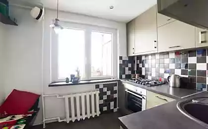
Another mistake when repairing is choosing dark matte furniture. Dark furniture in principle is suitable only for a large kitchen. After all, only in this case it will not visually narrow the space. In small kitchens, light furniture under a tree will look best. This is a neutral option that will definitely not start to annoy you over time.
View this post on Instagram
A post shared by Kitchen design ideas (@loft_kitchens)
Natural wood countertops are not only expensive, but also very impractical. Even if you are very careful, you can easily scratch the surface. Humidity also plays a big role. And behind such a countertop you need an eye and an eye: it is desirable to treat with special compositions, and not only this.
View this post on Instagram
A post shared by Kitchens of Instagram (@kitchens_of_insta)
Open shelves we often see in all loft-style. Yes, the shelves are really quite photogenic. That's just to build there constantly dishes you get tired in a week, and how much dust accumulates! No open shelves.
View this post on Instagram
A post shared by Kitchens of Instagram (@kitchens_of_insta)
I do not recommend installing in the kitchen on the walls. too-bright. This trend of the late 90s was especially beloved: red huge poppies on the entire apron above the working surface. Again, it looks great in the photos, but in life it looks too catchy and screaming. But this is not a picture that can be quickly removed or replaced by another.
From the kitchen gradually move to the bathroom. Here, too, you need to pay attention to several important details. Like switches. Under no circumstances should you install fan and light on one switch. Believe me, you don't need this constant noise at all, especially if you're not a fan of hot baths.
View this post on Instagram
A post shared by Triangle Tile & Stone of NC (@triangletileandstoneofnc)
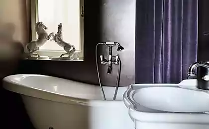
Many ladies have long dreamed of a beautiful bath, which is installed separately. It seems very convenient, but it is not quite so. Water from such a bath is constantly poured onto the floor, and it is expensive to clean around it.
View this post on Instagram
A post shared by Interior & Design (@indoorsgram)
The flat surfaces of the cranes are a mess. Water does not flow from them, but turns into a raid. You need to wash these faucets every day.
Don’t forget that the switch should also be pen-sideNot from the side of the door hinges. Forgetting about this feature, you risk constant discomfort, especially in the dark.
View this post on Instagram
A post shared by Prospect Refuge Studio (@prospectrefuge)
The last recommendation from our website concerns the installation of doors. A lot of people are confused. door-piece without any stained glass inserts. Do not listen to your instincts in this case. Through glass inserts in doors often penetrates light, which can interfere with those who are in another room.
View this post on Instagram
A post shared by @ourcosyhome
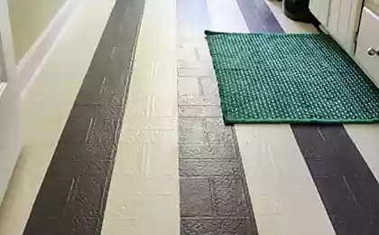
It's not worth installing. flooring. It is much better visible dirt, hair and hair. This applies not only to the floor, but also to furniture. It is not surprising that the owners of apartments decorated in a dark palette, constantly tormented and endlessly wipe the dust.
Annual marathon of New Year's films, complemented by new masterpieces
The way to prepare tomatoes for the winter without salt, spices, vinegar and dill


