Why palette of modern films orange-blue
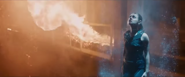
Jupiter Rising (2015) i>
Maybe you have not noticed, but over the past 20 years in Hollywood has developed a steady course on the orange-blue palette images. This scheme is also known as "orange and teal" or "amber and green-blue." Do not believe me? Let's check. I warn you once - after seeing razvidet it will not succeed, you will notice this palette anywhere.
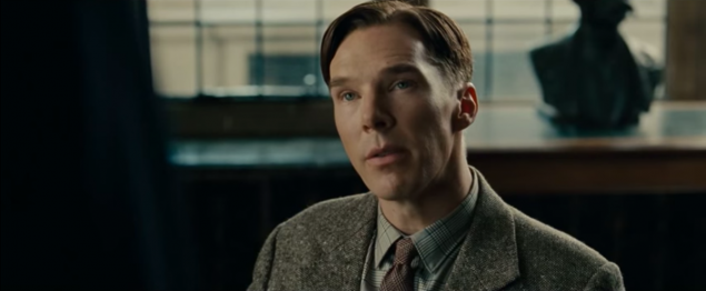
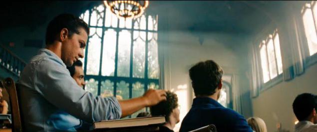
The Imitation Game (2014) i>
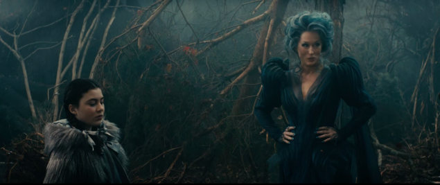
Into the Woods (2014) i>
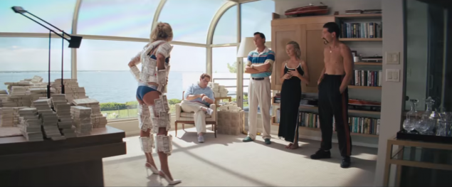
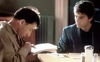
The Wolf of Wall Street (2013) i>
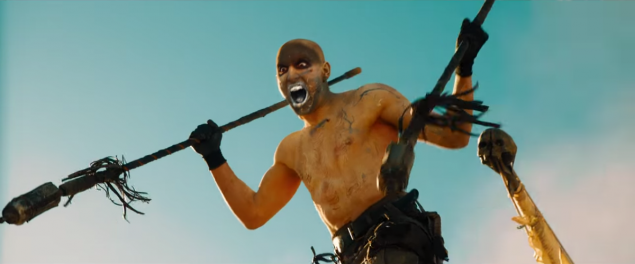
Mad Max (2015) (a little more yellow than the previous examples, but nonetheless) i>
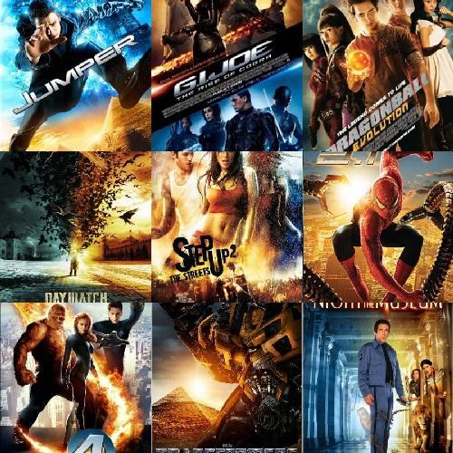
And, of course, do not forget about advertising posters. They have to be bright and flashy, so their intensity is stronger - but the same palette.
Yes, this palette can be noticed in each stage of each film is not. Some directors prefer the original color scheme. But the rest tend to be orange and blue. One blogger, after analyzing the 2013 palette trailers, brought the following scheme:
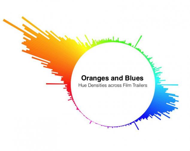
Edmund Helmer - analysis of movie trailers in 2013 i>
Digital Coloring h4> 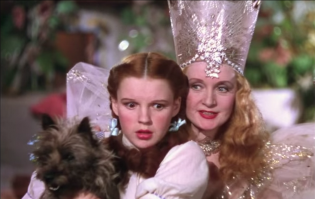
The Wizard of Oz precedes trend i>
What's the matter? Before color film depended only on the shooting conditions and the use of color filters cameras because all the films were shot on film. Repaint the result could only be modal.
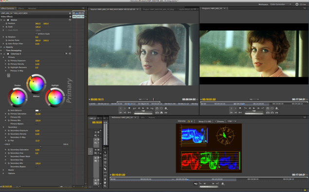
Now, all movies are shot on digital cameras, and is fairly easy to adjust the image to any desired look. But it will still need to do specifically. And if the result will be bad, then you will have problems.
As an example of a strong post-processing often lead movie O 'Brother Where Art Thou (2000). Coen brothers wanted to make it look retrograde, so the entire movie is made in sepia. The operator said: "They needed the film to look like a grown old picture, where the intensity of the color is determined by the scene, and skin tones would be all colors».
But as we have moved from a rainbow of colors to orange?
Modern means of working with video allow us to apply a color scheme to multiple scenes at once. The more movie scenes will look good with the same scheme, the less you will have a job. In addition, if the filmmakers reduce the number of different formats into one movie a movie, use the same color scheme binds them together.
One way to find a good picture - to establish a common denominator of most scenes. And so it turns out that most of the scenes involved actors. And the actors - it's usually the people. And the people - they are orange (well, almost). Most skin tones fall into the gap from pale peach to dark brown, which leaves them in an orange segment of any color chart. A blue and cyan are located at the opposite end of the circuit.
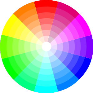
You may have heard that a pair of opposite colors complement each other. That is, being together, they create a good color contrast - more than any other color. And usually we are making it a good contrast.
Therefore, the theory of the origin of the trend says the following: if you make a color cast as much as possible and warm orange and background colors - blue as much as possible, you will have a very contrasting picture and complementary colors. According to Дэн Seytts site Cracked :


This is not necessarily a question of laziness. Specialist in color should handle a two-hour movie, sometimes frame by frame, for about two weeks. Do not need too often ignore the deadline, hanging on the calendar to throw up your hands and say, "Yes, to hell with it, everyone loves blue with orange!». Blockquote>
Each film his own kind h4>
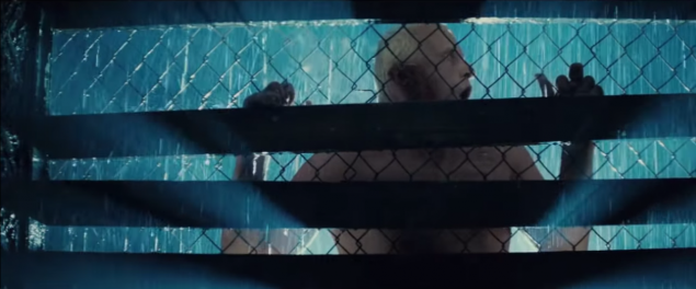
Blade Runner. Blue with orange before it became a trend i>
In general, this is just a theory. Although this color scheme has become popular in recent years, before she, too, was used. Resource TV Trope notes:
Unlike other pairs of complementary colors, fiery orange and cool blue associated with opposing concepts: fire and ice, earth and sky, land and sea, day and night, humanism and indifference, explosions and futuristic views. This method of strengthening the image is used because it is worth it. Blockquote>
It makes sense or not, but now this method coloring films became generally accepted. However, experts say the color Stefan Sonnenfeld : «Not there is a special process for choosing a color palette in which we would sit in the room and said: "We will only use these complementary colors to produce a certain impression on the viewer." Each film his own kind. »
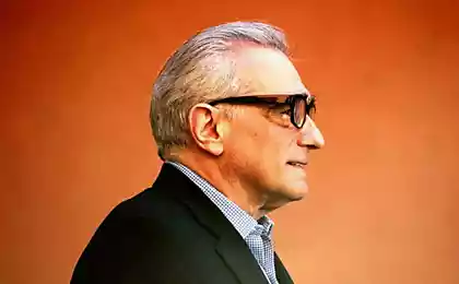
Sonnenfeld known work on some of the most spectacular and some of the orange and blue movies the last 15 years: a series of "Transformers».
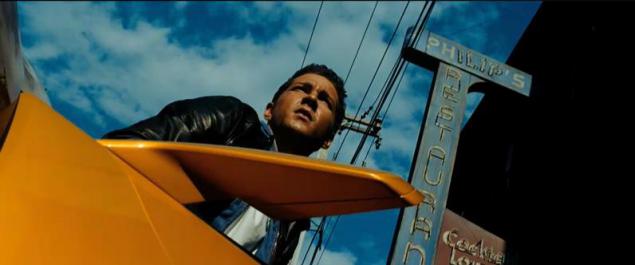
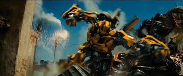
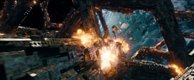
"Transformers" is so orange and blue that one команда researchers , worked on the automatic algorithm coloring, took their palette as one of the main. Their algorithm allows to color video in any of the palettes taken from any movie:
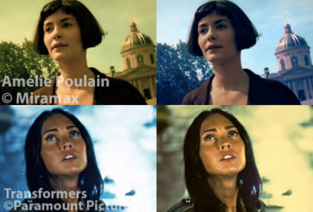
Top - "Amelie", painted in a palette of Transformers. Below - "Transformers", painted in a palette of "Amelie». I>
The method is not fully automatic, you need to choose where in the image background, and where - the foreground. But the results are impressive anyway.
As technology advances, we can see the color-coding the new trends in the selection of palettes. And yet - look and notice the orange and blue.
Source: geektimes.ru/post/245102/