1016
Interfaces in the real world
IT-interfaces often grow from the physical. For example, here is the hardware checkboxes:
Generally, the best example is the correct engineering interface - a faceted glass
Why? Very simple. On the one hand, he is friendly to the Soviet robots: round the upper band allows an automatic car wash to grope him since the 40s. On the other hand, he forgives human error: rib stop slide glass from the table in the fall. Plus he's just beautiful.
I'll show you a few more interfaces that make life easier. Common sense - try understand how developers think , to do something more convenient.
But let's start with the bad example. One of the most ugly IT-interfaces I've ever seen - this disc packaging. Three use it will be covered in fingerprints, scratched or even remain without an envelope.
Now affordans
So, usually IT-interfaces used some objects from the real world for the construction of metaphors. Well, sort of half-open door on the exit button and so on. Solvable problem - the transfer of experience from the familiar in an unfamiliar area.
Here is an example of how well the old experience is transferred to the training. Here it is important to teach the user to open the bag in place (ie, orient it correctly):
Well, at the same time good publicity, right?
There is a reverse process. Appstore icons quite well recorded in reality.
Never thought I'd see how selling icons, but no, that's the same.
It is worth mentioning bag of sugar
Another great example of prejudice - a container for hot food and salads. Plastic such transparent. Again, engineers have come up with to make ears, so you can easily grab hold of them and lift the lid, not vykolupyvaya her nails. The first implementation was not the best - one ear and one on Bags need to cover. It was assumed that when closing tabs do not coincide. Clearly, all of them covered one-to-one. Because it looks so neat. Here's the next level of evolution of these tabs:
Now fucking package , which does not want to open. He simply pressed stack so that it becomes difficult to divide the layers. The engineer came up with print "oblique" packets when one layer shorter than the other:
This is the perfect solution. But when we started to order their own packages for retail five years ago, it became clear that another fine man with IT-education (chemist), too long ago came up with a polymer that takes and does not stick. Just do not stick together and everything. Now when chemists tell me about the architectural features of the perceptron for polymers miscalculation, I do not ask questions. I fingered packages.
Generally, packages - is the clearest example of the struggle interface manufacturer, client interface and human greed. You see here these?
I am sure that the stores that use them every day of hell loses a lot of money just because of the fact that there are situations, "Oh, apples. Take a couple of ... well, not the same package must be razleplyat. " It was possible to buy a package which is easily disengaged. Others can be used. But no, keep awkward interface.
Come on. Cans illustrate insertion tool for working with the object in the object itself. Without this key must be sought opener (and some of them are very trivial for training), or try to open a can of improvised means. We opened their knives, bricks, axes, and once even a spoon. Cost to build a tool in itself a bank - and everything has become much more convenient:
But spoon, going along with the yogurt. I was incredibly happy when she found. Manufacturer, I think, too, because now you can eat yogurt in the park. You do not have to carry a tool for this. Sales probably rose.
And it is - one of the most interesting pieces.
In the twenty-first century, the cost of producing such a "nipple" is not much higher than conventional tubes. We had just the second time to think and do. As long as you do not try this milk, the difference is not clear - but then the usual tube directly perceptible scratches language. It would be difficult to come up with such users asking "what you improve?».
The following case - an example of solving the same problem in different ways. Sometimes good buy bread sliced. We sell pre-sliced bread, which is worth more than a ruble or two. In Europe and Africa are almost everywhere here are slicers. There can shove anything. Something tells me that this is a better solution:
And one more example. Here is the "toilet" is also met in the Norwegian store:
If you pay the bills, then the cashier presses a button on the box office with her image. At the bottom tray "toilet" falls putting coins. If you pay with coins - you just throw them on top. Device them carefully sorted and counted. Insanely saves time at the box office and just happy.
In the milk ducts, and these devices have in common - they are, at first glance, it does not need an ordinary person, but it is worth to use them as a sense of delight. And yes, we have a history, too, was one such a strange thing. We were a man came and brought blankets with sleeves. "Weird" - we thought the chorus. But no, they're not uporolis, and really found the need. When that evening I was sitting with a tablet and mёrz (was such a beautiful rainy day in Moscow, when it became sharply cold), it was really cold hands. I used to be simply wrapped in a blanket smarter, but this is not a good man made me want to buy.
He left a few pieces - and we tested them on living people on Toy Library.
Take away the blankets from living people, even just after the photograph was incredibly difficult. As a result, we put them on sale. At this point, the manufacturer brought a blanket with sleeves 4 - for two. And this thing, it seems to me, shoot - couples will not have to share the tuck. At least, when I thought about the gift for a wedding, it worked.
But we go further. Here's another example of a necessary requirements
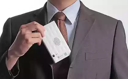
This cellular modem, which distributes around Wi-Fi. It needs to be constantly rassharivat guests or passengers of the bus, so it is written password. If you've seen Yota Many, then you know that there is this problem solved switch "included - off - the network without a password." However, flimsy, but the idea is excellent.
And finally, a beautiful (probably the most successful work to increase the speed of object recognition) and low-tech example of this display of Samarkand.
Yes, in order to distinguish spices in the market spices in them stuck sample source.
But the combination of IT and thoughtful approach. The implementation stage
One common place, which is divided into 20 banks. On leaving the zone banks - a number to which to go. No problems slower side line, easily razloginivat cashiers without stress for those who are waiting for (just do not send to the queue), always the average waiting time even if the front passenger with a huge basket, there are no problems with sudden problem in your "tail". And one steep climb check the checkout area where you can cool and incredibly tasty shell out all that is usually put on a small patch about individual banks. Unambiguous profit for the store and for the people in it.
Source: habrahabr.ru/company/mosigra/blog/232505/
The first step to smart home and remote control home appliances
Gіmn Ukraine on Arenі Lviv. Okean Elzy - breathtaking!
