1121
Rebranding Police: changes which awaited
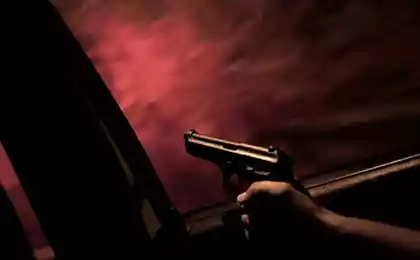
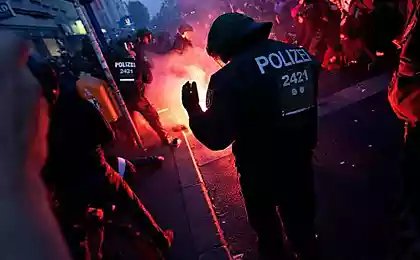
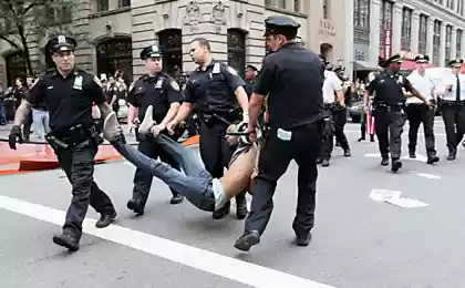
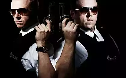
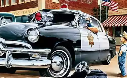
Reform of the Ministry of Internal Affairs and renaming of the police officers have generated a lot of discussion about the absence of visible changes. The former image and symbolism inherited from the Russian police are not suitable for the newly created structure. The study was conducted from February to March 2011 showed that the Russians have extremely negative attitude to the ongoing reform. It became clear that there is a need of radical changes in the ideological and communication sectors of law enforcement agencies.
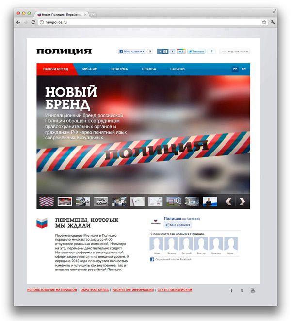
The new brand
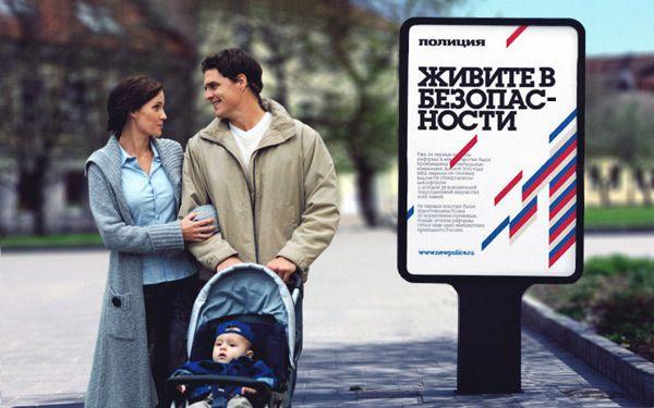
In autumn 2011 the event started to build a new innovative brand of Russian police. Brand turned both inward (law enforcement officials) and externally (public, the citizens of the Russian Federation) through the clear language of contemporary visual communication. In the new way of the public authority is not distancing itself from society, it is open, transparent and friendly. Modern police intended to be a model in everything: in the home, on the street, in his actions, in appearance, be highly cultured man.
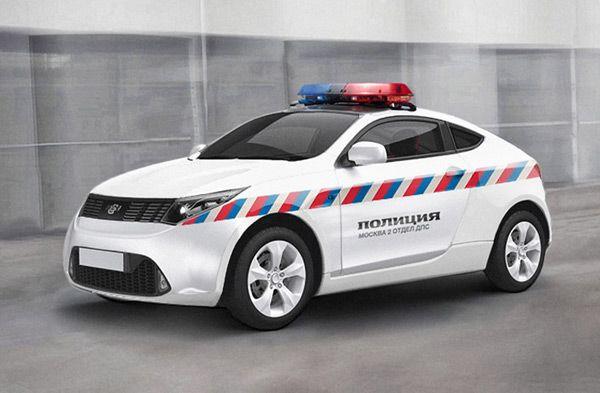
Style
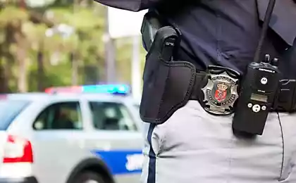
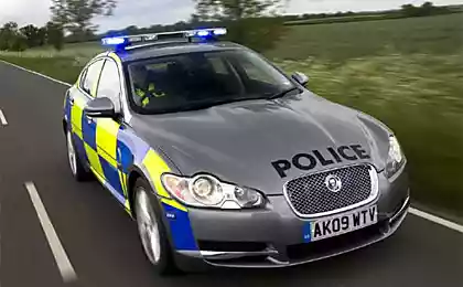
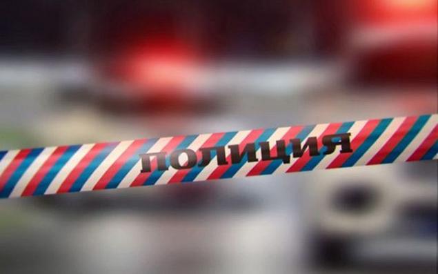
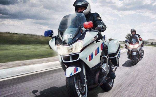
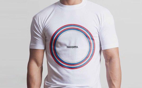
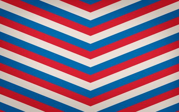
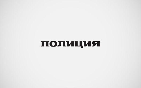
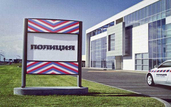
The main symbol of the changes in the Police becomes a new style. Modern, bright rhythmic pattern created on the basis of the Russian tricolor, identifies vehicles and police uniforms in the environment and can be transformed by a variety of carriers without losing awareness. The word "police" typed characters and is supported by a unique sign of the chevron symbol, putting on the uniform sleeves employees.
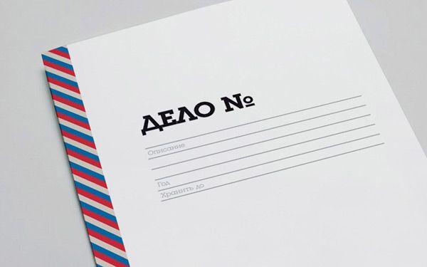
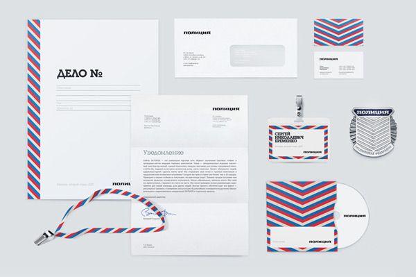

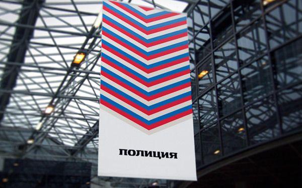
All branches of the new Police should be transparent - a symbol of openness and direct evidence of the Company.
To date, the event rebranding Police are in the process of implementation and will be completed by mid-2012. This process should be an incentive for positive change in society and the impact on strengthening the positive image of Russia as a whole.
Source: ru-designer.livejournal.com

The new brand
In autumn 2011 the event started to build a new innovative brand of Russian police. Brand turned both inward (law enforcement officials) and externally (public, the citizens of the Russian Federation) through the clear language of contemporary visual communication. In the new way of the public authority is not distancing itself from society, it is open, transparent and friendly. Modern police intended to be a model in everything: in the home, on the street, in his actions, in appearance, be highly cultured man.


Style
The main symbol of the changes in the Police becomes a new style. Modern, bright rhythmic pattern created on the basis of the Russian tricolor, identifies vehicles and police uniforms in the environment and can be transformed by a variety of carriers without losing awareness. The word "police" typed characters and is supported by a unique sign of the chevron symbol, putting on the uniform sleeves employees.


All branches of the new Police should be transparent - a symbol of openness and direct evidence of the Company.
To date, the event rebranding Police are in the process of implementation and will be completed by mid-2012. This process should be an incentive for positive change in society and the impact on strengthening the positive image of Russia as a whole.

Source: ru-designer.livejournal.com