1264
The opening of new subway stations
In the Moscow subway opened three new stations, all of them made in the same manner to the standard design.
We can not say that this is something new and fantastic, but overall not bad happened.
Let's see how to look like 183, 184 and 185 stations of Moscow subway.
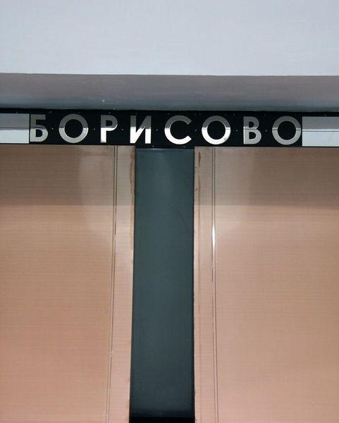
Let's start from the station Borisov.
Lobbies
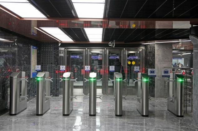
In the spirit of the new stations. Lovely and faceless
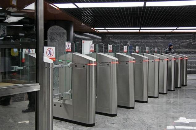
Feature three stations: you can observe the transition from the escalator
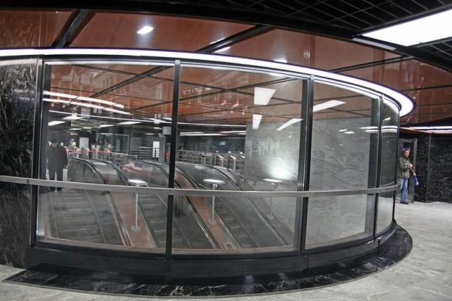
Or vice versa: for insurances
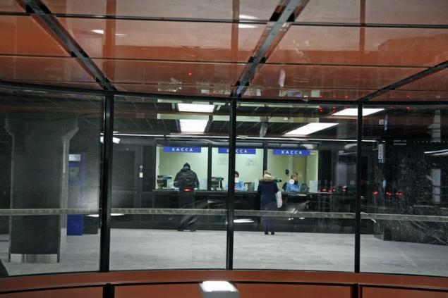
One of the entrances
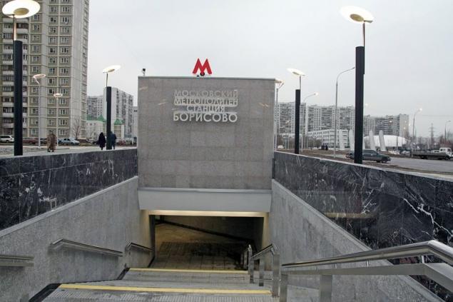
Branded intakes of new stations. Not nice for my taste. Although honestly, neighborhood outlets also somehow not good. Typical Moscow suburb
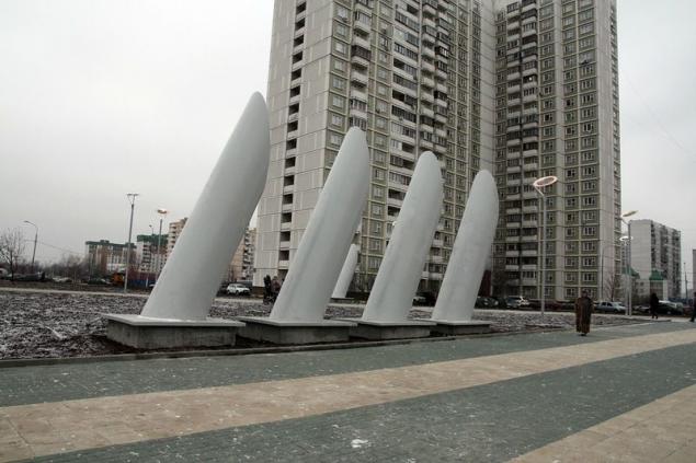
Now we can return to the station. Technical Nadeskalatorny balcony
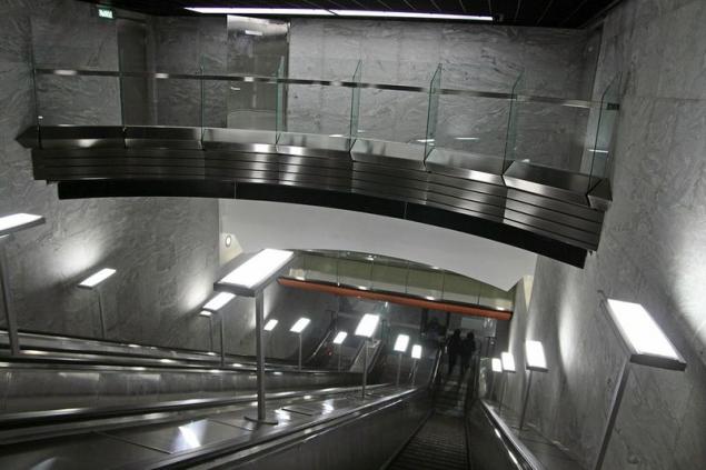
Towards "Shipilovskaya»
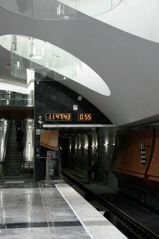
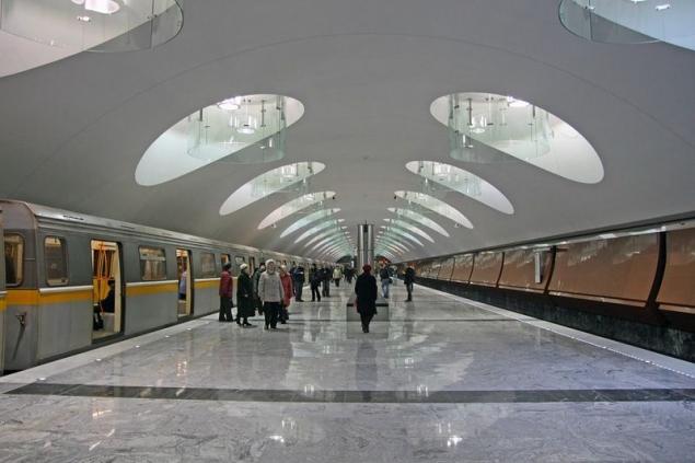
Doubtful design course very pleasant station - weird "glass" lamps
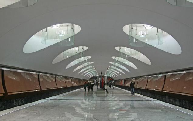
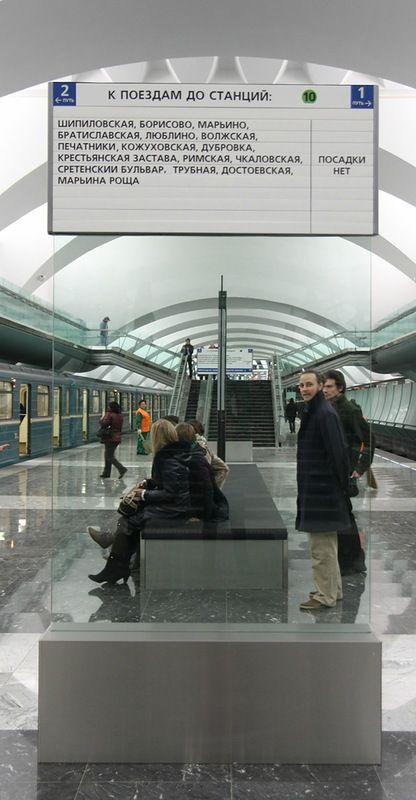
In general, the same elements of Plexiglas are present in the design of all three stations. This individual racks ukazatelemi
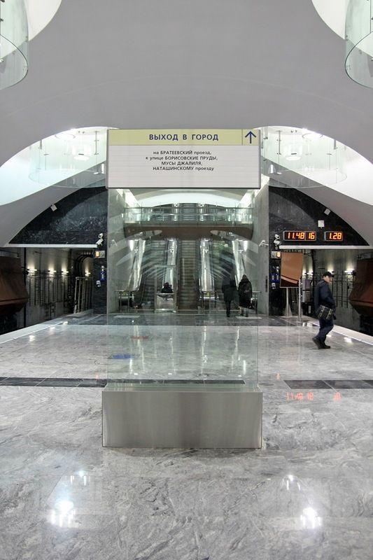
And combined with their extensive bench
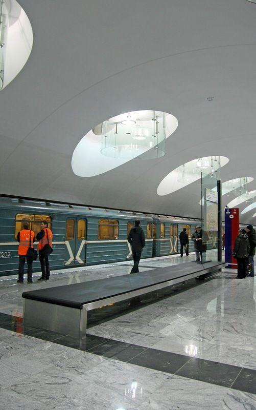
The youngest branch is growing before our eyes. Five stations over two years
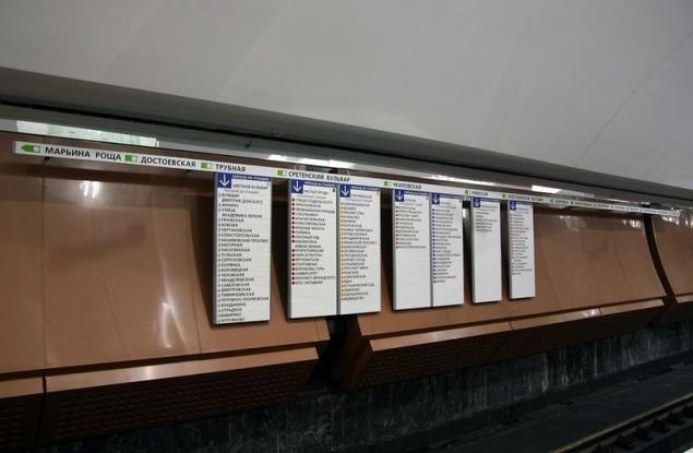
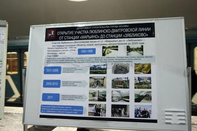
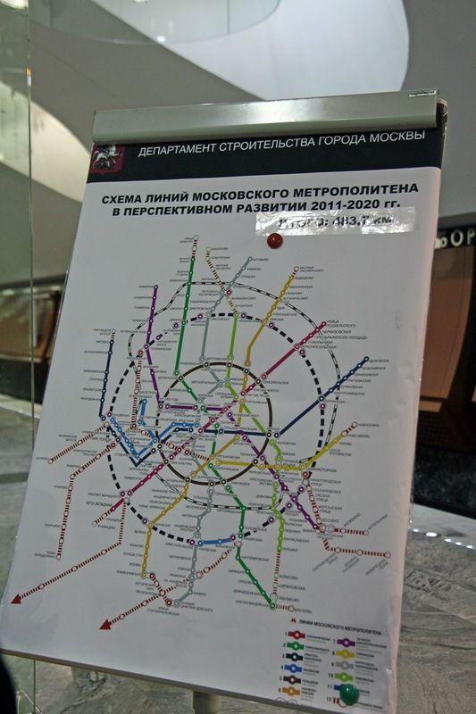
At the station, as always, I was a table with a book review and stands devoted to the further development of metro
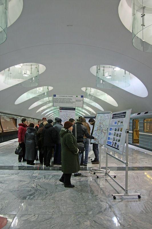
Opened portion
And plans for ten years
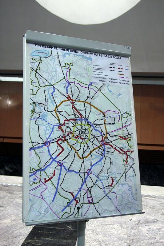
Quite fantastic, if you imagine the amount of planned work and compare the existing rates of construction
Without the glasses do really well, and the brownish wall design looks quite
Escalators and elevators
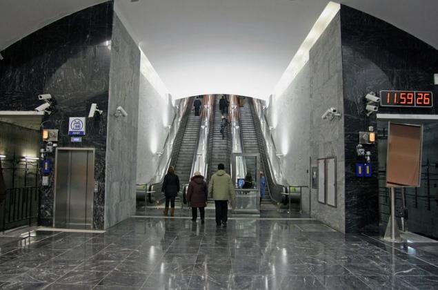
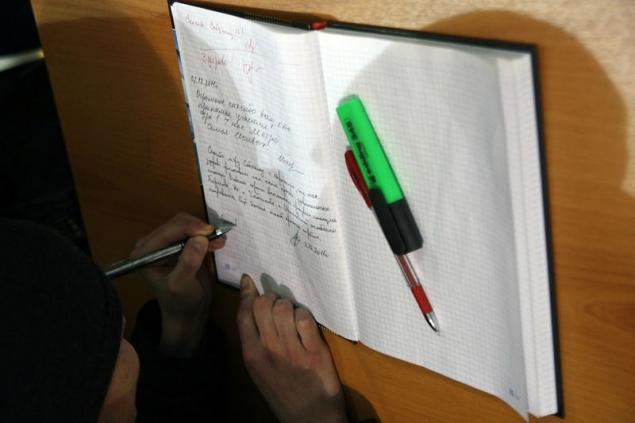
Turn to the book was great, I decided the time it does not lose
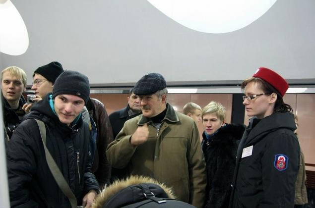
And I flipped a page. All thanks :) Personally Sobyanin also
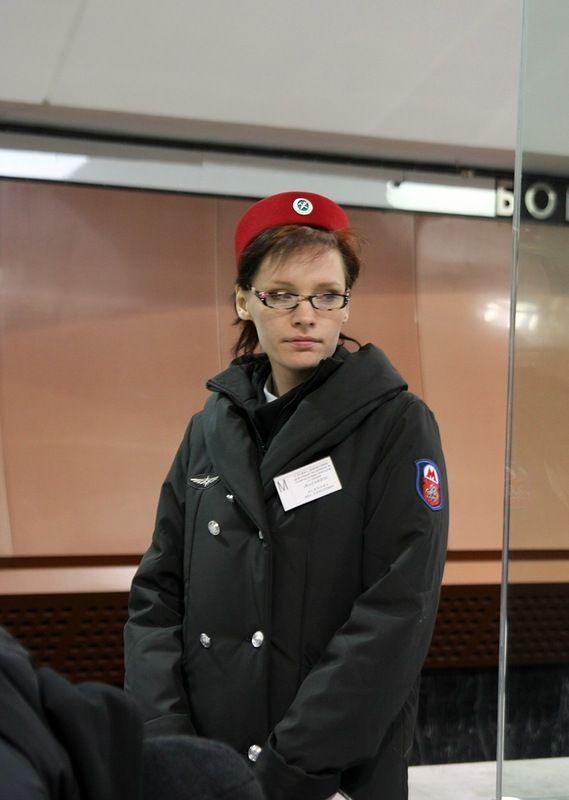
An employee with a badge "Marino» :)
Let's last
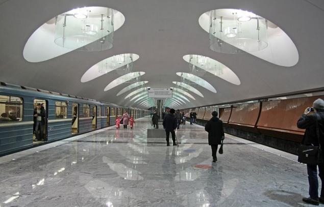
And go to "Shipilovsky" blessing came 6K, which I still have not been able to visit
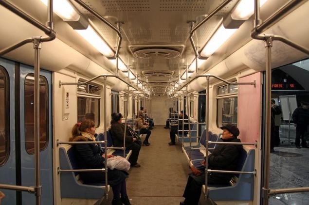
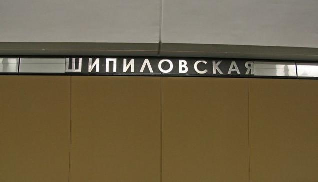
Also start with the lobby while he here alone, but promise to open a second outlet soon
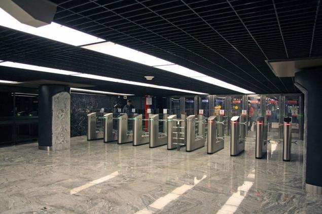
Machines work, though for how long? We've put a couple of weeks ago, but I included until they saw
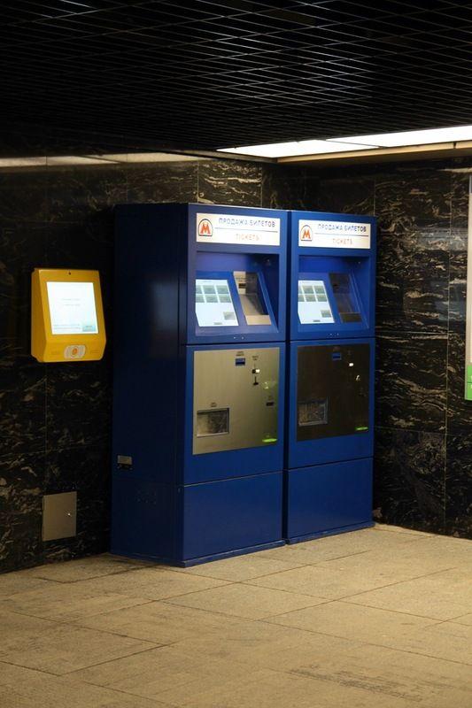
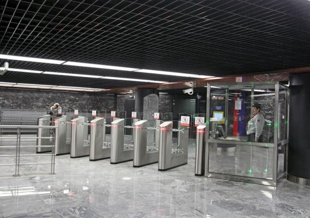
Such is the way
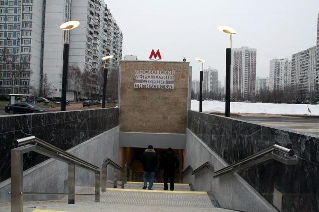
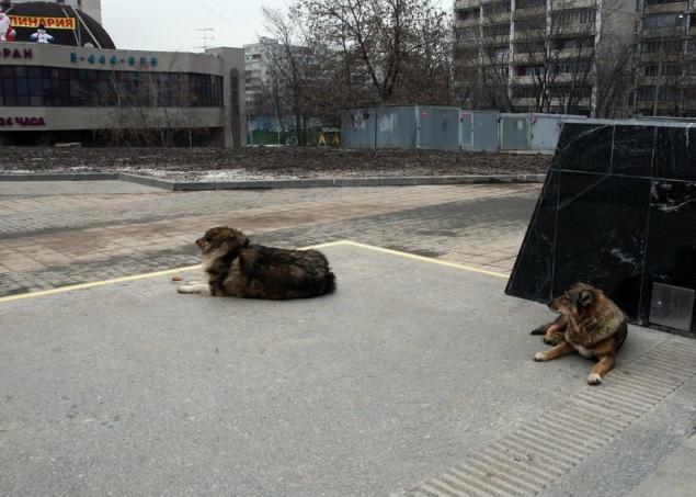
Only with guards
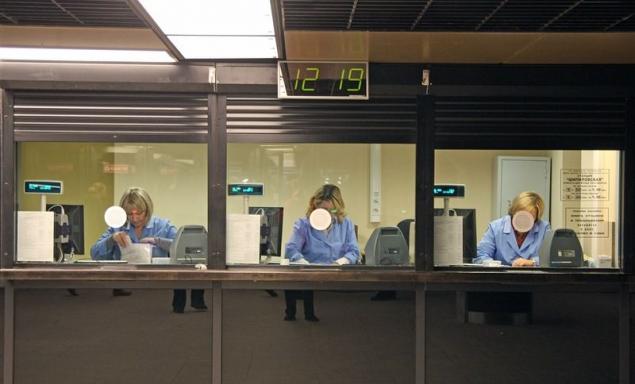
Cashier
And here is the station. Apparently darker than "Borisov". Generally, there is light I do not like. Uneven and ugly
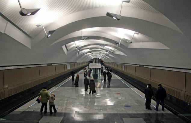
Lots of shade remains
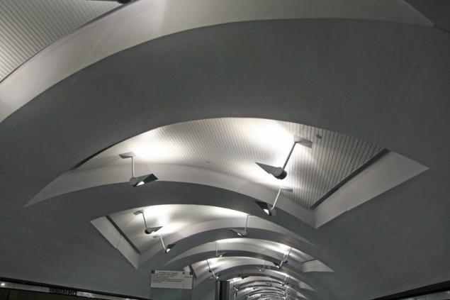
The current output
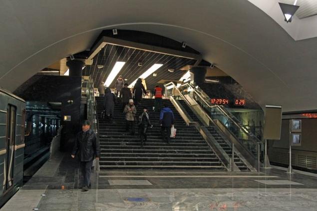
Here, incidentally, the book reviews lying in a corner and popularity once did not use. My record was the fourth, and the message number two

Another station
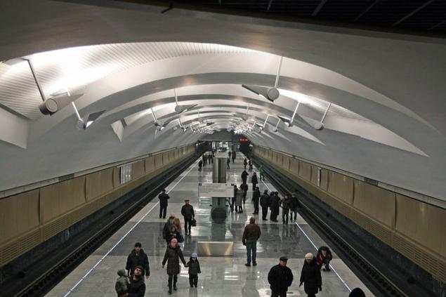
Familiar license
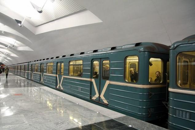
Straight from the tin container
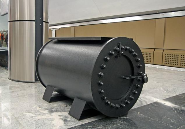
bomboustoychivy
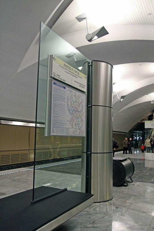
Glass racks not like me, but the style definition creates
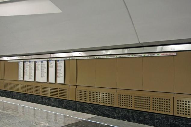
Track Wall "Shipilovskaya" framed similar, but sympathy is somehow less
More 6K
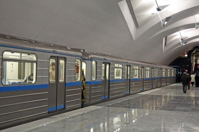
Infosos
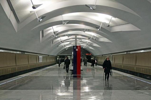
By the color of the wall it is a little different from the "Borisov»
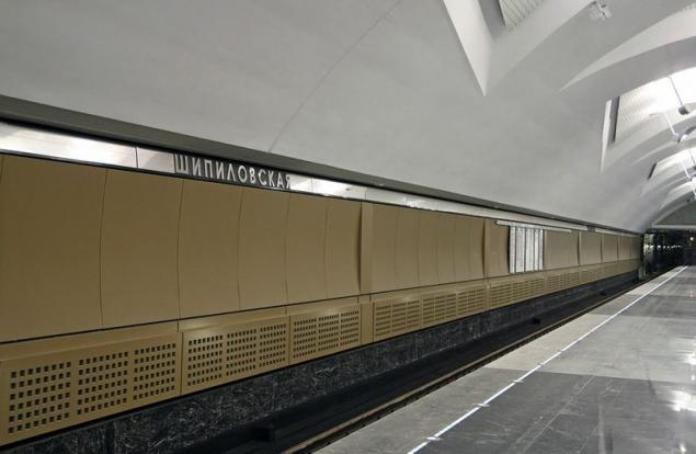
Rarity, almost deserted frame
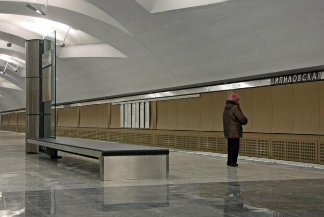
It's time to look "Zyablikovo" went
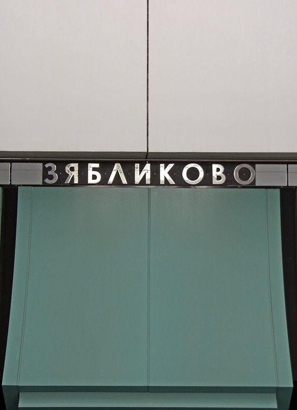
Lobbies
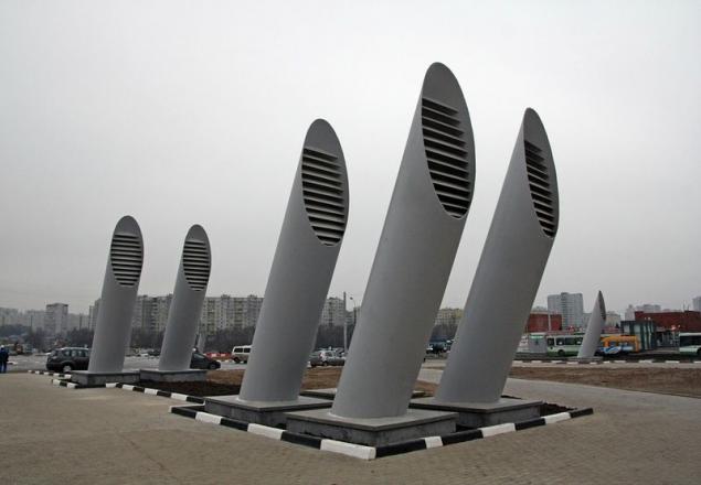
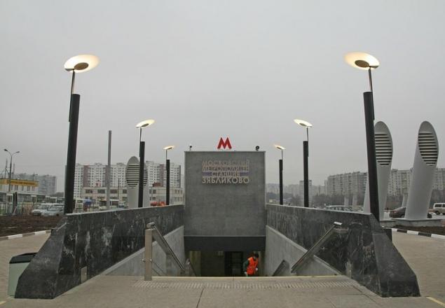
The familiar air intakes
Login
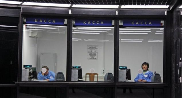
Cashier
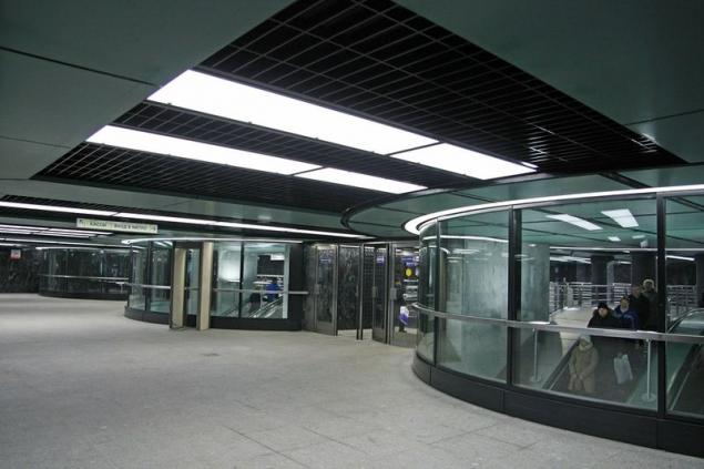
The station interchange (about how this change is organized, I still say), so there are three protrusions on escalators
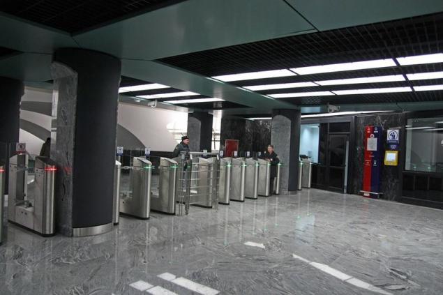
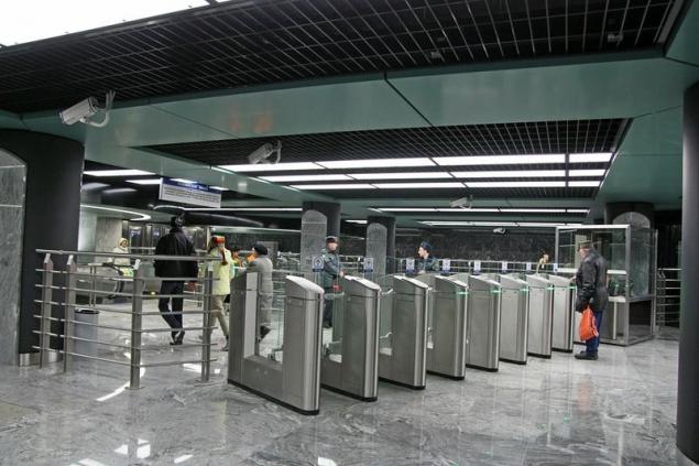
Another brand-new turnstiles
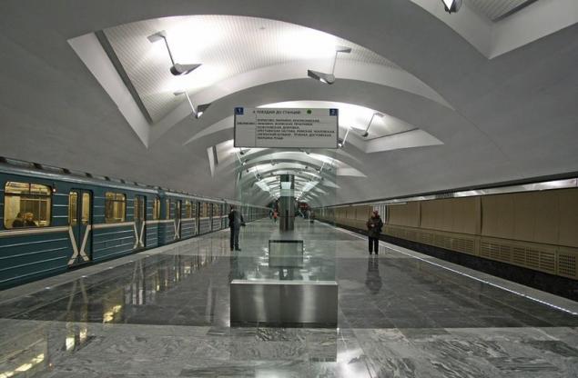
And the station itself. Pretty nice, although the color of the walls is not much I liked
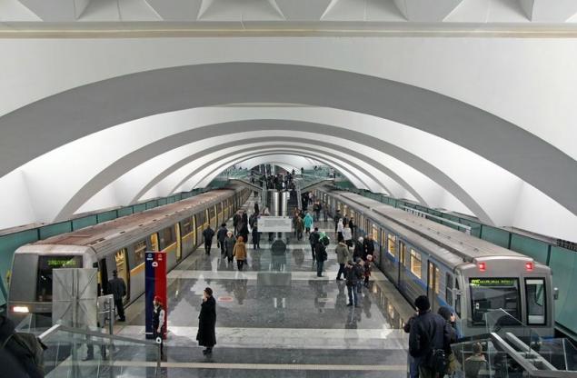
Out
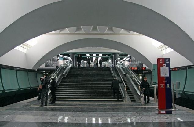
Well, where do without 6K :)
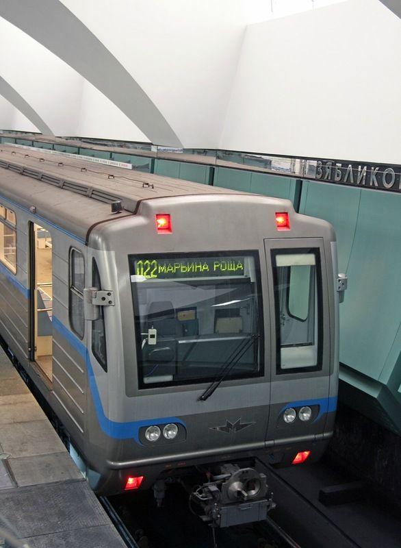
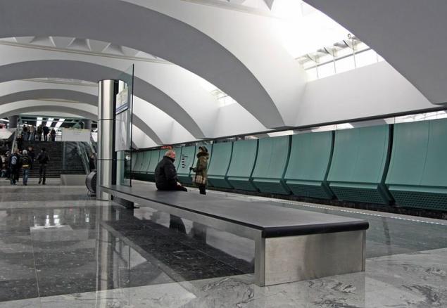
Withstands a single scheme of fasting. Bench
Driving line
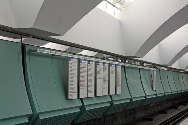
And here is the highlight. Station "Zyablikovo" part two-storey, to prevent crowding. This is not unique to our subway ("Komsomolskaya" and "Dmitry Donskoy Boulevard" is also two-storey), but still unusually
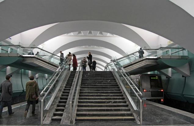
View from the stairs
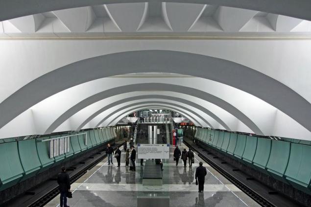
Balcony
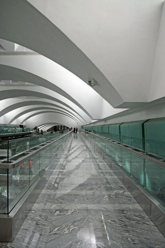
The opposite side
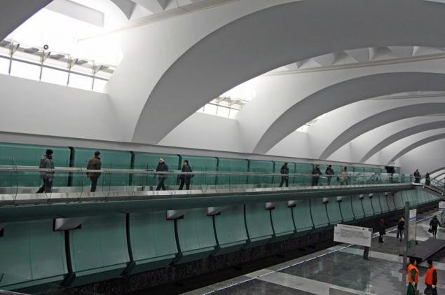
Transplanting is organized in such a way that the flow of people almost do not overlap
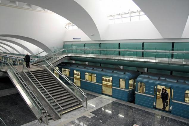
Gone are the stairs
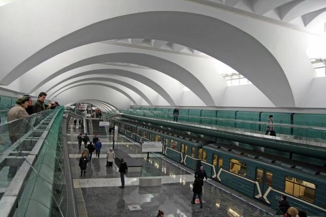
The second output, with escalators
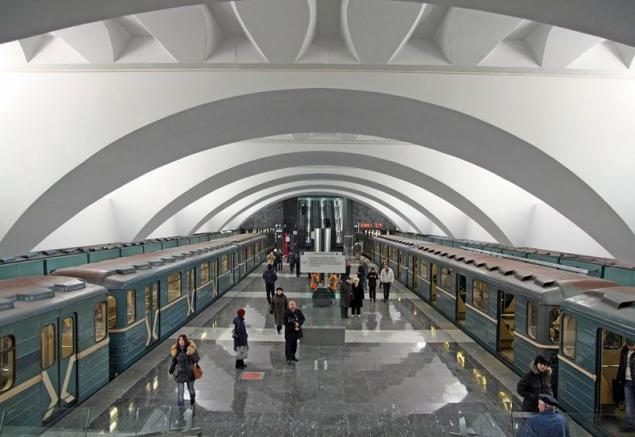
Another firm bench
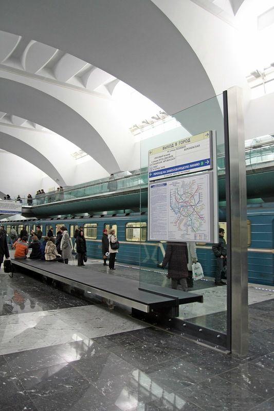
And branded the reception
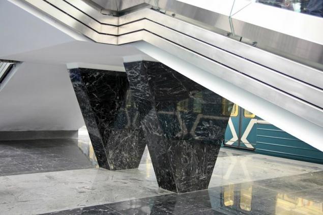
Supports staircases interchange
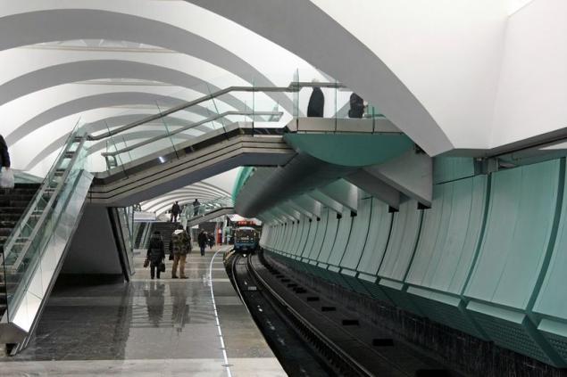
The second feature after the two-storey station - its curvature ("Alexandrovsky Garden" also has a curved shape, but there is a platform side)
That's nice, I think
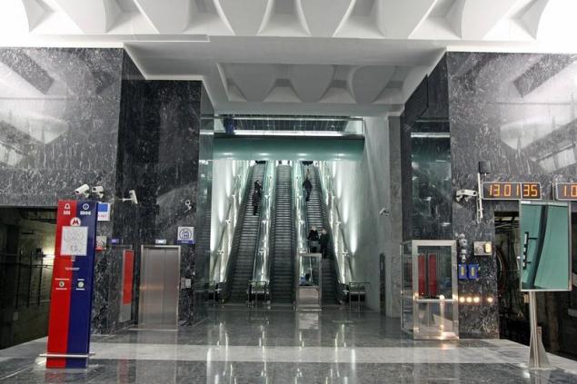
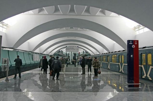
Once again we see the station
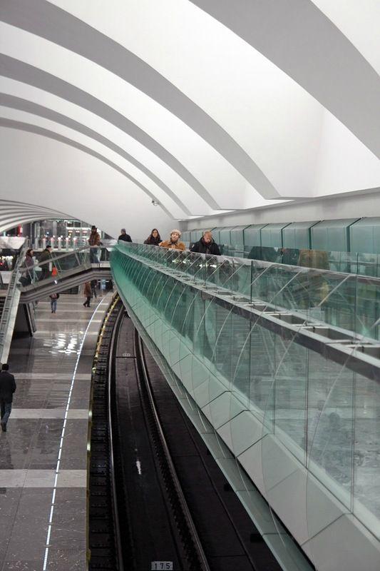
And let's go to the transplant
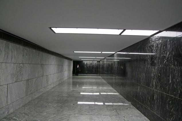
Organized it is reasonable, as I have said, but at the same time it turns out is quite a long and confusing at first because of the lack of signs (some grandmother looked around in confusion halfway). This corridor runs parallel to the station and out into the lobby
From there on the outer radius (internal exit to the city) you can get to "Krasnogvardeyskaya" or return to the station Lyublinki the other side (here's the question for some, much further). And this is a way out on the green branch
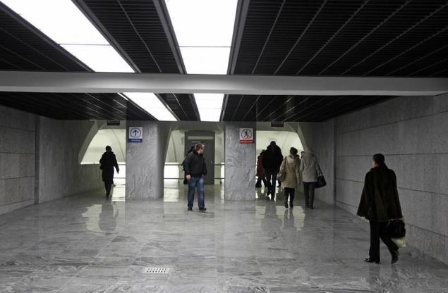
Go to "Krasnogvardeyskaya." Then the glass
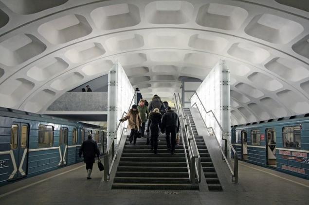
That's all :) New metro station - always a good thing, but these turned out quite well and some shortcomings (in my opinion, of course) does not cause negative emotions.
We can not say that this is something new and fantastic, but overall not bad happened.
Let's see how to look like 183, 184 and 185 stations of Moscow subway.
Let's start from the station Borisov.

Lobbies

In the spirit of the new stations. Lovely and faceless


Feature three stations: you can observe the transition from the escalator

Or vice versa: for insurances

One of the entrances

Branded intakes of new stations. Not nice for my taste. Although honestly, neighborhood outlets also somehow not good. Typical Moscow suburb

Now we can return to the station. Technical Nadeskalatorny balcony

Towards "Shipilovskaya»

Doubtful design course very pleasant station - weird "glass" lamps

In general, the same elements of Plexiglas are present in the design of all three stations. This individual racks ukazatelemi

And combined with their extensive bench

The youngest branch is growing before our eyes. Five stations over two years

At the station, as always, I was a table with a book review and stands devoted to the further development of metro

Opened portion

And plans for ten years

Quite fantastic, if you imagine the amount of planned work and compare the existing rates of construction

Without the glasses do really well, and the brownish wall design looks quite

Escalators and elevators

Turn to the book was great, I decided the time it does not lose

And I flipped a page. All thanks :) Personally Sobyanin also

An employee with a badge "Marino» :)

Let's last

And go to "Shipilovsky" blessing came 6K, which I still have not been able to visit


Also start with the lobby while he here alone, but promise to open a second outlet soon

Machines work, though for how long? We've put a couple of weeks ago, but I included until they saw

Such is the way

Only with guards

Cashier

And here is the station. Apparently darker than "Borisov". Generally, there is light I do not like. Uneven and ugly

Lots of shade remains

The current output

Here, incidentally, the book reviews lying in a corner and popularity once did not use. My record was the fourth, and the message number two

Another station

Familiar license

Straight from the tin container
bomboustoychivy

Glass racks not like me, but the style definition creates

Track Wall "Shipilovskaya" framed similar, but sympathy is somehow less

More 6K

Infosos

By the color of the wall it is a little different from the "Borisov»

Rarity, almost deserted frame

It's time to look "Zyablikovo" went


Lobbies

The familiar air intakes

Login

Cashier

The station interchange (about how this change is organized, I still say), so there are three protrusions on escalators

Another brand-new turnstiles

And the station itself. Pretty nice, although the color of the walls is not much I liked

Out

Well, where do without 6K :)

Withstands a single scheme of fasting. Bench

Driving line

And here is the highlight. Station "Zyablikovo" part two-storey, to prevent crowding. This is not unique to our subway ("Komsomolskaya" and "Dmitry Donskoy Boulevard" is also two-storey), but still unusually

View from the stairs

Balcony

The opposite side

Transplanting is organized in such a way that the flow of people almost do not overlap

Gone are the stairs

The second output, with escalators

Another firm bench

And branded the reception

Supports staircases interchange

The second feature after the two-storey station - its curvature ("Alexandrovsky Garden" also has a curved shape, but there is a platform side)

That's nice, I think

Once again we see the station

And let's go to the transplant

Organized it is reasonable, as I have said, but at the same time it turns out is quite a long and confusing at first because of the lack of signs (some grandmother looked around in confusion halfway). This corridor runs parallel to the station and out into the lobby

From there on the outer radius (internal exit to the city) you can get to "Krasnogvardeyskaya" or return to the station Lyublinki the other side (here's the question for some, much further). And this is a way out on the green branch

Go to "Krasnogvardeyskaya." Then the glass

That's all :) New metro station - always a good thing, but these turned out quite well and some shortcomings (in my opinion, of course) does not cause negative emotions.

