1045
Retrospective of a cigarette pack
Typography, heraldry, graphics and seals - how to change the design of a cigarette package in the last hundred years.
Ancestors of modern cigarettes have been known for at least half a millennium ago, before the discovery of North America, Columbus met on an island in the Caribbean Indian smoker wrapped in a corn leaf tobacco. But the mass distribution of cigarettes received only at the end of the 19th century, when the machine was invented to make them. The first cigarette factory was built in London, most of those same old brands that are common today, are Marlboro and Camel - the two "Americans." The first well-known brands on the Russian market (before the revolution) became cigarettes "Java" and "Flor Herzegovina", issued in Moscow, and quickly gained their popularity - particularly in their campaign involved Mayakovsky. The current appearance of cigarettes taken only in the middle of the last century, when the British brand Kent began releasing them to the filter.
But we are more interested in the history of cigarette packs. In the past, except that the packs were more like matchboxes, however, and now in Europe, you can buy religious leftist Gitanes cigarettes in their original packaging, and in the former Soviet Union such misoneism hold cigarettes "Prima" and "White Sea Canal." Basically the materials from which they were made initially popular, and now it is, primarily, cardboard and paper, as well as different types of wood and tin.
Source
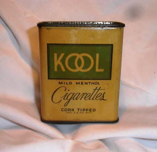
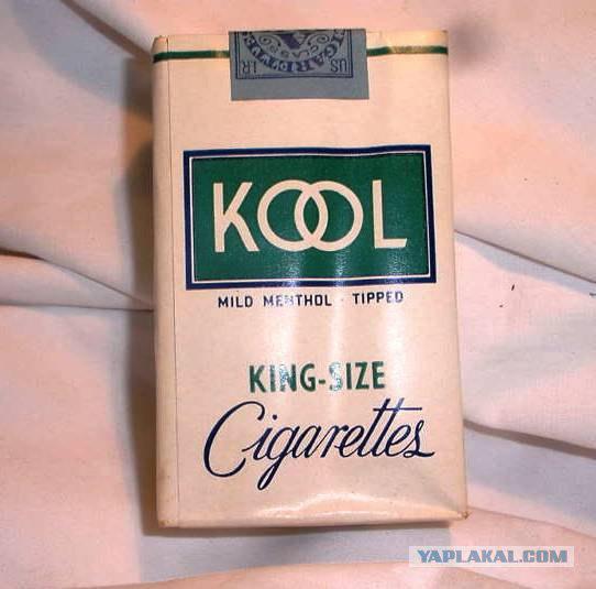
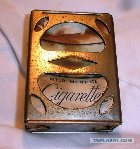
Retro-pack of Kool cigarettes of American metal and cardboard
2.
3.
4.
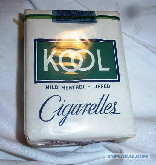
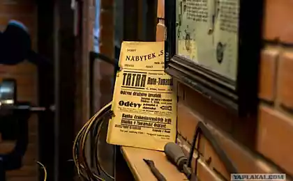
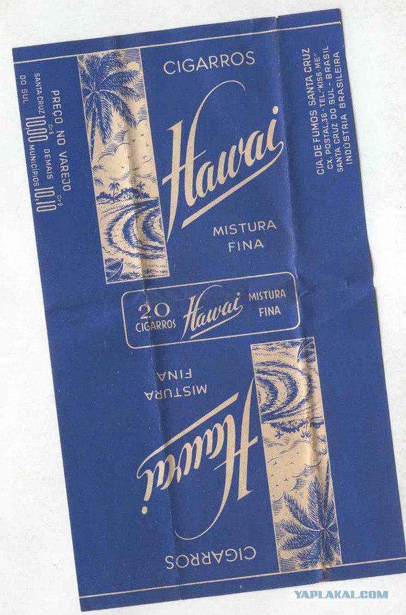
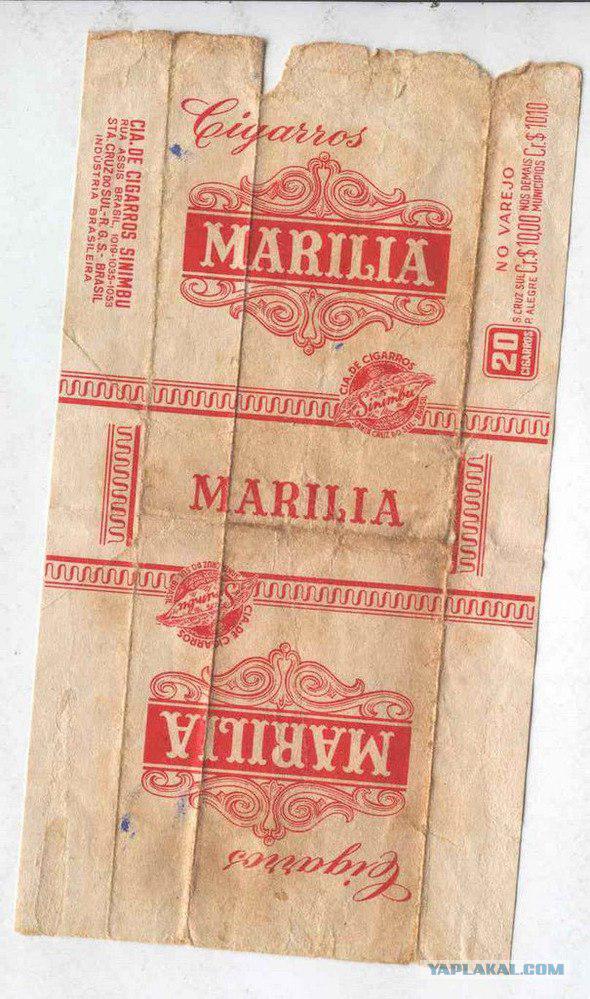
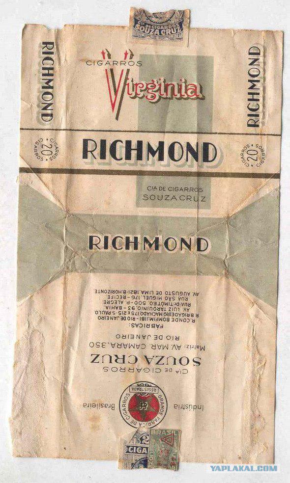
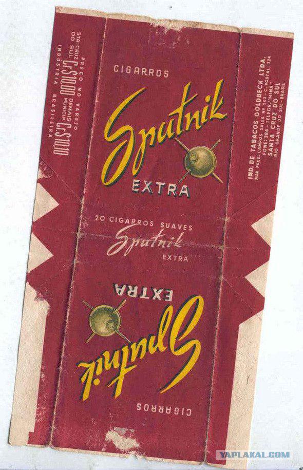
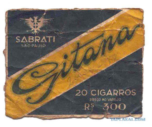
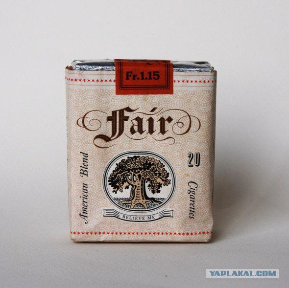
Therefore, special attention should be given not to those which have been made from the pack - they are, roughly speaking, a technically perfected - and the fact that it was shown to them. At the end of the nineteenth and the first half of the twentieth century because of the scarce opportunities in the design of the printing industry packs dominated typography.
6.
7.
8.
9.
10.
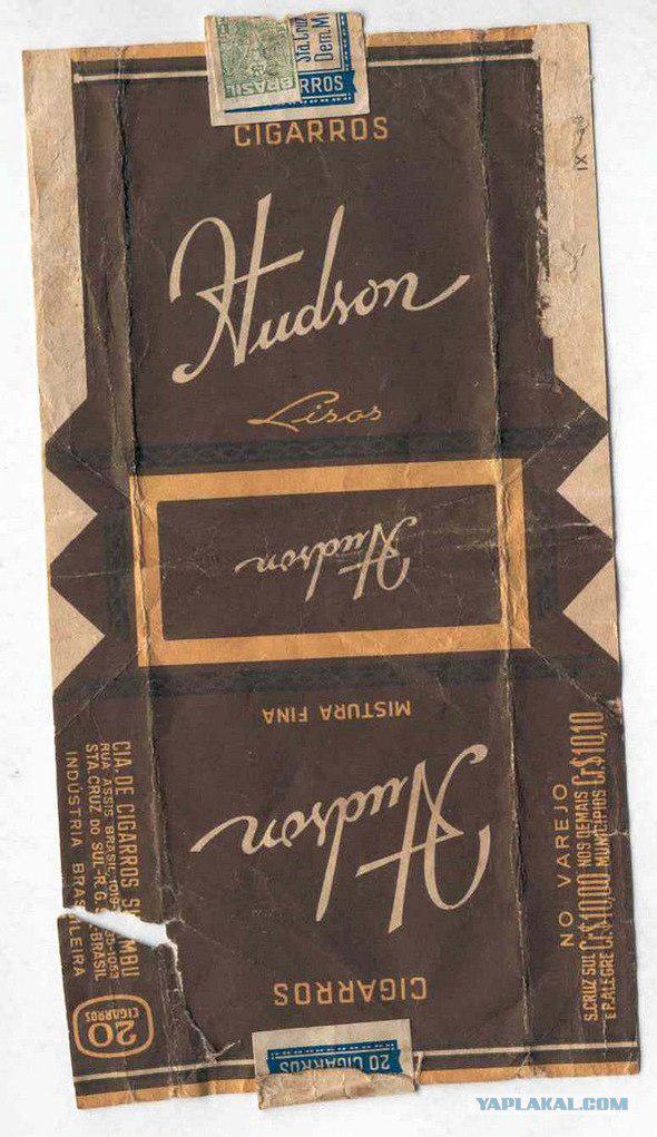
11.
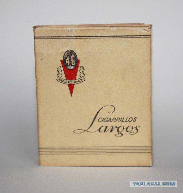
12.
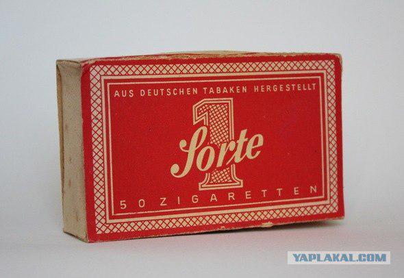
13.
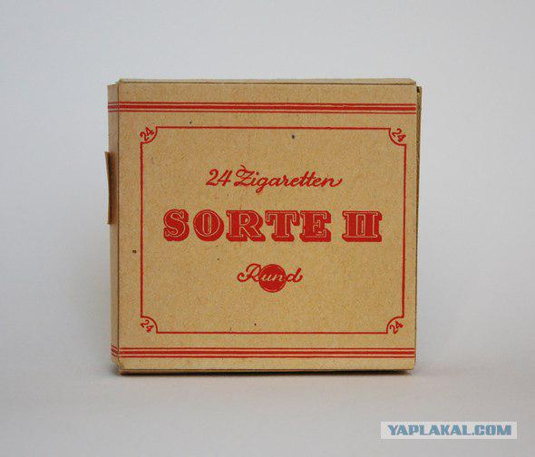
14.
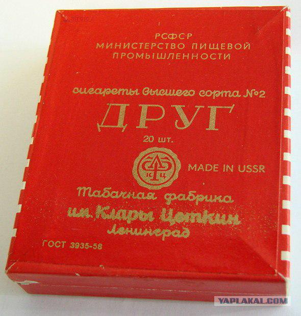
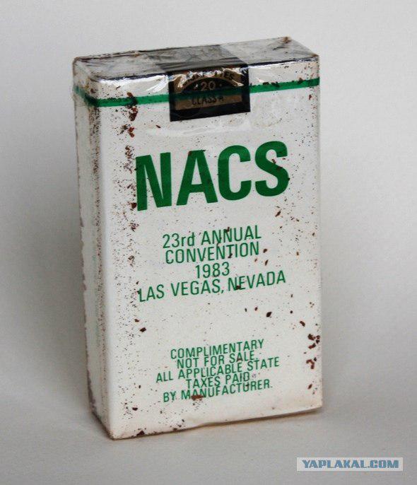
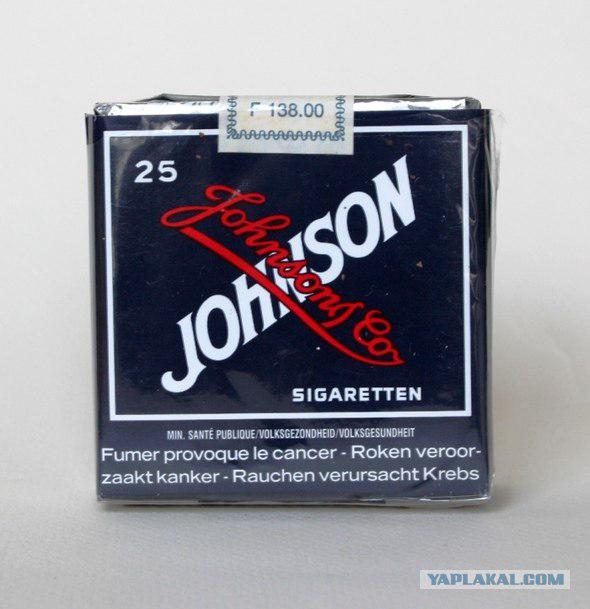
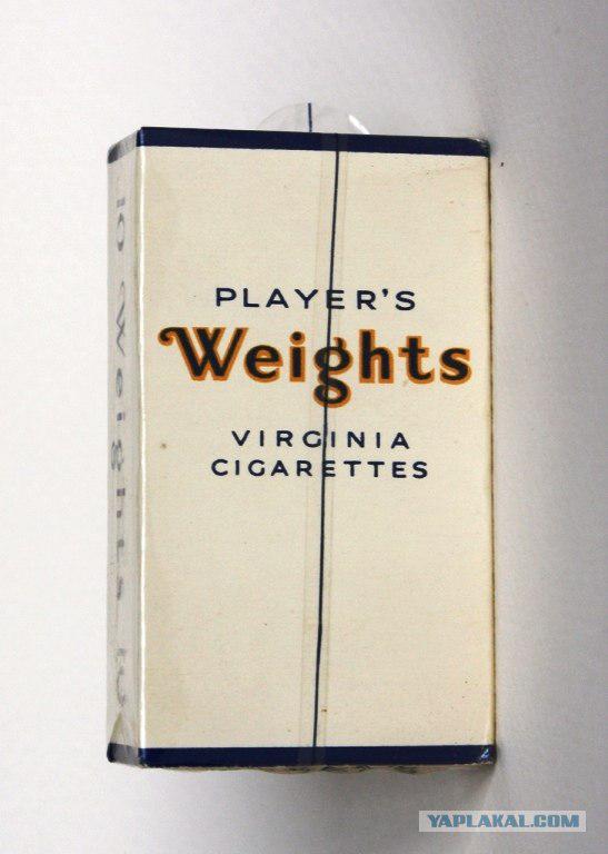
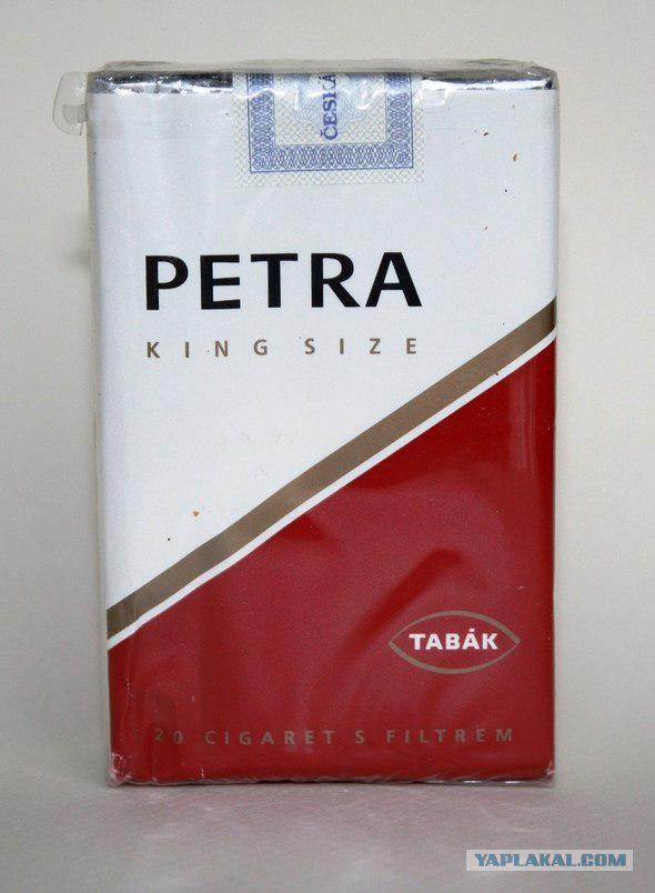
More recent examples of ascetic designed packs, where the main design element - a font
16.
17.
18.
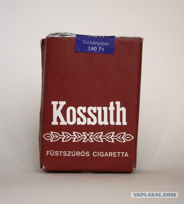
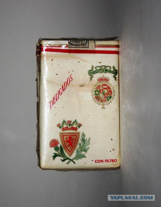
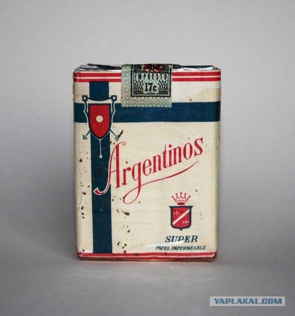
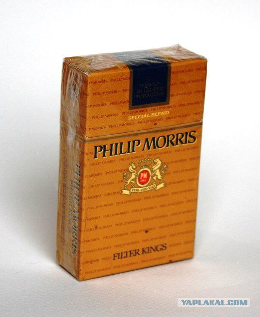
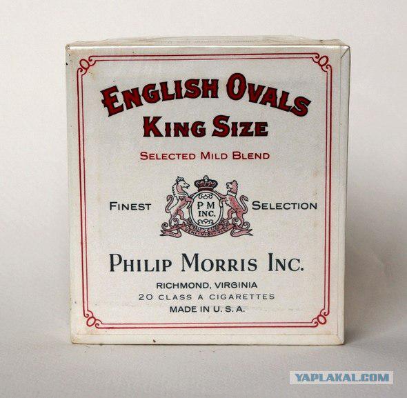
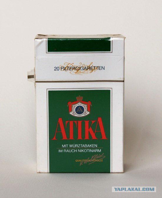
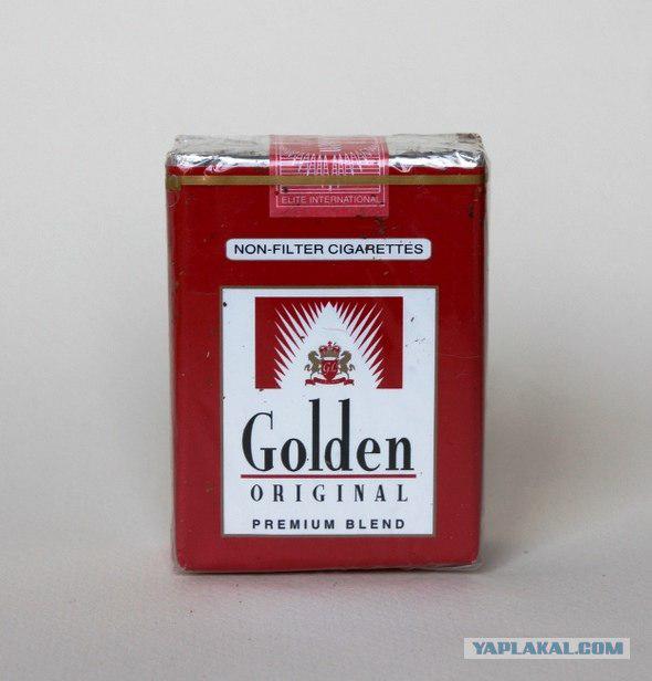
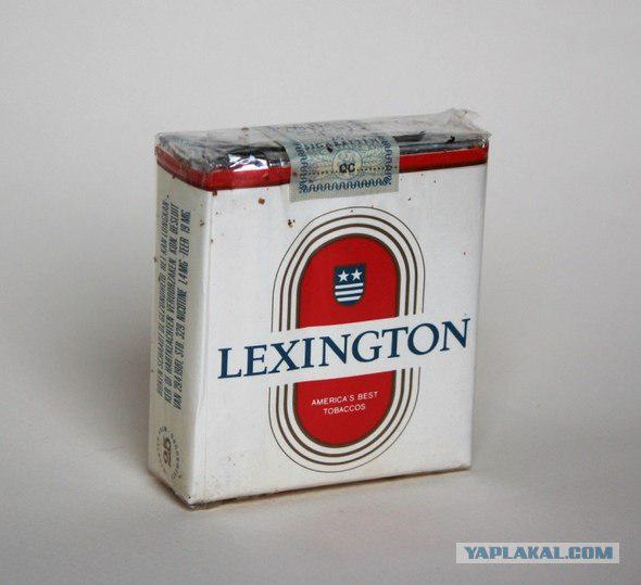
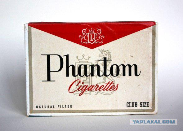
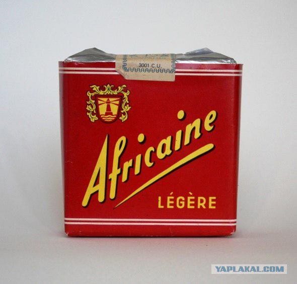
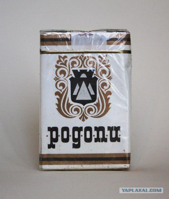
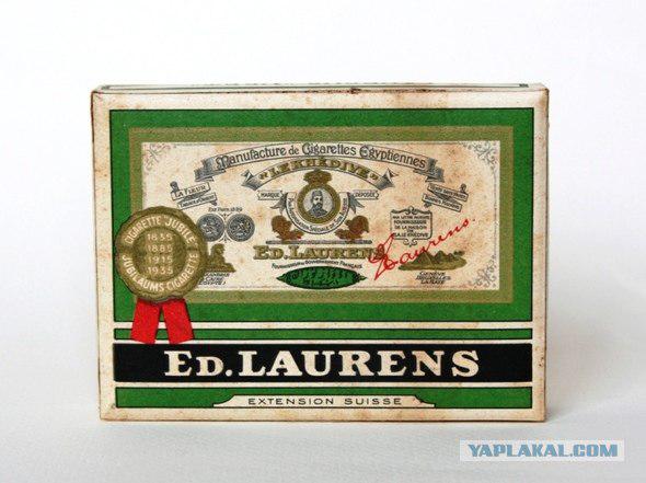
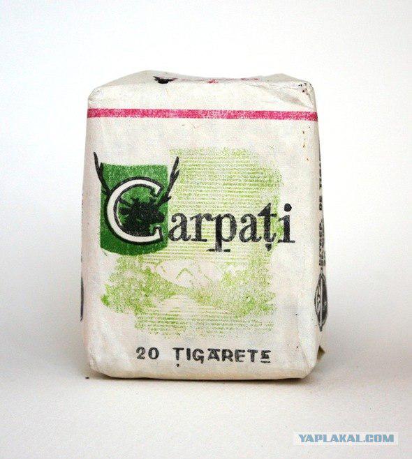
At the same time there was a tradition to place on the front of packs of coats of arms and other heraldic paraphernalia. This tradition is still alive today.
20.
21.
22.
23.
24.
25.
26.
27.
28.
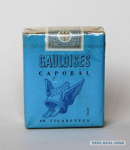
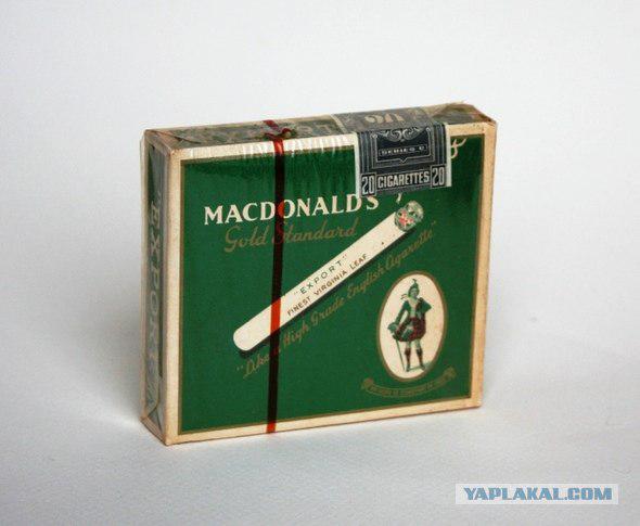
In addition to the coats of arms on packages of cigarettes can meet all sorts of characters, referring to various historical periods.
30.
31.
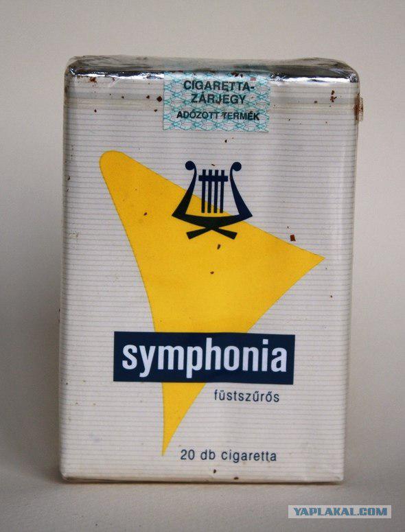
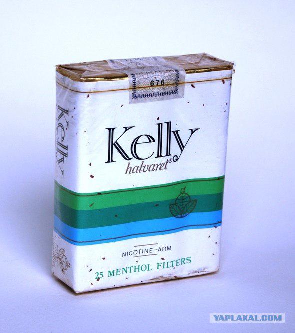
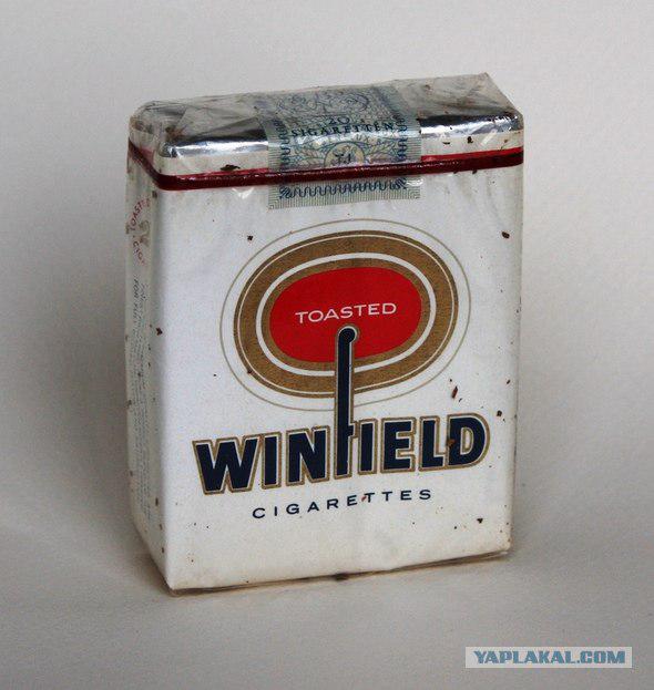
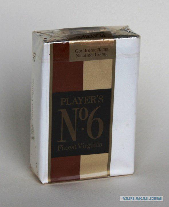
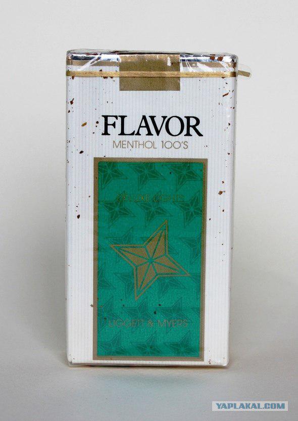
Other, more modern trend - the design of cigarettes with a variety of graphics solutions, "hello" it was somewhere in the seventies.
33.
34.
35.
36.
37.
38.
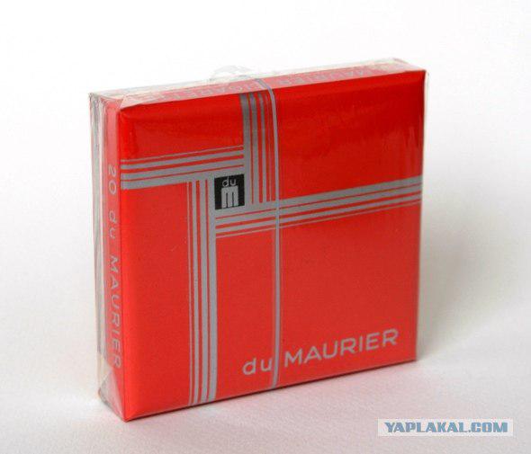
39.
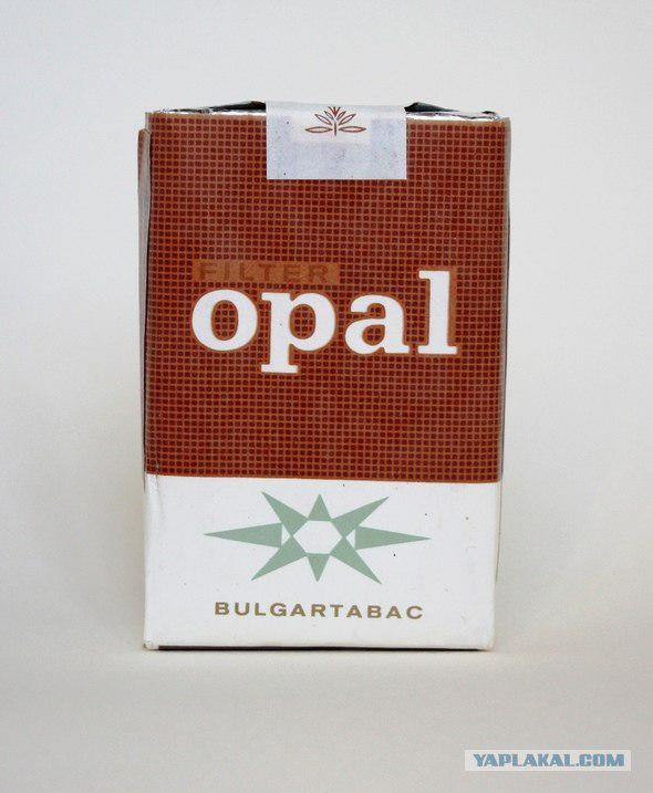
40.
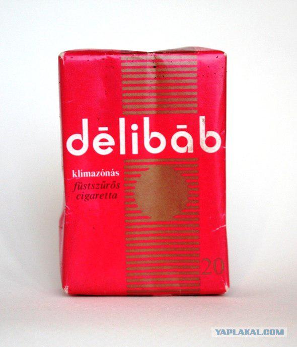
41.
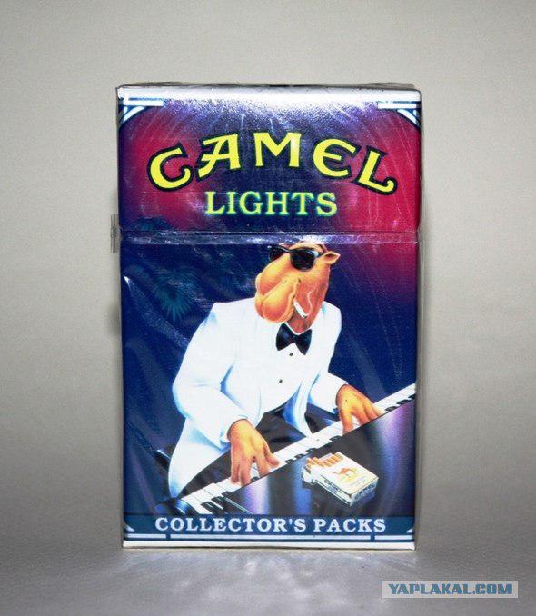
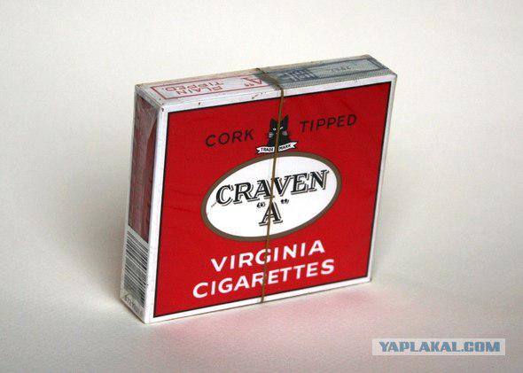
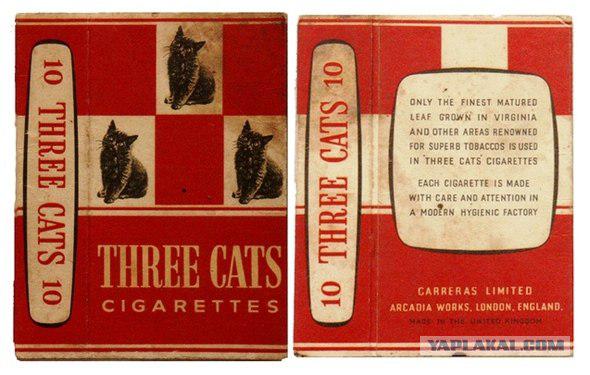
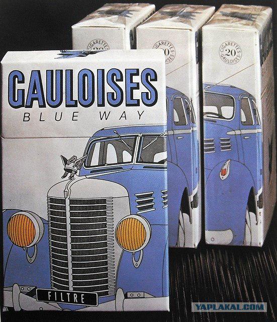
We should also mention packaging design, dedicated to a variety of topics - from the automotive to the cat.
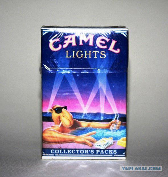
Of course, the most recognizable and matured character with a cigarette pack is the camel Camel, which in two years will celebrate one hundred years
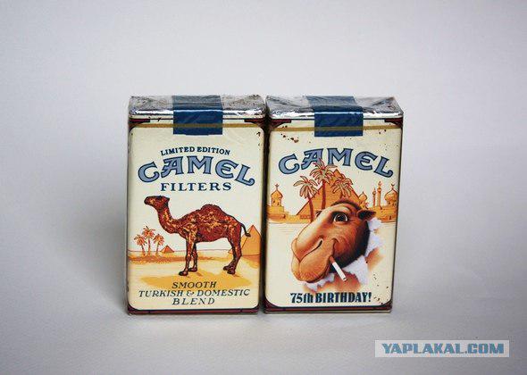
42.
43.
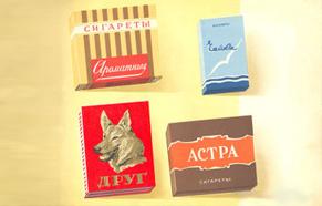
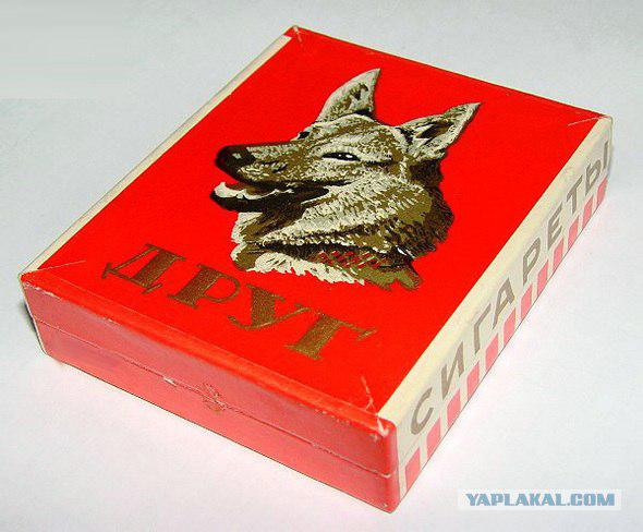
Subject pets also reflected in cigarette design, including the cult of domestic cigarettes had "Friend»
45.
46.
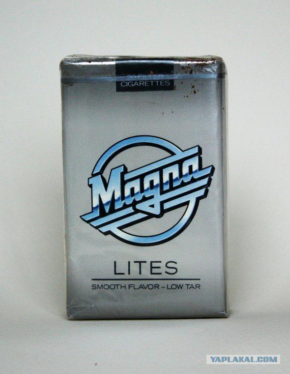
Logo "Magnet", a memorial to all who are older than twenty-five, like a car, and Gauloises Blue Way directly addresses the auto category
48.
For nature lovers
50.
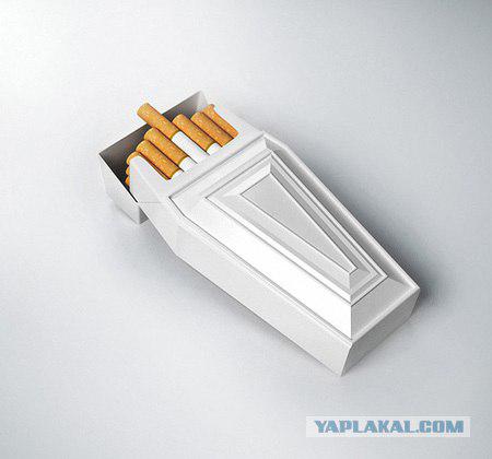
Spectacular and colorful cigarette packs lacking today. But the most correct and relevant, in my opinion, is this one concept:
Posted in [mergetime] 1299419377 [/ mergetime]
Truncated.
52.
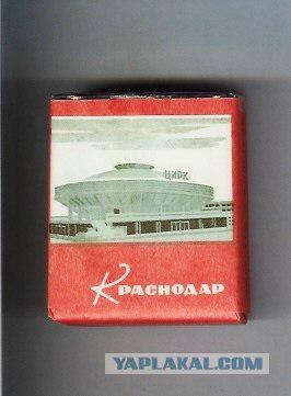
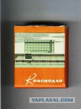
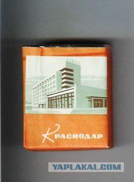
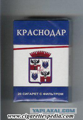
Compared with the old "Soviet" cigarette design "Krasnodar" (all its versions have 8 pieces), the new does not hold water.
53.
54.
55. New
Posted in [mergetime] 1299419624 [/ mergetime]
In general, stop smoking
Source:
Ancestors of modern cigarettes have been known for at least half a millennium ago, before the discovery of North America, Columbus met on an island in the Caribbean Indian smoker wrapped in a corn leaf tobacco. But the mass distribution of cigarettes received only at the end of the 19th century, when the machine was invented to make them. The first cigarette factory was built in London, most of those same old brands that are common today, are Marlboro and Camel - the two "Americans." The first well-known brands on the Russian market (before the revolution) became cigarettes "Java" and "Flor Herzegovina", issued in Moscow, and quickly gained their popularity - particularly in their campaign involved Mayakovsky. The current appearance of cigarettes taken only in the middle of the last century, when the British brand Kent began releasing them to the filter.
But we are more interested in the history of cigarette packs. In the past, except that the packs were more like matchboxes, however, and now in Europe, you can buy religious leftist Gitanes cigarettes in their original packaging, and in the former Soviet Union such misoneism hold cigarettes "Prima" and "White Sea Canal." Basically the materials from which they were made initially popular, and now it is, primarily, cardboard and paper, as well as different types of wood and tin.
Source

Retro-pack of Kool cigarettes of American metal and cardboard

2.

3.

4.

Therefore, special attention should be given not to those which have been made from the pack - they are, roughly speaking, a technically perfected - and the fact that it was shown to them. At the end of the nineteenth and the first half of the twentieth century because of the scarce opportunities in the design of the printing industry packs dominated typography.

6.

7.

8.

9.

10.

11.

12.

13.

14.

More recent examples of ascetic designed packs, where the main design element - a font

16.

17.

18.

At the same time there was a tradition to place on the front of packs of coats of arms and other heraldic paraphernalia. This tradition is still alive today.

20.

21.

22.

23.

24.

25.

26.

27.

28.

In addition to the coats of arms on packages of cigarettes can meet all sorts of characters, referring to various historical periods.

30.

31.

Other, more modern trend - the design of cigarettes with a variety of graphics solutions, "hello" it was somewhere in the seventies.

33.

34.

35.

36.

37.

38.

39.

40.

41.
We should also mention packaging design, dedicated to a variety of topics - from the automotive to the cat.
Of course, the most recognizable and matured character with a cigarette pack is the camel Camel, which in two years will celebrate one hundred years

42.

43.

Subject pets also reflected in cigarette design, including the cult of domestic cigarettes had "Friend»

45.

46.

Logo "Magnet", a memorial to all who are older than twenty-five, like a car, and Gauloises Blue Way directly addresses the auto category

48.

For nature lovers

50.

Spectacular and colorful cigarette packs lacking today. But the most correct and relevant, in my opinion, is this one concept:
Posted in [mergetime] 1299419377 [/ mergetime]
Truncated.

52.
Compared with the old "Soviet" cigarette design "Krasnodar" (all its versions have 8 pieces), the new does not hold water.

53.

54.

55. New
Posted in [mergetime] 1299419624 [/ mergetime]
In general, stop smoking

Source:


