1502
Memo website designers
The second version of the article, extensions and additions.
The best part was getting ready for my presentation on « RHS: Client Technology », which I unfortunately did not get.

Unfortunately, even the huge army of experienced, "fashionable" and the spectacular designers forget that the result of their work is to be site em> , and not just "super-screenshot" fit only for the portfolio.
Initially, this memo was written by me for internal use but, gathering materials grown in separate article. America I have not opened, but simply gathered together and made a number of requirements that must be taken into account in the design process the designer and the design of the site.
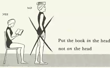
At first we think then do
It is very simple and often break the rules. Especially young designers.
I urge each and every one: take a pencil and paper. Think about the tasks and the idea of the site. Make a quick rough sketches, get a composition approximate grid location of blocks and elements required pocherkushki illustrations. And only then sit down at the computer.
This simple move several times more productive saves a lot of time and helps to find more interesting solutions.
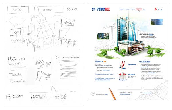
Example quick sketch and the result em>
From high to low, from general to specific
This is the second simple rule. And it is also often violated.
Classical teaching drawing and painting teaches: "Move from largest to smallest, from the general to the specific. Initially, work through the overall composition, the largest mass and volume, the largest spot, and then further developed, ask about, sates details. »
This rule is entirely applicable to all aspects of design and genres.
Think about your project, get the idea and composition, draw a series of sketches. And then, gradually, these sketches embody since grid layout block elements, large patches of color. And consistently fed them details.
Example of stepwise refinement and finalization layout from general to specific. Em>
I must admit that I have often seen as self-taught artist, nuggets started writing Portrait of a man with his eyes, or with the finger of the left leg. And not just seen as some designers are beginning to draw a site with a private-toodnoy icons. And in both cases, to my surprise, we get an interesting result.
But it's a long way, often requiring large adjustments and alterations in the design process. He may apply for creativity, but in the design profession, when at a certain time to get a good result, I believe that such an approach is unacceptable. Need guaranteed Process Technology em>, to obtain garanitrovannye results in clear terms. And not just "turn-nepoluchitsya».
So summarize: « from high to low, from the general to the specific ».
Modular grid
One of the first decisions in the design process - a modular grid. Unified frame and layout of all major units and elements passing through all the pages of the site.
Grids are simple and complex, flexible in use and not. This is not so important. It is important that if you are in the design of the design sets a certain grid modules - please follow it. From the first to the last page of your project. And if in the process of drawing the internal pages you have any items that are not accepted in the lodge keeper - it means you have given her enough time designing.
Following a single modular grid, the project will not only increase the integrity and consistency of the perception of the site, but also facilitate the work of multiple developers.
Example of using a modular grid em>
Example of using a modular grid em>
Scalability
In our time, when all users have a variety of monitors, it makes sense to do mainly "rubber" sites. Ie sites that are scaled to fit the user's monitor.
Display elastic site on different monitors em>
So, making the "rubber" design do not forget that:
Total composition shall not be violated under any screen resolution of the visitor. All the elements are scaled depending on the user's screen size and font size. All modular grid, blocks and other horizontally scaled in percentage. All fonts, margins, almost all of the vertical scale in the em em>. In many cases, this is true even in the framework ( border em>). Exceptions em> can be only a picture. And then, the hard size in px em> for many images - limited only vertically.
"Compression-tension»
Optimal for the use of the so-called "semi-tires", ie site stretches and shrinks to a certain limit.
min h4> The first thing you need to start - is to find the minimum compression of the site.
max h4> Maximum width em> of the site may be different, but as a rule, it is recommended to stretch the range of not greater than one and a half to two times the size of the minimum compression. This is due to the fact that when stretched site more than half a composition usually collapses.
menu and navigation; block allocation (important information, quotations, callouts); for small text, in order to improve readability.
The designer should plan a single overall scheme indent size / spades for all items on the site, the hierarchy of headings and navigation elements (eg menu tree or tag clouds). It must be solid and used on all pages.
All subsequent registration information on the site should be built on the basis of the general scheme.
Font scheme simple corporate site em>
Reaction to the user
The designer must plan what will happen with the elements respond to user.
Consider the typical elements.
Navigation

A fragment of the site layout showing the three states of navigation: general view of the menu item when the cursor, highlighting the current section. Em>
Depending on the type and scale of the site, you need to show the number of states of the navigation item.
A typical set:
Normal. We have put the cursor. We are in this section. We are in this category, but went deeper. We have put the cursor to the parent partition.
The minimum set of all em> navigation elements, including switches and controls - this is a normal and active mode. Ie at least, for all control and navigation elements is - "incl. / off.».

The different states of the navigation item em>
Links
Link located in the text, always stressed and have a different color from the main text.
It is desirable and in the navigation necessarily provide exterior links, hover.
In large volumes of text and in the issuance of heterogeneous information (eg, table of contents entries, site maps, etc.), be sure to provide the appearance of visited links. And they also require their appearance when the cursor.
Links with excl properties h4> For links that provide additional capabilities, especially when using the text em>, it is recommended to provide a small icon that will prompt the user for additional properties of links.
Alternative Preparation of data (RSS, PDA, print version) download the files located on the server appeal to popular resources (Yandex, Google, Flickr, LJ , mapping services, Wikipedia, etc.) e-mail address opening forms Open link in new window ul >
Examples of using additional icons "life». Em>
Pseudo-reference
Psevdossylki, ie links that do not lead to a different page, and open / hide information on the current, without a reboot, denoted by a dotted underline. In all other respects, they are subject to whatever is normal for reference.
One example of the use psevdossylok. Em>
Taba
Taba - a mixture of some elements of navigation and control.
For them, take into account the state of:
inactive tab the pointer (opt) loader content (opt) tab is active < br />
A fragment of the site that displays the status of just three tabs: active tab, hover and normal, inactive state. Em>
Cursor
Involves reacting the cursor when hovering. Especially when it comes to custom controls, such as navigation, pseudo-links and tabs ( hand em>), tips acronym> ( help em>), change element size, and dragging.
Making content
The Internet content right. Website - just a way to deliver it. Appearance of the site - a frame that defines the emotional and supporting brand.
It is studying the information the user spends the largest part of their time on the site. It is for this reason should be given due attention design content.
Objectives of the site and its content is always different. So draw this content also always need differently.
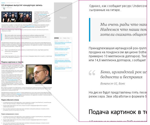
Detail of the news site on which the designer showed most of the typical elements for the design of content. Em>
Elements of the content
Immediately I must say that foresee in advance all the possible options for processing impossible. We consider only typical.
For example, for a corporate site:
a paragraph of text; heading hierarchy of three or four levels; links, pseudo-links; element highlight important information; quote; unordered list; numbered list; nested lists; illustration of the strip, in the text ; Table or more types of them; downloads; callouts; clearance marginalia, if used; the presentation of information in columns 2-3 (depends on the grid); a simple form.
Fish
Ideally, you need to handle real em> content. If this is not present, as a minimum, "fish" should be as-is issued for a typical page of the type and volume. This will avoid gaps in the design of the site and annoying after commissioning.
Completely unacceptable to use "fish" from another language, because amounts of text, and the average length of the words are different. For example, in English and in Russian it is very noticeable.
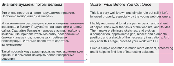
A different pattern identical in content blocks of text in different languages. Em>
P.S.
These requirements are not dogma. From any of the rules can sometimes retreat. Just do not need it because of ignorance, and deliberately em>.
About the Author
< Paul Kolodyazhni. Art director and founder of design studio «make».
Specializes in the development of Internet-Site designing interfaces.
Total experience in design - 9 years. As an author and co-author was involved in the birth of more than one hundred sites, and about three dozen interfaces. Among the works are projects for companies such as Sunbay Software, Space Andventures, Pulsar Software Systems, Canon Inc., Yandex, Yamaha Motors. Despite previous achievements believes that the most interesting projects yet to come.
Thanks
All my colleagues and staff, as all the examples are fragments of works of our office.
Eugene Cheporovu which prompted me to create the article.
Vlad Denisov, who helped me with illustrative examples.
Yaroslav Trofimov (from Inspire) for advice and constructive criticism of texts.
Ira Yantsevu, for proofreading, translation of the English version, and for the fact that she convinced me to finish the article, when he wanted to quit.
All users of LiveJournal and Habrahabr , for Comments, reviews and questions by which I modified and expanded this material.
Source: habrahabr.ru/post/50497/
The best part was getting ready for my presentation on « RHS: Client Technology », which I unfortunately did not get.

Unfortunately, even the huge army of experienced, "fashionable" and the spectacular designers forget that the result of their work is to be site em> , and not just "super-screenshot" fit only for the portfolio.
Initially, this memo was written by me for internal use but, gathering materials grown in separate article. America I have not opened, but simply gathered together and made a number of requirements that must be taken into account in the design process the designer and the design of the site.
At first we think then do
It is very simple and often break the rules. Especially young designers.
I urge each and every one: take a pencil and paper. Think about the tasks and the idea of the site. Make a quick rough sketches, get a composition approximate grid location of blocks and elements required pocherkushki illustrations. And only then sit down at the computer.
This simple move several times more productive saves a lot of time and helps to find more interesting solutions.

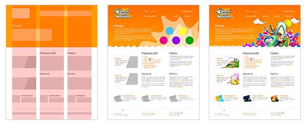
Example quick sketch and the result em>
From high to low, from general to specific
This is the second simple rule. And it is also often violated.
Classical teaching drawing and painting teaches: "Move from largest to smallest, from the general to the specific. Initially, work through the overall composition, the largest mass and volume, the largest spot, and then further developed, ask about, sates details. »
This rule is entirely applicable to all aspects of design and genres.
Think about your project, get the idea and composition, draw a series of sketches. And then, gradually, these sketches embody since grid layout block elements, large patches of color. And consistently fed them details.

Example of stepwise refinement and finalization layout from general to specific. Em>
I must admit that I have often seen as self-taught artist, nuggets started writing Portrait of a man with his eyes, or with the finger of the left leg. And not just seen as some designers are beginning to draw a site with a private-toodnoy icons. And in both cases, to my surprise, we get an interesting result.
But it's a long way, often requiring large adjustments and alterations in the design process. He may apply for creativity, but in the design profession, when at a certain time to get a good result, I believe that such an approach is unacceptable. Need guaranteed Process Technology em>, to obtain garanitrovannye results in clear terms. And not just "turn-nepoluchitsya».
So summarize: « from high to low, from the general to the specific ».
Modular grid
One of the first decisions in the design process - a modular grid. Unified frame and layout of all major units and elements passing through all the pages of the site.
Grids are simple and complex, flexible in use and not. This is not so important. It is important that if you are in the design of the design sets a certain grid modules - please follow it. From the first to the last page of your project. And if in the process of drawing the internal pages you have any items that are not accepted in the lodge keeper - it means you have given her enough time designing.
Following a single modular grid, the project will not only increase the integrity and consistency of the perception of the site, but also facilitate the work of multiple developers.

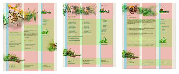
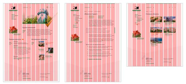
Example of using a modular grid em>

Example of using a modular grid em>
Scalability
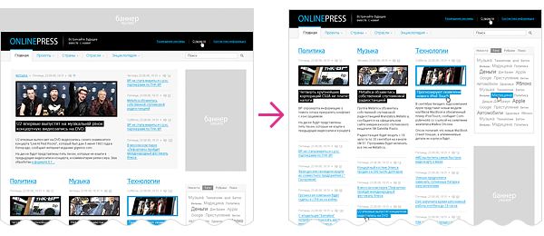
In our time, when all users have a variety of monitors, it makes sense to do mainly "rubber" sites. Ie sites that are scaled to fit the user's monitor.

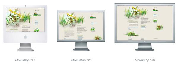
Display elastic site on different monitors em>
So, making the "rubber" design do not forget that:
Total composition shall not be violated under any screen resolution of the visitor. All the elements are scaled depending on the user's screen size and font size. All modular grid, blocks and other horizontally scaled in percentage. All fonts, margins, almost all of the vertical scale in the em em>. In many cases, this is true even in the framework ( border em>). Exceptions em> can be only a picture. And then, the hard size in px em> for many images - limited only vertically.
"Compression-tension»
Optimal for the use of the so-called "semi-tires", ie site stretches and shrinks to a certain limit.
min h4> The first thing you need to start - is to find the minimum compression of the site.
< Minimum width em> of the site is definitely determined by the objectives of the site and its target audience. In fact, now there are only two minimal parameters: 760 px em> and 990 px em>. The first is optimal for corporate sites or resources, designed for the most massive and motley audience (for example, mass services: e-mail, search, news, etc.). The second approach for sites of image and promotion of destination.
Check and if necessary adjust, each element modular grid to avoid any raids / overlaps the elements on each other with a minimum compressive site.
max h4> Maximum width em> of the site may be different, but as a rule, it is recommended to stretch the range of not greater than one and a half to two times the size of the minimum compression. This is due to the fact that when stretched site more than half a composition usually collapses.
You need to determine what will happen with all the site, with the size of the user's monitor more than the maximum width. Decides where it will level off. Right? To the left? Centered?
To completing the look of the site and its surroundings in a natural transition at a resolution of more than the maximum. It is unacceptable that a site on the big screen looked like a "cut».
Draw illustrations and recurring backgrounds of the principle of "one more monitor, he sees more." Typically, the width is due to the width of illustrations aside for them modular grid blocks in the state max em>.
Stock up on the growth of the site
In the area of greater problems if it is not a small website or a promotional site, you need to take into account that the number of pages and sections of the site can grow and change.
Therefore:
Navigation should be constructed so as to add new menu items, and even more so the name change points occurred painlessly. It is unacceptable that the addition of a new section resulted in a revised navigation.
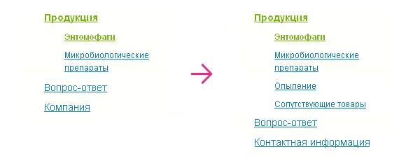
Example "painless" changes / additions navigation tree first and second level em>
In some cases it is necessary to provide for the appearance of painless adding / hiding information / functional units on the site.
Example "painless" movement,
change / delete blocks of the site em>
Given the soft scalability, as well as adding new material to the site, it is recommended to give preference to the text headings and navigation.
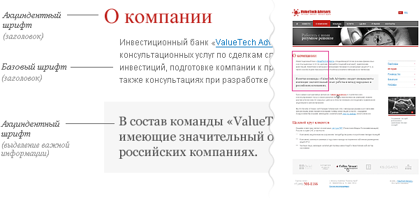
Font scheme
Most of the sites look whole and complete the construction of the design on the basis of one to three fonts.
< The base font em> - the main font of the site materials.
Aktsidentny em> - font for headings.
In some cases, introduce additional fonts em> for:
menu and navigation; block allocation (important information, quotations, callouts); for small text, in order to improve readability. 

The designer should plan a single overall scheme indent size / spades for all items on the site, the hierarchy of headings and navigation elements (eg menu tree or tag clouds). It must be solid and used on all pages.
All subsequent registration information on the site should be built on the basis of the general scheme.

Font scheme simple corporate site em>
Reaction to the user
The designer must plan what will happen with the elements respond to user.
Consider the typical elements.
Navigation

A fragment of the site layout showing the three states of navigation: general view of the menu item when the cursor, highlighting the current section. Em>
Depending on the type and scale of the site, you need to show the number of states of the navigation item.
A typical set:
Normal. We have put the cursor. We are in this section. We are in this category, but went deeper. We have put the cursor to the parent partition.
The minimum set of all em> navigation elements, including switches and controls - this is a normal and active mode. Ie at least, for all control and navigation elements is - "incl. / off.».

The different states of the navigation item em>
Links
Link located in the text, always stressed and have a different color from the main text.
It is desirable and in the navigation necessarily provide exterior links, hover.
In large volumes of text and in the issuance of heterogeneous information (eg, table of contents entries, site maps, etc.), be sure to provide the appearance of visited links. And they also require their appearance when the cursor.
Links with excl properties h4> For links that provide additional capabilities, especially when using the text em>, it is recommended to provide a small icon that will prompt the user for additional properties of links.
Such icons require references:
Alternative Preparation of data (RSS, PDA, print version) download the files located on the server appeal to popular resources (Yandex, Google, Flickr, LJ , mapping services, Wikipedia, etc.) e-mail address opening forms Open link in new window ul > 
Examples of using additional icons "life». Em>
Pseudo-reference
Psevdossylki, ie links that do not lead to a different page, and open / hide information on the current, without a reboot, denoted by a dotted underline. In all other respects, they are subject to whatever is normal for reference.

One example of the use psevdossylok. Em>
Taba
Taba - a mixture of some elements of navigation and control.
For them, take into account the state of:
inactive tab the pointer (opt) loader content (opt) tab is active < br />

A fragment of the site that displays the status of just three tabs: active tab, hover and normal, inactive state. Em>
Cursor
Involves reacting the cursor when hovering. Especially when it comes to custom controls, such as navigation, pseudo-links and tabs ( hand em>), tips acronym> ( help em>), change element size, and dragging.
Making content
The Internet content right. Website - just a way to deliver it. Appearance of the site - a frame that defines the emotional and supporting brand.
It is studying the information the user spends the largest part of their time on the site. It is for this reason should be given due attention design content.
Objectives of the site and its content is always different. So draw this content also always need differently.

Detail of the news site on which the designer showed most of the typical elements for the design of content. Em>
Elements of the content
Immediately I must say that foresee in advance all the possible options for processing impossible. We consider only typical.
For example, for a corporate site:
a paragraph of text; heading hierarchy of three or four levels; links, pseudo-links; element highlight important information; quote; unordered list; numbered list; nested lists; illustration of the strip, in the text ; Table or more types of them; downloads; callouts; clearance marginalia, if used; the presentation of information in columns 2-3 (depends on the grid); a simple form.
Fish

Ideally, you need to handle real em> content. If this is not present, as a minimum, "fish" should be as-is issued for a typical page of the type and volume. This will avoid gaps in the design of the site and annoying after commissioning.
Completely unacceptable to use "fish" from another language, because amounts of text, and the average length of the words are different. For example, in English and in Russian it is very noticeable.

A different pattern identical in content blocks of text in different languages. Em>
P.S.
These requirements are not dogma. From any of the rules can sometimes retreat. Just do not need it because of ignorance, and deliberately em>.
About the Author
< Paul Kolodyazhni. Art director and founder of design studio «make».
Specializes in the development of Internet-Site designing interfaces.
Total experience in design - 9 years. As an author and co-author was involved in the birth of more than one hundred sites, and about three dozen interfaces. Among the works are projects for companies such as Sunbay Software, Space Andventures, Pulsar Software Systems, Canon Inc., Yandex, Yamaha Motors. Despite previous achievements believes that the most interesting projects yet to come.
Thanks
All my colleagues and staff, as all the examples are fragments of works of our office.
Eugene Cheporovu which prompted me to create the article.
Vlad Denisov, who helped me with illustrative examples.
Yaroslav Trofimov (from Inspire) for advice and constructive criticism of texts.
Ira Yantsevu, for proofreading, translation of the English version, and for the fact that she convinced me to finish the article, when he wanted to quit.
All users of LiveJournal and Habrahabr , for Comments, reviews and questions by which I modified and expanded this material.
Source: habrahabr.ru/post/50497/