771
The most beautiful packaging products and items in 2014
Recently, there are many for fresh ideas in the field of packaging design. There is always what to admire.
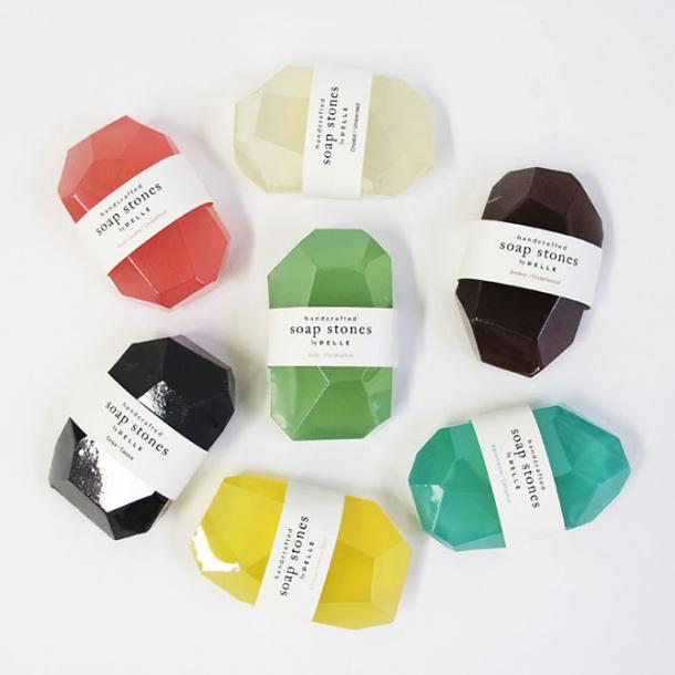
Tandem Architects and Jean Oliver Pelle made soap in the form of stones. On the one hand to draw public attention to his work in architecture, and on the other - it's just a wonderful idea.
These candies and buy nicer!
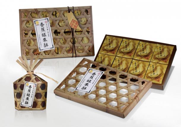
Banana candy
Unusual packaging, which wants to examine.
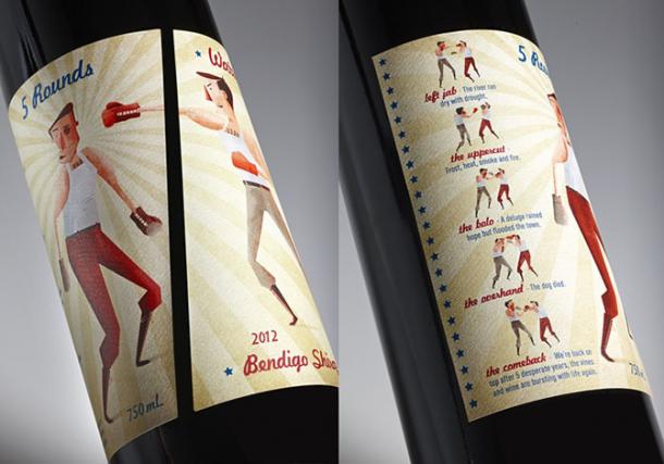
Wine 5 Rounds
It is proved that the heart symbol increases customer loyalty.
Wine Latin lovers
Small door. All miniature touches.
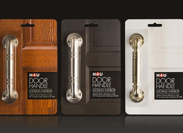
Door handle H4U
And the image and flavor, and shine, and the flowers. The right combination and a unique marketing approach.
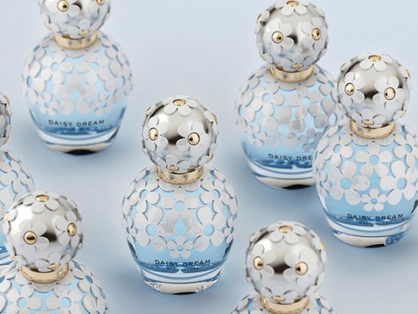
Perfume Marc Jacobs
Get to sign it!
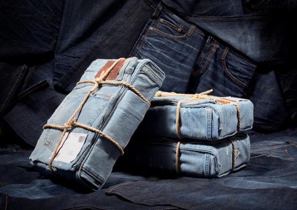
Packing jeans Mustang
It is more convenient to spread it was cakes.
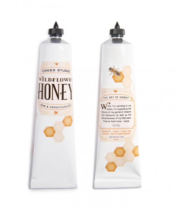
Flower honey
Here like and do not need you no pencil or a notebook and want to buy. Milo because!
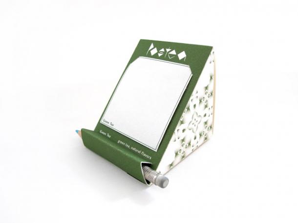
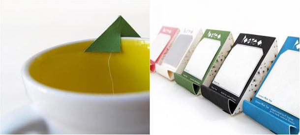
Tea Postea
Draws attention, do not you?
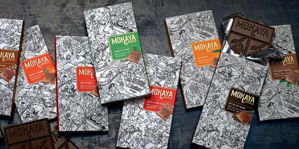
Chocolate Mokaya
Too beautiful chocolate.
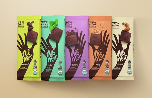
Chocolate NibMor
Accessible and intelligible description of the salad dressing. Clearly, for some, it is clear that over the sauce. And no need to write anything, and all so obvious.
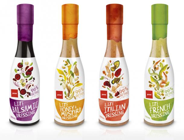
Sauces
In the snow and bad weather, at any time of the year ... our Eat ice cream!
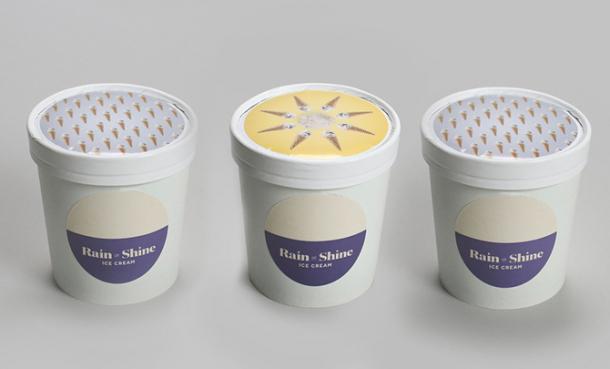
Ice Rain or Shine
But it is not just creative, but first of all convenient!
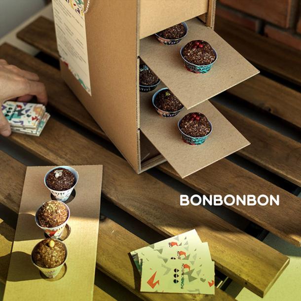
Set pastries Bonbonbon picnic
Touching thing, you want to examine. Mini story. The explicit calculation at a female audience.
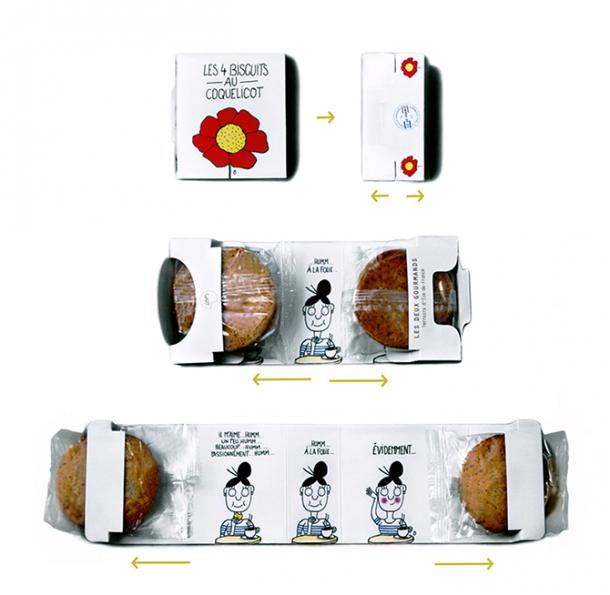
Cookies
Very affordable explanation and immediately wants to take up the brush.
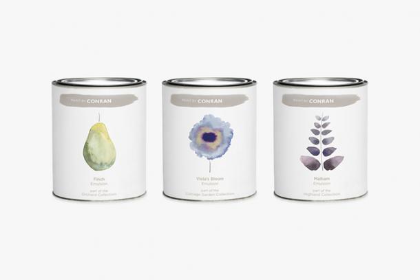
Interior Paint Conran
Where's our waist?
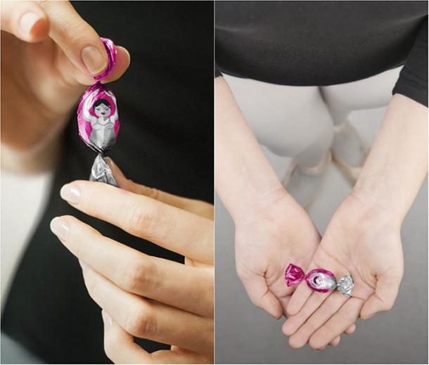
Sweets for dancers
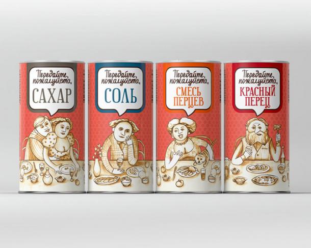
The concept of packaging for spices
Tandem Architects and Jean Oliver Pelle made soap in the form of stones. On the one hand to draw public attention to his work in architecture, and on the other - it's just a wonderful idea.

These candies and buy nicer!

Banana candy
Unusual packaging, which wants to examine.

Wine 5 Rounds
It is proved that the heart symbol increases customer loyalty.
Wine Latin lovers
Small door. All miniature touches.

Door handle H4U
And the image and flavor, and shine, and the flowers. The right combination and a unique marketing approach.

Perfume Marc Jacobs
Get to sign it!

Packing jeans Mustang
It is more convenient to spread it was cakes.

Flower honey
Here like and do not need you no pencil or a notebook and want to buy. Milo because!


Tea Postea
Draws attention, do not you?

Chocolate Mokaya
Too beautiful chocolate.

Chocolate NibMor
Accessible and intelligible description of the salad dressing. Clearly, for some, it is clear that over the sauce. And no need to write anything, and all so obvious.

Sauces
In the snow and bad weather, at any time of the year ... our Eat ice cream!

Ice Rain or Shine
But it is not just creative, but first of all convenient!

Set pastries Bonbonbon picnic
Touching thing, you want to examine. Mini story. The explicit calculation at a female audience.

Cookies
Very affordable explanation and immediately wants to take up the brush.

Interior Paint Conran
Where's our waist?

Sweets for dancers

The concept of packaging for spices
