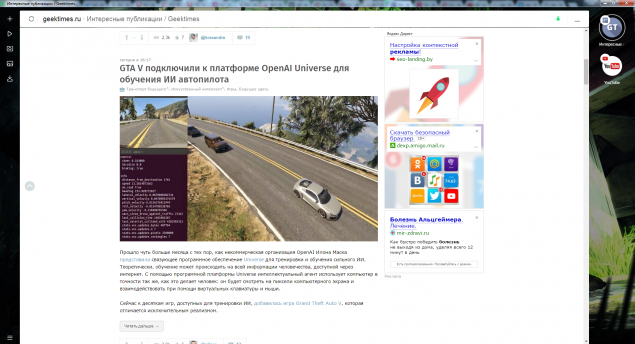
442
Opera introduced a new browser Neon

The real appearance of the home page Neon in the Windows version. Image the clickable
Software maker Opera Software has launched a new browser of its own production under the name of Neon, as reported in the company's official blog.
Work on the browser began about a year ago. New product from Mozilla is positioned as a next-generation browser for desktop computers. Neon is already available for Windows and MacOS.
Opera Software for more than 20 years working on the creation of browsers. The company believes that there is a need of revision of the basic doctrine of browserscreen, which classically relies on all pages and documents.
The company stresses that the Neon is not yet another incarnation of the Opera as you would think, and attempt a complete rethinking of what should be a browser in the modern web.
To redesign and upgrade the UX and UI specialists Opera Software came up thoroughly. Here are some features Neon on the background of the classic browsers:
- The new start page, which uses as a Wallpaper background of your desktop.
- Left side panel with its own video player, download Manager and image viewer.
- Vertical tab bar on the right side of the browser window, which makes it easier to distinguish between them with tabs.
- Intelligent control system of tabs. Often used tabs to move upward, when used as less to "settle" down.
- Brand new Omnibox, support both core and less popular search engines.
- The split screen mode to view two tabs simultaneously.
A live example of the site's appearance in Neon
It should be noted that due to the side panels using as a background Wallpaper of the desktop visual workspace of the screen becomes significantly smaller. Also conventionally difficult to navigate a large number of tabs, because the icons of sites in the left side of the screen, which act as tabs, not getting less, and going to the list with a slightly visible scroll bar:

Demonstration of the navigation pane tabs. If pages are too many, they are arranged in a vertical list
It should be noted that this browser is unlikely to appeal to those who have to operate many tabs during surfing. At the same time, Neon has some nice features and a fresh UI that can come for your daily surfing the Internet after work.
Add a new site on the home page is a trivial drag and drop the icons from the right column to the Central area of the screen. Everything is quite simple and intuitive. Obviously, the decision was taken from the mobile environment:

Adding the site to the "cloud" on the home page
Definitely a good decision can be called split screen mode. And, if used, the user can select the scope of pages until a ratio of 20% to 80%.

The split screen mode. Is activated by dragging icons tab in the workspace by selecting the display
The developers of Mozilla are more succeeded. Neon looks fresh and different from other browsers. Worth to commend that the attempt to break the established doctrine of the UI and UX, worthy of respect.
Of the downsides that immediately caught my eye, it is worth noting the narrowing of the visual workspace, because the side panels. Thus the vertical work area on the screen with a resolution of 1920x1080 at 25 pixels less than the popular Google Chrome and 10 than in Opera. This is due to the massive address bar-search bar at the top of the screen.
Besides Neon the same as Opera or Chrome creates a separate process for each tab of the browser with the appropriate amount of RAM, and smooth animations and other effects out of the box implying that the developers are not aimed at the budget market and wait for the desktop worthy performance. In order to understand whether or not Neon more attention, it will take time.
Source: geektimes.ru/post/284530/


Scientists have proposed to use instead of dental fillings cure for Alzheimer's disease
SpaceX told how and where it is planned to land the spent stages of the Falcon Heavy