631
Artemy Lebedev called the 2012 London logo "The best emblem of the Olympic Games"
Artemy Lebedev called on this week's London 2012 Olympics logo "The best emblem of any Olympic Games in recent years." This comment appeared on the studio site in the section "Business-Lynch» . B>
- Firstly, the motif endlessly fruitful (including parody capacity). It is very good when you do not have to worry that the logo will spoil.
- Secondly, the image of a very technologically - it is clear that the guys want to make a triple merchandising margins. If the yellow stroke will move down, no one will notice.
- Third, the emblem nepozorna. It is very rare for such starperskogo genre as the Olympic symbols.
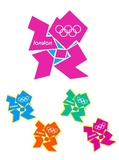
The popular blogger "Other", as commented positively on the work of Wolff Olins: «I really liked the work, it is a real breakthrough in the future (do not forget that until 2012, four and a half years). Logo is very dynamic, beautifully assembled, regardless of fashion trends and, moreover, he has created the trend today. Great professional work, which I am sure will be appreciated, but a little later. In short, I applaud colleagues ».
Related Links: interactive presentation online Wolff Olins
via www.wolffolins.com/interactive.html


Leaders of religious sects are sent via MTV PSAs
City germs on your wound in advertising conventional patches.