611
25 comments of customers, for which we really love them
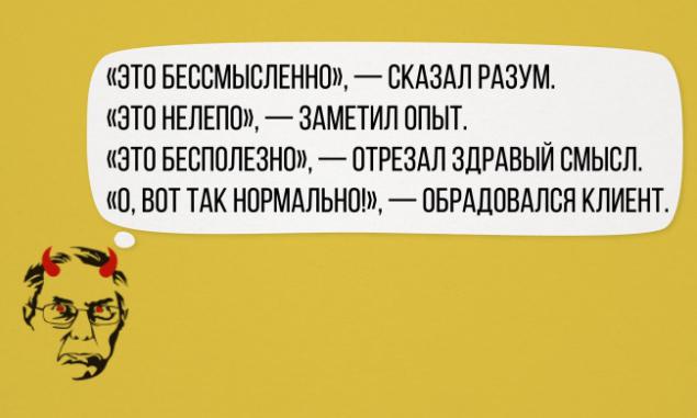
«The customer is always right" - this simple thought is considered axiomatic in many areas. But some customers as originally formulated their wishes, for example, a designer in the letters and the terms of reference that stories about it is simply impossible not to share.
And, indeed, when the projects are completed, all the models put into print, clips removed, and the customers are happy, we can be a good laugh over the fact that almost destroyed the work.
< Website I gathered in this article actual letter and comments of customers, for which we really love them.
- Very like your idea of a black man. And you can remove the black man?
- Yes, the certificate is made by all of our requirements, but that is not what we wanted ...
1. Buttons unexpressed.
2. GRASS sucks anyway, but okay. Do as a postcard to a new year. The client asked to change the snowflakes as they seemed to her not European. with the mother listened to music clips. It is not rushing. Have PEYRELEAU! I want you to use in the logo of a rainbow of colors, except brown. Make our logo eyes at infinity, only that it looks like: S as in Skype, but with rounded ends. In the catalog almost everything in a dark color. Sofas look as if they fly away. The text should be made more visible, but that he did not stand out. Edits Layout from the customer: "Nut color loses" raisins "». «And you could on a card insert builder with a European appearance, I am embarrassed by the Asian construction worker in a hard hat," - told me Eleusizov Nurlan Serikbayevich. - You can make a logo for 1000 rubles?
- No.
- And what can you do for 1000 rubles?
- Turn on the computer. From the correspondence on the logo for cranes: "I finally just decided that I wanted to. It is necessary to depict a mysterious expression in a raspberry-lemon color! » In an ideal single-site is needed to store contacts and perhaps a few pages ... Manager: "In the main we can place icons».
Customer: "What? Let's not drag God here! » Now, if you have developed a design iOS 7, I have listened to your opinion. And yet you are an ordinary designer, let's make a juicy gradient in the background, I think it will be great. Somewhere insert a conditional picture of white silhouette of daisy flower with stem as repulsed some good ideas, or send or something like that, you can even conditional rays shine - rhinestones - something to decorate.
All is fine, like everything, just make the casting on a chariot, like a Lexus.
Your letter "M" in a logo similar to the devil.
Bald smiley does not fit - similar to Gopnik. Add his hair and glasses. Smiley must be intelligent.
And under a curtain:
got a new job. Open the folder "Clients". Among other things, I notice the text I've found «read_me». Click, and then: "Run away, man !!!»
You will also enjoy:
20 when advertisers failed its job. With a bang
via www.adme.ru/zhizn-marazmy/20-sluchaev-kogda-reklamschiki-provalili-svoyu-rabotu-s-treskom-788010/


