2169
Pedigrees avtoemblem

Your suspicions that the logos on the cars - not really a chaotic stream of consciousness designers are true. Each emblem - the fruit of many years of work that reflects the traditions and other important things for the owner of the company. Buckle stronger, now you know everything! From time immemorial, cars adorned posters, figurines and statuettes. All these brilliant pieces constantly tore off all kinds of children. But there are still some mystery, the story of the origin ... Sometimes you do not know, how did monogram decorating the radiator of your car, and he looked like a hundred years ago.
Alfa Romeo

For the logo elements borrowed the coat of arms of the family Visconti, Duke of Milan: the Red Cross (reminiscent of the 1st crusade, which was attended by members of the family) and the Dragon, according to legend, was killed in the V century ancestor of the Visconti.
BMW

The first logo appeared in 1917, and represented the rotating propeller. In 1920, there was only from the propeller circle divided into four quarters, painted in traditional Bavarian colors - white and blue.
Citroen

Engineer Andre Citroen began his career as a businessman with a plant for the production of gearboxes. Gears in these boxes for a better grip had special teeth in the form of a chevron. Their image has crowned a company logo and more fundamentally changed.
Ferrari

A rearing horse first appeared on the fuselage of the Italian fighter ace Francesco Barak. The pilot was shot down in 1918, and his mother suggested to use a symbol to Enzo Ferrari. Yellow background - the color of the city of Modena, where he produced machines.
Nissan

Initially, the circle in the logo was red and symbolized the rising sun, and a rectangle (blue) - the sky. The company believes that all this expresses the motto of "sincerity brings success." However, the red and blue colors over time gave way under the pressure of the cold metal.
Mitsubishi

Three diamond emblem moved on with the family crest Yataro Iwasaki, the founding father. Hence the name: "Mitsui" in Japanese "three", "Bisi" - diamond. Diamonds symbolize honesty, responsibility to society and understanding between nations.
Mercedes-Benz

The company was established in 1926 by the merger of Karl Benz and Gottlieb Daimler. The star of the Daimler hinted superiority in 3 environments - on land, at sea and in the air. In 1937 the star was placed in a circle. (Prior to this, in its place was a laurel wreath on the "Benz».)
Opel

Lightning enclosed in a circle, recalls the legendary truck 30s Opel Blitz Tour 3, 6 (lightning German Blitz). Prior to this, the sign company was easier - blue oval with the inscription Opel, who later got drawn torpedo. And replaced it with a zipper.
Peugeot

Lion symbolizes the power of the Company's products. With him company involved and the Lion Monument in Belfort, which are located in the vicinity of the factories Peugeot. The monument was erected by Auguste Bartholdi (author of the Statue of Liberty), in order to remind the German unsuccessful siege of 1871 goda.PorscheT.k. company is located in Stuttgart, placed in the center of the emblem with a horse emblem of the city (the city was founded on the site of stud farm). Horns and stripes - with the coat of arms of the Duchy of Vyurttembergskogo, whose capital Stuttgart and was.
Renault
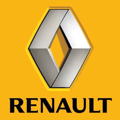
Logo was not 32 years old. In 1922 there was a sign in the form of a circle placed inside it on the grid labeled Renault. Sign hung on the horn, the grid also allows the sound output. And when, in 1924, made the diamond lattice, and the shape of the logo has changed.
Rover

As a shield emblem first appeared on the frames of bicycles, and since 1904 migrated to the first car company. Pictured on her ship, framed leaves, reminiscent of the Vikings - the distant ancestors of the English.
Subaru
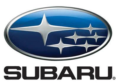
The stars in the logo symbolize the constellation of the Pleiades (Subaru in Japanese). Another name - "Seven Sisters", in memory of his daughters turned into stars Greek titan Atlas.
Toyota

Three ellipses appeared in 1989. Vertical and horizontal fold in the letter "T", and the ellipse symbolizes "spirit of creation in development." Ellipses surrounding empty space also makes sense and means "future opportunities and development of technologies».
Volkswagen

Initially, the company logo was the emblem of the castle Wolfsburg, which was not far from the plants Volkswagen. Later, coat of arms was abolished, and the emblem of the letter W. The letters appeared were outlined circle, in this form the emblem and still exists today.
Volvo

Firstborn Automobile, Volvo Jakob, was produced with the logo in the form of diagonal stripes on the radiator and the circle with an arrow (symbol of masculinity, in astrology - the symbol of Mars). In 1975 the range was abolished, leaving only a sign VOLVO.
Source: www.maximonline.ru/guide/auto/_article/auto-coats-of-arms/