855
15 examples of smart packaging
A third of all waste that we throw to the dump - is the packaging of food products: boxes, bags and wrappers. Most of them are bright, but absolutely useless things that we hurry to get rid.
But packaging can be quite different - a useful and facilitate people's lives. Examples of such a package in this collection.
22 photos + text.
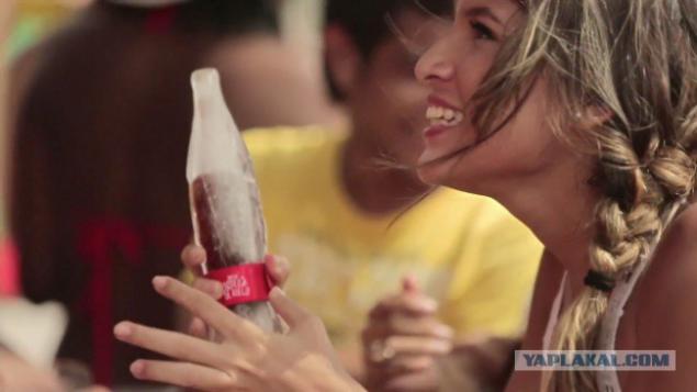
Bottle ice

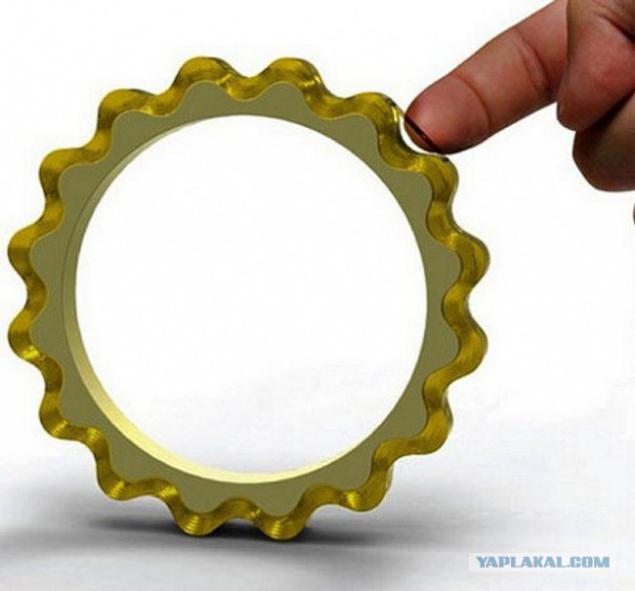
In the summer of refreshing drinks with ice become more relevant than ever. That's just the ice can not find everywhere and always. Coca-Cola has solved this problem cardinal manner - had spilled his drink in bottles made of ice. In order to avoid Toiletries and frostbitten fingers on ice container is put on a red bracelet with the logo of Coca-Cola.
02
Folding packaging for sandwiches
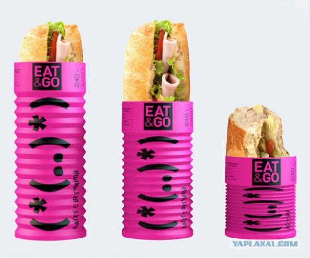
Folding accordion packaging Eat & Go - is a student work Olga Hamparian, Diana Gibadullin Alexander Kishchenko, Andronicus runners. Very convenient to eat on the go - the wrapper decreases as the disappearance of content.
03
Bank-bowl of chips
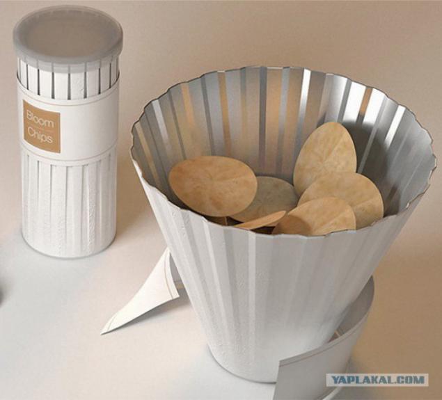
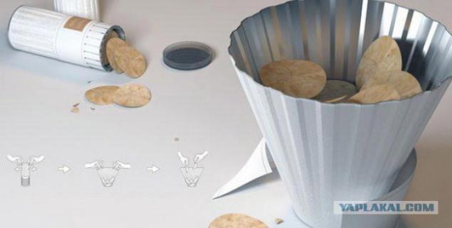
Designer Dohyuk Kwon figured out how to get the chips from the bottom of the cylindrical cans. In order not to tilt the container when the chips have reached a critical level, which it is impossible to reach, it is proposed to transform the bank into a bowl. After removing the tightening element cylinder is made of compressed paper, curly modernized dishes.
04
05
Price lists freshness
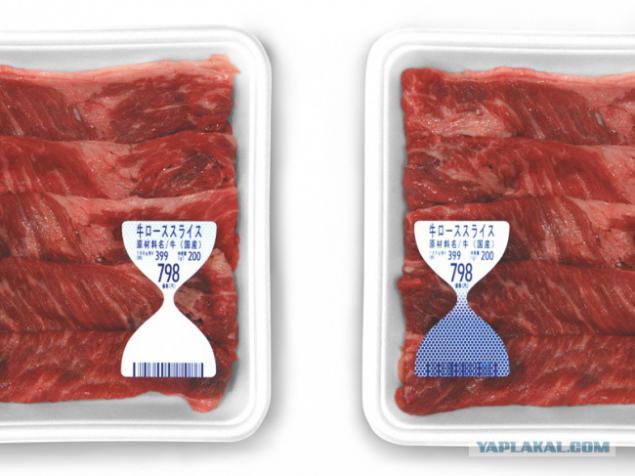
Japanese design agency To-Genkyo develop innovative price tags on meat products. They show the customer the freshness of a product. Price lists change color depending on the meat products of ammonia emitted. With their help it is easy to determine how much fresh product is on the counter.
06
Cheese pencils
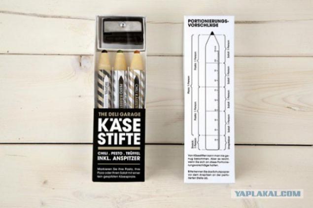
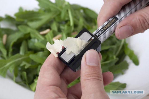
Company The Deli Garage Parmesan cheese produced in the form of pencils of three pieces in a package with rods of different flavors - truffle pesto and chili. Sharpener, with which you can grate cheese directly on the plate, attached. Measurement scale on the packaging tells you how much cheese to add to this or that dish, and how many calories are in each of them.
07
08
Butter
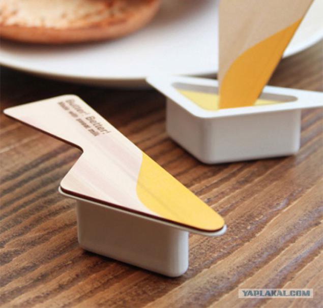
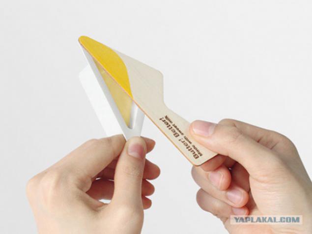
Portion packaging butter knife and a wooden "2 in 1" from designer Yeongkeun. Convenient to use the road.
09
10
Milled Scotch
novate
No more agonizing search for the end of the tape and try to pick up his fingernail. With this packaging is easy to find and mark the cut edge. However, in the mass production of this idea is not yet gone.
11
"Anti-theft" bags for lunch
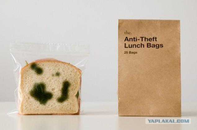
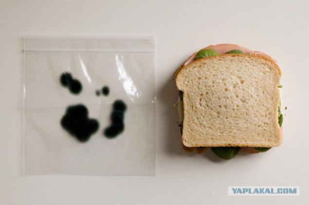
If you worry about the safety of your sandwiches in the office refrigerator, you can pack them in bags "moldy". No presentation does not cause appetite colleagues. Smart packaging engineers and designers came up with Sherwood Forli from Los Angeles.
12
13
Bank with two covers
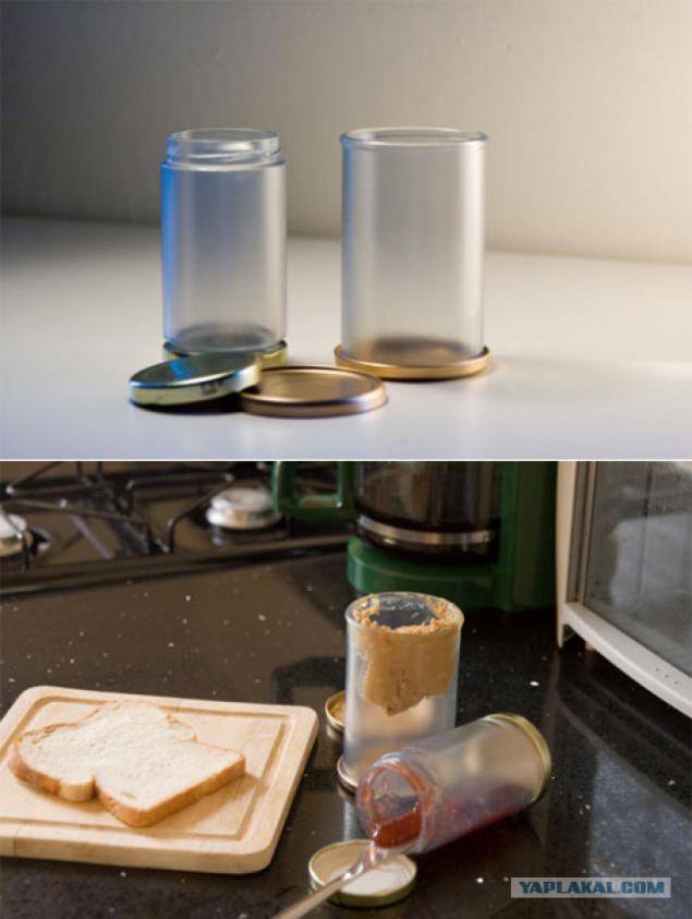
Another invention Sherwood Forli. In such an economic package not a bit of jam or mustard will not remain at the bottom.
14
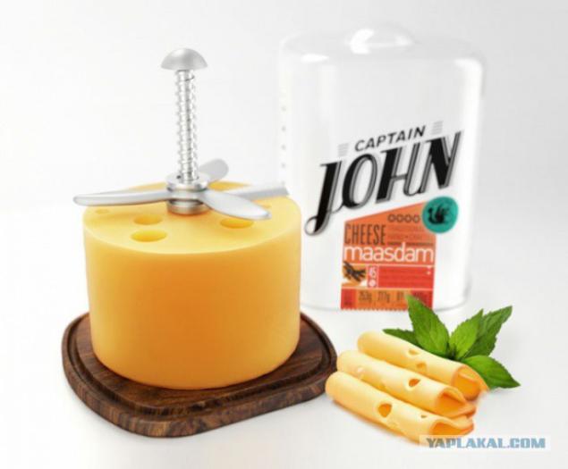
Cheese propeller
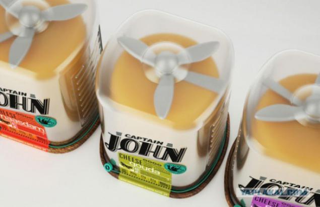
Cut cheese slices in neat - great art, subservient real aces. The packaging of cheese «Captain John» designers Galim Akhmetzyanova and Paul Tchouikina embedded knife. A small turn of the propeller and cheese cut into thin slices.
15
16
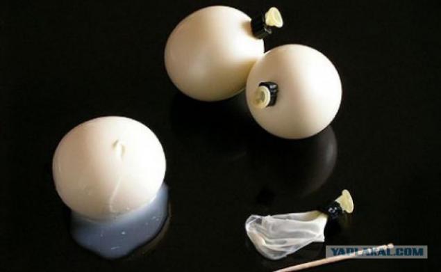
Packing-ball
Packing-ball for tofu or Japanese pudding made of an elastic material that is easy to change the size. One has only to pierce with a toothpick packaging - and from it will be only a small piece of rubber
17
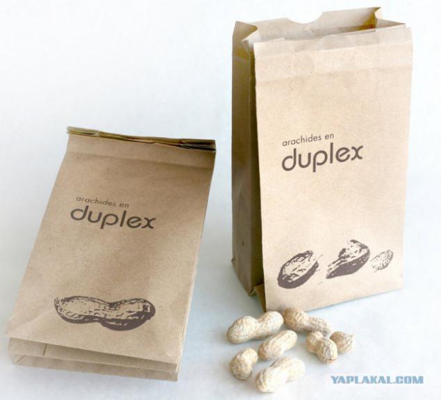
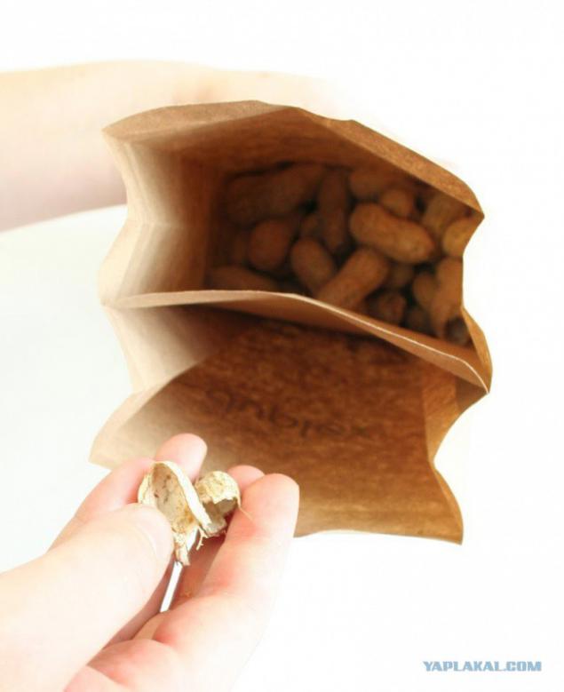
Double bag
That would be all the seeds and nuts were sold in such. To be where to put the husk.
18
19
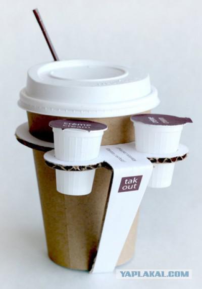
Cup holder
Cup holder «Take out» invented designer from Canada Melissa Kluter. It is made of cardboard glueless manner. With the help of the hot glass is easy to carry with one hand without fear of getting burned. In addition, the holder has special holes for molds with cream.
20
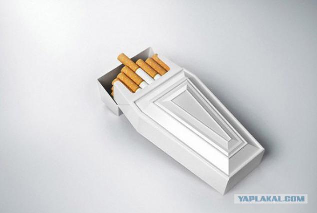
Tutu against smoking
Ominous and a simple concept - cigarette packs in the form of a coffin. The authors believe that this package can be an alternative to the words "Smoking kills" and frightening pictures. Design tobacco company RJ Reynolds
21
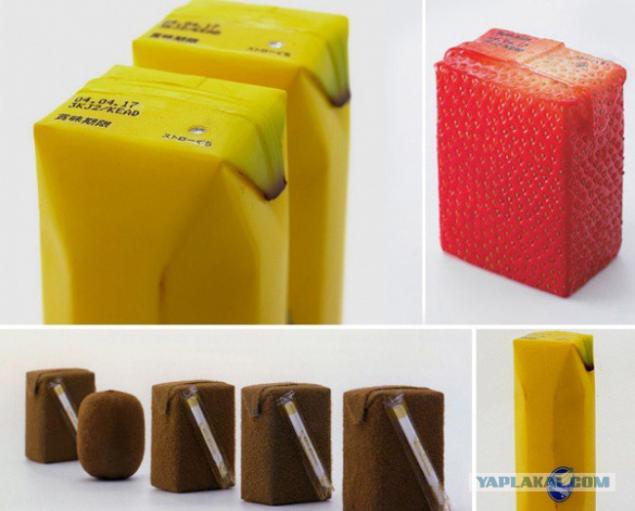
Natural juices
Naoto Fukasawa Japanese designer has created the packaging for juices that mimics the skin of fruit. All clear without unnecessary labels.
That's all I wanted to say. proof
22
Source:
But packaging can be quite different - a useful and facilitate people's lives. Examples of such a package in this collection.
22 photos + text.
Bottle ice

In the summer of refreshing drinks with ice become more relevant than ever. That's just the ice can not find everywhere and always. Coca-Cola has solved this problem cardinal manner - had spilled his drink in bottles made of ice. In order to avoid Toiletries and frostbitten fingers on ice container is put on a red bracelet with the logo of Coca-Cola.
02

Folding packaging for sandwiches
Folding accordion packaging Eat & Go - is a student work Olga Hamparian, Diana Gibadullin Alexander Kishchenko, Andronicus runners. Very convenient to eat on the go - the wrapper decreases as the disappearance of content.
03

Bank-bowl of chips
Designer Dohyuk Kwon figured out how to get the chips from the bottom of the cylindrical cans. In order not to tilt the container when the chips have reached a critical level, which it is impossible to reach, it is proposed to transform the bank into a bowl. After removing the tightening element cylinder is made of compressed paper, curly modernized dishes.
04

05

Price lists freshness
Japanese design agency To-Genkyo develop innovative price tags on meat products. They show the customer the freshness of a product. Price lists change color depending on the meat products of ammonia emitted. With their help it is easy to determine how much fresh product is on the counter.
06

Cheese pencils
Company The Deli Garage Parmesan cheese produced in the form of pencils of three pieces in a package with rods of different flavors - truffle pesto and chili. Sharpener, with which you can grate cheese directly on the plate, attached. Measurement scale on the packaging tells you how much cheese to add to this or that dish, and how many calories are in each of them.
07

08

Butter
Portion packaging butter knife and a wooden "2 in 1" from designer Yeongkeun. Convenient to use the road.
09

10

Milled Scotch
novate
No more agonizing search for the end of the tape and try to pick up his fingernail. With this packaging is easy to find and mark the cut edge. However, in the mass production of this idea is not yet gone.
11

"Anti-theft" bags for lunch
If you worry about the safety of your sandwiches in the office refrigerator, you can pack them in bags "moldy". No presentation does not cause appetite colleagues. Smart packaging engineers and designers came up with Sherwood Forli from Los Angeles.
12

13

Bank with two covers
Another invention Sherwood Forli. In such an economic package not a bit of jam or mustard will not remain at the bottom.
14

Cheese propeller
Cut cheese slices in neat - great art, subservient real aces. The packaging of cheese «Captain John» designers Galim Akhmetzyanova and Paul Tchouikina embedded knife. A small turn of the propeller and cheese cut into thin slices.
15

16

Packing-ball
Packing-ball for tofu or Japanese pudding made of an elastic material that is easy to change the size. One has only to pierce with a toothpick packaging - and from it will be only a small piece of rubber
17

Double bag
That would be all the seeds and nuts were sold in such. To be where to put the husk.
18

19

Cup holder
Cup holder «Take out» invented designer from Canada Melissa Kluter. It is made of cardboard glueless manner. With the help of the hot glass is easy to carry with one hand without fear of getting burned. In addition, the holder has special holes for molds with cream.
20

Tutu against smoking
Ominous and a simple concept - cigarette packs in the form of a coffin. The authors believe that this package can be an alternative to the words "Smoking kills" and frightening pictures. Design tobacco company RJ Reynolds
21

Natural juices
Naoto Fukasawa Japanese designer has created the packaging for juices that mimics the skin of fruit. All clear without unnecessary labels.
That's all I wanted to say. proof
22

Source:

