589
Comments to the famous paintings
If customers can comment on the work iskusstva.Izvestny illustrator Tabor when working on illustrations for the book, always pririsovyvat in the corner of the dog. When the editor starts complaining, what the figure depicts a dog, the artist began foaming at the mouth to prove that the dog in the picture is needed. As a result, the artist gave up, the dog was removed from the image and content editor gave the drawing to print. And when the artist asked, why did you draw this dog everywhere, he said, "Would not it be a dog, he would have to do with anything else find fault! ..»
And we are in the Website have decided to present a situation where the famous works of art that adorn the walls of the world's museums and private collections, have been the subject of comments by the modern customers.
Sandra Botticelli's "Birth of Venus»
Overall, okay, a couple of important amendments:
1. The chest should be bigger. Much more.
2. color here that we do not like squiggles. It is desirable to make it light green, and if it does not - even clean or replace the leather sword belt buckled. Of course, green.
3. This garbage neither here nor there. Remove it down between the reed and finger. And reduced.
4. Correct facial expression guy at a workplace. It seems that he pukes, not blowing. It should be similar to the girl next door, one thing they are busy.
Jan van Eyck "Arnolfini Portrait»
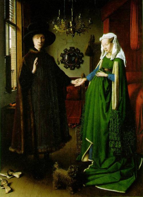
We liked your option, it was amazing! Simply super. But redo. Guys, well, we have to bear the happiness of the people, not melancholy! Therefore, all you need to cheer up.
1. Orange in this layout is not enough positive. A green looks harmless enough.
2. totally cute dog, Hachiko to replace something.
3. It is necessary to think about the interior, it is obsolete. If you do not know what inspiration, go to Ikea.
4. Celebrities why a man like Putin? this is some trend? Let's better to be Brad Pitt, Angelina Jolie and the woman, and let everyone will be happy.
Karl Bryullov "Horsewoman»
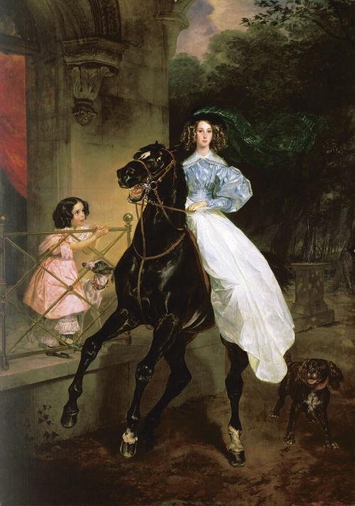
You know, we have opened your layout, and somehow there was no such that "ah!". We honestly expected more from you.
1. The horse is not in good looks, play with her look, it should be more visionary and express the philosophy of our company. It is difficult, but try.
2. She liked a good deal, but change their clothes in her red evening gown.
3. you draw from nature? Next time, please contact us affirm all models.
4. The girl on a balcony replace the young man, and his eyes should be a healthy interest.
5. Change the stucco on the wall. We need something more avant-garde.
Michelangelo's "Creation of Adam»
Colleagues, we understand that today take the layout to print, but we still have small changes:
1. at the bottom left hand Incomprehensible like opening a can of beer. Remove.
2. The current background color we do not like, want something perky, try prints.
3. An adult bearded man and a cluster of boys around him will not pass censorship. Somehow solve this problem.
4. a red rag to the right shaped like an ear, correct. We have too much and anatomy in the layout!
5. The man on the left came out perfectly. We see that you have tried. To make it even cooler, let's change to a more dynamic posture - let it be a jump.
Leonardo da Vinci's "Lady with an Ermine»
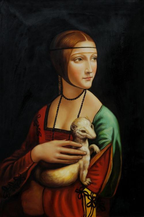
A sincere thank you for a wonderful layout, but still have a couple of small comments:
1. What is the mutant in the hands of women? Replace sweet dog.
2. The image of the girl lacks the glamor, let's replace the black background to pink breasts bigger and deeper necklines.
3. If the output is to the fore hand, do not forget to varnish nails. This obviously begs the red!
4. What's wrong with the girl's eyes, there is no commitment and credibility. Oh, let it looks straight! And let smiles like Mona Lisa! So we create a puzzle!
5. Accessories on the neck of the girl is not in fashion this season, look for something from Swarovski.
via www.adme.ru/articles/vy-unyloe-govno-a-ne-sovremennyj-hudozhnik-428605/
And we are in the Website have decided to present a situation where the famous works of art that adorn the walls of the world's museums and private collections, have been the subject of comments by the modern customers.
Sandra Botticelli's "Birth of Venus»
Overall, okay, a couple of important amendments:
1. The chest should be bigger. Much more.
2. color here that we do not like squiggles. It is desirable to make it light green, and if it does not - even clean or replace the leather sword belt buckled. Of course, green.
3. This garbage neither here nor there. Remove it down between the reed and finger. And reduced.
4. Correct facial expression guy at a workplace. It seems that he pukes, not blowing. It should be similar to the girl next door, one thing they are busy.
Jan van Eyck "Arnolfini Portrait»

We liked your option, it was amazing! Simply super. But redo. Guys, well, we have to bear the happiness of the people, not melancholy! Therefore, all you need to cheer up.
1. Orange in this layout is not enough positive. A green looks harmless enough.
2. totally cute dog, Hachiko to replace something.
3. It is necessary to think about the interior, it is obsolete. If you do not know what inspiration, go to Ikea.
4. Celebrities why a man like Putin? this is some trend? Let's better to be Brad Pitt, Angelina Jolie and the woman, and let everyone will be happy.
Karl Bryullov "Horsewoman»

You know, we have opened your layout, and somehow there was no such that "ah!". We honestly expected more from you.
1. The horse is not in good looks, play with her look, it should be more visionary and express the philosophy of our company. It is difficult, but try.
2. She liked a good deal, but change their clothes in her red evening gown.
3. you draw from nature? Next time, please contact us affirm all models.
4. The girl on a balcony replace the young man, and his eyes should be a healthy interest.
5. Change the stucco on the wall. We need something more avant-garde.
Michelangelo's "Creation of Adam»
Colleagues, we understand that today take the layout to print, but we still have small changes:
1. at the bottom left hand Incomprehensible like opening a can of beer. Remove.
2. The current background color we do not like, want something perky, try prints.
3. An adult bearded man and a cluster of boys around him will not pass censorship. Somehow solve this problem.
4. a red rag to the right shaped like an ear, correct. We have too much and anatomy in the layout!
5. The man on the left came out perfectly. We see that you have tried. To make it even cooler, let's change to a more dynamic posture - let it be a jump.
Leonardo da Vinci's "Lady with an Ermine»

A sincere thank you for a wonderful layout, but still have a couple of small comments:
1. What is the mutant in the hands of women? Replace sweet dog.
2. The image of the girl lacks the glamor, let's replace the black background to pink breasts bigger and deeper necklines.
3. If the output is to the fore hand, do not forget to varnish nails. This obviously begs the red!
4. What's wrong with the girl's eyes, there is no commitment and credibility. Oh, let it looks straight! And let smiles like Mona Lisa! So we create a puzzle!
5. Accessories on the neck of the girl is not in fashion this season, look for something from Swarovski.
via www.adme.ru/articles/vy-unyloe-govno-a-ne-sovremennyj-hudozhnik-428605/
