It is considered that in order to get a significant return on changes to the site, you need to undertake a thorough redesign, change the concept, make rebranding etc. But in fact, sometimes even small changes can lead to huge effect. Sometimes you can achieve conversion by changing or moving elements of your site. When we wrote an article about
A / B analysis , we stumbled on the
selection of examples that demonstrate results of various tests. We have chosen a few of them are based on two main parameters: the simplicity and efficiency.
5th: Change the description of their activities in order to increase sales in the 1, 5 times. B> h5>
Arlington Plastics Machinery - a company that sells equipment for processing plastic, extruders, etc. In September 2013 a decision was made about the need to change the site to increase conversion rates. Then the page looked like this:
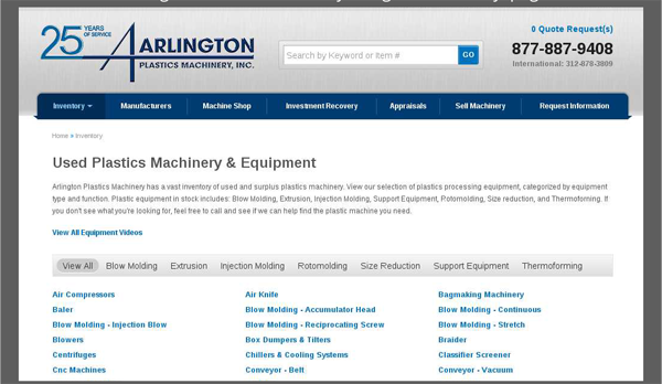
The page contains a list of the operations that you can spend with plastic using equipment from Arlington below lists 119 methods of processing plastics. Following changes were made:
- Added links to the 5 most popular methods of processing;
- This has been listed machines that do this work, but not the direction, ie, solution to the problem, not its description;
- A call to action "call ..».
As a result, the page has received this form:
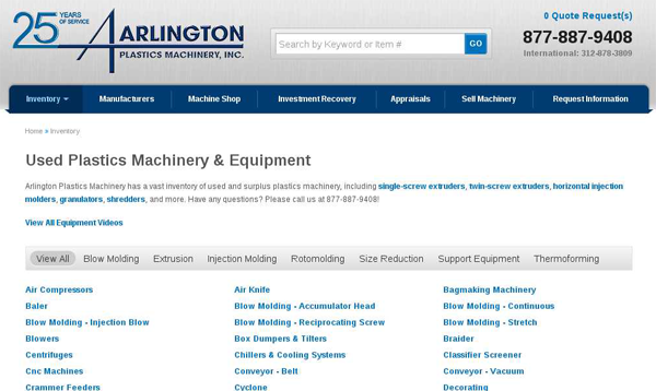
The result has been an increase in the conversion of 150%, with almost 100% of long-term effectiveness. In monetary terms, this result can be represented as an extra 15 thousand. Dollars for the first month of the test page. According to rough estimates, these changes will bring 500 thousand. Dollars for the first year of operation.
4th place: do not distract the user and get a 232 percent result! B> h5>
Open Mile - brokers working in the field of freight USA. The company decided to evaluate the possibility of increasing the efficiency of Landing Page, which in May 2013 could boast like this look:
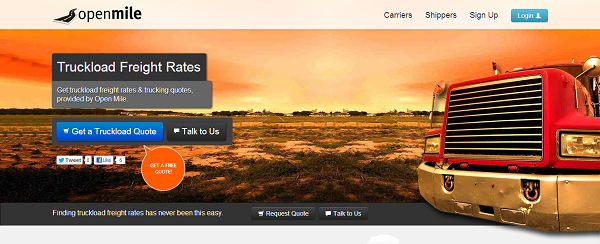
During the analysis it was assumed that the bright picture with open horizon distract the user from the call to action and a negative effect on the final result. In eventually it was decided to eliminate all distractions and maximize highlight SAT:

3rd place: Be honest and increase sales in 2 times 68 h5>
Acuity Scheduling works in the field of software for online scheduling. Originally it was planned three tariff plans:
- Free version (freemium) with limited functionality, but that does not expire;
- Package Professional - a set of the most popular features for 10 bucks a month;
- Premium - complete package for $ 19.
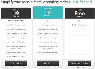
Free version assumes that you are using the trial version of the software in order to become familiar with the interface, but if you want to use it for its intended purpose, then you will have to pay 10 dollars. In May 2013 it was proposed to change the freemium on 14-day trial version. As a result, the number of registrations for paid services in the test period increased by 268%. To date, Acuity Scheduling returned to freemium, but offer a trial version for a premium account.
This can happen for two reasons: the changes are not justified itself in the long term or, more likely, a decision was made to attract customers to a premium account.
2nd place: Remove excess and you will have to book in 4 times more often. B> h5>
This party has confirmed the idea that we have formulated in the description of the 4-th place. Anything that can distract you from the ultimate goal should be removed, even if it ... icon security. Change:
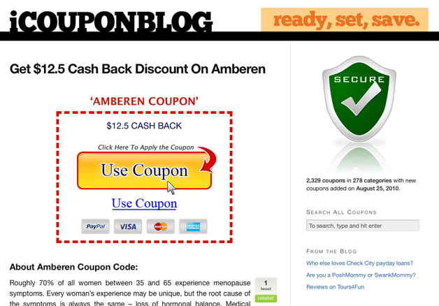
on:
showed an increase of conversion in a test period of 4 times.
It was in the distant year 2010, presently the domain of the site sold for reasons unknown to us, and the last activity on Twitter was listed in 2011.
Rank 1: "And you weak?" Increase quoting their news in social networks 36 times (!) Due to ... move the block of social networks. B> h5>
Easily move the button "share" caused absolutely unpredictable effect: recording began to quote 36 times more often. Of course, this is not quite the conversion in the conventional sense, but it's a great result in the achievement of this goal.
In 2012, AMD had a test, trying to determine which location button "share" will be optimal in terms of citations in the social networks. At that time it was located at the bottom of the page. Testing has shown that the movement of the buttons in the upper-left portion of the site leads to an increase in citation 36 times.
To date, AMD team for unknown reasons abandoned function "share" in the pages of the site, leaving this possibility only in the blog, where she also was moved, but under the title of the article.
By reading this post, it is important to remember that what works for one site may not necessarily be effective for another. The basic idea that we wanted to convey: no trifles in the optimization of your site, just as there is no complete optimization. When you think you have nothing more to change, look closely to detail.
Of course, most likely, the top turned subjective and you can offer your options that deserve a prize in this list.
Source: habrahabr.ru/company/paysto/blog/219179/