1333
Advertising Logos
There are still on Earth witty people who create advertising. I thought it really was that the authors logos plohovasto very imaginative, but no - all very good. It turns out that some of these logos can play with us, showing more than just those who are able to include imagination and see what others do not see. If you stare at the many logos, we can see the amazing details that talk about the wit of the authors and, of course, brought to our attention some "hidden message" or the versatility of the image. Presented logos, though small, but they have invested a lot more than meets the eye.
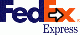
The most memorable and popular logo containing a hidden meaning, a company logo FedEx. If you look a little better, you will notice a flat arrow, resulting from a combination of the space between the letter "E" and «x». The arrow pointing to the right, serves as a symbol of speed and accuracy - the two main principles of the company. Surprisingly, almost everyone who has ever seen the arrow, always pay attention on it.
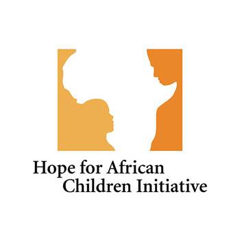
This logo is an organization dedicated to good business - help African kids, at first glance, it seems to be something strange and incomprehensible. What is happening, it is not clear ... But in fact, the logo depicts a silhouette of the African continent, child and adult, as a symbol of support and care.
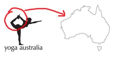
"Yoga Club" in Australia also uses a similar chip. In the resulting silhouette of a woman can be seen the outlines of Australia.
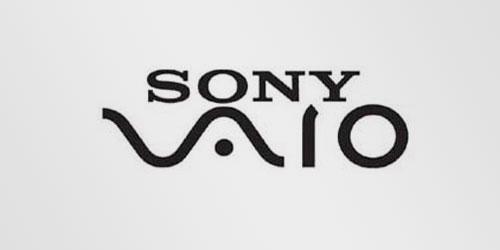
The first two letters of the logo make an easy wave that symbolizes the analog signal, but the last two letters in the name resemble the numbers 1 and 0, that is, the digital signal.
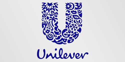
Unilever is engaged in manufacturing a huge number of products that successfully reflected in its logo. If you look closely, you'll see a lot of things, including the heart, as a symbol of love and health, as well as a bird as a symbol of freedom and liberation from everyday worries.
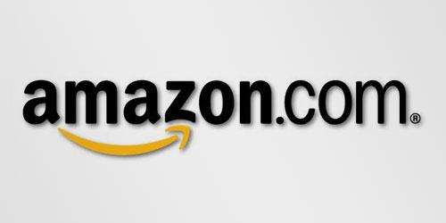
, Amazon wants their services and products pleasing customers, so the yellow arrow is reminiscent smile and connects the letters "a" and «z», which means that to find in this company, you can literally everything!
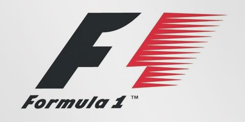
Get accustomed to the empty space between the letter «F» and bright red stripes and you'll see the number 1, which represents the speed and desire to win.

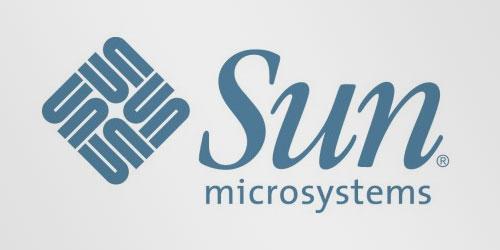
Logos creates even professors! So Stanford University professor Van Pratt designed the logo for the company «Sun», which is easy to read from each corner of the square.
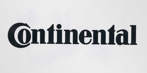
Continental tires are known worldwide for their quality, but not everyone knows that in the logo of the company's first two letters create a tire perspective.
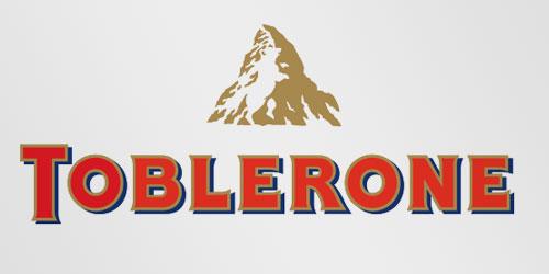
The company for the production of Toblerone Swiss chocolate knows how to emphasize the city of Bern manufacturer or as it is called the City of Bears. The company has included a silhouette of a bear in the mountain.
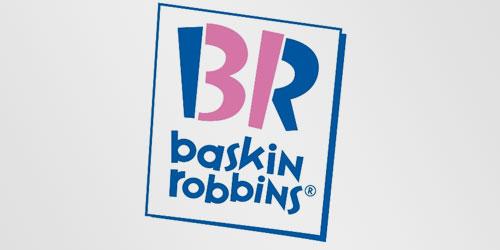
Delicious ice cream Baskin Robbins from its inception, had 31 taste, the company decided to consolidate in its logo. Look for the pink part of the letter «B» and «R» and you will understand what I mean.
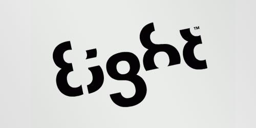
Eight company has decided to create an unusual logo. Each letter of the name of the company is made of numbers 8.
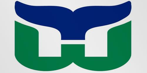
Logo of the company consists of just three parts - the letters H, the letter W and blue whale tail.
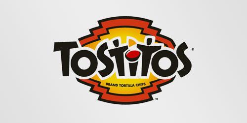
Look at the center of the logo. On it, two people enjoy a delicious meal from the Tostitos.
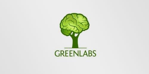
As you know the tree crown in the logo nothing more than the brain. The company decided to focus on excellent intelligence of their employees and to reflect the name of the green - green and labs - Laboratory.
That's how it is. And there is a sense in logos)

The most memorable and popular logo containing a hidden meaning, a company logo FedEx. If you look a little better, you will notice a flat arrow, resulting from a combination of the space between the letter "E" and «x». The arrow pointing to the right, serves as a symbol of speed and accuracy - the two main principles of the company. Surprisingly, almost everyone who has ever seen the arrow, always pay attention on it.

This logo is an organization dedicated to good business - help African kids, at first glance, it seems to be something strange and incomprehensible. What is happening, it is not clear ... But in fact, the logo depicts a silhouette of the African continent, child and adult, as a symbol of support and care.

"Yoga Club" in Australia also uses a similar chip. In the resulting silhouette of a woman can be seen the outlines of Australia.

The first two letters of the logo make an easy wave that symbolizes the analog signal, but the last two letters in the name resemble the numbers 1 and 0, that is, the digital signal.

Unilever is engaged in manufacturing a huge number of products that successfully reflected in its logo. If you look closely, you'll see a lot of things, including the heart, as a symbol of love and health, as well as a bird as a symbol of freedom and liberation from everyday worries.

, Amazon wants their services and products pleasing customers, so the yellow arrow is reminiscent smile and connects the letters "a" and «z», which means that to find in this company, you can literally everything!

Get accustomed to the empty space between the letter «F» and bright red stripes and you'll see the number 1, which represents the speed and desire to win.

Logos creates even professors! So Stanford University professor Van Pratt designed the logo for the company «Sun», which is easy to read from each corner of the square.

Continental tires are known worldwide for their quality, but not everyone knows that in the logo of the company's first two letters create a tire perspective.

The company for the production of Toblerone Swiss chocolate knows how to emphasize the city of Bern manufacturer or as it is called the City of Bears. The company has included a silhouette of a bear in the mountain.

Delicious ice cream Baskin Robbins from its inception, had 31 taste, the company decided to consolidate in its logo. Look for the pink part of the letter «B» and «R» and you will understand what I mean.

Eight company has decided to create an unusual logo. Each letter of the name of the company is made of numbers 8.

Logo of the company consists of just three parts - the letters H, the letter W and blue whale tail.

Look at the center of the logo. On it, two people enjoy a delicious meal from the Tostitos.

As you know the tree crown in the logo nothing more than the brain. The company decided to focus on excellent intelligence of their employees and to reflect the name of the green - green and labs - Laboratory.

That's how it is. And there is a sense in logos)