Eternal Logos
 Bashny.Net
25 logos that never changes with the times osnovaniya.Rebrending - one of the favorite activities of top management of most of the world and Russian companies. However, there are those who protects their logos tens and hundreds of years.
This site contains material eternal logos of world renowned companies, so firmly entered our lives, which is likely to change the visual image would kill these brands. No one would understand such a move. Imagine, for example, Coca Cola began to be manufactured with a yellow label and the name written in block letters shaggy. Would you buy it? We - definitely not.
All logos with a long history can be divided into two categories: those that do not, and I never did, and those that occasionally change details and Richt fonts. According to this principle, and we have built this material.
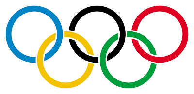
Generally not menyalisOlimpiyskie ring 1912, Baron Pierre de Coubertin
The most common and generally accepted symbols of the Olympic Games - five colored rings connected - invented himself Pierre de Coubertin in 1912. Worldwide representation they received at the VII Summer Olympics in Antwerp in 1920.
Distributed version, the rings represent the five parts of the world, the countries which participate in the Olympic movement: Europe - Blue America - red, Asia - yellow, Africa - Black, Australia - green. Six color (along with white background cloth) are combined so that the colors are contained in the flags of all countries of the world.
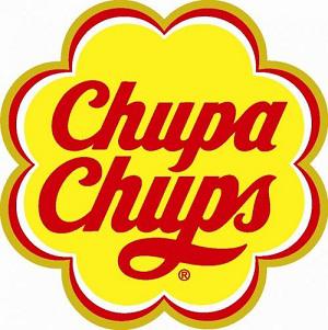
Chupa Chups 1969 Salvador Dali
Chupa-Chups brand was founded in Spain in 1958 in the framework of "Granja Asturias." Enric Bernat created the first lollipop (originally wooden) which could suck and do not spoil your clothes and hands. Logo design brand owner company Enric Bernat "an acquaintance" painted the famous countryman Salvador Dali. It was he who in 1969 invented the form of a flower logo Chupa Chups for that with small modifications safely survived until today. He also proposed to place the logo is not on the side and on top of candy.
Eared Bunny appeared in Playboy in the same year, when he first saw the light - in 1953. He painted for Hugh Hefner illustrator Art Paul. Hare in bow tie - it was a hare, not a rabbit - was chosen because it is fun, playful and yet very sexy. In this he was confident Hugh.
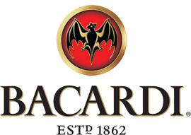
Bacardi 1862 Facundo Bacardi
In 1862 Cuban wine merchant Facundo Bacardi acquired the distillery in Santiago de Cuba, and started to make her white rum on its own technology. Under the roof of the distillery lived a huge number of Mexican tailed bats, and Facundo decided to take the image of the mouse, eating fruit on their logo. This decision contributed to the fact that in Cuba fruit bats - a symbol of good luck.
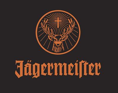
Jagermeister 1935
Logo 35-degree digestif is based on an ancient tale about Monk Ditharda Klein Hubertus, the patron saint of hunters. The tale speaks of Hubert, who violated the ban on hunting, and his destiny. He met a deer and he was hurt and ashamed (divine a story). The deer turned and shone between his horns a cross, animal hunter forgiveness and offered to free him from suffering. Hubert, of course, became very religious and then a saint.
Name digestif translated as "the master of hunting».
Maybach 1909
The two "M" on the logo Maybach - a name the company's founders, Wilhelm Maybach and his son Karl.

Porsche 1951
When it comes to the origin of the iconic logo from the same company car can be two versions of the same story. And it hides from us the truth about the Porsche and the logo of the German manufacturer of sports cars. According to the representative of Porsche Cars North America, a very powerful car distributor Max Hoffman (Max Hoffman) met with Ferry Porsche (Ferry Porsche) in the New York restaurant in 1951. During the discussion, Hoffman insisted Porsche that his car needed a powerful logo, something special and very elegant. A rough sketch was made in the same place and at the same time, on a napkin.
But the story told in the Porsche Germany differs from this colorful story. Max Hoffman asked exactly Ferry Porsche to come up with the logo, but it was drawn on a napkin definitely not a restaurant in Manhattan, and the company engineer Franz Xaver Raymshpissom (Franz Xaver Reimspiess).

Goodyear 1900
Constant sandalik winged logo on Goodyear tires appeared thanks to Frank Ziberlingu, founder and president of many years. House Frank on the stairs stood a statue of Mercury (aka Hermes), the god of trade and cunning, and Mr. Ziberling felt that this god embodies all the characteristics that already at that time were known products Goodyear. He assembled at the house of his employees to discuss upcoming logo, among the sketches was one sandalik winged Mercury. The decision was taken unanimously.

Nivea 1924
Nivea cream went on sale in 1911, but in 1924 he was packed into a flat tin can of blue with white lettering, which immediately became the company's logo. Nivea, by the way, from the Latin, "Snow White." A blue color was chosen largely because at that moment he was not associated with any political party in Germany.

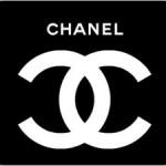
Chanel 1925, Coco Chanel
The two letters "c", located mirror and crossbones, he came up and drew Coco Chanel herself in the castle in Nice before opening his first mono-brand store.
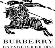
Burberry 1901
The inscription «Burberry» existed since 1856, since the foundation of the brand, but a knight in armor on horseback with a flag that says «Prorsum» («Next») was registered only in 1901.
Bvlgari 1884
The strange shape of the letters «u» in the logo of the world famous jewelry brand explains the origin. Italian company founded by the Greeks, Sotirios Voulgaris, and modern Greek, his name was written that way - Bvlgaris. From the last letter immediately refused to give more Italian sounding name.
Louis Vuitton 1896 Louis Vuitton
LV monogram appeared in 1896, six years after the founding of the company. Interestingly, this monogram was planned to mark all of the original things Vuitton, as already bags and suitcases began to actively forge. I wonder what would now become of Louis Vuitton, if he went to the Moscow metro and walked in the markets. According to recent reports, the world's only 1% of items with similar markings are authentic.
Hermes 1950
The company was founded in 1837, but more than a hundred years, never had a logo. He played just writing the name, as it is now accepted in the fashion business. The logo became a royal horse-drawn carriage with orange.
Varied detaliCoca Cola 1886, Frank Robinson
The main competitor of Pepsi all the years of relentless war quietly watched for throwing red and blue in the area of identity, occasionally drawing subtle restyling its centennial logo. In the history of Coca Cola there is only one "shameful moment" when they literally for several months tried to introduce a new writing in 1890, but quickly gave up the idea. In 2008, Coca Cola again prefer easy alignment of a cardinal restructuring - the company simply took the "vyvorotki", and the letters are red and the background is gone.

McDonald's 1962 Jim Schindler
Golden arches were painted to correlate Identity restaurants with arches, which were then at the entrances to McDonald's. Jim Schindler actually just joined two of the same architectural elements into one. The purpose of the logo, in addition to raising awareness among consumers, and was holding a parallel in the minds of potential franchise partners from McDonald's to the gold veins. So they, and color is.
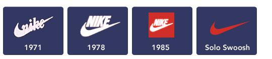
Nike 1971, Caroline Davidson
History, nabivshaya on edge and become painfully familiar. Swoosh Nike, which is perhaps the most recognizable sign in the world, came up with the University of Portland student Caroline Davidson in 1971. She paid him $ 35, even taking into account the prices of those years it - a penny. Logo design is almost not changed in 37 years - only changed the spelling of the brand, and now all disappeared.
BMW 1923
BMW, the myth (and smart marketers) took over several generations, linking the company's logo with the aviation theme. "The German advertising agency in the 1920s created an advertisement that showed a range of BMW in front of the rotating propeller aircraft, and thus reflect the origin of the company as a manufacturer of aircraft engines. And then it turned into a myth, "said Dave Buchko (Dave Buchko), the representative of BMW North America. And despite the fact that BMW actually produces engines for aircraft, white and blue logo is the color of the Bavarian flag, not a propeller and sky.
For 88 years, the logo has changed only a little of his surroundings.

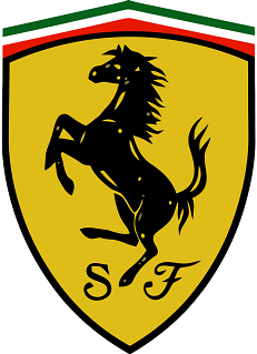
Ferrari 1947
One of the most famous logos of all time - prancing horse Ferrari - first appeared on military aircraft, which is controlled by Francesco Baracca, an aviator and hero of the First World War. In 1923, Enzo Ferrari (Enzo Ferrari), met with the parents of Francesco after the race and they asked him to use the image on his prancing horse racing car - good luck and as a tribute to the memory of Francesco, who died shortly before the end of the war. By the horse was added yellow background (the official color of Enzo Ferrari's hometown, Modena, Italy), as well as to change the direction of the tail, it began to look up.

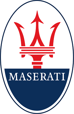
Maserati 1914
Inspiration to find a name and logo creation can come from a careful and accurate research among consumers, loopholes in the law or, in some cases, out of sight on the environment. Maserati brothers when creating his trident got inspiration from the statue of Neptune, which stood in the central park of Bologna, where the headquarters of the company. Maserati Trident signed under it was painted by the artist Mario, who was also the only one of seven brothers Maserati, which has never been occupied by the design or manufacture of machinery.
The first time the logo has not been lower strap closing, "leg" of a trident.
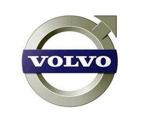
Volvo 1924
Volvo name has Latin roots. It means "I roll" and is taken from the name brand balls, which he wore until the moment when it was attached to the Swedish automaker in 1924. As the company's logo was selected antique iron symbol is a circle with an arrow located on a diagonal toward the upper right corner.
Symbol of iron is one of the oldest and most well-known image in Western culture. In the Roman Empire, the sign represented the militant and invincible god Mars, who fought only iron weapons.
The diagonal stripe running across the radiator grille, which was originally performed only as a mounting point for the nameplate, but now it's almost the same brand identity as the symbol.
Johnnie Walker 1908, Tom Brown
The son of the founder of the brand Johnnie Walker George Walker in 1908, met with comic book artist Tom Brown, and together they created the concept of a walking man. It is believed that this is actually a caricature of John Walker, but be that as it may, the figure so like Tom George and his brother Alexander, that since people and stepping on each bottle of whiskey. The only change is the color, and a few decades ago has changed the font.
We deliberately did not take the logos of companies that are less than thirty years. Such as Google, Red Bull and others. Too little time has passed in the history of identity to be able to make any conclusions. Also, we did not take everything the eternal logos of the three business sectors, renowned for its conservatism - high fashion, cars, expensive alcohol. We chose only the most illustrative and interesting.
See also the history of great logos and automotive branding, the most noticeable change logos of 2011 and a selection of logos with a hidden meaning.
via www.adme.ru/kreativnyj-obzor/logotipy-so-skrytym-smyslom-102541/
This site contains material eternal logos of world renowned companies, so firmly entered our lives, which is likely to change the visual image would kill these brands. No one would understand such a move. Imagine, for example, Coca Cola began to be manufactured with a yellow label and the name written in block letters shaggy. Would you buy it? We - definitely not.
All logos with a long history can be divided into two categories: those that do not, and I never did, and those that occasionally change details and Richt fonts. According to this principle, and we have built this material.
Generally not menyalisOlimpiyskie ring 1912, Baron Pierre de Coubertin
The most common and generally accepted symbols of the Olympic Games - five colored rings connected - invented himself Pierre de Coubertin in 1912. Worldwide representation they received at the VII Summer Olympics in Antwerp in 1920.
Distributed version, the rings represent the five parts of the world, the countries which participate in the Olympic movement: Europe - Blue America - red, Asia - yellow, Africa - Black, Australia - green. Six color (along with white background cloth) are combined so that the colors are contained in the flags of all countries of the world.

Chupa Chups 1969 Salvador Dali
Chupa-Chups brand was founded in Spain in 1958 in the framework of "Granja Asturias." Enric Bernat created the first lollipop (originally wooden) which could suck and do not spoil your clothes and hands. Logo design brand owner company Enric Bernat "an acquaintance" painted the famous countryman Salvador Dali. It was he who in 1969 invented the form of a flower logo Chupa Chups for that with small modifications safely survived until today. He also proposed to place the logo is not on the side and on top of candy.

Eared Bunny appeared in Playboy in the same year, when he first saw the light - in 1953. He painted for Hugh Hefner illustrator Art Paul. Hare in bow tie - it was a hare, not a rabbit - was chosen because it is fun, playful and yet very sexy. In this he was confident Hugh.
Bacardi 1862 Facundo Bacardi
In 1862 Cuban wine merchant Facundo Bacardi acquired the distillery in Santiago de Cuba, and started to make her white rum on its own technology. Under the roof of the distillery lived a huge number of Mexican tailed bats, and Facundo decided to take the image of the mouse, eating fruit on their logo. This decision contributed to the fact that in Cuba fruit bats - a symbol of good luck.

Jagermeister 1935
Logo 35-degree digestif is based on an ancient tale about Monk Ditharda Klein Hubertus, the patron saint of hunters. The tale speaks of Hubert, who violated the ban on hunting, and his destiny. He met a deer and he was hurt and ashamed (divine a story). The deer turned and shone between his horns a cross, animal hunter forgiveness and offered to free him from suffering. Hubert, of course, became very religious and then a saint.
Name digestif translated as "the master of hunting».

Maybach 1909
The two "M" on the logo Maybach - a name the company's founders, Wilhelm Maybach and his son Karl.

Porsche 1951
When it comes to the origin of the iconic logo from the same company car can be two versions of the same story. And it hides from us the truth about the Porsche and the logo of the German manufacturer of sports cars. According to the representative of Porsche Cars North America, a very powerful car distributor Max Hoffman (Max Hoffman) met with Ferry Porsche (Ferry Porsche) in the New York restaurant in 1951. During the discussion, Hoffman insisted Porsche that his car needed a powerful logo, something special and very elegant. A rough sketch was made in the same place and at the same time, on a napkin.
But the story told in the Porsche Germany differs from this colorful story. Max Hoffman asked exactly Ferry Porsche to come up with the logo, but it was drawn on a napkin definitely not a restaurant in Manhattan, and the company engineer Franz Xaver Raymshpissom (Franz Xaver Reimspiess).

Goodyear 1900
Constant sandalik winged logo on Goodyear tires appeared thanks to Frank Ziberlingu, founder and president of many years. House Frank on the stairs stood a statue of Mercury (aka Hermes), the god of trade and cunning, and Mr. Ziberling felt that this god embodies all the characteristics that already at that time were known products Goodyear. He assembled at the house of his employees to discuss upcoming logo, among the sketches was one sandalik winged Mercury. The decision was taken unanimously.

Nivea 1924
Nivea cream went on sale in 1911, but in 1924 he was packed into a flat tin can of blue with white lettering, which immediately became the company's logo. Nivea, by the way, from the Latin, "Snow White." A blue color was chosen largely because at that moment he was not associated with any political party in Germany.

Chanel 1925, Coco Chanel
The two letters "c", located mirror and crossbones, he came up and drew Coco Chanel herself in the castle in Nice before opening his first mono-brand store.

Burberry 1901
The inscription «Burberry» existed since 1856, since the foundation of the brand, but a knight in armor on horseback with a flag that says «Prorsum» («Next») was registered only in 1901.

Bvlgari 1884
The strange shape of the letters «u» in the logo of the world famous jewelry brand explains the origin. Italian company founded by the Greeks, Sotirios Voulgaris, and modern Greek, his name was written that way - Bvlgaris. From the last letter immediately refused to give more Italian sounding name.

Louis Vuitton 1896 Louis Vuitton
LV monogram appeared in 1896, six years after the founding of the company. Interestingly, this monogram was planned to mark all of the original things Vuitton, as already bags and suitcases began to actively forge. I wonder what would now become of Louis Vuitton, if he went to the Moscow metro and walked in the markets. According to recent reports, the world's only 1% of items with similar markings are authentic.

Hermes 1950
The company was founded in 1837, but more than a hundred years, never had a logo. He played just writing the name, as it is now accepted in the fashion business. The logo became a royal horse-drawn carriage with orange.

Varied detaliCoca Cola 1886, Frank Robinson
The main competitor of Pepsi all the years of relentless war quietly watched for throwing red and blue in the area of identity, occasionally drawing subtle restyling its centennial logo. In the history of Coca Cola there is only one "shameful moment" when they literally for several months tried to introduce a new writing in 1890, but quickly gave up the idea. In 2008, Coca Cola again prefer easy alignment of a cardinal restructuring - the company simply took the "vyvorotki", and the letters are red and the background is gone.

McDonald's 1962 Jim Schindler
Golden arches were painted to correlate Identity restaurants with arches, which were then at the entrances to McDonald's. Jim Schindler actually just joined two of the same architectural elements into one. The purpose of the logo, in addition to raising awareness among consumers, and was holding a parallel in the minds of potential franchise partners from McDonald's to the gold veins. So they, and color is.

Nike 1971, Caroline Davidson
History, nabivshaya on edge and become painfully familiar. Swoosh Nike, which is perhaps the most recognizable sign in the world, came up with the University of Portland student Caroline Davidson in 1971. She paid him $ 35, even taking into account the prices of those years it - a penny. Logo design is almost not changed in 37 years - only changed the spelling of the brand, and now all disappeared.

BMW 1923
BMW, the myth (and smart marketers) took over several generations, linking the company's logo with the aviation theme. "The German advertising agency in the 1920s created an advertisement that showed a range of BMW in front of the rotating propeller aircraft, and thus reflect the origin of the company as a manufacturer of aircraft engines. And then it turned into a myth, "said Dave Buchko (Dave Buchko), the representative of BMW North America. And despite the fact that BMW actually produces engines for aircraft, white and blue logo is the color of the Bavarian flag, not a propeller and sky.
For 88 years, the logo has changed only a little of his surroundings.

Ferrari 1947
One of the most famous logos of all time - prancing horse Ferrari - first appeared on military aircraft, which is controlled by Francesco Baracca, an aviator and hero of the First World War. In 1923, Enzo Ferrari (Enzo Ferrari), met with the parents of Francesco after the race and they asked him to use the image on his prancing horse racing car - good luck and as a tribute to the memory of Francesco, who died shortly before the end of the war. By the horse was added yellow background (the official color of Enzo Ferrari's hometown, Modena, Italy), as well as to change the direction of the tail, it began to look up.


Maserati 1914
Inspiration to find a name and logo creation can come from a careful and accurate research among consumers, loopholes in the law or, in some cases, out of sight on the environment. Maserati brothers when creating his trident got inspiration from the statue of Neptune, which stood in the central park of Bologna, where the headquarters of the company. Maserati Trident signed under it was painted by the artist Mario, who was also the only one of seven brothers Maserati, which has never been occupied by the design or manufacture of machinery.
The first time the logo has not been lower strap closing, "leg" of a trident.

Volvo 1924
Volvo name has Latin roots. It means "I roll" and is taken from the name brand balls, which he wore until the moment when it was attached to the Swedish automaker in 1924. As the company's logo was selected antique iron symbol is a circle with an arrow located on a diagonal toward the upper right corner.
Symbol of iron is one of the oldest and most well-known image in Western culture. In the Roman Empire, the sign represented the militant and invincible god Mars, who fought only iron weapons.
The diagonal stripe running across the radiator grille, which was originally performed only as a mounting point for the nameplate, but now it's almost the same brand identity as the symbol.

Johnnie Walker 1908, Tom Brown
The son of the founder of the brand Johnnie Walker George Walker in 1908, met with comic book artist Tom Brown, and together they created the concept of a walking man. It is believed that this is actually a caricature of John Walker, but be that as it may, the figure so like Tom George and his brother Alexander, that since people and stepping on each bottle of whiskey. The only change is the color, and a few decades ago has changed the font.

We deliberately did not take the logos of companies that are less than thirty years. Such as Google, Red Bull and others. Too little time has passed in the history of identity to be able to make any conclusions. Also, we did not take everything the eternal logos of the three business sectors, renowned for its conservatism - high fashion, cars, expensive alcohol. We chose only the most illustrative and interesting.
See also the history of great logos and automotive branding, the most noticeable change logos of 2011 and a selection of logos with a hidden meaning.
via www.adme.ru/kreativnyj-obzor/logotipy-so-skrytym-smyslom-102541/
Tags
See also
30 minutes a day, that can change lives
In the Egyptian desert has a strange cinema "End of the World", which was never shown films
Business idea: Production of paper bags (Kraft packing)
Tony Robbins: Words can change the brain
Things will never be the west
Before and after diet and sports. People who have got to change.
25 fearless women who forever changed the course of history. You say the weaker sex?
15 signs that the Russian advertising is getting worse
Someday you'll understand that there are people who will never betray ....