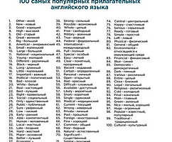
Trends in design logos 2009
 Bashny.Net
The chief editor of the influential catalog and logo storage Logolounge.com Bill Gardner published its traditional annual review of trends in the creation of logos for 2009 god.Vse logos in 2009 brings together some general areas of development: increasing the role of the text in which the logo becomes more and more, and who is no longer just general information about the brand, and narrowly specialized, as well as the bold use of vivid colors even in the logos of major serious clients.
Bill Gardner (Bill Gardner) also drew attention to the launch earlier this year badge favicon Google in size 15x15 pixels, calling it a harbinger of great changes in logostroenii. He predicts that in the near future will depend on the success of the logo and how it will look in the format favicon.
Bill Gardner traditionally allocates 15 promising trends-images and a few not so significant trends in the development of logos.
See also: Trends in design logo design logos 2008Trendy 2007FOTONAPOLNENIE / PhotoFillIspolzovanie not only and not so much the vector elements with rigidly defined colors, and photos or elements of photographic quality.
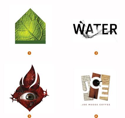
1. El Paso, Galeria de Comunicacion, Lazar Greenhouses
2. TOKY Branding + Design, The Pulitzer Foundation for the Arts
3. APSITS, DIESEL
4. Big Communications, Joe Muggs Coffee
Hidden elements / logos ConcealedTak called double value using the reception of optical illusions. If you look carefully at this picture, you can see children running into a dove, in tangles of antlers of a swan, and the slopes of the soldier and the horse on the background of the house.
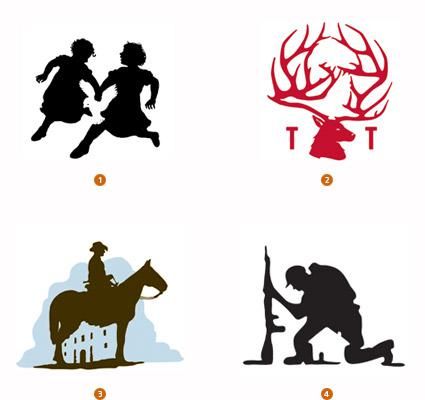
1. Calacampania Studios, Calagraphic Design
2. Duffy & Partners, Gander Mountain
3. The Bradfor Lawton Design Group, REOC
4. Felixsockwell.com, New York Times
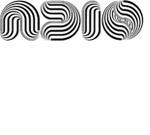
Diversity of / VariDotEtot style is not new. In his last year's review of Bill Gardner also I mentioned it, describing how colorblind (Colorblind). A distinctive feature of this year trend is that all points of the different size of the logo, contrasting colors and are arranged in an arbitrary order.
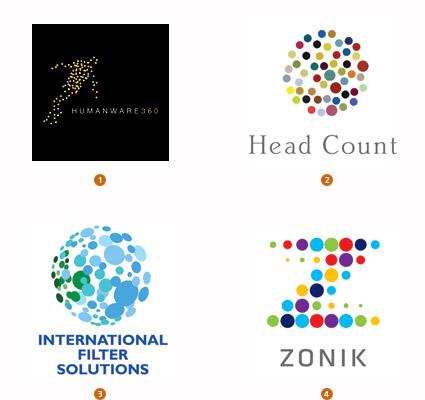
1. Alin Golfitescu, www.humanware360.com
2. Thread Design, Head Count Asia
3. Blue Sky Design, International Filter Solutions4. Lippincott, Zonik
Patches / Candy StripeV logo is based on the image of the scattered beam of colored pencils or colored ribbons. These logos inspired by childhood memories, are playful, not very serious nature and resemble a rainbow, a symbol of diversity and choice of the majority.
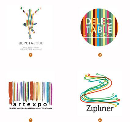
1. ORFIK DESIGN, DVA SA
2. Liquid Pixel Studio, Delectable Chocolate
3. juancazu, camara de comercio de bogota
4. dache, Zipline
TEXT / Texting Logos begin to contain not only the brand name but also other additional information such as, for example, the tagline and addresses of organizations. It solves the problem of space saving, but may create some difficulties: readability and recognition of logo depends on its size.
1. Chris Rooney Illustration / Design, Heavenly Ski Resort
2. Bryan Cooper Design, Tulsa Glassblowing Studio
3.Sussner Design Company, saint barts
4. GDNSS, cheapairlines.com
Inlay / Encrust introduction of "inside" logo variety of characters and graphics. Certainly it attracts attention with its content symbolic structure, which wants to be seen not once.
1. Mattson Creative, Career Artist Management
2. cogu design, Yvonne Coutinho
3. Graphics & Designing Inc., MTK
4. Jobi, Sam and Shahir Ahmed
MONOLOGUE / Monologue Visual foundation logo up words, smoothly flowing into each other and having a strong emotional and credibility.
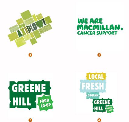
1. Airside, Airplot
2. Wolff Olins, Macmillan Cancer Support
3. Base, Greene Hill Food Co-op
4. Base, Greene Hill Food Co-op, Lockup Variation
LACE / Doily Logo like a delicacy, served on a lace doily. Openwork pattern envelops graphic center of the logo, giving the softness and sophistication.

1. Iperdesign, Inc., splurge dessert
2. R & R Partners, Harrah's
3. Diagram, Eligiuz
4. Gesture Studio, Isaias Gil
Shifters / Flip Flop Logo-shifters, which are either the same read both up and down the legs, or are a mirror image of the word. Full or partial use of this technique in the logo.
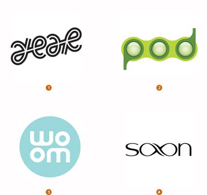
1. MINE, Scheyer / SF
2. Pearson Education Ltd, Pearson Education
3. NOT A CANNED HAM, Graco
4. Roy Smith Design, Shaun Saxon Photography
MOSAIC / Mosaic This trend can be described as «E pluribus unum», which means "One of the many created." The visual image of the logo was created by a mosaic of bright multi-colored pixels.
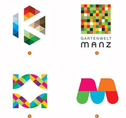
1. Team Y & R, Khalid Bin Haider Group
2. Kommunikation & Design, Gartenwelt Manz
3. dache, webmynd
4. NATIONAL Public Relations, Greater Montreal
Sequent / Sequential sequent (lat. Sequentia, «adherence", "what is vosled") - a term meaning a dynamic, gradual movement. Logos are made in the style of stop-motion graphics and represent a sequence of flowing into each other colors and shades, symbolizing harmony and order: the change of seasons, change of colors of the rainbow, and so on.
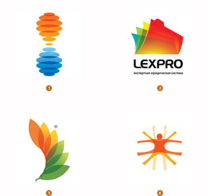
1. Gardner Design, BiTemp
2. RedBrand, LexPro
3. metaforma design, RACE research for an alternative and clean energy
4. Schwartzrock Graphic Arts, Design Center
PROCESSING / Recycle recycling symbol of the International was created 40 years ago for the American manufacturer dumpsters Container Corporation. Today the icon with three arrows is widely used for creating logos of other environmentally-oriented and not just companies.

1 .rylander design, Refabric, Inc.
2. Tyme Inc., Office Depot
3. BrandBerry, non-commercial
4. Kevin France Design, Inc., VF corp
Dandelion / Dandelion Dandelion - a kind of iconic symbol of freedom: each feather flying its not driven her way, only obeying the will of the wind, not knowing where it will fall and take root. Use of this image in the logo gives the brand gives a feeling of lightness and freedom.
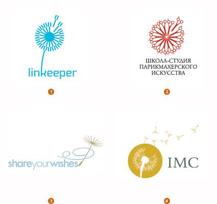
1. Ulyanov Denis, linkeeper
2. RedBrand, Barberschool
3. LaMonica Design, Morningstar Communications
4. Courtney & Company, IMC Group
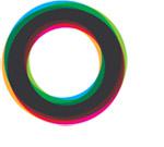
Movement in a circle / Circulate The circle is the ideal graphic image that symbolizes infinity and the balance of life and the planet Earth, and the movement of the wheel, and so on. Introducing the new evolution of the classic examples of the trend.
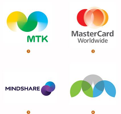
1. Porkka & Kuutsa Oy, Central Union of Agricultural Producers & Forest Owners
2. FutureBrand, MasterCard Worldwide
3. Moving Brands, Mindshare
4.Gardner Design, PBA Architects
Blurs / Gossamer This new trend combines two old trend, marked by Bill Gardner in 2003 and 2005 respectively, the Transparency Blur.
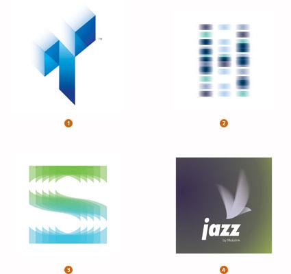
1. Michael Freimuth Creative, Tone Animation, LLC.
2. Roy Smith Design, Hooke Laboratories
3. Roman Kotikov, Soft cafe
4. Alin Golfitescu, mobilink pakistan
Bill Gardner also cited several less significant trends in logostroenii, including:
Halftone - bitmap fill / Peepshow
Psychedelic / Psychosis
Embroidery / Embroidery
Vitrage / Stained Glass
Ribbon 3D / 3D Curls
Colored rings / Color Ring
Celtic motifs / Celtic
Full article is available on Logolounge.
via www.logolounge.com/logotrends/
Bill Gardner (Bill Gardner) also drew attention to the launch earlier this year badge favicon Google in size 15x15 pixels, calling it a harbinger of great changes in logostroenii. He predicts that in the near future will depend on the success of the logo and how it will look in the format favicon.
Bill Gardner traditionally allocates 15 promising trends-images and a few not so significant trends in the development of logos.
See also: Trends in design logo design logos 2008Trendy 2007FOTONAPOLNENIE / PhotoFillIspolzovanie not only and not so much the vector elements with rigidly defined colors, and photos or elements of photographic quality.

1. El Paso, Galeria de Comunicacion, Lazar Greenhouses
2. TOKY Branding + Design, The Pulitzer Foundation for the Arts
3. APSITS, DIESEL
4. Big Communications, Joe Muggs Coffee
Hidden elements / logos ConcealedTak called double value using the reception of optical illusions. If you look carefully at this picture, you can see children running into a dove, in tangles of antlers of a swan, and the slopes of the soldier and the horse on the background of the house.

1. Calacampania Studios, Calagraphic Design
2. Duffy & Partners, Gander Mountain
3. The Bradfor Lawton Design Group, REOC
4. Felixsockwell.com, New York Times
Diversity of / VariDotEtot style is not new. In his last year's review of Bill Gardner also I mentioned it, describing how colorblind (Colorblind). A distinctive feature of this year trend is that all points of the different size of the logo, contrasting colors and are arranged in an arbitrary order.

1. Alin Golfitescu, www.humanware360.com
2. Thread Design, Head Count Asia
3. Blue Sky Design, International Filter Solutions4. Lippincott, Zonik
Patches / Candy StripeV logo is based on the image of the scattered beam of colored pencils or colored ribbons. These logos inspired by childhood memories, are playful, not very serious nature and resemble a rainbow, a symbol of diversity and choice of the majority.

1. ORFIK DESIGN, DVA SA
2. Liquid Pixel Studio, Delectable Chocolate
3. juancazu, camara de comercio de bogota
4. dache, Zipline
TEXT / Texting Logos begin to contain not only the brand name but also other additional information such as, for example, the tagline and addresses of organizations. It solves the problem of space saving, but may create some difficulties: readability and recognition of logo depends on its size.
1. Chris Rooney Illustration / Design, Heavenly Ski Resort
2. Bryan Cooper Design, Tulsa Glassblowing Studio
3.Sussner Design Company, saint barts
4. GDNSS, cheapairlines.com
Inlay / Encrust introduction of "inside" logo variety of characters and graphics. Certainly it attracts attention with its content symbolic structure, which wants to be seen not once.

1. Mattson Creative, Career Artist Management
2. cogu design, Yvonne Coutinho
3. Graphics & Designing Inc., MTK
4. Jobi, Sam and Shahir Ahmed
MONOLOGUE / Monologue Visual foundation logo up words, smoothly flowing into each other and having a strong emotional and credibility.

1. Airside, Airplot
2. Wolff Olins, Macmillan Cancer Support
3. Base, Greene Hill Food Co-op
4. Base, Greene Hill Food Co-op, Lockup Variation
LACE / Doily Logo like a delicacy, served on a lace doily. Openwork pattern envelops graphic center of the logo, giving the softness and sophistication.

1. Iperdesign, Inc., splurge dessert
2. R & R Partners, Harrah's
3. Diagram, Eligiuz
4. Gesture Studio, Isaias Gil
Shifters / Flip Flop Logo-shifters, which are either the same read both up and down the legs, or are a mirror image of the word. Full or partial use of this technique in the logo.

1. MINE, Scheyer / SF
2. Pearson Education Ltd, Pearson Education
3. NOT A CANNED HAM, Graco
4. Roy Smith Design, Shaun Saxon Photography
MOSAIC / Mosaic This trend can be described as «E pluribus unum», which means "One of the many created." The visual image of the logo was created by a mosaic of bright multi-colored pixels.

1. Team Y & R, Khalid Bin Haider Group
2. Kommunikation & Design, Gartenwelt Manz
3. dache, webmynd
4. NATIONAL Public Relations, Greater Montreal
Sequent / Sequential sequent (lat. Sequentia, «adherence", "what is vosled") - a term meaning a dynamic, gradual movement. Logos are made in the style of stop-motion graphics and represent a sequence of flowing into each other colors and shades, symbolizing harmony and order: the change of seasons, change of colors of the rainbow, and so on.

1. Gardner Design, BiTemp
2. RedBrand, LexPro
3. metaforma design, RACE research for an alternative and clean energy
4. Schwartzrock Graphic Arts, Design Center
PROCESSING / Recycle recycling symbol of the International was created 40 years ago for the American manufacturer dumpsters Container Corporation. Today the icon with three arrows is widely used for creating logos of other environmentally-oriented and not just companies.

1 .rylander design, Refabric, Inc.
2. Tyme Inc., Office Depot
3. BrandBerry, non-commercial
4. Kevin France Design, Inc., VF corp
Dandelion / Dandelion Dandelion - a kind of iconic symbol of freedom: each feather flying its not driven her way, only obeying the will of the wind, not knowing where it will fall and take root. Use of this image in the logo gives the brand gives a feeling of lightness and freedom.

1. Ulyanov Denis, linkeeper
2. RedBrand, Barberschool
3. LaMonica Design, Morningstar Communications
4. Courtney & Company, IMC Group
Movement in a circle / Circulate The circle is the ideal graphic image that symbolizes infinity and the balance of life and the planet Earth, and the movement of the wheel, and so on. Introducing the new evolution of the classic examples of the trend.

1. Porkka & Kuutsa Oy, Central Union of Agricultural Producers & Forest Owners
2. FutureBrand, MasterCard Worldwide
3. Moving Brands, Mindshare
4.Gardner Design, PBA Architects
Blurs / Gossamer This new trend combines two old trend, marked by Bill Gardner in 2003 and 2005 respectively, the Transparency Blur.

1. Michael Freimuth Creative, Tone Animation, LLC.
2. Roy Smith Design, Hooke Laboratories
3. Roman Kotikov, Soft cafe
4. Alin Golfitescu, mobilink pakistan
Bill Gardner also cited several less significant trends in logostroenii, including:
Halftone - bitmap fill / Peepshow

Psychedelic / Psychosis

Embroidery / Embroidery

Vitrage / Stained Glass

Ribbon 3D / 3D Curls

Colored rings / Color Ring

Celtic motifs / Celtic

Full article is available on Logolounge.
via www.logolounge.com/logotrends/
Tags
See also
Semishagovy test logo Paul Rand
The American model
National Geographic
For smart carts future retail or: How I invented the wheel
Stories of great logos
Highlights logos 2010
Best British Design
Sunset manual