523
10 characters that are hidden in famous logos
Logos of world famous brands are all around us: in television commercials, on the way to work, on t-shirts from bystanders. And in 90% of cases we do not even know what the meaning hidden in these seemingly abstract lines.
And we at the Website decided to tell and even show you what actually mean all these logos.
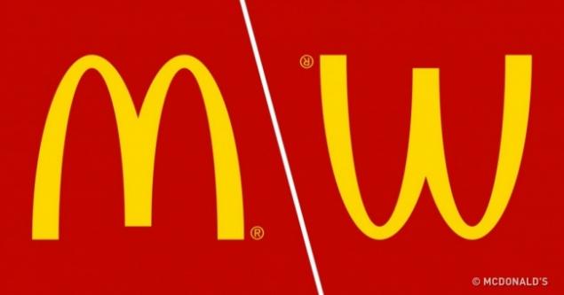
McDonald's
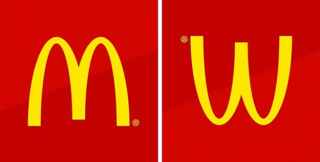
The architect of the first McDonald's came up with to equip the building with two large Golden arches, which became the symbol of fast food. Later, the company wanted to abandon this logo, but they persuaded the psychologist Louis Cheskin. He argued that a symbol similar to an inverted image of the female breast and therefore reminds people of the carefree childhood.
Chanel
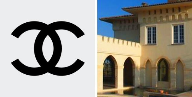
This logo is very special and romantic.Drew it herself, Coco Chanel, who at that time was at Château Crémat in nice. According to one famous legend, it was inspired by the form of vaulted arches of the castle and drew the logo, which has become known worldwide. Many say the magic of the letters, because CC is not only the first letter in the name of the castle, but the initials of Coco.

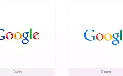
To Google logo was selected 3 main colors: red, yellow and blue. You may notice that these colors appear according to a specific algorithm. The logic breaks down only a green letter that is by design and is the most important. With this unexpected green designers as we would like to say that Google is breaking the stereotypes and not playing for any of the usual rules.
Gillette
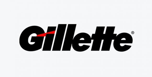
At first glance it seems that the Gillette logo is simply the brand name. But if you look closely, you can see that the edges of the letters G and I exactly the same shape as the famous blades of the shaving machine.
Mitsubishi
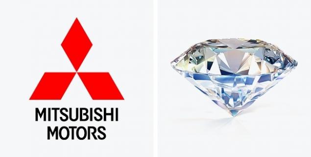
The basis of this logo formed the coat of arms of the Iwasaki family, which stood at the origins of the Mitsubishi company. Their arms consist of a 3 diamonds stacked on top of one another. 3 diamonds represent reliability, integrity, and success, red is confidence. Moreover, in Japan, believe that this color helps to attract customers.
Goodwill
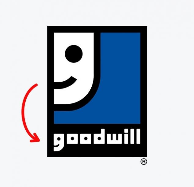
Goodwill — a world-renowned non-profit organization that collects food, clothing and Essentials and gives them to the needy. Employees of the organization believe that doing good need not just on holidays, but every day. That's why their logo is the letter G, which from a distance resembles a happy face.
FedEx
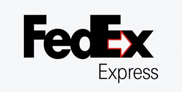
Most people don't immediately notice the arrow hidden between the letters E and X, but those who saw her once, begin to see the logo in the first place. According to designers ' idea, this arrow must act on the subconscious of customers, to symbolize the speed and lend credibility to the courier service.
Nike
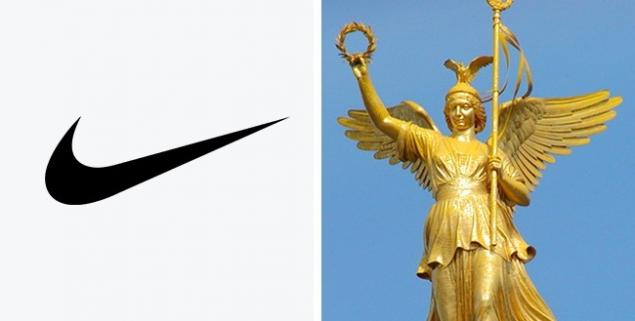
For logo design student Carolyn Davidson (Carolyn Davidson) in 1975, paid a total of $ 35. It is not easy to guess that this world-famous sign mimics the wing of the Greek goddess Nike, which inspired the warriors to victory.
Pepsi
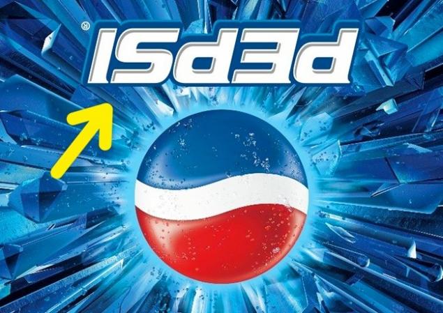
To the Mexican all saints Day (the Day of remembrance of the dead), Pepsi released products with inverted logo. Many thought it was just a mistake of production, but particularly savvy realized that in this position, the logo reads like isded, which is very similar to the phrase is dead, that is, "he's dead".
Le Tour de France
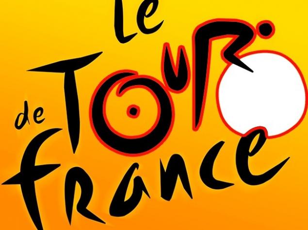
Even if you are already a million times, saw the logo of the famous Cycling race Tour de France, maybe you never noticed that hidden image of a cyclist. Look closely: the letter R is his body and the sun — wheel.
Photos on the preview McDonald's
See also
30 clever logos
15 famous logos, hidden meaning of which we didn't
via www.adme.ru/tvorchestvo-dizajn/15-izvestnyh-vsemu-miru-logotipov-o-skrytom-smysle-kotoryh-my-ne-dogadyvalis-1014110/


15 illustrations, in which all the inconvenient truth about the planet
How much are journey of your favorite movies?