Using the principles of Gestalt psychology to increase conversion sites. Part 1: The law of brevity
 Bashny.Net
Continuing the theme of psychology in online trading, we have decided to publish a translation of an article that recently appeared in the blog kissmetrics.com . The main value of this material is to demonstrate the real ways of using the described principles and the specific information about the extent of the impact of changes on the level of conversion.
In addition, the text will be used inserts that describe the elements of the influence of a principle, each of these inserts will be marked with the words "a bit of information».
In order not to overload the reader, it was decided to split the translation into several publications.
1. Law brevity
One of the central tenets of Gestalt psychology is the law of brevity. This law says that we tend to be much better perceive the simple, including from a visual standpoint, the things we prefer things that are clear, we are afraid of difficult things, ideas or projects. Instinctively, we know that the simple things safer.
Some information h5> Law brevity takes into account not only the amount of information and semantic accents in design. There are a few things that need to be taken into account when creating a "simple" design:
Some examples of successful use of the law to increase conversion: h5> Example number 1: The Sims 3 (128% increase)
In addition, the text will be used inserts that describe the elements of the influence of a principle, each of these inserts will be marked with the words "a bit of information».
In order not to overload the reader, it was decided to split the translation into several publications.
1. Law brevity
One of the central tenets of Gestalt psychology is the law of brevity. This law says that we tend to be much better perceive the simple, including from a visual standpoint, the things we prefer things that are clear, we are afraid of difficult things, ideas or projects. Instinctively, we know that the simple things safer.
Some information h5> Law brevity takes into account not only the amount of information and semantic accents in design. There are a few things that need to be taken into account when creating a "simple" design:
- Completion

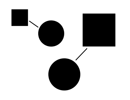
- The symmetry and order. B> People tend to perceive objects as ordered groups, symmetrically arranged around the center of the conditioned. The more clearly highlighted in these conditions, the simpler design for perception.
- Figure and background
- The principle of connectedness. B> If the two elements are visually linked third, they are perceived as a single entity.
- Zoning
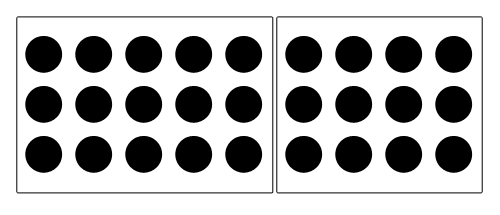
- Proximity
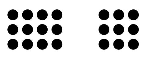
- Continue
- Parallel objects are perceived as a group.


Some examples of successful use of the law to increase conversion: h5> Example number 1: The Sims 3 (128% increase)
Despite the fact that Sims is one of the best selling PC games in franchise history, the producers knew that there is always the possibility of improving conversion.
The original design contained 4 STA:
• Register (or input)
• Visit the shop
• Read the latest company news
• Get Free materials
To improve conversion rates, they create six designs, each of which focuses on only one user call to action.
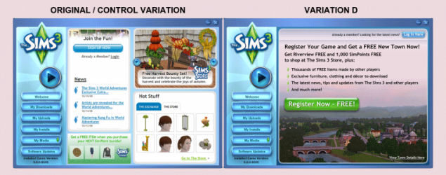
As a result, the best option was recognized as D (pictured), with a result of 128%. It is worth noting that all the proposed options were better than the original, the result of increasing the minimum conversion was 43%.
So if you have dozens of amazing features and offerings, serve them gradually. Just choose something that will be more effective.
Example number 2: Device Magic (35% increase)
Mobile business companies Device Magic was presented at a great landing page, which was filled with informative material, explains how it all works.
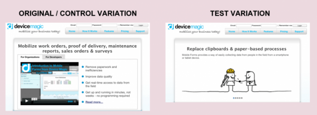
Deciding that their design may be too difficult, they decided to try a simpler option. The new design is easier to understand the product for new visitors, and transitions to the registration page increased by 35%.
Example number 3: Highrise (37, 5% growth)
When 37signals захотели improve the conversion rate of its popular software Highrise CRM, they decided to implement several major changes:
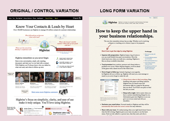
The original design (left) is filled with lots of images, arrows and captions. Page contains about 12 accents that disperses the user's attention.
The new design was limited to one title and one arrow in order to emphasize important.
Example number 4: Daily Burn (20.45% growth)
Daily Burn (formerly Gyminee) have developed excellent design home page. Great screenshots, visualization of the software and interesting calorie counter.
They decided to try a simple conversion and simply removed the portion of the page.
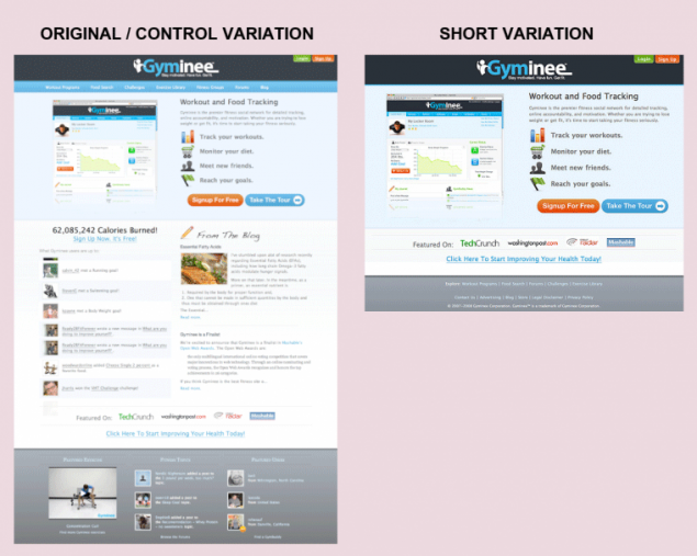
In each new test, they were cleaning the various elements of the page, bringing focus to the main element - STA. The average growth of conversion reached 20, 45%.
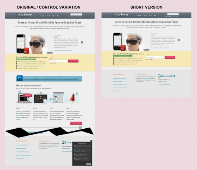
Example number 5: DesignBoost (13% increase)
When DesignBoost launched their project, they understand that they have to set A / B tests, so they decided to start with, that would bring the greatest result.
They have heard that short pages usually work better, and that's what they decided to check first. A simplified version allowed to increase conversion rate at 13%.
Note the word "usually" above. Although the general principles, such as the simple design, the length of the page or verbal triggers are generally effective, they have different effects on different target groups of sites.
Source: habrahabr.ru/company/paysto/blog/229921/


Tags
See also
Using the principles of psychology to increase conversion sites. Part 5: The effect of facial
RECIPE FOR GROWTH AND STRENGTHENING HAIR
The principle of "three no" to save vitality
Mask with mustard for hair growth
Protect plants from pests and diseases
What kind of energy is to accumulate a woman
Andrei Maximov: When parents become enemies to their children
Since "Panthenol" applied to the hair growth, I saw a noticeable effect! I give the recipe ...