Using the principles of psychology to increase conversion sites. Part 5: The effect of facial
 Bashny.Net
Part 1
Part 2
Part 3
Part 4
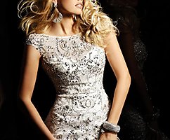
All people subconsciously watching others. Whenever we come across someone's portrait, we look at it and make a conclusion about the emotions experienced by the person. Almost always, this is absolutely unconsciously.
Human faces can increase the number of transitions in two ways:
1. Attracting attention
Portraits almost always attract attention better than any other design element. This makes them a great way to attract users to the key elements of the site. A great solution would be the person looking at the item you want to select, the user is required to see to look and stumble on what you need.
2. Stimulation of emotions
We are all "experts" in the reading of human emotions. If the person on the site looks really happy or sad, we can probably feel the same feelings. But be careful, over-expression of emotions has the effect of counterfeiting and unreliability.
Some information h5> Using portraits in site design includes several mechanisms of action:
Part 2
Part 3
Part 4
All people subconsciously watching others. Whenever we come across someone's portrait, we look at it and make a conclusion about the emotions experienced by the person. Almost always, this is absolutely unconsciously.
Human faces can increase the number of transitions in two ways:
1. Attracting attention
Portraits almost always attract attention better than any other design element. This makes them a great way to attract users to the key elements of the site. A great solution would be the person looking at the item you want to select, the user is required to see to look and stumble on what you need.
2. Stimulation of emotions
We are all "experts" in the reading of human emotions. If the person on the site looks really happy or sad, we can probably feel the same feelings. But be careful, over-expression of emotions has the effect of counterfeiting and unreliability.
Some information h5> Using portraits in site design includes several mechanisms of action:
- Social proof
The basis of this effect is the belief that the people around us can be informed much better than we do. This mechanism leads us to look around, when we do not know what to do.
Social proof is the basis of the efficiency reviews as a tool of conversion and other methods that demonstrate that "this product is used other, so you should enjoy."
- «Expert opinion»
The special case of using social proof. The basis of this approach is the belief that there is a group that specializes in this issue (in this product, in this area), and she is willing to share with us information about it, the best and proven products.
Photo of a representative man, alongside his quote that "... we checked and made sure that ... the best" looks pretty impressive to many, and may be an important factor in decision making, it does not forget that the extremes of use This tool can also lead to negative results.
- Зеркальные neurons
Example number 1: Highrise (+ 102, 5%)
We've already talked about Highrise in the first part of this article. Received 37, 5% increase in CTR by simplifying their design, they did not stop there.
In the next test, in combination with a simplified form has been used picture of a girl who looks quite happy.
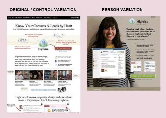
This change helped to increase conversions by 102, 5% in comparison with the base case. Subsequent tests with the various tested embodiments portraits showed similar results with a deviation of 5%
Example number 2: Medalia Art (95, 4% growth)
Internet-shop of art Medalia Art posted some of their artists profiles on the main page. New visitors were able to immediately go to the individual artist page, view pictures and buy them.
In the original version for the submission of a portfolio in the list used one of the works of the artist. In the course of testing as a cover for the portfolio was selected photograph of the artist.
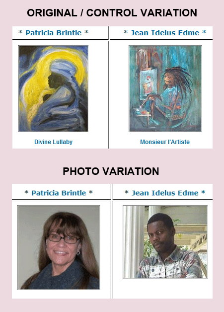
The result was a rapid increase CTR by 95, 4%.
When it comes to art, people rarely buy the product itself, the product they are buying the story. Using photos of the author on the site allowed Medalia Art begin to tell this story to your visitors.
Example number 3: Harrington Movers (45.45% growth)
At the beginning of this article we mentioned that the portrait should be used to inspire confidence.
Originally Harrington Movers used photos of smiling couples with boxes. Overall, the picture had nothing specifically to this carrier, and could illustrate the activities of any company that operates in this area.
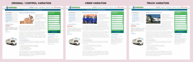
In search of a solution that will increase conversion rates, it was decided to test the two design options:
1. Option photo employees;
2. moving truck company.
Both options significantly improved conversion (45, 45 and 45%, 05%, respectively). This proves the fact that not all pictures are equally effective for increasing the impact of the site.
A few words about why the picture of the truck was more effective than the original version:
1. Photograph of a truck with the company logo on the body significantly increases the level of confidence in the site, proving that the company, at least, there is;
2. People who are planning to carry your things, can clearly associate themselves with this truck, "Oh, there are my things».
Conclusion:
The examples above - it's just isolated cases, which confirmed the assumptions based on the theories and principles. But the problem is that the result of the use of different techniques may be completely unexpected.
Firstly, not all of these methods are the same, and if you have a specific audience, it is worth it to take into account when you make your website. Secondly, when you make changes in order to use the effect of any principle or law, you may accidentally violate any other law, the negative impact which exceeds the positive impact of the changes.
In planning the implementation of such methods in your design, it is necessary to conduct a comprehensive analysis and a full assessment of each of the proposed options. In addition, there are now opportunities for A / B analysis, and other methods of assessing the effectiveness of the page and you just have to use them well, if you want to achieve real results.
Source: habrahabr.ru/company/paysto/blog/231229/


Tags
See also
Using the principles of Gestalt psychology to increase conversion sites. Part 3: Cost Benefit Analysis
TYPES OF HUMAN ENERGY:
About restraint.
Top 10 foods for muscle growth:
RECIPE FOR GROWTH AND STRENGTHENING HAIR
Our universe is a huge reservoir of energy.
17 the best ornamental shrubs for alkaline soils
Mask with mustard for hair growth
Protect plants from pests and diseases