10 real places that appeared in the logos of famous brands
 Bashny.Net
Any brand seeking to create a recognizable corporate logo. Sometimes they reflect the geographical residence of the company or use images of iconic buildings and attractions to increase customer loyalty. AdМe.ru gathered for you is not obvious examples of how real places fell to the logos of the brands.
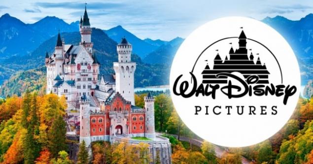
Neuschwanstein Castle (Germany) Walt Disney Pictures 1985-2006
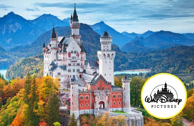
Neuschwanstein is one of the most beautiful castles in the world. Walt Disney was so fascinated by the castle that it has become a real symbol of the company. He was the prototype of the sleeping beauty castle in Paris Disneyland and in 1985 came to the logo of the Walt Disney Corporation.
The castle of Ussé (France) Walt Disney Pictures, 2006—present
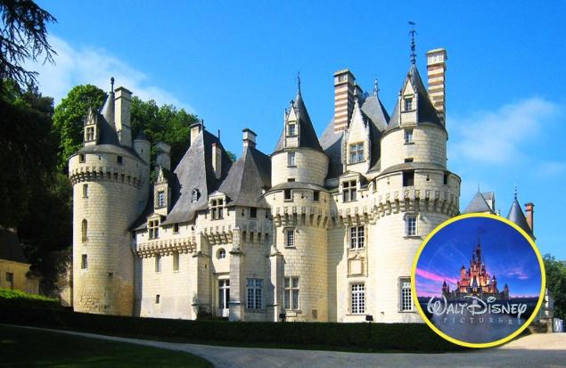
In 2006, the logo "Disney" changed. New castle is higher, more beautiful and bigger. You will of course recognize it is a Palace Cinderella cartoon of the same name. The inspiration artists drew from French castles and, in particular, the USSE castle. Interestingly, according to legend, the Palace belonged to Cinderella: it is believed that his Charles Perrault described in the fairy tale "Sleeping beauty".
The Matterhorn (Switzerland/ Italy) Toblerone Chocolate
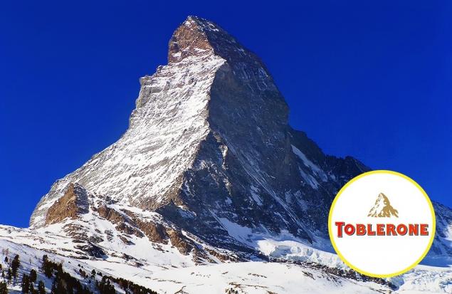
The mountain logo of Toblerone chocolate not to be confused with anything else. Like a quadrangular pyramid and stands apart from other peak of the Matterhorn is one of the most recognizable peaks in the Alps. It is believed that the picturesque mountain was not only on the packaging of the candy bar, but inside it. Supposedly the unusual scalloped form of chocolate — multiple mini replica of the Matterhorn.
Capitol (USA) Hockey club "Washington capitals"
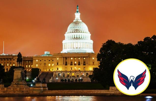
It would seem, what's the Capitol? On logo the Metropolitan club — eagle with a predatory look in traditional colors. But if you look closely, the Capitol dome will appear at the bottom of the logo. Great Association and great work of designers.
Spasskaya tower (Russia) XXII summer Olympic games
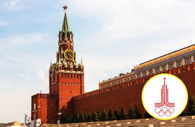
Symbolic logo created specifically for the Olympics—80. Parallel lines (symbolizing treadmills) are extended in an architectural silhouette with five-pointed star. Minimalist design is easy to guess Spasskaya tower — the most recognizable international symbol of Moscow — the Kremlin.
Hotel "Moscow" (Russia) Vodka "Stolichnaya"
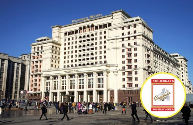
The building of hotel "Moscow" appeared in the capital in 1935. Then the painters put a recognizable silhouette on the label of a new brand of alcoholic product. World fame came to the logo after the beginning of export of "Metropolitan" to the West. Today and the label and product — brands.
The Golden gate bridge (USA) Cisco Systems
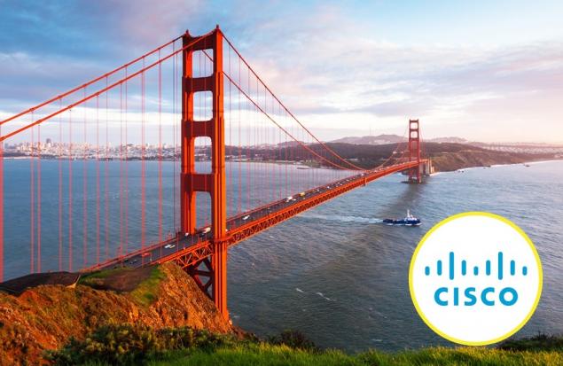
Perhaps one of the most stylish design solutions related to geography. It turns out, minimalistic company logo is a stylized image of the Golden gate bridge, in San Francisco. If you do not believe, keep in mind that the name cisco have appeared as an abbreviation of the name of San Francisco
The Valley Of Chamonix (France) "Evian"
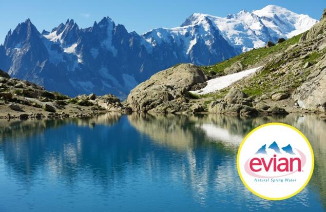
French mineral water Evian is named after the town of Evian-Les-Bains, near which are several springs. It was here, on the shores of lake Geneva with beautiful views of the Alps, and bottled the world-famous water. No wonder that on the recognizable logo was just the mountains.
Mansion Apricot (Russia) Chocolate "Babaevskiy"
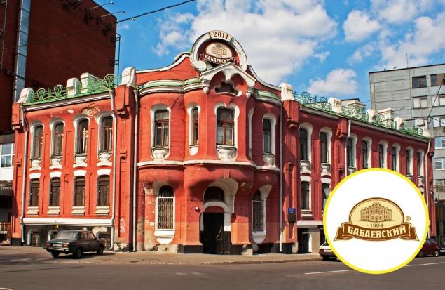
The logo of the concern "Babaevsky" painted two-storey mansion. This is the former home of candy Apricot dynasty, which housed their family business. The factory produced about 4 000 tons of caramel and chocolate. After the revolution, have changed the name of factory was named in honor of Secretary of the Communist Pyotr Babayev. But the mansion, the logo has become a trademark of quality.
The bridge over the river Tyne (UK) Newcastle Brown Ale
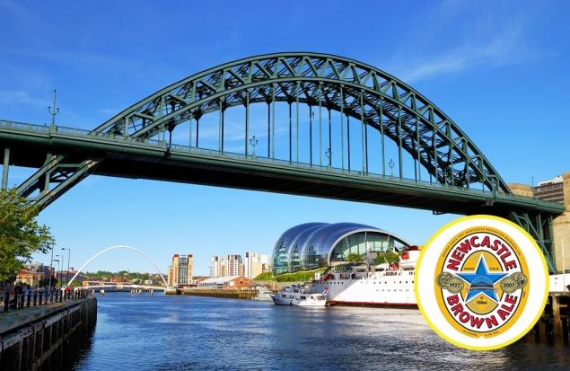
The birthplace of the brand Newcastle Brown Ale is Newcastle. Almost 100 years ago it was there, on the North East coast of the UK, this beer scored his first army of fans. And the label of the bottle was (and still there) then the main attraction of the city — bridge over the river Tyne, the opening of which in 1928 came the king George V.
Tower of Prince Rupert (Britain) Football club Everton
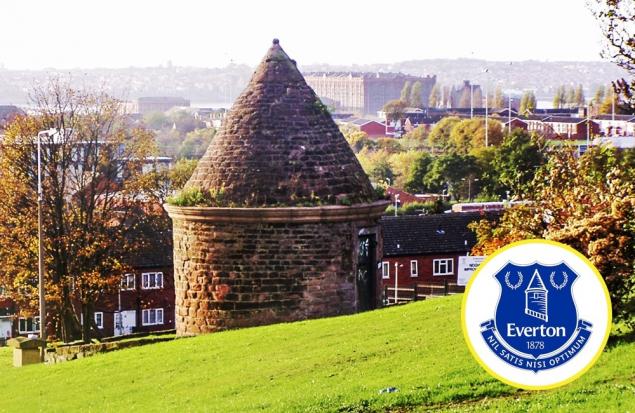
Unremarkable to look at the tower in fact — one of the main symbols of Liverpool. Or rather, the part that hurts the football club Everton. In the 1930-ies on branded merchandise the club has added the image of the ancient tower of Prince Rupert. She had a tough past: built in the XVIII century, the tower served as a detox, and even jail. Today to introduce the emblem of the club Liverpool without it is impossible.
Photos on the preview depositphotos, disney
According to the materials of brandsoftheworld, cborg
See also
15 logos that need to look twice
17 of the coolest logos, which speak for themselves
Top 25 attractions of the world
via www.adme.ru/svoboda-puteshestviya/25-luchshih-dostoprimechatelnostej-mira-712910/
Tags
See also
8 famous actresses who came to Hollywood in the modeling business.
Outdoor advertising, which works (Updated!)
Facts of real life, which take place.
The actual situation that happened the other day in Moscow!
20 real places that look like fairy tales
Real places from the series
Real places that look like castles series Game of Thrones (21 photos)
Alpha males, where are you?
Fabulous place
30 unreal real images, which will lead you to the wild delight! Neither program Photoshop ...