Star quality new Chrysler
 Bashny.Net
After nine years of oblivion back classic logo Chrysler - Pentastar. The company starts a new era in its development under the pe "Get ready for the next 100 years» (Get Ready for the next hundred years).
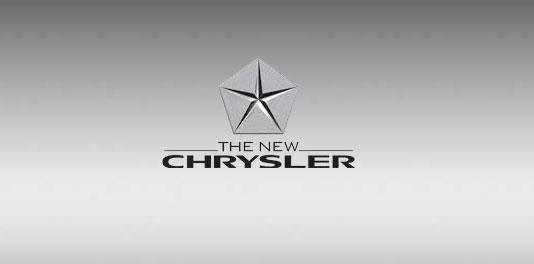
Emblem Pentastar («Star in the pentagon"), established in 1962, returned nine years later. After the upgrade, the star becomes a spectacular three-dimensional look. Pentastar will be released from the top of the tower headquarters of Chrysler.
Pentastar, which for decades was a symbol of the corporation Chrysler, returns to serve as a symbol of the new company, "Chrysler." After a nine-year break, five-pointed star inscribed in a pentagon, reborn in bulk form.
One of advertising prints, designed by agencies BBDO and Organic for a "new» Chrysler:

"The Return of the emblem Pentastar - in its new form - will serve as a wonderful symbol of the birth of the new company Chrysler», - said Steven Landry (Steven Landry), executive vice president of the North American branch of sales, marketing, service and spare parts. - «Pentastar represents all the pride, which is the soul of our employees 85-year history of Chrysler, and all the faith that we are on the new prospects of the company».
The original Pentastar emblem was a five triangles that are independently "floating" in the pentagon, as if hacked five-pointed star in the middle. The new logo Pentastar due to changes made by Trevor Creed (Trevor Creed), senior vice president of design, has gained strength and accuracy: the top of the five triangles are connected so that the star appeared concluded between them and the pentagon became withdrawn. "We wanted to ensure that our logo has expressed a very high quality," - says Creed. - "We have eliminated the gaps, violates the unity of geometric shapes, and gives it a feeling of solidity. Due to the shape of the star is much sleeker and more accurately, symbolizing high quality ».
The height of the triangles increases towards the center, and they are polished - to make the logo more textured. At the same time, polished star creates a sense of accuracy and gives the Pentastar volume. "I do not think this emblem will be used on our products - only on buildings, signs, corporate real estate and business cards," - said Creed. - "She says about who we are, not what we create».
"Even in the last 10 years the symbol Pentastar never disappeared completely. He literally towered over the company and all its employees and has been a source of pride, "- said Landry, referring to the emblem of the Pentastar, decorating the top of the building world headquarters Chrysler.
History of the Pentastar The Pentastar was created in 1962 by the president of Chrysler Corporation Lynn Townsend (Lynn Townsend), who decided that the company needed a new symbol to represent all the brands included in the corporation.
Townsend wanted this character had a strong, classic look - the unmistakable and universal. That is, he should not contain words or letters, so that it can be used in different countries to refer to people of different cultures.
"He was very worried that we did not have a program of development of corporate identity, allowing Chrysler dealerships in any city stand out among others. So he sought to unite all these centers together, drawing them in an easily recognizable manner: so that no matter where you turned, you will not be confused Chrysler Dealers with anybody, "- says Barry Dressel (Barry Dressel), manager of the Museum Walter P. Chrysler PR-issues of heritage Chrysler. Pentastar was selected from over 800 proposals submitted Chrysler design firm Lippincott & Margulies Inc.
"We were looking for a symbol that would not be too difficult - that people can remember it, but it looked like the embodiment of engineering," - says Robert Stanley (Robert Stanley), vice-president of the Detroit office and a member of the firm Lippincott & Margulies, executive for payments to Chrysler; It is credited with the authorship of the emblem Pentastar. - "We want people to look at this character, saying," This has been done haphazardly ».
In addition, Stanley created a blue coloristic Pentastar and the name of this symbol. Contrary to popular myth, the five-pointed star symbolizes the five brands of the Corporation Chrysler, which already existed at the time (Dodge, Chrysler, Plymouth, Imperial and Airtemp - compartment HVAC).
In 1963, the Pentastar emblem began appearing on the right front of the car body Dodge, Chrysler and Plymouth (or on the left front panel - for countries where it is assumed left-hand traffic, such as the UK or Australia). During the same year, comedian Bob Hope (Bob Hope) came out on stage in front of Pentastar logo at the beginning of his weekly TV show called "Bob Hope Theatre is Chrysler».
Soon Chrysler Corporation began using Pentastar hood ornament for many models of Dodge, Chrysler and Plymouth, especially in the 1980s when Chairman Lee Iacocca (Lee Iacocca) revived the company with the success of the new minivans. The Pentastar also began to appear on the top of buildings dealerships, offices, caps annual reports and virtually anywhere Chrysler did its business.
In June 1996, the company established a new headquarters kvaritiru in Auburn Hills, Michigan; it became part of the office tower, topped by a glass Pentastar logo of two storeys high.
After the merger in 1998, which arose as a result of the union of DaimlerChrysler, Pentastar was replaced by a new corporate symbol. However, it has not disappeared completely. "I tell people to the place where the easiest to find this logo - in all the years of DaimlerChrysler, if you looked at the windows of vehicles Chrysler, make sure you would see a small symbol of Pentastar, applied directly to the glass. On the windowpanes it is usually located in the lower right corner "- says Dressel.
Before the advent of Pentastar In 1924, Walter P. Chrysler (Walter P. Chrysler) introduced the first car called Chrysler - it was the Chrysler Six - with new logo in the form of tape, similar to the one which is awarded to the winners of the rural fairs. The tape was adorned with the inscription of Chrysler and two zigzags of lightning - in fact, it was the letter Z, in honor of Chrysler engineer Fred Zedera (Fred Zeder). When in 1925, Walter P. Chrysler founded the corporation Chrysler, Chrysler Six logo became its emblem, but only for a short time. Soon to a new corporation was created a new logo - an oak on the theme "Quality grows from many roots».
"Generally speaking, it was a rather mysterious thing. First of all, it is not clear what relationship the oak is to cars. Yes, and the motto is rather vague, "- says Dressel. - "So they, in fact, returned to the tape printing».
By the mid-1950s, at the dawn of the space age, printing on the tape was the strange symbol of a bygone era. Then, in 1955, the new chief designer of the Chrysler Virgil Exner (Virgil Exner) introduced the concept of design «Forward Look» (Looking Ahead). She became the embodiment of cars with low roofs and long hood give them more streamlined and aggressive appearance. Furthermore, Exner created a logo Forward Look - two transverse chevron. This futuristic new logo reflects its stylistic concept. Krayslerovskaya seal with tape and many other logos disappeared from the scene, and in 1957 became a symbol of the Forward Look cars appear at Chrysler, in television commercials and brochures companies. At the end of the 1950 design developed by Exner, Chrysler advanced to the forefront of automotive style. However, the last for this design began in 1961, and in 1962, Chrysler President Lynn Townsend ordered to start work on a new corporate symbol.
For more information about the history of the Pentastar can be found on the Internet at the address on the Chrysler blog: www.thefirehouse.biz ,
as well as on the websites: www.chrysler.ru , www .jeep-russia.ru , www.dodge.ru , cgmedia.daimlerchrysler.com, media.daimlerchrysler.ru. < br />
According to the materials: Drive
via drive.ru

Emblem Pentastar («Star in the pentagon"), established in 1962, returned nine years later. After the upgrade, the star becomes a spectacular three-dimensional look. Pentastar will be released from the top of the tower headquarters of Chrysler.
Pentastar, which for decades was a symbol of the corporation Chrysler, returns to serve as a symbol of the new company, "Chrysler." After a nine-year break, five-pointed star inscribed in a pentagon, reborn in bulk form.
One of advertising prints, designed by agencies BBDO and Organic for a "new» Chrysler:

"The Return of the emblem Pentastar - in its new form - will serve as a wonderful symbol of the birth of the new company Chrysler», - said Steven Landry (Steven Landry), executive vice president of the North American branch of sales, marketing, service and spare parts. - «Pentastar represents all the pride, which is the soul of our employees 85-year history of Chrysler, and all the faith that we are on the new prospects of the company».

The original Pentastar emblem was a five triangles that are independently "floating" in the pentagon, as if hacked five-pointed star in the middle. The new logo Pentastar due to changes made by Trevor Creed (Trevor Creed), senior vice president of design, has gained strength and accuracy: the top of the five triangles are connected so that the star appeared concluded between them and the pentagon became withdrawn. "We wanted to ensure that our logo has expressed a very high quality," - says Creed. - "We have eliminated the gaps, violates the unity of geometric shapes, and gives it a feeling of solidity. Due to the shape of the star is much sleeker and more accurately, symbolizing high quality ».
The height of the triangles increases towards the center, and they are polished - to make the logo more textured. At the same time, polished star creates a sense of accuracy and gives the Pentastar volume. "I do not think this emblem will be used on our products - only on buildings, signs, corporate real estate and business cards," - said Creed. - "She says about who we are, not what we create».
"Even in the last 10 years the symbol Pentastar never disappeared completely. He literally towered over the company and all its employees and has been a source of pride, "- said Landry, referring to the emblem of the Pentastar, decorating the top of the building world headquarters Chrysler.
History of the Pentastar The Pentastar was created in 1962 by the president of Chrysler Corporation Lynn Townsend (Lynn Townsend), who decided that the company needed a new symbol to represent all the brands included in the corporation.
Townsend wanted this character had a strong, classic look - the unmistakable and universal. That is, he should not contain words or letters, so that it can be used in different countries to refer to people of different cultures.
"He was very worried that we did not have a program of development of corporate identity, allowing Chrysler dealerships in any city stand out among others. So he sought to unite all these centers together, drawing them in an easily recognizable manner: so that no matter where you turned, you will not be confused Chrysler Dealers with anybody, "- says Barry Dressel (Barry Dressel), manager of the Museum Walter P. Chrysler PR-issues of heritage Chrysler. Pentastar was selected from over 800 proposals submitted Chrysler design firm Lippincott & Margulies Inc.
"We were looking for a symbol that would not be too difficult - that people can remember it, but it looked like the embodiment of engineering," - says Robert Stanley (Robert Stanley), vice-president of the Detroit office and a member of the firm Lippincott & Margulies, executive for payments to Chrysler; It is credited with the authorship of the emblem Pentastar. - "We want people to look at this character, saying," This has been done haphazardly ».
In addition, Stanley created a blue coloristic Pentastar and the name of this symbol. Contrary to popular myth, the five-pointed star symbolizes the five brands of the Corporation Chrysler, which already existed at the time (Dodge, Chrysler, Plymouth, Imperial and Airtemp - compartment HVAC).
In 1963, the Pentastar emblem began appearing on the right front of the car body Dodge, Chrysler and Plymouth (or on the left front panel - for countries where it is assumed left-hand traffic, such as the UK or Australia). During the same year, comedian Bob Hope (Bob Hope) came out on stage in front of Pentastar logo at the beginning of his weekly TV show called "Bob Hope Theatre is Chrysler».
Soon Chrysler Corporation began using Pentastar hood ornament for many models of Dodge, Chrysler and Plymouth, especially in the 1980s when Chairman Lee Iacocca (Lee Iacocca) revived the company with the success of the new minivans. The Pentastar also began to appear on the top of buildings dealerships, offices, caps annual reports and virtually anywhere Chrysler did its business.
In June 1996, the company established a new headquarters kvaritiru in Auburn Hills, Michigan; it became part of the office tower, topped by a glass Pentastar logo of two storeys high.
After the merger in 1998, which arose as a result of the union of DaimlerChrysler, Pentastar was replaced by a new corporate symbol. However, it has not disappeared completely. "I tell people to the place where the easiest to find this logo - in all the years of DaimlerChrysler, if you looked at the windows of vehicles Chrysler, make sure you would see a small symbol of Pentastar, applied directly to the glass. On the windowpanes it is usually located in the lower right corner "- says Dressel.
Before the advent of Pentastar In 1924, Walter P. Chrysler (Walter P. Chrysler) introduced the first car called Chrysler - it was the Chrysler Six - with new logo in the form of tape, similar to the one which is awarded to the winners of the rural fairs. The tape was adorned with the inscription of Chrysler and two zigzags of lightning - in fact, it was the letter Z, in honor of Chrysler engineer Fred Zedera (Fred Zeder). When in 1925, Walter P. Chrysler founded the corporation Chrysler, Chrysler Six logo became its emblem, but only for a short time. Soon to a new corporation was created a new logo - an oak on the theme "Quality grows from many roots».
"Generally speaking, it was a rather mysterious thing. First of all, it is not clear what relationship the oak is to cars. Yes, and the motto is rather vague, "- says Dressel. - "So they, in fact, returned to the tape printing».
By the mid-1950s, at the dawn of the space age, printing on the tape was the strange symbol of a bygone era. Then, in 1955, the new chief designer of the Chrysler Virgil Exner (Virgil Exner) introduced the concept of design «Forward Look» (Looking Ahead). She became the embodiment of cars with low roofs and long hood give them more streamlined and aggressive appearance. Furthermore, Exner created a logo Forward Look - two transverse chevron. This futuristic new logo reflects its stylistic concept. Krayslerovskaya seal with tape and many other logos disappeared from the scene, and in 1957 became a symbol of the Forward Look cars appear at Chrysler, in television commercials and brochures companies. At the end of the 1950 design developed by Exner, Chrysler advanced to the forefront of automotive style. However, the last for this design began in 1961, and in 1962, Chrysler President Lynn Townsend ordered to start work on a new corporate symbol.
For more information about the history of the Pentastar can be found on the Internet at the address on the Chrysler blog: www.thefirehouse.biz ,
as well as on the websites: www.chrysler.ru , www .jeep-russia.ru , www.dodge.ru , cgmedia.daimlerchrysler.com, media.daimlerchrysler.ru. < br />
According to the materials: Drive
via drive.ru
Tags
See also
A new life budget mountain bike: turning a train
10 real places that appeared in the logos of famous brands
Corporate horoscope which you're the boss?
All you need to know about Santa Claus and Santa Claus
Pictures of famous people that have no direct relation to painting (42 photos)
New Year party
The new face of golf TAG Heuer
145 ways to make fun of the girls
BusinessWeek: who is more important than all the web


