Localization of "Sherlock Holmes"
 Bashny.Net
Intrigued by the first divergence in the visualization "Sherlock," I decided to see what the price was purchased by the date of the broadcast exactly one day after the premiere at the BBC. Of course, the first channel did dubbing and translation for a day: from the BBC series clearly had been prepared ahead of time and sent to partners for dubbing, in this case, the First Channel.
Compares Peter, 27 frames

1. In the second season of the BBC changed the wallpaper. It begins and ends the same way, but the frames between the title and caption writers - other. In particular, we see the violin Holmes (titer, where the names of the actors), both characters, lips Irene Adler, Holmes, Watson and Lestrade in Dartmoor ...
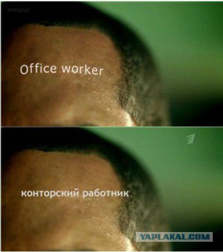
Channel One has apparently decided not to bathe with the transfer of the new screen, and stupidly punched the old version of the first season. And, apparently, still stretched to 16: 9 Letterbox initial broadcast as screen saver on Russian got quite hazy.

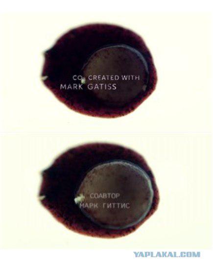
2. Moreover, Russian screensaver also took the first series of which the name of one of the founders, "Mark Gatiss» (Mark Gatiss) somehow became "Gittis."
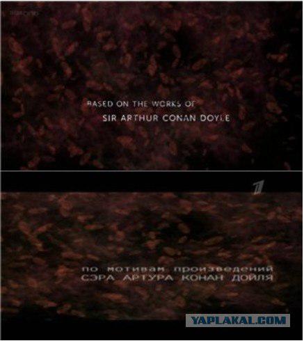
3. A titer of Conan Doyle in the Russian version for some reason found to compact anamorphic - apparently to emphasize the epic cinematography of this title.
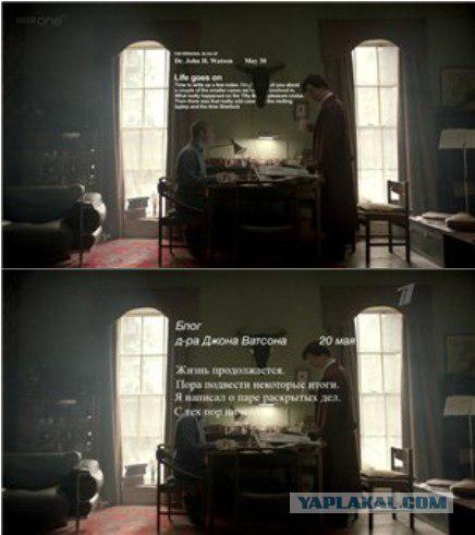
4. This is the best example - although the date «May 30" has become a "May 20", the fonts have changed the other way around, and the text considerably reduced (and Holmes in the dialogue even notices that Watson wrote a long text - yeah, like !). Again, the text is stuck on stupid on top of those characters, at the time, as in the original, he hovers over them, and even a "covered" head on decorative wall
5. Translation of the dialogues and titles made clearly different people - Holmes looks at the text of the "Strange interpreter" and asks aloud "gaga translator?" Of course, «The Geek Interpreter» was not translated and not syak, but as a "translator-geek" or "Interpreter-bot" - not to mention sending to the story of Conan Doyle «The Greek Interpreter» («The Greek Interpreter").

6. But the frame with three-dimensional recording entries must be entered localizer-to-PowerPoint'om in a complete stupor - and he just decided nafig do not translate. While the original is «The Speckled Blonde» - a reference to «The Speckled Band» («Speckled Band").
7. Stupor interpreter-2, the title is also omitted. Watson wrote in a blog: «Sherlock Holmes Baffled» («Sherlock Holmes Baffled").

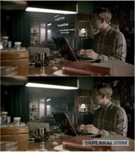
8. The best friend of the designer - Times New Roman. If there is no desired font - Times fails. Joke.

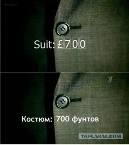
9. There localizers at least tried to play animated effects inscriptions homegrown means a la PowerPoint. Later, they generally will not bathe. On any computer font Tahoma- is what had to change it to Trebuchet MS? In addition, not the original price arrives, and "wound" to the necessary number
10. Find a big difference. And the truth is - why the gun when not armed?

11. Bend the text on the curve - above forces localizer. That is, they bend curved, but the letters are not turned.

12. And here too lazy to bend
13. Dogs do the song. In the original one inscription appears «small dog», and it is modified in the process of deduction: decreases the title «S», incremented «s» in the end, is added «two», then replaced by a «three». In the Russian version stupid fly three different labels.

14. Here, a small but amusing contrast - in the original inscription follows the contour of the rear seat and moves along with it; it is commonplace in the Russian hangs in the air and direct as the bayonet.

15. If the first deduction interpreters somehow tried to reproduce the size and orientation of the original text, there is no one bothered. We took the first available font (Times New Roman), stir the inscriptions at random and let fly at random, as it will. Frames a little different, since the timing of the credits also absolutely crazy shot down.

16. Bravo! The titer is so complex that localizers fought-fought, but could not locate it with dignity.
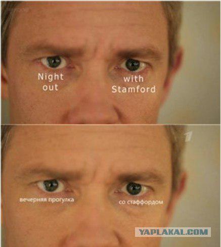
17. The audience: why would walk from Stafford to appear bags under the eyes? And where did Watson Stafford? But from there. In the original, it is - "Evening get-together with Stamford" (Stamford - a former classmate Watson, introduced him with Holmes).
18. So is blocked, that the lower part of the inscription already slipped

19. It is so difficult - draw two semi-transparent red stripes? We must stick in two opaque rectangles to arbitrary locations of the screen?

20. A small detail: here Holmes holds no deduction, and analysis of the upcoming attack - so the sniper scope here is not superfluous. It was not necessarily clean.

21. The numbers of input - the font Futura

22. The numbers of input - now Verdana. On zalochenny mobile phone has changed the font?

23. The numbers of input - now generally Times New Roman. The phone can not stand the ordeal and dropped to the system font.

24. Small, but significant difference - the codes do not match! Originally they thought (the letters go only to the letter K. As in the numbering of seats 747), in the Russian localizer bluntly slammed his fist on the keyboard

25. ... the next - again in dull Times New Roman, and just cut down (in the original - it soars to the Big Ben, and he blows Moriarty, as a result of SMS scatters spell in the Russian version ... it blows on Big Ben is not clear why) ... < br />

26. Here Russian interpreters because neither before that and did not think ...
... And left the original. Well, at least so.

27. Conclusion: The localization can ride if you do not know the original. If you are familiar with - the result breaks down, it worked extremely clumsy and knee. It becomes clear that localizers hurry, the technical side was weak, and test results no one bothered.

Source:
Compares Peter, 27 frames

1. In the second season of the BBC changed the wallpaper. It begins and ends the same way, but the frames between the title and caption writers - other. In particular, we see the violin Holmes (titer, where the names of the actors), both characters, lips Irene Adler, Holmes, Watson and Lestrade in Dartmoor ...
Channel One has apparently decided not to bathe with the transfer of the new screen, and stupidly punched the old version of the first season. And, apparently, still stretched to 16: 9 Letterbox initial broadcast as screen saver on Russian got quite hazy.

2. Moreover, Russian screensaver also took the first series of which the name of one of the founders, "Mark Gatiss» (Mark Gatiss) somehow became "Gittis."

3. A titer of Conan Doyle in the Russian version for some reason found to compact anamorphic - apparently to emphasize the epic cinematography of this title.

4. This is the best example - although the date «May 30" has become a "May 20", the fonts have changed the other way around, and the text considerably reduced (and Holmes in the dialogue even notices that Watson wrote a long text - yeah, like !). Again, the text is stuck on stupid on top of those characters, at the time, as in the original, he hovers over them, and even a "covered" head on decorative wall

5. Translation of the dialogues and titles made clearly different people - Holmes looks at the text of the "Strange interpreter" and asks aloud "gaga translator?" Of course, «The Geek Interpreter» was not translated and not syak, but as a "translator-geek" or "Interpreter-bot" - not to mention sending to the story of Conan Doyle «The Greek Interpreter» («The Greek Interpreter").

6. But the frame with three-dimensional recording entries must be entered localizer-to-PowerPoint'om in a complete stupor - and he just decided nafig do not translate. While the original is «The Speckled Blonde» - a reference to «The Speckled Band» («Speckled Band").

7. Stupor interpreter-2, the title is also omitted. Watson wrote in a blog: «Sherlock Holmes Baffled» («Sherlock Holmes Baffled").

8. The best friend of the designer - Times New Roman. If there is no desired font - Times fails. Joke.

9. There localizers at least tried to play animated effects inscriptions homegrown means a la PowerPoint. Later, they generally will not bathe. On any computer font Tahoma- is what had to change it to Trebuchet MS? In addition, not the original price arrives, and "wound" to the necessary number

10. Find a big difference. And the truth is - why the gun when not armed?

11. Bend the text on the curve - above forces localizer. That is, they bend curved, but the letters are not turned.

12. And here too lazy to bend

13. Dogs do the song. In the original one inscription appears «small dog», and it is modified in the process of deduction: decreases the title «S», incremented «s» in the end, is added «two», then replaced by a «three». In the Russian version stupid fly three different labels.

14. Here, a small but amusing contrast - in the original inscription follows the contour of the rear seat and moves along with it; it is commonplace in the Russian hangs in the air and direct as the bayonet.

15. If the first deduction interpreters somehow tried to reproduce the size and orientation of the original text, there is no one bothered. We took the first available font (Times New Roman), stir the inscriptions at random and let fly at random, as it will. Frames a little different, since the timing of the credits also absolutely crazy shot down.

16. Bravo! The titer is so complex that localizers fought-fought, but could not locate it with dignity.

17. The audience: why would walk from Stafford to appear bags under the eyes? And where did Watson Stafford? But from there. In the original, it is - "Evening get-together with Stamford" (Stamford - a former classmate Watson, introduced him with Holmes).

18. So is blocked, that the lower part of the inscription already slipped

19. It is so difficult - draw two semi-transparent red stripes? We must stick in two opaque rectangles to arbitrary locations of the screen?

20. A small detail: here Holmes holds no deduction, and analysis of the upcoming attack - so the sniper scope here is not superfluous. It was not necessarily clean.

21. The numbers of input - the font Futura

22. The numbers of input - now Verdana. On zalochenny mobile phone has changed the font?

23. The numbers of input - now generally Times New Roman. The phone can not stand the ordeal and dropped to the system font.

24. Small, but significant difference - the codes do not match! Originally they thought (the letters go only to the letter K. As in the numbering of seats 747), in the Russian localizer bluntly slammed his fist on the keyboard

25. ... the next - again in dull Times New Roman, and just cut down (in the original - it soars to the Big Ben, and he blows Moriarty, as a result of SMS scatters spell in the Russian version ... it blows on Big Ben is not clear why) ... < br />

26. Here Russian interpreters because neither before that and did not think ...
... And left the original. Well, at least so.

27. Conclusion: The localization can ride if you do not know the original. If you are familiar with - the result breaks down, it worked extremely clumsy and knee. It becomes clear that localizers hurry, the technical side was weak, and test results no one bothered.

Source:
Tags
See also
First photos
Map of Europe in the style of Steam-punk
Rpg-remember how it all began
Land alienation
Brief introduction to the SIM-card
In 2015 marks 200 years since the first large-scale geological map
Chinese ID-card. From shabby pieces of paper to card "all in one"
How to map the planet conquered
How to create a MAP of the BODY
In Switzerland, opened the first hotel in the world nulezvezdochny (7 photos)