1154
Fashionable shades of the new season according to Pantone
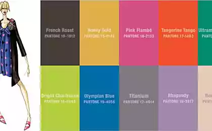
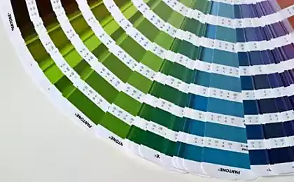
Despite the fact that in most cities of our country is still snow on the calendar - spring, which means it's time to update your wardrobe for the new season. To spring shopping was the most effective, I suggest you a list of the most relevant shades of the season, kindly compiled by the Institute for us color Pantone. The color palette Pantone - it's not just somebody's whim, is the result of research based on the study of trends in various fields of art, and this is serious. In addition, it Pantone once gave us the world-famous shade of "Tangerine Tango", so no reason to trust him, we simply do not have.
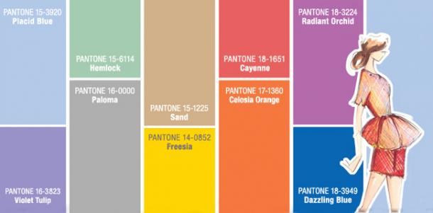
When you select a palette for spring-summer 2014 Pantone developers have relied primarily on the collection of the world's leading designers. Focusing on a balance and equilibrium, the master of color included in his scheme as gentle pastel and bright juicy colors. One of the main advantages of Pantone color palette is its versatility - shades perfectly complement each other, they are easy to combine and they are equally suitable for both women and men.
In the new season, consumers will look for a balance between thoughtful, emotional and artistic. Calm classic colors reflect the versatility and bright let you experiment and explore new combinations and ideas.
All photos are clickable.
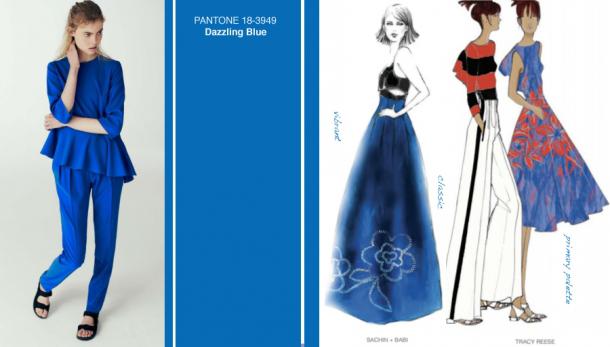
Dazzling Blue / Dazzling Blue
Percentage of designers who used the shade in their collections: 17, 05%
Shining blue - so describe this color in Pantone. Despite its brightness, this shade looks a little more subdued than we know cobalt or electrician, suitable to any skin tone and has a character of warm notes, thereby not hurt the eyes.
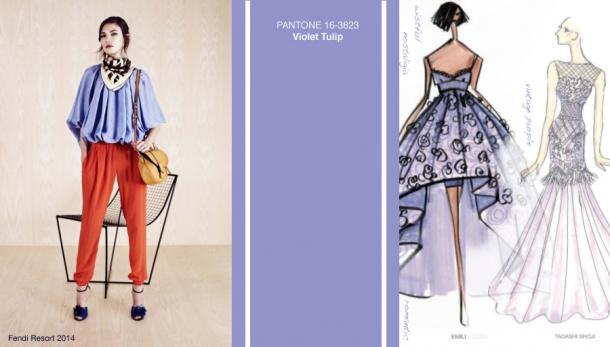
Violet Tulip / Purple tulip
Percentage of designers who used the shade in their collections: 16, 47%
Romantic and nostalgic tinge of purple, close to lavender. Versatile in terms tsvetotip - though refers to cold colors, but will look great on girls with any skin tone and shade of hair. Ideal for make-up: feather in the shade of pastel haze - the main trend of the season.
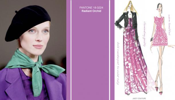
Radiant Orchid / Orchid Shining
Percentage of designers who used the shade in their collections: 15, 88%
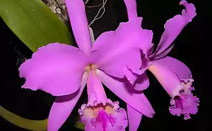
Not just another shade in the palette Pantone, the color and 2014. One of my favorite shades of Kate Middleton - in colored dress "radiant orchid" Duchess posed for photographers on his first photo shoot with her son Prince George. By the way, for photoset dedicated engagement to William, Kate chose a dress in a shade "dazzling blue", and on the way out of the hospital with the baby in her arms - dress color "serene blue" (described below). According to the workers Pantone, Duchess of choice largely affects the color palette that they offer as the main colors of seasons.
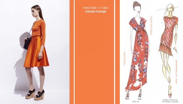
Celosia Orange / Orange Celosia
Percentage of designers who used the shade in their collections: 10%
Celosia - a plant with bright buds, which are often painted in a warm orange hue. According to Pantone, they have included this color palette, not only because it is associated by consumers with exotic fruits and flowers, but also because it reminds them of luxury and fashion - a firm tone design house Hermes.
Freesia / Freesia
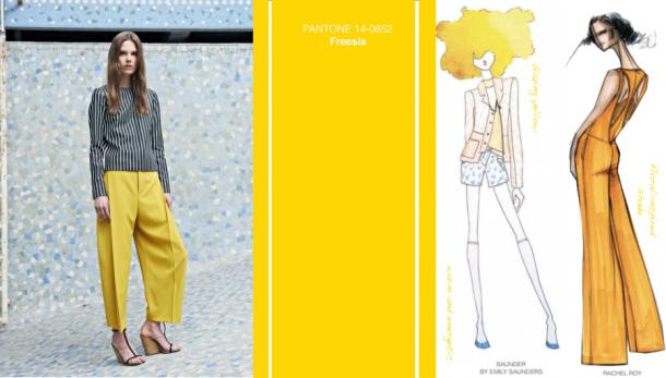
Percentage of designers who used the shade in their collections: 8, 24%
Again floral theme. Painted white freesia buds have a bright yellow center - hence the name hue. Rich, warm, but not knocking down its brightness "Freesia" is associated with sunshine and spring days - that it was hoped the staff Pantone, when included in the shade of the palette of the new season.
Cayenne / Cayenne pepper
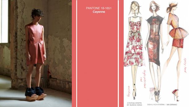
Percentage of designers who used the shade in their collections: 7, 65%
Reddish-orange hue is distinguished by its vigor, exotic and severity - by analogy with the name. "Cayenne pepper" will be a perfect look as accessories, jewelry and makeup - warm tone, reminiscent of the once fashionable coral to become a viable alternative to current in the new season of orange lipstick.
Placid Blue / serene blue
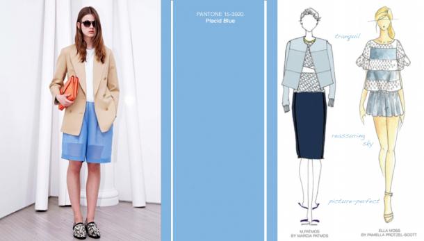
Percentage of designers who used the shade in their collections: 7, 06%
Boring and uninteresting? Not at all. "The serene blue" reveals its true nature in combination with other shades of the palette (in particular with a dazzling blue) and has a calming effect. In addition, it reminds the color of a cloudless summer sky, making it the perfect shade of the coming season.
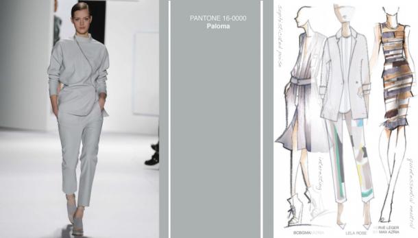
Paloma / Paloma
Percentage of designers who used the shade in their collections: 6, 47%
Named in honor of Paloma Picasso, not dull gray this is the perfect neutral shade in the locker room. Despite its softness, it instills a sense of confidence, but it remains a mystery - like a true woman.
Sand / Sand
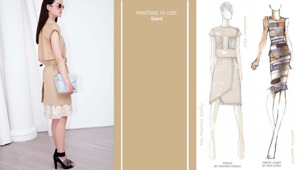
Percentage of designers who used the shade in their collections: 5.88%
Another neutral shade in the summer palette. "Sand" fully reflects its name - the color of sunny beaches, which, unlike the classic camel and beige, does not cause associations with autumn coat, and recalls the summer. This shade will look perfect as a solo performance, and in combination with other bright, pastel, neutral shades.
Hemlock / Hemlock
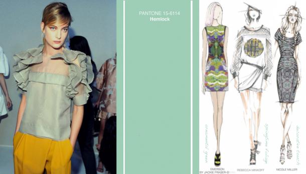
Percentage of designers who used the shade in their collections: 5, 3%
The younger brother of mint - the main summer shade previous seasons - so named in honor of a coniferous tree hemlock. This is a unique color - it can hardly be called a warm, cold or neutral, and creators Pantone characterize it "as a completely new direction in shades of green." In any case, "hemlock" perfectly complement and refresh any summer wardrobe and will be in harmony with all the shades of the palette provided.
At the end of the post I offer you useful video on how to combine all spectacular in the image above shades - with the filing of general director Pantone Leatris Eysman.

When you select a palette for spring-summer 2014 Pantone developers have relied primarily on the collection of the world's leading designers. Focusing on a balance and equilibrium, the master of color included in his scheme as gentle pastel and bright juicy colors. One of the main advantages of Pantone color palette is its versatility - shades perfectly complement each other, they are easy to combine and they are equally suitable for both women and men.
In the new season, consumers will look for a balance between thoughtful, emotional and artistic. Calm classic colors reflect the versatility and bright let you experiment and explore new combinations and ideas.
All photos are clickable.
Dazzling Blue / Dazzling Blue
Percentage of designers who used the shade in their collections: 17, 05%
Shining blue - so describe this color in Pantone. Despite its brightness, this shade looks a little more subdued than we know cobalt or electrician, suitable to any skin tone and has a character of warm notes, thereby not hurt the eyes.

Violet Tulip / Purple tulip
Percentage of designers who used the shade in their collections: 16, 47%
Romantic and nostalgic tinge of purple, close to lavender. Versatile in terms tsvetotip - though refers to cold colors, but will look great on girls with any skin tone and shade of hair. Ideal for make-up: feather in the shade of pastel haze - the main trend of the season.

Radiant Orchid / Orchid Shining
Percentage of designers who used the shade in their collections: 15, 88%
Not just another shade in the palette Pantone, the color and 2014. One of my favorite shades of Kate Middleton - in colored dress "radiant orchid" Duchess posed for photographers on his first photo shoot with her son Prince George. By the way, for photoset dedicated engagement to William, Kate chose a dress in a shade "dazzling blue", and on the way out of the hospital with the baby in her arms - dress color "serene blue" (described below). According to the workers Pantone, Duchess of choice largely affects the color palette that they offer as the main colors of seasons.

Celosia Orange / Orange Celosia
Percentage of designers who used the shade in their collections: 10%
Celosia - a plant with bright buds, which are often painted in a warm orange hue. According to Pantone, they have included this color palette, not only because it is associated by consumers with exotic fruits and flowers, but also because it reminds them of luxury and fashion - a firm tone design house Hermes.

Freesia / Freesia
Percentage of designers who used the shade in their collections: 8, 24%
Again floral theme. Painted white freesia buds have a bright yellow center - hence the name hue. Rich, warm, but not knocking down its brightness "Freesia" is associated with sunshine and spring days - that it was hoped the staff Pantone, when included in the shade of the palette of the new season.

Cayenne / Cayenne pepper
Percentage of designers who used the shade in their collections: 7, 65%
Reddish-orange hue is distinguished by its vigor, exotic and severity - by analogy with the name. "Cayenne pepper" will be a perfect look as accessories, jewelry and makeup - warm tone, reminiscent of the once fashionable coral to become a viable alternative to current in the new season of orange lipstick.

Placid Blue / serene blue
Percentage of designers who used the shade in their collections: 7, 06%
Boring and uninteresting? Not at all. "The serene blue" reveals its true nature in combination with other shades of the palette (in particular with a dazzling blue) and has a calming effect. In addition, it reminds the color of a cloudless summer sky, making it the perfect shade of the coming season.

Paloma / Paloma
Percentage of designers who used the shade in their collections: 6, 47%
Named in honor of Paloma Picasso, not dull gray this is the perfect neutral shade in the locker room. Despite its softness, it instills a sense of confidence, but it remains a mystery - like a true woman.

Sand / Sand
Percentage of designers who used the shade in their collections: 5.88%
Another neutral shade in the summer palette. "Sand" fully reflects its name - the color of sunny beaches, which, unlike the classic camel and beige, does not cause associations with autumn coat, and recalls the summer. This shade will look perfect as a solo performance, and in combination with other bright, pastel, neutral shades.

Hemlock / Hemlock
Percentage of designers who used the shade in their collections: 5, 3%
The younger brother of mint - the main summer shade previous seasons - so named in honor of a coniferous tree hemlock. This is a unique color - it can hardly be called a warm, cold or neutral, and creators Pantone characterize it "as a completely new direction in shades of green." In any case, "hemlock" perfectly complement and refresh any summer wardrobe and will be in harmony with all the shades of the palette provided.

At the end of the post I offer you useful video on how to combine all spectacular in the image above shades - with the filing of general director Pantone Leatris Eysman.
